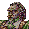
thespaceinvader's portraits - Ancient Wose
Moderator: Forum Moderators
Forum rules
Before posting critique in this forum, you must read the following thread:
Before posting critique in this forum, you must read the following thread:

Re: thespaceinvader's portraits - current, Dwarves
Displacement maps are really awesome if you know how to use them. That's my suggestion.. 
I really like how it's turning out. You may want to work on his left (right side of the portrait) armpit and below it, it looks rather flat at the moment.
The thunderstick looks awesome, I like the runes down his tail.
(and what? Looks metallic to me.. )
)
I really like how it's turning out. You may want to work on his left (right side of the portrait) armpit and below it, it looks rather flat at the moment.
The thunderstick looks awesome, I like the runes down his tail.
(and what? Looks metallic to me..
Re: thespaceinvader's portraits - current, Dwarves
The cape on dragonguard's right arm is looking strange to me. It is closely wrapped around the arm, where I would rather expect loose hanging.
About the lighting: either the dwarves have very shiny skin or there is something not good with lighting IMO. If the forehead is exposed on the rays of very close and very intense source of light, the chainmail should be shining too, much more than now is.
I like the weapon design. It is kind of baroque minigun
And his beard is unusual too.
-
thespaceinvader

- Retired Art Director
- Posts: 8414
- Joined: August 25th, 2007, 10:12 am
- Location: Oxford, UK
- Contact:
Re: thespaceinvader's portraits - current, Dwarves
Doofus: it's intended to be bronze. It looks that way to me =)
Mefisto: it's a singe, very large barrel. As with the previous one, the cartridges are in the canisters around his waist, to give you an idea of the bore size. I mightt one the forehead down just a touch.
Mefisto: it's a singe, very large barrel. As with the previous one, the cartridges are in the canisters around his waist, to give you an idea of the bore size. I mightt one the forehead down just a touch.
http://thespaceinvader.co.uk | http://thespaceinvader.deviantart.com
Back to work. Current projects: Catching up on commits. Picking Meridia back up. Sprite animations, many and varied.
Back to work. Current projects: Catching up on commits. Picking Meridia back up. Sprite animations, many and varied.
-
beetlenaut

- Developer
- Posts: 2867
- Joined: December 8th, 2007, 3:21 am
- Location: Washington State
- Contact:
Re: thespaceinvader's portraits - current, Dwarves
The highlights in general look a little too bright--like it's night and he's standing near a spotlight. Great work though! I look forward to seeing more.
Campaigns: Dead Water,
The Founding of Borstep,
Secrets of the Ancients,
and WML Guide
The Founding of Borstep,
Secrets of the Ancients,
and WML Guide
-
Sgt. Groovy

- Art Contributor
- Posts: 1471
- Joined: May 22nd, 2006, 9:15 pm
- Location: Helsinki
Re: thespaceinvader's portraits - current, Dwarves
The perspective of the chainmail is now much better, but now it looks like he's wearing a coat with a chainlink pattern print. The reason is that chainmail is three-dimensional material and it looks considerablely different depending on the view angle. This image illustrates one of the results of the three-dimensionality: You can only see through the chainmail when you're looking at it from a straight angle.
Chainmail really is a challenging material to draw. I believe something like your earlier approach might work better, instead of having one pattern for all of it, it might be better to have several superimposed. One base colour, one pattern for the holes and one for the highlight bits.
Chainmail really is a challenging material to draw. I believe something like your earlier approach might work better, instead of having one pattern for all of it, it might be better to have several superimposed. One base colour, one pattern for the holes and one for the highlight bits.
Tiedäthän kuinka pelataan.
Tiedäthän, vihtahousua vastaan.
Tiedäthän, solmu kravatin, se kantaa niin synnit
kuin syntien tekijätkin.
Tiedäthän, vihtahousua vastaan.
Tiedäthän, solmu kravatin, se kantaa niin synnit
kuin syntien tekijätkin.

Re: thespaceinvader's portraits - current, Dwarves
woha - lots of new stuff since i last had time to check your thread!
some quick comments on the three lads:
thunderer: the face has improved massively! i know that you are going for an extremely healthy dwarf look - but isn't his skin colour a tad to sunburned? and the nosetip is extremely pointy now, but those are no hard critiques, i think your picture would benefit from following them, but it is no must. i still have a problem with the chainmail... it's much more detailed now and you invested a lot of work, but it looks really technical (and vector-y) and really clashes with the painterly style of the rest of the pic. i'd say another variant is needed.
dragonguard: as it has already been noted, there's something strange with the skin colour (while the style of the face is perfect now) - i think your lightsource is way to yellow! grab some reference photos. another problem i see with him (but it's too late to fix it, i fear) is the pose - it's very stiff and angular. both arms are nearly perpendicular to the upright body/head.
and the fighter - it's good that you try to approach the fighter in a different way and avoid the classical dwarven stereotypes. but for me this just has no dwarf vibes at all, he looks like a short human.
some quick comments on the three lads:
thunderer: the face has improved massively!
dragonguard: as it has already been noted, there's something strange with the skin colour (while the style of the face is perfect now) - i think your lightsource is way to yellow! grab some reference photos. another problem i see with him (but it's too late to fix it, i fear) is the pose - it's very stiff and angular. both arms are nearly perpendicular to the upright body/head.
and the fighter -
-
thespaceinvader
- Retired Art Director
- Posts: 8414
- Joined: August 25th, 2007, 10:12 am
- Location: Oxford, UK
- Contact:
Re: thespaceinvader's portraits - current, Dwarves
I'll fiddle the light source on the D'guard's face, but i think it's too late, as you suggest, to deal with the pose. Is the pose acceptable, assuming the other issues are dealt with? And does the light colour problem also include the light on the cloak?
The thunderer: I'm happy with the face as it is. As regards the chaim mail, I've dropped you a PM.
I've another version of the fighter waiting. But I'm really not sure how to tip him over the line between short, bulky human with big head and hands and dwarf. Possibly more beard, but i'm trying to avoid the typical dwarf beard...
- Attachments
-
- dwarf-fighter.png (96.94 KiB) Viewed 4768 times
http://thespaceinvader.co.uk | http://thespaceinvader.deviantart.com
Back to work. Current projects: Catching up on commits. Picking Meridia back up. Sprite animations, many and varied.
Back to work. Current projects: Catching up on commits. Picking Meridia back up. Sprite animations, many and varied.

Re: thespaceinvader's portraits - current, Dwarves
I think it has to do with his shoulders not appearing to be wider than his hips, and the fact that he is so skinny. One of the iconic parts of a dwarf that make him recognizable are that seemingly rounded nature. I am not saying he has to be fat, but they are hardy, stocky. They have those barrel chests that complement their short powerful builds. The shorter neck like you first used on the thunderer might emphasize that as well. He just appears as a short, lean human now.thespaceinvader wrote:I've another version of the fighter waiting. But I'm really not sure how to tip him over the line between short, bulky human with big head and hands and dwarf. Possibly more beard, but i'm trying to avoid the typical dwarf beard...
Mainline Maintainer: AOI, DM, NR, TB and THoT.
UMC Maintainer: Forward They Cried, A Few Logs, A Few More Logs, Start of the War, and Battle Against Time
UMC Maintainer: Forward They Cried, A Few Logs, A Few More Logs, Start of the War, and Battle Against Time
Re: thespaceinvader's portraits - current, Dwarves
for the fighter, i agree with what turuk wrote: rounded nature, hardy, stocky, broad shoulders, big hands, short neck, perhaps a belly - you know, a dwarf... if you want to give him such a "human" beard style and equipment a human would use too, you'll have make the rest of his appearance extra-dwarven!
as for the dragonguard - the pose is not really bad or wrong, it's just boring. so if the rest of the rendering is up to par, he'll go in. (right now, the shading on his cloak doesn't make any sense - ref...) but please avoid too angular poses in future, make them more natural...
as for the dragonguard - the pose is not really bad or wrong, it's just boring. so if the rest of the rendering is up to par, he'll go in. (right now, the shading on his cloak doesn't make any sense - ref...) but please avoid too angular poses in future, make them more natural...
-
Cernunnos
- Art Contributor
- Posts: 292
- Joined: August 12th, 2008, 11:47 am
- Location: Bordeaux, France.
Re: thespaceinvader's portraits - current, Dwarves
I'm sorry for not being able to help about his aspect, but i would just like to say the details on the axe are excellent.
edited for the phrasing
edited for the phrasing
"While portrait art may be where Wesnoth gets its glamour, and sprite art may be where Wesnoth gets its zest, it's the terrain art that's so crucial to Wesnoth's polish - it's the canvas that the rest goes on." Sangel
Re: thespaceinvader's portraits - current, Dwarves
I have to agree, one of my favorite bits about these portraits is that each one has a touch of detail in their weapon or armor that fits in well with the dwarvish mentality, and I like that you have kept to that mindset.Cernunnos wrote:I'm sorry for not being able to help about his aspect, but i would just like to say the details on the axe are excellent.
Mainline Maintainer: AOI, DM, NR, TB and THoT.
UMC Maintainer: Forward They Cried, A Few Logs, A Few More Logs, Start of the War, and Battle Against Time
UMC Maintainer: Forward They Cried, A Few Logs, A Few More Logs, Start of the War, and Battle Against Time
-
thespaceinvader
- Retired Art Director
- Posts: 8414
- Joined: August 25th, 2007, 10:12 am
- Location: Oxford, UK
- Contact:
Re: thespaceinvader's portraits - current, Dwarves
Update of the Thunderer/T'guard based on a technique Kitty mentioned in PM. If this one's not up to scratch, I officially give up =P
EDIT: minor update.
EDIT: minor update.
- Attachments
-
- dwarf-thunderer close.png (38.65 KiB) Viewed 4650 times
-
- dwarf-thunderer.png (154.48 KiB) Viewed 4665 times
-
- dwarf-thunderer.png (47.65 KiB) Viewed 4655 times
http://thespaceinvader.co.uk | http://thespaceinvader.deviantart.com
Back to work. Current projects: Catching up on commits. Picking Meridia back up. Sprite animations, many and varied.
Back to work. Current projects: Catching up on commits. Picking Meridia back up. Sprite animations, many and varied.

Re: thespaceinvader's portraits - current, Dwarves
Looks believable to me.
(The only thing I notice is the bottom edge looks a little hole-punched, but I probably would not notice it if I weren't looking for something.)
(The only thing I notice is the bottom edge looks a little hole-punched, but I probably would not notice it if I weren't looking for something.)
-
mnewton1

- Posts: 777
- Joined: November 12th, 2008, 4:31 am
- Location: On my pretty teal horsey.
- Contact:
Re: thespaceinvader's portraits - current, Dwarves
Personally I like this one but it is your choice

I like it because it seems a bit more relistic and does not have such big holes in it. Like this


I like it because it seems a bit more relistic and does not have such big holes in it. Like this
Creator of Ageless Era
Check out Frogatto & Friends, it's made by the same people who created The Battle for Wesnoth!
Check out Frogatto & Friends, it's made by the same people who created The Battle for Wesnoth!
-
LordBob

- Portrait Director
- Posts: 1322
- Joined: December 8th, 2008, 8:18 pm
- Location: Lille, France
- Contact:
Re: thespaceinvader's portraits - current, Dwarves
I really like your latest Thunderer. Let the argument about its realism roll on, I personnaly find it the most visually convincing chainmail you've done, both in scale and lighting.
About the warrior, I'd say don't hesitate to start over : you'll feel free to follow you gut without the constraint of an existing linework.
About the warrior, I'd say don't hesitate to start over : you'll feel free to follow you gut without the constraint of an existing linework.
Want to see more of my art ? Visit my portfolio !