EVILEST's 'Chaos' stuff
Moderator: Forum Moderators
Forum rules
Before posting critique in this forum, you must read the following thread:
Before posting critique in this forum, you must read the following thread:
Re: EVILEST's 'Chaos' stuff
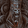
The axe is supposed to be resting against the shoulder plate, but the unfinished execution didn't make it clear enough. I hope it looks clearer now!
I've still not touched the sword yet, but I don't think I'm going to change the shape of it too much. For the blade I'm going to stick to the broadsword shape that the pixel art has. The sprite has a crescent shaped crossguard which I'm thinking of adding in.
Would it be preferable if the cape was clearly made of some sort of stitched hide?
I've been fiddling with the overall colors a little, trying out some different yellow tones. Overall, I think this piece is about one update away from being complete!
- Attachments
-

Re: EVILEST's 'Chaos' stuff
It seems too good 
The creator of "City Defense", a 2P survival on the add-ons list.
Visite my Art Gallery!
http://forums.wesnoth.org/viewtopic.php?f=23&t=30931
Visite my Art Gallery!
http://forums.wesnoth.org/viewtopic.php?f=23&t=30931
Re: EVILEST's 'Chaos' stuff
Ok, so it's done! I'll take care of final sizing and the cutout version once things are ok'd by Shadowmaster or Espreon, just to be sure that everything is ok by the campaign creators. Anything that needs to be changed can still be taken care of, if there's any modifications or edits needed, I'll be happy to fix.
- Attachments
-
Re: EVILEST's 'Chaos' stuff
very nice. i have a vision of an SX map that will have this guy in the introduction screen 
EDIT: you avatar is also quite cool, i'd like too have a 400x400 version of it
EDIT: you avatar is also quite cool, i'd like too have a 400x400 version of it
The best bet is your own, good Taste.

Re: EVILEST's 'Chaos' stuff
Wow. I love it!
The final touches you added really bring it to life.
The effect on the sword turned out great as well.
The final touches you added really bring it to life.
The effect on the sword turned out great as well.
http://www.wesnoth.org/wiki/User:Sapient... "Looks like your skills saved us again. Uh, well at least, they saved Soarin's apple pie."

Re: EVILEST's 'Chaos' stuff
All the details you integrated put my sprites to shame. Nice work! The sword though simple almost seems more elegant in artistic skill than your armor due to its composition.

Re: EVILEST's 'Chaos' stuff
*Thumbs up*EVILEST wrote:Ok, so it's done! I'll take care of final sizing and the cutout version once things are ok'd by Shadowmaster or Espreon, just to be sure that everything is ok by the campaign creators. Anything that needs to be changed can still be taken care of, if there's any modifications or edits needed, I'll be happy to fix.
@Zerovirus: of course you can't expect the sprites to be that detailed. It's part of the deal when making pixel art.
Author of the unofficial UtBS sequels Invasion from the Unknown and After the Storm.
Re: EVILEST's 'Chaos' stuff
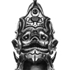
Ok, it's in an early stage, but the Invader is coming along. I'll get the Blood Knight's proper sizing done soon.
Zerovirus - Your Chaos sprites are pretty much loaded with details as well! Your full set of Chaos warriors look great, and they have a very nice cohesive feel across the levels.
Also, to anyone in the know... if I post some art here and don't want it to be considered under GPL, do I simply state that I'd like it to remain as personal work?
Zerovirus - Your Chaos sprites are pretty much loaded with details as well! Your full set of Chaos warriors look great, and they have a very nice cohesive feel across the levels.
I'm working on updating my website (featuring a lot of incomplete personal art), which should then have the image I've used as my avatar. I'll update my profile to include the website once it's done.Mabuse wrote:i'd like too have a 400x400 version of it
Also, to anyone in the know... if I post some art here and don't want it to be considered under GPL, do I simply state that I'd like it to remain as personal work?
- Attachments
-

Re: EVILEST's 'Chaos' stuff
Yes, simply make sure it appears near the image (maybe even in the image description), that this is not GPL-ed.EVILEST wrote:Also, to anyone in the know... if I post some art here and don't want it to be considered under GPL, do I simply state that I'd like it to remain as personal work?
Re: EVILEST's 'Chaos' stuff
Thanks for the clarification. Sounds simple enough!pauxlo wrote:Yes, simply make sure it appears near the image (maybe even in the image description), that this is not GPL-ed.
And... an update on the Invader, and the resized Blood Knight.
- Attachments
-
- Bloodknight205.png (65.23 KiB) Viewed 4072 times
-
- Bloodknight400.png (251.29 KiB) Viewed 4072 times
-
-
thespaceinvader

- Retired Art Director
- Posts: 8414
- Joined: August 25th, 2007, 10:12 am
- Location: Oxford, UK
- Contact:
Re: EVILEST's 'Chaos' stuff
The invader's helm (and now that I think about it, the blood knight's too) look kind of flat - they don't have shading or shaping that makes them look 3d, so they look kind of frieze-like. Otherwise, looking cool =D
http://thespaceinvader.co.uk | http://thespaceinvader.deviantart.com
Back to work. Current projects: Catching up on commits. Picking Meridia back up. Sprite animations, many and varied.
Back to work. Current projects: Catching up on commits. Picking Meridia back up. Sprite animations, many and varied.
Re: EVILEST's 'Chaos' stuff
I totally overlooked the lighting on the Blood Knight's helm! Here's an edited version. I'll also keep the lighting in mind when I continue work on the Invader's helm.thespaceinvader wrote:The invader's helm (and now that I think about it, the blood knight's too) look kind of flat - they don't have shading or shaping that makes them look 3d, so they look kind of frieze-like.
- Attachments
-
- Bloodknight205.png (65.31 KiB) Viewed 4015 times
-
- Bloodknight400.png (251.52 KiB) Viewed 4015 times
Re: EVILEST's 'Chaos' stuff
Let me first start out by saying that these portraits are coming out very well. You are clearly imaginative and have a good sense of form.
The problem I see over and over again in these portraits however, are in the details. Simply put, you use a LOT of small lines and curves and such in everything you do. Where this becomes an issue is that just to look at what's going on, I have absolutely no idea what material the majority of what these characters are using. There are no highlights, there are no real darks. It is majority midtone which is makes it more like high quality plastic of some sort.
It comes down to an old adage about drawing. The more simple an object is, the harder it is to draw. The reason for this is there is no margin for error. It will either look right, or it doesn't. You'll see bounce lights, shadows, shadow cores, etc. Now if you start adding in detail, these basics become obscured. Suddenly, the shadow core doesn't matter as much because you have a bajillion details running through and breaking up everything. Basically, people have a built in sense of margin of error, and those details play on that. After all, you made those details up and they've most likely never seen anything like that before to compare it to in their memory. However if you have a flat sheet of metal, they expect one part to have a very bright highlight, followed by mid-dark tones, and then the very dark areas around the edges.
Another problem with adding all of that in is your portraits tend to look more statuesque and less like they fight. One thing I find over and over again is the less design and prettying up you add to something, the more brutal they feel. Scratched up armor, rivets, gashes, rips, tears. All of these give the warrior a history. It says they've been in fights, they've taken hits, and they came out alive at the expense of someone elses life. If you take away those details, then all you have is some guy in armor. Certainly, medieval plate had its share of trim and relief on it, but you could still tell it was there to be used to kill the other guy.
The last critique is upon the lighting you use. It's always either monochromatic or two tone. The darker areas are just a darker color of everything else. Even in your latest blood night, the cloak on his back is reddish brown. Not exactly a far cry from the yellow you have elsewhere, nor the brown you have on his lower half. They're all warm colors, even if some are less saturated than others. With this and on the two tones it further aids in the loss of the idea of what material these shapes are made of. I'm not saying this kind of coloration is bad all the time, however most of the portraits you do seem as though you're aiming for a more neutral and natural lighting, but with material that just happens to all be in the same side of the color wheel.
Form follows function, at all times. You don't want to make detailed armor, you want to make armor that has some details on it. Swords with ornate hilts and such? Fine, but make sure those hilts are covered in a material that has friction and grip to it. At the moment, you have a metal hand gripping a metal handle. You have very ornate pauldrons that would limit his movement to the point that he could never raise his arms up. Because of the coloration and lighting you use, a lot of areas look very flat where they should be curving around the body, specifically the chest and shoulder pieces.
You're very talented, you have a lot of ideas. I hope none of this came off as overly harsh, however I feel it is greatly detracting from what could be very wonderfully done portraits. I'm not saying you aren't perfectly capable of doing all that and have for some reason chosen not to, but I think your work would greatly benefit by utilizing those skills.
Win if you can. Lose if you must. But always cheat.
-
Sgt. Groovy

- Art Contributor
- Posts: 1471
- Joined: May 22nd, 2006, 9:15 pm
- Location: Helsinki
Re: EVILEST's 'Chaos' stuff
What these guys need is some backlight. Metal is very good at reflecting backlights and it helps anchoring the material into real life and make it look more lively.
Tiedäthän kuinka pelataan.
Tiedäthän, vihtahousua vastaan.
Tiedäthän, solmu kravatin, se kantaa niin synnit
kuin syntien tekijätkin.
Tiedäthän, vihtahousua vastaan.
Tiedäthän, solmu kravatin, se kantaa niin synnit
kuin syntien tekijätkin.
-
Midnight_Carnival

- Posts: 836
- Joined: September 6th, 2008, 11:08 am
- Location: On the beach at sunset, gathering coral
Re: EVILEST's 'Chaos' stuff
Something tells me that a whole lot of contributors nitpicking is a good omen (?) I wouldn't be too surprised to see your name change colour one day.
But if you needed someone to say that they do like your style, I'm here saying it.
But if you needed someone to say that they do like your style, I'm here saying it.
...apparenly we can't go with it or something.