The new Wesnoth logo and the Loyalist sigil
Moderator: Forum Moderators
Forum rules
Before posting critique in this forum, you must read the following thread:
Before posting critique in this forum, you must read the following thread:
-
Girgistian

- Art Contributor
- Posts: 668
- Joined: April 5th, 2008, 8:23 pm
- Location: The lands of perkele
Re: The new Wesnoth logo and the Loyalist sigil
Long time no Groovy, nice to have one artist back from the dead. 
I'm kinda sure voting's pretty much in vain since in the end the decision's going to be in Jetrel's hands, but out of these two, I'd really rather go with the wooden one. The colour sits better with the surrounding gold and gives out an earthly impression, which in turn suits a human faction fairly well. You could also colour it blue and add scratches and places where tha paint has scraped off a little.
I'm kinda sure voting's pretty much in vain since in the end the decision's going to be in Jetrel's hands, but out of these two, I'd really rather go with the wooden one. The colour sits better with the surrounding gold and gives out an earthly impression, which in turn suits a human faction fairly well. You could also colour it blue and add scratches and places where tha paint has scraped off a little.
For the dark gods!

Re: The new Wesnoth logo and the Loyalist sigil
Great that you found time & will to continue your work! 
Textures: Both need work on that account, to make them look more used and worn. Scratches, marks, what not, as somebody already has pointed out before me. Wooden looks like a floor and the green looks like green hard plastic, but all this is just a matter of tweaking back and forth and I'm confident you'll get it perfect.
Natural: What disturbs me most is the combo of skin and gold/metal: Wouldn't it be better to create a skin-shield combined with all tribal materials, like sticks, plant's, etc. I think that would feel way more natural than the combination of something skinish with metal, and I'd reserve the metal-wood for humans.
Middle-segment: The one with the symbol, looks like it's in a totally different materail than the outer metal rings of the shield. I think the contrast in materials is too big between them and that they need to come more alike (maybe not identical ofc, but more so than now...)
That said, it's great work and I think most in here look forward seeing more of it. Hopefully you'll get something good out from peoples comments instead of just personal aesthetical preferences.
Edit: Btw, what tools do you use?
Textures: Both need work on that account, to make them look more used and worn. Scratches, marks, what not, as somebody already has pointed out before me. Wooden looks like a floor and the green looks like green hard plastic, but all this is just a matter of tweaking back and forth and I'm confident you'll get it perfect.
Natural: What disturbs me most is the combo of skin and gold/metal: Wouldn't it be better to create a skin-shield combined with all tribal materials, like sticks, plant's, etc. I think that would feel way more natural than the combination of something skinish with metal, and I'd reserve the metal-wood for humans.
Middle-segment: The one with the symbol, looks like it's in a totally different materail than the outer metal rings of the shield. I think the contrast in materials is too big between them and that they need to come more alike (maybe not identical ofc, but more so than now...)
That said, it's great work and I think most in here look forward seeing more of it.
Edit: Btw, what tools do you use?

Re: The new Wesnoth logo and the Loyalist sigil
Sgt. Groovy wrote:Hi, y'all. Sorry about dropping off for so long. Due to a career change and death in the family I haven't got much time or energy for art for the past year, but now I'm back.
I'm actually indifferent about the texture, but to match most of our other GUI art, I really think we need to stick with a dark blue (on any material, it would be a lacquer).Sgt. Groovy wrote:I've decided to start working on the logo again. This is a total redo-from-scratch revision, since last time I have found much better reference and the old sword just looked awful. I've also decided to part more from the original design, colour and detailwise.
All told though, this looks incredible! It's really great to have you working on this again.
I was worried you might be gone for good, and I was dreading having to learn a whole sub-field of art just to get this done. (It's not that I don't want to learn vector art, it's just that I'm already so spread thin that I can't.) Especially - it would have been really tough to get up to the level of quality you're doing these at.
-
Sgt. Groovy

- Art Contributor
- Posts: 1471
- Joined: May 22nd, 2006, 9:15 pm
- Location: Helsinki
Re: The new Wesnoth logo and the Loyalist sigil
Thank you all for yor feedback.
Here's with a blue-gray skin and different take on the embossment. I think the more detailed and 3d look works better than the previous flat one, which look sort of modern. Now I have to try with different designs, some with emanating rays instead of upward going flames.
I'm partial for the reptile skin, because I though it would add an exotic touch to the shield, because Wesnoth is a fantasy setting after all, not merely a plain old medieval one (I'm even considering a subtle colour pattern to it). I haven't given up the wood one either yet, though, but I have to see how it would work as dark blue. I wanted the wood to have a stark pattern, to make it more interesting, and with a staining paint (that sucks into the wood and leaves the pattern visible) that would be possible with non-wood colour too. If it's goint to be a covering, laquer-type paint, then I'd like it to have some painted (subtle, dark blue on darker blue) pattern to it.
- Attachments
-
Tiedäthän kuinka pelataan.
Tiedäthän, vihtahousua vastaan.
Tiedäthän, solmu kravatin, se kantaa niin synnit
kuin syntien tekijätkin.
Tiedäthän, vihtahousua vastaan.
Tiedäthän, solmu kravatin, se kantaa niin synnit
kuin syntien tekijätkin.
-
thespaceinvader

- Retired Art Director
- Posts: 8414
- Joined: August 25th, 2007, 10:12 am
- Location: Oxford, UK
- Contact:
Re: The new Wesnoth logo and the Loyalist sigil
Looking good. I'd be happy, personally, with a subtle pattern on the skin - maybe in scale size/shape and/or colour?
http://thespaceinvader.co.uk | http://thespaceinvader.deviantart.com
Back to work. Current projects: Catching up on commits. Picking Meridia back up. Sprite animations, many and varied.
Back to work. Current projects: Catching up on commits. Picking Meridia back up. Sprite animations, many and varied.

Re: The new Wesnoth logo and the Loyalist sigil
The pebbled texture of the center bronze is a nice idea, but do you think it should only be in the regions remote from the sceptre & flames? It looks a little bit synthetic (to me) because of how the pattern continues inside the flame circle. If the sceptre & flames were put there by a hammer or mould, that pebble pattern would be smoothed out.
I realize this is a work in progress, so never mind if you simply hadn't gotten to around to such details yet. It's looking good.
I realize this is a work in progress, so never mind if you simply hadn't gotten to around to such details yet. It's looking good.
BfW 1.12 supported, but active development only for BfW 1.13/1.14: Bad Moon Rising | Trinity | Archaic Era |
| Abandoned: Tales of the Setting Sun
GitHub link for these projects
| Abandoned: Tales of the Setting Sun
GitHub link for these projects
Re: The new Wesnoth logo and the Loyalist sigil
This is looking nice thus far. 
So the pattern is always going to be visible, even with lacquer over it. Don't worry about that.
You're wrongly concerned about one aspect of realism, notably, you're forgetting that wood-grain is not merely coloration. Wood-grain is actually totally-different material density, and after the wood ages at all, the dessication of the less-dense parts of the wood causes them to contract. Which results in all of the dark lines in the wood actually sticking out further.Sgt. Groovy wrote:I haven't given up the wood one either yet, though, but I have to see how it would work as dark blue. I wanted the wood to have a stark pattern, to make it more interesting, and with a staining paint (that sucks into the wood and leaves the pattern visible) that would be possible with non-wood colour too. If it's goint to be a covering, laquer-type paint, then I'd like it to have some painted (subtle, dark blue on darker blue) pattern to it.
So the pattern is always going to be visible, even with lacquer over it. Don't worry about that.
Play Frogatto & Friends - a finished, open-source adventure game!
-
King_Elendil

- Posts: 250
- Joined: February 26th, 2010, 4:54 am
Re: The new Wesnoth logo and the Loyalist sigil
Hello, this is the loyalist sigil/Coat of Arms, right? If so, are there sigils for the other factions, or descriptions of them?
I'm finally admitting that this will be a very long (if not permanent) Wesbreak. Thank y'all for the great times, and may Wesnoth rise to become one of the most popular games on the planet.
-
thespaceinvader
- Retired Art Director
- Posts: 8414
- Joined: August 25th, 2007, 10:12 am
- Location: Oxford, UK
- Contact:
Re: The new Wesnoth logo and the Loyalist sigil
This is a replacement coat of arms for the Wesnoth logo, the one that appears on the main page, and at the top of your screen right now - it is the Loy coat of arms too, I suppose, but for the moment, there are no plans to do any others.
http://thespaceinvader.co.uk | http://thespaceinvader.deviantart.com
Back to work. Current projects: Catching up on commits. Picking Meridia back up. Sprite animations, many and varied.
Back to work. Current projects: Catching up on commits. Picking Meridia back up. Sprite animations, many and varied.
-
Sgt. Groovy
- Art Contributor
- Posts: 1471
- Joined: May 22nd, 2006, 9:15 pm
- Location: Helsinki
Re: The new Wesnoth logo and the Loyalist sigil
I'm finally working on this again, and hoping to finish this before fall.
The upper parts of the swords and a bluish gray wood texture (it's the same as previous one, only colours are changed). I have given up trying to match the original sword design too closely, and instead trying something that looks good also in big size (it's very difficult to make out the actual shape from the small pixmap, and the shapeless blob of my previous version is the closest I could get. Ugh.)
I think the angular design of the crossguard matches nicely with the shape of the shield (it wasn't all that conscious choice, actually):
- Attachments
-
Tiedäthän kuinka pelataan.
Tiedäthän, vihtahousua vastaan.
Tiedäthän, solmu kravatin, se kantaa niin synnit
kuin syntien tekijätkin.
Tiedäthän, vihtahousua vastaan.
Tiedäthän, solmu kravatin, se kantaa niin synnit
kuin syntien tekijätkin.
Re: The new Wesnoth logo and the Loyalist sigil
What I was just thinking: This shield looks like "THE shield", meaning produced by a very skilled legendary XYZ-whatever. It also looks like there are quite some tales and legends about it. It looks really expensive, decorative and unique/rare.
What does not fit into this interpretation is the wood with the ruff pattern. If a shield as I described would be produced they would probably select the wood very carefully... and they probably would select wood with a very fine or symmetric pattern.
The reptile skin however fits very well into "my interpretation of the shield", since as mentioned already several times it could be from very exotic, dangerous, fabulous creatures.
For the wood some grey color of the metal would fit better?
Just 2 pence from a non-artist-non-programmer. I just feel that this wood is somehow going in the wrong direction. THX
Really a miracle (to me) how you produce such great pictures...
I don't see any problems with an elf-woman hitting somebody with a mace...
-
Sgt. Groovy
- Art Contributor
- Posts: 1471
- Joined: May 22nd, 2006, 9:15 pm
- Location: Helsinki
Re: The new Wesnoth logo and the Loyalist sigil
The wood could be fancier, something like mahogany or ebony. On the other hand, it could be some curly hardwood, like these:
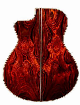

A bit more difficult to render, though.
Here's an earlier leather experiment, I kinda like it, though it's hard to tell what it is, exactly (shark skin?):
A bit more difficult to render, though.
Here's an earlier leather experiment, I kinda like it, though it's hard to tell what it is, exactly (shark skin?):
- Attachments
-
Tiedäthän kuinka pelataan.
Tiedäthän, vihtahousua vastaan.
Tiedäthän, solmu kravatin, se kantaa niin synnit
kuin syntien tekijätkin.
Tiedäthän, vihtahousua vastaan.
Tiedäthän, solmu kravatin, se kantaa niin synnit
kuin syntien tekijätkin.
-
thespaceinvader
- Retired Art Director
- Posts: 8414
- Joined: August 25th, 2007, 10:12 am
- Location: Oxford, UK
- Contact:
Re: The new Wesnoth logo and the Loyalist sigil
I'd echo the sentiment of preferring the lizard skin/scale pattern than a wood one. Also, I think you could stand to have some deeper shades in the centre - currently it's got the bright highlights, but without darker shadows it looks a little plasticky.
Otherwise, looking really good =)
Otherwise, looking really good =)
http://thespaceinvader.co.uk | http://thespaceinvader.deviantart.com
Back to work. Current projects: Catching up on commits. Picking Meridia back up. Sprite animations, many and varied.
Back to work. Current projects: Catching up on commits. Picking Meridia back up. Sprite animations, many and varied.
-
Captain_Wrathbow

- Posts: 1664
- Joined: June 30th, 2009, 2:03 pm
- Location: Guardia
Re: The new Wesnoth logo and the Loyalist sigil
Meh, not that my opinion matters, but I like wood better.
[/peanut gallery comment]
[/peanut gallery comment]
Re: The new Wesnoth logo and the Loyalist sigil
Well since parchment was commonly used on shields a suggestion would be a texture like this
http://www.me.gov.ar/efeme/15dejunio/im ... gamino.jpg
But coulored in that blue coulor.
I believe it would look really nice.
Edit to add: I personally doesn't like the wood one, not because it doesn't look good but because wooden shields without leather, parchment,cloth or anything is just such a bad idea.
And this looks like a really high quality shield.
Edit again: found better reference, at this page there are 7 different types of parchment (click them for bigger picture).
http://www.viking.se/akta-pergament-g165.html