EVILEST's stuff for EoM
Moderator: Forum Moderators
Forum rules
Before posting critique in this forum, you must read the following thread:
Before posting critique in this forum, you must read the following thread:

Re: Hey all, newbie here hoping to contribute!
I love that expression on her face and her hair-do!
It is obvious that she is a vampress (thats probably not correct but...) anyone who cannot determine that relies on stereotypes; she's sexy and scary as it is. Her weapon is that wicked sword, not seduction.
It is obvious that she is a vampress (thats probably not correct but...) anyone who cannot determine that relies on stereotypes; she's sexy and scary as it is. Her weapon is that wicked sword, not seduction.
Ecce, in caelo! Est avem! Minime, est vehiculum aerem! Minime, est virum Latinum!
Re: Hey all, newbie here hoping to contribute!
do you mind telling me what steps you took to add this reddish glow? i guess it's not some kind of color shift but rather some sort of shading? it looked rather flat before - and now...
i really like your style - those nailers are so cut. (if you ever get bored you might consider finishing these portraits?: http://forums.wesnoth.org/viewtopic.php?f=9&t=29902)
i really like your style - those nailers are so cut. (if you ever get bored you might consider finishing these portraits?: http://forums.wesnoth.org/viewtopic.php?f=9&t=29902)
Re: Hey all, newbie here hoping to contribute!
I like these portraits. They fit the whole vampire aristocrat mood very well.
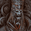
The female warrior lady girl person: Putting breast formed armor has always been more about fan service than anything. After that, just making the girl half naked is what usually ends up happening. From my own experiments, just making the waist a little bigger and shoulders slimmer is enough to get the point across. Even then, armor is about protection and not looking good.
Couple of things about it on the crit side however. The arm closest to us looks like it's supposed to be resting but doesn't actually have anything to rest on. She appears to simply be holding her thigh for no real reason.
The armor itself is fine and dandy. If I had to find something I didn't like, I'd say the shoulder pads are far too big and awkward. Like, not able to raise her arms above her waist awkward. I think your first iteration was a lot more function and not so much form, which is good in my opinion. Obviously this is not my project however, and I know next to nothing about the "World" you're creating for it. If you believe it's fine how it is, then no worries.
Keep up the good work.
Win if you can. Lose if you must. But always cheat.
Re: Hey all, newbie here hoping to contribute!
Thanks for all the comments! Cuirass is going to stay the way it is!
At this point I make my brush edges very soft (I normally paint with a 100% hard brush), and paint in the red glow on the areas that need it. I also painted some bright white/blues on some armor areas to give it a little more shine, and added some darker gray blues to further shade the armor. All of this done with a softer edged brush, on the Overlay layer. I hope this helps... if you'd like me to clarify a little further, I can take some screencaps and upload them with instructions.
I'm glad that you like the Nailers! I'll get around to painting some more Devlings eventually. As to 'finishing' those portraits in the other thread - I suppose I could, but would that be considered rude to take someone's work and paint over it? Painting on top of someone's work to more easily demonstrate a point of critique is fine I think, but to paint over and present it as a finished product?
I'll get these two things sorted out before finalizing this piece.
Thanks for the crit!
Normally I just paint away from a selected palette, but for this one I worked in monochrome first since the armor was going to be more detailed. It was too blue to easily glaze some of those red/orange tones in, so I had to flatten the image onto one layer (working in Photoshop), and turn down the overall saturation a little. After that, I open up a new layer on top of the flattened and desaturated image. I change the layer type from 'Normal to 'Overlay' (this is found on a drop down menu right below your layer tab on the right hand side, to the left of Opacity). This allows you to glaze in colors without loosing too much detail. The Overlay mode will allow your brush to affect mainly mid tones, and preserve your highlights and shadow areas. Beware that colors can become extremely saturated when you do this, so you'll need to fiddle with your selected colors. Also, the less saturated your original image is, the easier it is for the Overlay colors to show. You can paint an image entirely in gray and black, and then glaze in all of your colors. Working this way can save a lot of time, but the colors can end up looking a little boring, so I'd advise on a mix of painting with actual colors and Overlay glazing.Max2008 wrote:do you mind telling me what steps you took to add this reddish glow? i guess it's not some kind of color shift but rather some sort of shading? it looked rather flat before - and now...
i really like your style - those nailers are so cut. (if you ever get bored you might consider finishing these portraits?: http://forums.wesnoth.org/viewtopic.php?f=9&t=29902)
At this point I make my brush edges very soft (I normally paint with a 100% hard brush), and paint in the red glow on the areas that need it. I also painted some bright white/blues on some armor areas to give it a little more shine, and added some darker gray blues to further shade the armor. All of this done with a softer edged brush, on the Overlay layer. I hope this helps... if you'd like me to clarify a little further, I can take some screencaps and upload them with instructions.
I'm glad that you like the Nailers! I'll get around to painting some more Devlings eventually. As to 'finishing' those portraits in the other thread - I suppose I could, but would that be considered rude to take someone's work and paint over it? Painting on top of someone's work to more easily demonstrate a point of critique is fine I think, but to paint over and present it as a finished product?
I think you're right on target with these two points; the positioning of the arm and the oversized shoulder pad are some of my biggest worries about this piece. I'll keep tweaking the arm until it looks more like she's got her hand propped on the outside of her thigh. Regarding the armor/shoulder plate - that was something that started small, and throughout rendering ended up getting vastly enlarged. I do wonder myself how practical something like that is. I'll try to find a happy balance and make it look not quite so ridiculous. It's important to me that basic practicalities and sensibilities aren't completely ignored in favor of pure style.Valkier wrote:The arm closest to us looks like it's supposed to be resting but doesn't actually have anything to rest on. She appears to simply be holding her thigh for no real reason.
The armor itself is fine and dandy. If I had to find something I didn't like, I'd say the shoulder pads are far too big and awkward.
I'll get these two things sorted out before finalizing this piece.
Thanks for the crit!
Re: Hey all, newbie here hoping to contribute!
Besides the shoulderpad that's halfway into WoW-level proportions (but not nearly as awful), my main question is how she is going to bite anyone while wearing that armor. While the neck armor is quite protective, it also looks like it would make striking with her fangs more difficult.
EVILEST's stuff for EoM
Good point... I never even thought of that! I've changed the neck armor to reduce the extreme bevor protrusion, although I don't know if this sort of half measure helps the appearance. I might try getting rid of it altogether, replacing it with a good 'ol fashioned gorget and see how the different neck armors compare visually.AI wrote:Besides the shoulderpad that's halfway into WoW-level proportions (but not nearly as awful), my main question is how she is going to bite anyone while wearing that armor. While the neck armor is quite protective, it also looks like it would make striking with her fangs more difficult.
And so here is a updated version with changes to the neck and shoulder armor, as well as a slight shortening and repositioning of the right arm. Thanks to Valkier for pointing to the very first draft of this portrait - I've tried to move the armor a little back towards those proportions. Not a whole lot of new work done yet, however I think this portrait is getting closer to where I want it to be in the end.
Thanks for everyone's comments and crits.
- Attachments
-
Last edited by EVILEST on June 23rd, 2010, 10:03 am, edited 1 time in total.
-
Midnight_Carnival

- Posts: 836
- Joined: September 6th, 2008, 11:08 am
- Location: On the beach at sunset, gathering coral
Re: Hey all, newbie here hoping to contribute!
Very nice!
However, while you have gone to great lengths with regards to the figure and the armor, the sword needs attention. I'm assuming you are coming to that. I suggest a carved hilt and possibly an etched ricasso.
However, while you have gone to great lengths with regards to the figure and the armor, the sword needs attention. I'm assuming you are coming to that. I suggest a carved hilt and possibly an etched ricasso.
Last edited by Iris on June 19th, 2010, 11:50 pm, edited 1 time in total.
...apparenly we can't go with it or something.
Re: Hey all, newbie here hoping to contribute!
I know it is slightly offtopic, but I think this thread could use a name like "EVILEST portraits" or something. Current thread name just doesn't give justice to quality of the artworks. 
ride on shooting star

Re: Hey all, newbie here hoping to contribute!
Valkier may disagree with me, but I totally liked the arms and shoulders of the previous version better. The shoulder guard was more stylish, more elite. Who cares if she couldn't lift her arm very high? It looked awesome! We're talking about an extremely high level unit, afterall.
Also, I disagree with changing the pose of her hand. It seemed more provocative and deadly when she was not resting her hand on her hip. The previous pose looked fine to me, like maybe she's getting ready to grab someone with that clawed gauntlet, or just laying it across her leg so her opponent gets a good look at it.
However, the other changes I agree with, such as the neck. Also the jewel was a nice touch. Either way, it's a very nice piece of art.
http://www.wesnoth.org/wiki/User:Sapient... "Looks like your skills saved us again. Uh, well at least, they saved Soarin's apple pie."
Re: EVILEST's stuff for EoM
Really great. Could you supply a description or a link to describe your working style? Based on the work-in-progress it must be very different from what I read before. I really like the perspective of the majority. I finally got the idea. It brings all the needfull features in 400x400 and creates some distance.
My Temple Project: http://forums.wesnoth.org/viewtopic.php?f=23&t=29800
This is "must-play" campaign! Don´t read the thread, unless you need help. http://forums.wesnoth.org/viewtopic.php?f=8&t=31895
This is "must-play" campaign! Don´t read the thread, unless you need help. http://forums.wesnoth.org/viewtopic.php?f=8&t=31895
Re: EVILEST's stuff for EoM
Ok, so progress on this piece is sort of slowing to a crawl, but it's almost there! Thanks to all the comments and crits (and the reminder that the previous topic title wasn't exactly descriptive).
After some fiddling around with the shouldered sword, I've changed it out for one planted directly into the ground. I'm also considering changing the cropping a little, so that it doesn't cut off right on her knees. We'll cross that bridge when we get there...
Your point about the 'awesome' factor is very true though. During art college, one of my favorite professors would always break down images into what he called 'the four key factors of a solid image'. You made sure that each of these (composition, contrast, hue, rendering) was taken care of competently, and the piece would generally be decent (at the very least, it made it difficult to argue against the piece on a technical level). However, I always felt that the prof completely overlooked one extraordinarily important factor (at least with regards to sci-fi/fantasy illustration), the awesome factor. A space ship that is placed impeccably cropped, beautifully colored, dramatically lit and crisply drawn/detailed is all fine and good - but how much better would it be if it was an impeccably cropped, beautifully colored, dramatically lit and crisply drawn/detailed vessel of galaxy-burninating doom (much better)? The only struggle is to not get TOO carried away...
First off, most of the time I work purely in Photoshop. Very occasionally I might scan or photograph something in and then paint on top of it. The way I work in Pshop is very crude - I never use any sort of layer masking or selections/paths/etc. I don't keep too many layers in Pshop, usually a new layer is added on to experiment without damaging the underlying work.
99% of the time I work with a round brush that is 100% hard around the edges, set to 50% opacity. The only time I use soft edges and lower opacity is to add atmosphere to certain areas, or to do some final smoothing on something like skin. If there is a good deal of detail in the piece, I'll work with much more limited colors to save time. The stronger colors are then selected and glazed into an overlay layer after most of the details are done. If it's not too detailed, I'll always try to paint with the actual colors instead of glazing.
As for the non-technical side... most of the time I like to start painting on a darker background, and I try to get the light and dark areas figured out early.
Anyways, I hope this hasn't been too confusing. I'm happy to elaborate more on any of this, so just let me know. Also, keep in mind that there isn't any right or wrong way to approach creating an image. Whatever works, right?
So, finally onto the update. Went along fancying up the armor, which now needs some relighting in certain areas. And, fiddled with the sword placement.
After some fiddling around with the shouldered sword, I've changed it out for one planted directly into the ground. I'm also considering changing the cropping a little, so that it doesn't cut off right on her knees. We'll cross that bridge when we get there...
I really did like how the previous shoulder guard looked, but the mobility of it bothered me just too much. Right now, I'm trying to fancy things up a little without making the armor too difficult to move in. I'm not completely sold on how the current hand is resting either, but I'll keep working at it.Sapient wrote:Valkier may disagree with me, but I totally liked the arms and shoulders of the previous version better. The shoulder guard was more stylish, more elite. Who cares if she couldn't lift her arm very high? It looked awesome! We're talking about an extremely high level unit, afterall.
Also, I disagree with changing the pose of her hand. It seemed more provocative and deadly when she was not resting her hand on her hip. The previous pose looked fine to me, like maybe she's getting ready to grab someone with that clawed gauntlet, or just laying it across her leg so her opponent gets a good look at it.
Your point about the 'awesome' factor is very true though. During art college, one of my favorite professors would always break down images into what he called 'the four key factors of a solid image'. You made sure that each of these (composition, contrast, hue, rendering) was taken care of competently, and the piece would generally be decent (at the very least, it made it difficult to argue against the piece on a technical level). However, I always felt that the prof completely overlooked one extraordinarily important factor (at least with regards to sci-fi/fantasy illustration), the awesome factor. A space ship that is placed impeccably cropped, beautifully colored, dramatically lit and crisply drawn/detailed is all fine and good - but how much better would it be if it was an impeccably cropped, beautifully colored, dramatically lit and crisply drawn/detailed vessel of galaxy-burninating doom (much better)? The only struggle is to not get TOO carried away...
No worries - if you'd like, I can make more frequent saves the next time I start on a portrait. That way you'll get a better idea of how things start and where they go.Tet wrote:Really great. Could you supply a description or a link to describe your working style? Based on the work-in-progress it must be very different from what I read before. I really like the perspective of the majority. I finally got the idea. It brings all the needfull features in 400x400 and creates some distance.
First off, most of the time I work purely in Photoshop. Very occasionally I might scan or photograph something in and then paint on top of it. The way I work in Pshop is very crude - I never use any sort of layer masking or selections/paths/etc. I don't keep too many layers in Pshop, usually a new layer is added on to experiment without damaging the underlying work.
99% of the time I work with a round brush that is 100% hard around the edges, set to 50% opacity. The only time I use soft edges and lower opacity is to add atmosphere to certain areas, or to do some final smoothing on something like skin. If there is a good deal of detail in the piece, I'll work with much more limited colors to save time. The stronger colors are then selected and glazed into an overlay layer after most of the details are done. If it's not too detailed, I'll always try to paint with the actual colors instead of glazing.
As for the non-technical side... most of the time I like to start painting on a darker background, and I try to get the light and dark areas figured out early.
Anyways, I hope this hasn't been too confusing. I'm happy to elaborate more on any of this, so just let me know. Also, keep in mind that there isn't any right or wrong way to approach creating an image. Whatever works, right?
So, finally onto the update. Went along fancying up the armor, which now needs some relighting in certain areas. And, fiddled with the sword placement.
- Attachments
-

Re: EVILEST's stuff for EoM
Gargoyle armor!!! 
Now she could bite people with her shoulder, elbow, heart ... so cool.
Now she could bite people with her shoulder, elbow, heart ... so cool.
“It is written in my life-blood, such as that is, thick or thin; and I can no other.” - J.R.R. Tolkien
My campaign: Swamplings - Four centuries before the founding of Wesnoth, the first wolf rider emerges from a tribe of lowly swamp goblins.
My campaign: Swamplings - Four centuries before the founding of Wesnoth, the first wolf rider emerges from a tribe of lowly swamp goblins.
Re: EVILEST's stuff for EoM
Very cool, I agree. I like the new sword placement, too. Although the sword seems a bit crooked in one spot, I am sure that is because it is not finished yet. This is really turning out to be an amazing portrait.
http://www.wesnoth.org/wiki/User:Sapient... "Looks like your skills saved us again. Uh, well at least, they saved Soarin's apple pie."
-
Midnight_Carnival
- Posts: 836
- Joined: September 6th, 2008, 11:08 am
- Location: On the beach at sunset, gathering coral
Re: EVILEST's stuff for EoM
Greatly aprove of sword, nice!
Damn, I hate it when someone draws such a great unit portrait that you fall in love with it and you know it will never return your feelings.
Damn, I hate it when someone draws such a great unit portrait that you fall in love with it and you know it will never return your feelings.
...apparenly we can't go with it or something.
Re: EVILEST's stuff for EoM
If she were real, none of us would be badass enough for her anyway.Midnight_Carnival wrote: Damn, I hate it when someone draws such a great unit portrait that you fall in love with it and you know it will never return your feelings.
Yeah, the sword placement is much better.
Ecce, in caelo! Est avem! Minime, est vehiculum aerem! Minime, est virum Latinum!