EVILEST's stuff for EoM
Moderator: Forum Moderators
Forum rules
Before posting critique in this forum, you must read the following thread:
Before posting critique in this forum, you must read the following thread:
-
thespaceinvader

- Retired Art Director
- Posts: 8414
- Joined: August 25th, 2007, 10:12 am
- Location: Oxford, UK
- Contact:
Re: Hey all, newbie here hoping to contribute!
And you should - perspective doesn't just enhance size, it enhances our impression of units. I deliberately used a very low perspective, for instance, for the Dwarvish Lord, and for a lot of the Dwarf units - they don't seem nearly as threatening if you look down on them. Size is as much a function of their height within the frame as the perspective we see them from. Low perspectives tell us that this person is more important than we are, and we should look up to them. That's the perfect impression to have of a noble.
Similarly, we see the devling portraits up close, but their gear allows forced perspective to show that they're tiny.
Similarly, we see the devling portraits up close, but their gear allows forced perspective to show that they're tiny.
http://thespaceinvader.co.uk | http://thespaceinvader.deviantart.com
Back to work. Current projects: Catching up on commits. Picking Meridia back up. Sprite animations, many and varied.
Back to work. Current projects: Catching up on commits. Picking Meridia back up. Sprite animations, many and varied.
Re: Hey all, newbie here hoping to contribute!
lol: beeing careful or ignoring, what he should do?
Please explain the concept of peanut gallery.
I only wish to be ignored, if it keeps him happy. Otherwise I would prefer to be considered.
For me the perspective on the Noble is borderline. But than again: good art has to be borderline. Your example looking down on tiny dwarfs, I mentioned. Looking up to woses, ogre and trolls, I can comprehend. Looking up to nobles as portrait (not as story art), I would recommend extrem caution. Extrem perspective is a definite no-go, I have seen that in the past. The dwarven perspective I haven't even noticed, so uneducated in art am I.
Edit: Ah, you are looking up to the dwarves to make them more important. I thought they just have tiny heads to make them look fully grown. English language sometimes hard to comprehend.
My Temple Project: http://forums.wesnoth.org/viewtopic.php?f=23&t=29800
This is "must-play" campaign! Don´t read the thread, unless you need help. http://forums.wesnoth.org/viewtopic.php?f=8&t=31895
This is "must-play" campaign! Don´t read the thread, unless you need help. http://forums.wesnoth.org/viewtopic.php?f=8&t=31895
-
catwhowalksbyhimself
- Posts: 411
- Joined: January 23rd, 2006, 8:28 am
Re: Hey all, newbie here hoping to contribute!
Which is exactly why your opinion should probably be kept to yourself. If you yourself are forced to admit that you don't know what you're talking about, then how are you supposed to be helping this artist? That's what the purpose of commenting on this portraits is, after all, so if you don't know a lot about art, there's usually no reason to say anything. That's why I only rarely comment on the art forums at all. I'm not an art person, and while I do have my opinions, they are not informed opinions, and thus are of no practical value.so uneducated in art am I.
TSI on the other hand, no only has an informed position, he actually has a title here and therefore has a large amount of practical experience on exactly this sort of thing.
Re: Hey all, newbie here hoping to contribute!
I appreciate all the feedback!
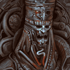
Tet, I understand your concerns. Truth be told, I started out with the intention of setting the Noble just slightly higher in perspective, but over the course of painting the perspective became a little more extreme. Right now his perspective differs from the rest of the Vampire set, which is a little unfortunate (I set up all pieces that should belong to this set and try to make the overall lighting and perspectives similar), but I don't think it's so extreme that a change is needed. I cropped the Devlings so that the cut would enhance the pressure on the Devling holding up the hammer; he's squished under both the hammer and the edge of the portrait. I think showing the leftmost Devling without cropping is worth trying out though, so I'll get around to making a version that shows him in full. Whichever version is preferred can be the one used in EoM. Cropping the Devlings with feet fully in frame is a good way to show their small size. They'd be the only figures that aren't 'tall' enough to warrant cropping - however, for the sake of consistency with the rest of the portraits, I'm going to stick with waist/thigh-down cropping on them.
And, the finished Noble.
Completely failed to notice the large jaggies on noble's sword! I'm working on this piece at its natural 400x400, and shift-clicking to draw straight lines combined with a completely hard edged brush resulted a strange blade. Good catch!thespaceinvader wrote:Noble's sword has picked up some jaggies during scaling
Tet, I understand your concerns. Truth be told, I started out with the intention of setting the Noble just slightly higher in perspective, but over the course of painting the perspective became a little more extreme. Right now his perspective differs from the rest of the Vampire set, which is a little unfortunate (I set up all pieces that should belong to this set and try to make the overall lighting and perspectives similar), but I don't think it's so extreme that a change is needed. I cropped the Devlings so that the cut would enhance the pressure on the Devling holding up the hammer; he's squished under both the hammer and the edge of the portrait. I think showing the leftmost Devling without cropping is worth trying out though, so I'll get around to making a version that shows him in full. Whichever version is preferred can be the one used in EoM. Cropping the Devlings with feet fully in frame is a good way to show their small size. They'd be the only figures that aren't 'tall' enough to warrant cropping - however, for the sake of consistency with the rest of the portraits, I'm going to stick with waist/thigh-down cropping on them.
And, the finished Noble.
- Attachments
-
- Noble400 copy.png (144.8 KiB) Viewed 3677 times
-
- Noble205.png (46.76 KiB) Viewed 3760 times
Last edited by EVILEST on June 16th, 2010, 6:42 am, edited 1 time in total.
-
thespaceinvader
- Retired Art Director
- Posts: 8414
- Joined: August 25th, 2007, 10:12 am
- Location: Oxford, UK
- Contact:
Re: Hey all, newbie here hoping to contribute!
I'm all the more impressed that you're working in native scale - most of our artists start a lot larger and scale down.
Looks good =)
Looks good =)
http://thespaceinvader.co.uk | http://thespaceinvader.deviantart.com
Back to work. Current projects: Catching up on commits. Picking Meridia back up. Sprite animations, many and varied.
Back to work. Current projects: Catching up on commits. Picking Meridia back up. Sprite animations, many and varied.
Re: Hey all, newbie here hoping to contribute!
Normally I work in sizes from 2000-5000 pixels wide/tall (just in case I want to print it out on a large piece of paper), but it takes much longer to complete an illustration of that size. I find myself uncontrollably working out details until the resolution won't allow me to noodle in anything more. Starting out on a smaller canvas really helps keep me working on a more realistic schedule! That being said, I'll probably start working on these portraits at slightly larger sizes.thespaceinvader wrote:I'm all the more impressed that you're working in native scale - most of our artists start a lot larger and scale down.
Looks good =)
And for the time being, the rough base for the next in the Noble line. Just playing around with it - the crazier hairdo and the flamberge may or may not stay since they deviate from the sprite quite a bit. After this, I'll probably work on the Flesh Artisan or some of the spellcasters.
- Attachments
-
- Mistress copy.png (170.47 KiB) Viewed 3674 times
-
thespaceinvader
- Retired Art Director
- Posts: 8414
- Joined: August 25th, 2007, 10:12 am
- Location: Oxford, UK
- Contact:
Re: Hey all, newbie here hoping to contribute!
That level of deviations from the sprite is pretty OK i suspect, if it results in a more interesting portrait. It would be in mainline =)
http://thespaceinvader.co.uk | http://thespaceinvader.deviantart.com
Back to work. Current projects: Catching up on commits. Picking Meridia back up. Sprite animations, many and varied.
Back to work. Current projects: Catching up on commits. Picking Meridia back up. Sprite animations, many and varied.
-
Eleazar

- Retired Terrain Art Director
- Posts: 2481
- Joined: July 16th, 2004, 1:47 am
- Location: US Midwest
- Contact:
Re: Hey all, newbie here hoping to contribute!
Great looking portraits!
Portraits are not my domain, but if you want to do campaign portraits with the largest impact, i'd do these two, since they are both beginner mainline campaigns, and thus probably gets played alot, and has no custom portraits at all:
* Two Brothers
* Orcish Incursion
Somebody else can probably provide a list of important characters.
Also one portrait in Defador's Memoirs, three in Hammer of Thursgan are sorely lacking.zookeeper wrote:At least Liberty, Sceptre of Fire, Two Brothers and The South Guard fit that bill.EVILEST wrote:Is there a list for mainline campaigns most in need of updated artwork? I'd also like to make sure that I wouldn't be doing something that another artist is already hard at work on.
Portraits are not my domain, but if you want to do campaign portraits with the largest impact, i'd do these two, since they are both beginner mainline campaigns, and thus probably gets played alot, and has no custom portraits at all:
* Two Brothers
* Orcish Incursion
Somebody else can probably provide a list of important characters.
Feel free to PM me if you start a new terrain oriented thread. It's easy for me to miss them among all the other art threads.
-> What i might be working on
Attempting Lucidity
-> What i might be working on
Attempting Lucidity
-
thespaceinvader
- Retired Art Director
- Posts: 8414
- Joined: August 25th, 2007, 10:12 am
- Location: Oxford, UK
- Contact:
Re: Hey all, newbie here hoping to contribute!
I'm assured by the current artist that tHoT will be completed eventually, I'd prefer to leave him the chance to doi so, and keep the images in a unified style.
SoF and tRoW are probably the ones in most need of updating IMO.
SoF and tRoW are probably the ones in most need of updating IMO.
http://thespaceinvader.co.uk | http://thespaceinvader.deviantart.com
Back to work. Current projects: Catching up on commits. Picking Meridia back up. Sprite animations, many and varied.
Back to work. Current projects: Catching up on commits. Picking Meridia back up. Sprite animations, many and varied.
-
artisticdude

- Moderator Emeritus
- Posts: 2424
- Joined: December 15th, 2009, 12:37 pm
- Location: Somewhere in the middle of everything
Re: Hey all, newbie here hoping to contribute!
More awesome portraits. Man, I wish I had one-tenth of your skill. 

Again, I really like the portraits. Especially since you've acknowledged that you are capable of working at native scale.
A suggestion: If you decide to work on one of these campaigns, why not play through each (if you haven't already) and pick your your favorite of the two? Of course, having both updated would be nice, but I won't try to push you into doing too much.thespaceinvader wrote:SoF and tRoW are probably the ones in most need of updating IMO.
Again, I really like the portraits. Especially since you've acknowledged that you are capable of working at native scale.
"I'm never wrong. One time I thought I was wrong, but I was mistaken."
Re: Hey all, newbie here hoping to contribute!
Quick update on the Mistress.
With how fancy the armor is looking it might end up getting used as the level 4 noble - we'll see when it's finished.
Thanks all for the suggestions on campaigns - I'll do what I can to play through them.
With how fancy the armor is looking it might end up getting used as the level 4 noble - we'll see when it's finished.
Thanks all for the suggestions on campaigns - I'll do what I can to play through them.
- Attachments
-

Re: Hey all, newbie here hoping to contribute!
That might be a good idea. I can't see how you could make the level 4 fancier without going all "japanese RPG boss" on the design considering the age isn't an option for a vampire.
GREAT work anyway
GREAT work anyway
"There is no difference between good or bad but thinking makes it so"
William Shakespeare.
William Shakespeare.
Re: Hey all, newbie here hoping to contribute!
Very true! Guess this is going to be the level 4. I do love the insane J-RPG bosses though! If there was a vampire even more ancient than a level 4 it would probably be some monster that spent most of its time in torpor... Possibly represented in the game by a stone sarcophagus that slides about the map, opening just enough for a clawed hand to reach out and slash for 18-5 damage (drains hp as well). Good for comedy value, but the portrait would be a boring painting of essentially a gray box (slight marbling texture though). Either that, or some transcendent Cthulian blood-sucking horror of mind melting power.Guidrion wrote:I can't see how you could make the level 4 fancier without going all "japanese RPG boss" on the design considering the age isn't an option for a vampire.
Here's something I've been meaning to ask everyone's opinion about. I understand that we're dealing with a fantasy world here, and in a lot of fantasy... female armor gets the 'boob cup' treatment. I've opted to go with a more realistic form for the curiass, making it no different than a man's piece of armor. Is is preferable to have armor that looks more 'feminine', or is it fine the way it is?
Fleshed it out a little more, and getting things ready for the actual colors.
- Attachments
-
-
artisticdude
- Moderator Emeritus
- Posts: 2424
- Joined: December 15th, 2009, 12:37 pm
- Location: Somewhere in the middle of everything
Re: Hey all, newbie here hoping to contribute!
I think it's fine the way it is, and more realistic to my mind. 'Sexy' armor would have poorer protection than the more realistic armor you created above, imo.EVILEST wrote:I understand that we're dealing with a fantasy world here, and in a lot of fantasy... female armor gets the 'boob cup' treatment. I've opted to go with a more realistic form for the curiass, making it no different than a man's piece of armor. Is is preferable to have armor that looks more 'feminine', or is it fine the way it is?
"I'm never wrong. One time I thought I was wrong, but I was mistaken."
-
thespaceinvader
- Retired Art Director
- Posts: 8414
- Joined: August 25th, 2007, 10:12 am
- Location: Oxford, UK
- Contact:
Re: Hey all, newbie here hoping to contribute!
QFTartisticdude wrote:I think it's fine the way it is, and more realistic to my mind. 'Sexy' armor would have poorer protection than the more realistic armor you created above, imo.EVILEST wrote:I understand that we're dealing with a fantasy world here, and in a lot of fantasy... female armor gets the 'boob cup' treatment. I've opted to go with a more realistic form for the curiass, making it no different than a man's piece of armor. Is is preferable to have armor that looks more 'feminine', or is it fine the way it is?
http://thespaceinvader.co.uk | http://thespaceinvader.deviantart.com
Back to work. Current projects: Catching up on commits. Picking Meridia back up. Sprite animations, many and varied.
Back to work. Current projects: Catching up on commits. Picking Meridia back up. Sprite animations, many and varied.