Loyalist Portrait Series
Moderator: Forum Moderators
Re: Loyalist Portrait Series
Ah, so it´s vector on the armor. I just thought you had an incredibly steady hand, and then I felt really bad about myself.LordBob wrote:Thanks for the advice, I'm often struggling with the search for valid reference.
As far as lines are concerned, I do a bit of everything. Vector for armour parts that have to be regular and nicely curved, brush with line-weight variation for hair, hands and the like, without for clothing...I don't have a definite rule, I work mostly on gut feeling.
Which program do you use. Do you switch programs for the vector? If you do it all in photoshop, which tools?
-
LordBob

- Portrait Director
- Posts: 1322
- Joined: December 8th, 2008, 8:18 pm
- Location: Lille, France
- Contact:
Re: Loyalist Portrait Series
Oh, but I do have an incredibly steady hand 

I work mostly with photoshop. My only step out is when cleaning the lineart : once it's finished, I vectorize it with Inkscape for better lines (the lines I draw tend to get blurry after multiple erasing and countless strokes), before switching back to photoshop . I've considered doing the entire lineart with Inkscape, but it's a lot of learning since I've been using photoshop for years now.
Finished horseman linework
EDIT: and a quick sketch of the lancer for a check of his pose
- Attachments
-
-
Want to see more of my art ? Visit my portfolio !
-
Sgt. Groovy

- Art Contributor
- Posts: 1471
- Joined: May 22nd, 2006, 9:15 pm
- Location: Helsinki
Re: Loyalist Portrait Series
The room for the horseman's cranium is a bit small, considering there must be some space between the helmet and the head. That, or the face is too large for the head.
- Attachments
-
- rect3165.png (12.67 KiB) Viewed 5027 times
Tiedäthän kuinka pelataan.
Tiedäthän, vihtahousua vastaan.
Tiedäthän, solmu kravatin, se kantaa niin synnit
kuin syntien tekijätkin.
Tiedäthän, vihtahousua vastaan.
Tiedäthän, solmu kravatin, se kantaa niin synnit
kuin syntien tekijätkin.
Re: Loyalist Portrait Series
OK, now I just feel bad about myself.LordBob wrote:Oh, but I do have an incredibly steady hand
And you´re officially on my people-I-hate-because-they-have-steady-hands-list!
New sketch looks great. Lot´s of motion.
On the horsesman-sketch the head of the horse works better now, but you can still shave off about a centimeter from the front of the horse neck. It´s really quite incredibly thick in your version. Made a quickie paintover.
And... damn.... Sgt.Groovy has X-ray vision or something. He notices what´s hidden behind shield and helmets and armor all the time. It aints natural, I tell ye...
- Attachments
-
- horsemanBob.png (51.09 KiB) Viewed 5020 times
-
LordBob
- Portrait Director
- Posts: 1322
- Joined: December 8th, 2008, 8:18 pm
- Location: Lille, France
- Contact:
Re: Loyalist Portrait Series
Groovy: point taken. I think this kind of helm can be closer to the skull thanks to its crest, but nevertheless I'll toy with the helm in the final linework.
Duhh : was joking My hand is steady enough on paper, but drawing on the tablet with eyes fixed on the screen is a quite different tale (not that I can't do it, but it takes a lot longer)
As to the thickness of horses' necks, this picture suggests otherwise. Altogether I'll stick to a possibly overlarge neck because it gives off a feeling of strength, which is always good for a battle mount.
In the meantime I drew another sketch, this time the paladin
Duhh : was joking
As to the thickness of horses' necks, this picture suggests otherwise. Altogether I'll stick to a possibly overlarge neck because it gives off a feeling of strength, which is always good for a battle mount.
In the meantime I drew another sketch, this time the paladin
- Attachments
-
Want to see more of my art ? Visit my portfolio !
-
thespaceinvader

- Retired Art Director
- Posts: 8414
- Joined: August 25th, 2007, 10:12 am
- Location: Oxford, UK
- Contact:
Re: Loyalist Portrait Series
Me likey muchly =)
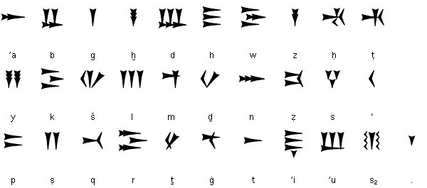
I know you were thinking about runes for the Paladin. How would you feel about the Ugaritic alphabet? It would tie nicely with what Kitty's used on some of the mages =) and we could put in some hidden messages. I'd prefer you not to use futhark-type runes if possible, i'd like to keep those as dwarf territory.
I know you were thinking about runes for the Paladin. How would you feel about the Ugaritic alphabet? It would tie nicely with what Kitty's used on some of the mages =) and we could put in some hidden messages. I'd prefer you not to use futhark-type runes if possible, i'd like to keep those as dwarf territory.
http://thespaceinvader.co.uk | http://thespaceinvader.deviantart.com
Back to work. Current projects: Catching up on commits. Picking Meridia back up. Sprite animations, many and varied.
Back to work. Current projects: Catching up on commits. Picking Meridia back up. Sprite animations, many and varied.
Re: Loyalist Portrait Series
Well, first... from the back of the neck to the front is of course much wider than from side to side, and at your angle it still shouldn´t be quite as thick even on a muscle-horse. As far as I can tell.LordBob wrote:As to the thickness of horses' necks, this picture suggests otherwise. Altogether I'll stick to a possibly overlarge neck because it gives off a feeling of strength, which is always good for a battle mount.
And second... If you wanna do a muscle-horse... Do a muscle horse. Look at the head on the one you linked. It´s a massive head with, probably with lot´s of rugged features(If we could see them in the picture). Your horse-head on the other hand... That´s the head of a horse that listens to Celine Dion and cries during made for TV movies.
Now what you need to do is find some reference of a horse with a great muscular body and head, and start exaggerating that ever so little. Just like realistic fantasy-art warriors have muscles like movie-stars or wrestlers and not of real warriors, realistic fantasy-horses need to have muscles that are built on steroids and with personal trainers to tone and define and give them that special Brad Pitt tummy. Or whatever horsies get.
So on intention I give you an A+.
But as is it doesn´t look like you intended.
Or that´s at least my two cents.

Re: Loyalist Portrait Series
Paladin. Hot. Drool.
-
West
- Retired Lord of Music
- Posts: 1173
- Joined: October 30th, 2006, 7:24 am
- Location: In the philotic connections between ansibles.
- Contact:
Re: Loyalist Portrait Series
Not a very good photo, but a beautiful animal.DUHH wrote:Now what you need to do is find some reference of a horse with a great muscular body and head, and start exaggerating that ever so little. Just like realistic fantasy-art warriors have muscles like movie-stars or wrestlers and not of real warriors, realistic fantasy-horses need to have muscles that are built on steroids and with personal trainers to tone and define and give them that special Brad Pitt tummy. Or whatever horsies get.
(I can understand Ian Anderson's love for these beasts
Re: Loyalist Portrait Series
indeed, that's a good war horse reference...
Fight key loggers: write some perl using vim
-
Lord.Bedham
- Posts: 49
- Joined: February 4th, 2008, 12:56 pm
- Location: Germany
Re: Loyalist Portrait Series
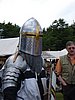
Wow great scetches, for the Paladin i wish me a Great Helm, something like this.
Its a Typical knight helm, for the High Middleage.
Its a Typical knight helm, for the High Middleage.

I gonna club you in`da face
Re: Loyalist Portrait Series
thats probably better suited to the grand knight than the paladin. i love all these new portraits being made, just makes the game so much better.
-
LordBob
- Portrait Director
- Posts: 1322
- Joined: December 8th, 2008, 8:18 pm
- Location: Lille, France
- Contact:
Re: Loyalist Portrait Series
Unfortunately, the great helm isn't a design I like very much, mostly because it is very simple compared to the armour suits of the loyalist. The lancer will get the crown thingy, but the resemblance stops there.
As a break from the sketches, flats for the cavalryman. I gave him heavier armour (plus a piece of mail for the horse) and removed the crossbow altogether : he will be the lvl.1 portrait while lvl.2/3 get a signle portrait.
As a break from the sketches, flats for the cavalryman. I gave him heavier armour (plus a piece of mail for the horse) and removed the crossbow altogether : he will be the lvl.1 portrait while lvl.2/3 get a signle portrait.
- Attachments
-
Want to see more of my art ? Visit my portfolio !

Re: Loyalist Portrait Series
Because I didn't feel competent to comment on your horsies, since I never was much of a horse girl I did some research on medieval horses, knights etc. and found some nice ref depicting renaissance fairs and re-enactments:
http://www.flickr.com/photos/msmercury01/2070788754/ not exactly your cavaleryman's horse's pose but pretty near
http://www.flickr.com/photos/cindysweets/2816007890/
http://www.flickr.com/photos/cindysweets/2815162435/
http://www.flickr.com/photos/uptonia/2063704925/
http://www.flickr.com/photos/uptonia/2064424804/
http://www.flickr.com/photos/cindysweet ... 655712576/
http://www.flickr.com/photos/verifex/1358691364/
http://www.flickr.com/photos/queenjeanne/2812750830/
http://www.flickr.com/photos/pingu1963/3291876463/
http://www.flickr.com/photos/pingu1963/2200963977/
http://www.flickr.com/photos/potnoodle62/3253630668/
http://www.flickr.com/photos/saveena/282954270/
http://www.flickr.com/photos/chrisinside/528423880/
http://www.flickr.com/photos/capnkroaker/487052984/
Perhaps some of those could help.
(And of course I already love the cavaleryman's armour and equipment details! But I think his leg is too thin.)
Re: Loyalist Portrait Series
I was definetly way off with my criticism of the horses neck. 
But... The head needs to get bigger.
But... The head needs to get bigger.