thespaceinvader's portraits - Ancient Wose
Moderator: Forum Moderators
Forum rules
Before posting critique in this forum, you must read the following thread:
Before posting critique in this forum, you must read the following thread:
-
LordBob

- Portrait Director
- Posts: 1322
- Joined: December 8th, 2008, 8:18 pm
- Location: Lille, France
- Contact:
Re: thespaceinvader's portraits - current, Dwarves
Here comes the promised paintover at last. In the top left corner I drew a comparison of the profile your current line suggests.
I also had a go with the grip : I think part of the problem might also be that the second phalanx of his last two fingers are barely visible, which doesn't help with the "grip" sensation.
I also had a go with the grip : I think part of the problem might also be that the second phalanx of his last two fingers are barely visible, which doesn't help with the "grip" sensation.
- Attachments
-
- Dfighter_paintover.png (127 KiB) Viewed 4416 times
Want to see more of my art ? Visit my portfolio !
-
Simons Mith

- Posts: 821
- Joined: January 27th, 2005, 10:46 pm
- Location: Twickenham
- Contact:
Re: thespaceinvader's portraits - current, Dwarves
Do you really think so? I've noticed 'hand problems' a few times recently and I think a more common issue is that an artist draws a correctly-proportioned hand (well, more or less), then turns it into a glove or armoured gauntlet. The result is a gloved thing that's the right size for a bare hand + wrist + forearm, but too thin for a hand protected by armour. So we mentally scale down the hand inside to too thin.Girgistian wrote:TrashMan's got a point, the current hand's very thick.
I tried some measurements on my own average-sized hands;
Palm flat, 4 fingers + thumb, widest part: 9.5cm
Same hand position, wearing leather glove; 12cm. (+27%)
So that suggests a hand should be 10% wider even with a thin glove, and with a thick leather gauntlet easily 30-35% wider. That's quite a big difference.
Hand length; 21cm, call it 22cm with the glove on, so a 5% length increase can be expected, and possibly up to 10% when wearing thicker gloves.
Wrist width; 6cm, but 7.5cm with the glove on; that's a 25% increase - in other words a glove that makes your palm maybe 12% wider could easily make your wrist 20-30% wider. After all your hand still has to pass through the wrist for you to be able to put the glove on. (Edit 2: I've re-checked the ratios more carefully and corrected my bad mental arithmetic. It seems that a thick glove increases the size of the wrist more than it increases the size of the hand, but for a really thick glove (e.g. wicket-keepers), the hand size increases catches up again.)
I think this is often getting overlooked when people draw or critique units with armoured hands - such as these dwarfs. So I suspect the hand is right, and could be larger still without immediately becoming 'wrong' and the wrist and lower arm are only too thin because spaceinvader hadn't taken into account the thickening effects of the armour yet. [Though from his followup post above he's now on the case.]
As an aside I also feel it's credible for the typical chunky dwarven body type to have stronger, thicker wrists and proportionally bigger hands than most human body types.
[Edit: The hand's not too thick, it's that the gauntlet is too skintight round both hand and wrist. Isn't that it?]
-
thespaceinvader

- Retired Art Director
- Posts: 8414
- Joined: August 25th, 2007, 10:12 am
- Location: Oxford, UK
- Contact:
Re: thespaceinvader's portraits - current, Dwarves
Better?
Also, reshaped the bead a bit, deeper shadows on the facial features, fiddled with the hand. ALong with the Lord, assuming no further problems, I'll call him finished and commit tonight. You all have a grand total of 4 hours or so to make any further suggestions. Tick tock =p
EDIT: O FFS why do I ALWAYS forget to attach the frigging images...
- Attachments
-
- dwarf-fighter.png (139.6 KiB) Viewed 4381 times
-
- dwarf-fighter.png (41.55 KiB) Viewed 4376 times
http://thespaceinvader.co.uk | http://thespaceinvader.deviantart.com
Back to work. Current projects: Catching up on commits. Picking Meridia back up. Sprite animations, many and varied.
Back to work. Current projects: Catching up on commits. Picking Meridia back up. Sprite animations, many and varied.
-
Cernunnos
- Art Contributor
- Posts: 292
- Joined: August 12th, 2008, 11:47 am
- Location: Bordeaux, France.
Re: thespaceinvader's portraits - current, Dwarves
Definitely!Better?
I think it has been suggested some posts before, but can't find it, while the lines on the axe looks like engraved lines, those on the shoulders aren't done the same way...
Duplicating the layer, turning it to black and moving it from some pixels could help at that?
Well that's just a detail.
It's really good overall, i must add the pose of the guardsman is nice too!
Good luck, hope you won't have much critiques in the remaining ~3 hours
"While portrait art may be where Wesnoth gets its glamour, and sprite art may be where Wesnoth gets its zest, it's the terrain art that's so crucial to Wesnoth's polish - it's the canvas that the rest goes on." Sangel
-
thespaceinvader
- Retired Art Director
- Posts: 8414
- Joined: August 25th, 2007, 10:12 am
- Location: Oxford, UK
- Contact:
Re: thespaceinvader's portraits - current, Dwarves
Bugger, forgot that.
Fixed.
Fixed.
- Attachments
-
- dwarf-fighter.png (139.96 KiB) Viewed 4303 times
-
- dwarf-fighter.png (41.67 KiB) Viewed 4292 times
http://thespaceinvader.co.uk | http://thespaceinvader.deviantart.com
Back to work. Current projects: Catching up on commits. Picking Meridia back up. Sprite animations, many and varied.
Back to work. Current projects: Catching up on commits. Picking Meridia back up. Sprite animations, many and varied.

Re: thespaceinvader's portraits - current, Dwarves
ha! you won't get them commited without a round of further comments and critiques by me! 
fighter:
the face is really, really nice! so much improvement since the earlier versions! and i'm always a sucker for scale mail some little problems should still get fixed: he is slightly crosseyed and the shape of the rear eye is off. the engraved lines still don't work - drop the black extra lines and just do some metal colour and reflection alternation on them. the trousers (or is it a skirt?) need more shadow, formshadow as well as dropshadow. did you follow mefisto's advice regarding the beard's orientation? it would really improve the pic. and i have a problem with the golden helmet decorations - the way the stripe looks now i have to think of an alice band... perhaps just another shade of metal to turn its importance down?
and i challenge you to find another lightsetting instead of frontally towards the breast of your character for your next portraits!!!
lord:
a lot of similar critiques like on the fighter: his eyes need a rework (they are balls in the skull, not almonds painted on the skin...) and the engravings need some more love. his nose is *very* red, near to a drunkard, could be very nice for a specific char, but for the generic portrait i suggest tuning it down a bit. while the golden plate hanging from his belt is really beautiful i get no sense of volume from his lower half. i think because his axe casts such a strong and specific shadow - that may be correct but i would tone that down in favour of general form. and i have a unspecific problem with the shading of the helmet - the golden bits are beautiful but the shading of the metal makes it look like two seperate parts not like one hemisphere.
keep it up! (as if you need encouragement )
)
fighter:
the face is really, really nice! so much improvement since the earlier versions! and i'm always a sucker for scale mail
and i challenge you to find another lightsetting instead of frontally towards the breast of your character for your next portraits!!!
lord:
a lot of similar critiques like on the fighter: his eyes need a rework (they are balls in the skull, not almonds painted on the skin...) and the engravings need some more love. his nose is *very* red, near to a drunkard, could be very nice for a specific char, but for the generic portrait i suggest tuning it down a bit. while the golden plate hanging from his belt is really beautiful i get no sense of volume from his lower half. i think because his axe casts such a strong and specific shadow - that may be correct but i would tone that down in favour of general form. and i have a unspecific problem with the shading of the helmet - the golden bits are beautiful but the shading of the metal makes it look like two seperate parts not like one hemisphere.
keep it up! (as if you need encouragement
-
thespaceinvader
- Retired Art Director
- Posts: 8414
- Joined: August 25th, 2007, 10:12 am
- Location: Oxford, UK
- Contact:
Re: thespaceinvader's portraits - current, Dwarves
Hopefully this fixes your issues, Kitty.
EDIT: if I don't see you before I get to bed tonight, I'll probably submit these as they are, and make any further fixes later on.
RE-EDIT: committed the latest versions of both Fighter and Lord. Any further revisions, I'll change on SVN too.
EDIT: if I don't see you before I get to bed tonight, I'll probably submit these as they are, and make any further fixes later on.
RE-EDIT: committed the latest versions of both Fighter and Lord. Any further revisions, I'll change on SVN too.
- Attachments
-
- dwarf-lord.png (139.53 KiB) Viewed 4145 times
-
- dwarf-lord.png (42.89 KiB) Viewed 4142 times
-
- dwarf-fighter.png (139.4 KiB) Viewed 4148 times
-
- dwarf-fighter.png (41.44 KiB) Viewed 4141 times
http://thespaceinvader.co.uk | http://thespaceinvader.deviantart.com
Back to work. Current projects: Catching up on commits. Picking Meridia back up. Sprite animations, many and varied.
Back to work. Current projects: Catching up on commits. Picking Meridia back up. Sprite animations, many and varied.
Re: thespaceinvader's portraits - current, Dwarves
why are you in such a hurry? what does it matter if you wait another day until we have talked about it before committing  ...
...
but of course you are right both are pretty much there. i'd still like to ask you to have another fiddle with their eyes: the lord's eyes reflections are too different, you could easily tone the rear eye's one down and make it smaller. and the fighter's right eye looks straightforward while the left one looks up? it's tiny stuff, but still.
and i think i haven't said anything about your nice guard sketch up to now - it's looking really good! i like the mongolian elements you chose, interesting cultural twist on dwarves. but watch out that he looks like belonging to the same people as the rest of your dwarves. but some of those engravings should do this job.
his right arm bothers me, the way the lower and the upper arm connect seems strange. and i don't like the way his shield meets his left pauldron, that creats a unnecessary confusing tangent, just moving the shield up or down a tad should fix that.
-
thespaceinvader
- Retired Art Director
- Posts: 8414
- Joined: August 25th, 2007, 10:12 am
- Location: Oxford, UK
- Contact:
Re: thespaceinvader's portraits - current, Dwarves
End of my week off, I wanted to get it sorted before I got buy again. I'm not ure what times i'll have to work on this stuff for a while.
http://thespaceinvader.co.uk | http://thespaceinvader.deviantart.com
Back to work. Current projects: Catching up on commits. Picking Meridia back up. Sprite animations, many and varied.
Back to work. Current projects: Catching up on commits. Picking Meridia back up. Sprite animations, many and varied.

Re: thespaceinvader's portraits - current, Dwarves
I just realized why my eye still thinks the lord a little strange: the axe head's shadow on the hip is too round. The layered plates of metal curve and are at different levels, yet the shadow seemlessly glides over them like a swan on a lake. The green line is what I'm referencing.
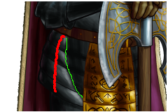
The red line is where I think the shading should also be more consistent.
The red line is where I think the shading should also be more consistent.
-
thespaceinvader
- Retired Art Director
- Posts: 8414
- Joined: August 25th, 2007, 10:12 am
- Location: Oxford, UK
- Contact:
Re: thespaceinvader's portraits - current, Dwarves
Committing these revisions of the Lord and Fighter. Also, sketch for the Gryphon rider, sketch based on a frankenstein of a tiger, a bald eagle, and a well-known ponytailed digital artist =P
I might shrink the rider a touch, and bring him up in the frame a little more. I might also bring the wing over the leg, to give it space to it comfortably and be big enough.
I might shrink the rider a touch, and bring him up in the frame a little more. I might also bring the wing over the leg, to give it space to it comfortably and be big enough.
- Attachments
-
-
- dwarf-fighter.png (139.4 KiB) Viewed 3471 times
-
- dwarf-lord.png (139.9 KiB) Viewed 3469 times
http://thespaceinvader.co.uk | http://thespaceinvader.deviantart.com
Back to work. Current projects: Catching up on commits. Picking Meridia back up. Sprite animations, many and varied.
Back to work. Current projects: Catching up on commits. Picking Meridia back up. Sprite animations, many and varied.
-
thespaceinvader
- Retired Art Director
- Posts: 8414
- Joined: August 25th, 2007, 10:12 am
- Location: Oxford, UK
- Contact:
Re: thespaceinvader's portraits - current, Dwarves
Attachment limit... new post.
Lines (ish, the wing still needs much love) and flats for the Gryphon Rider, revised lines/flats for the Guard.
This afternoon's project, colouring the Guard.
Lines (ish, the wing still needs much love) and flats for the Gryphon Rider, revised lines/flats for the Guard.
This afternoon's project, colouring the Guard.
- Attachments
-
- dwarf-guard.png (84.92 KiB) Viewed 3287 times
-
http://thespaceinvader.co.uk | http://thespaceinvader.deviantart.com
Back to work. Current projects: Catching up on commits. Picking Meridia back up. Sprite animations, many and varied.
Back to work. Current projects: Catching up on commits. Picking Meridia back up. Sprite animations, many and varied.
-
Darker_Dreams

- Posts: 608
- Joined: February 1st, 2008, 5:26 pm
Re: thespaceinvader's portraits - current, Dwarves
I do want to start by saying how great I think these portraits are turning out. That said-
Guard; I think the spear is still too short. One of the main advantages of spears is their reach. By cutting the spear to dwarf-size (it looks to be almost exactly the same height as the dwarf carrying it) you sacrifice that completely- especially dangerous when your opponents wield human/elf/orc and sized spears. While the length you've drawn is appropriate to a pilum (image). It might still be a little short and that weapon, one assumes, would represent the Javalin attack of the unit, not their primary spear. I would expect a rank of spearmen, particularly members of a shorter race, to utilize reach-weapons more like these to allow themselves to maintain distance from orcs carrying swords almost as long as their own spears. Ignoring that a human halberder or spearman, with longer arms and taller at-body-height spears would be able to reach past a guardsman so equipped with little difficulty.
ok, wow. That turned out way longer (and more rant-y) than I intended- the logic of equipping a short race with a (relatively sized) short spear just kinda bugged me.
Griffin rider; The front ankles look absolutely tiny compared to the creature, like it'd never be able to support itself on them. There's a couple other things about the griffin that feel *off* in size, especially around the griffin's face, but nothing I can quite put a finger on...
Anyway, that aside, looking good. I especially like your latest (last?) revs on the dwarven lord and fighter. Its always amazing to see the portraits come together from a good artist.
edit; grammar and punctuation got away from me for a minute there...
Last edited by Darker_Dreams on January 28th, 2009, 2:45 pm, edited 1 time in total.
-
thespaceinvader
- Retired Art Director
- Posts: 8414
- Joined: August 25th, 2007, 10:12 am
- Location: Oxford, UK
- Contact:
Re: thespaceinvader's portraits - current, Dwarves
I'll happily extend the spear a touch more =)
http://thespaceinvader.co.uk | http://thespaceinvader.deviantart.com
Back to work. Current projects: Catching up on commits. Picking Meridia back up. Sprite animations, many and varied.
Back to work. Current projects: Catching up on commits. Picking Meridia back up. Sprite animations, many and varied.

Re: thespaceinvader's portraits - current, Dwarves
I'm confused by something about the Gryphon Rider. I'm trying to picture where the ground is, and it seems to me that either the dwarf's legs are chopped off at the thigh, or he is *much* closer to us in Z-space than the gryphon. Thing is, the way the reigns look, there's no way he's that much closer... so yeah, I'm confused, you could say.  Perhaps it would help if you extended this sketch to show the ground itself, so you could make sure the dwarf and gryphon were arranged reasonably with each other.
For I am Turin Turambar - Master of Doom, by doom mastered. On permanent Wesbreak. Will not respond to private messages. Sorry!
And I hate stupid people.
The World of Orbivm
And I hate stupid people.
The World of Orbivm