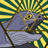
Slight tweakment on the Warlord.
Moderator: Forum Moderators
Forum rules
Before posting critique in this forum, you must read the following thread:
Before posting critique in this forum, you must read the following thread:

Slight tweakment on the Warlord.
I've never liked the image for this unit, much as I want to.
The most glaring problem is they way he holds the sword in his (his) left hand, pointing straight up and hugged close to the chest. Also, it appears to be directly in front of his face. It just doesn't seem like the way a person (or orc) would hold it. On top of that, the straight lines don't sit well with the eye - although that might just be me.
Anyway, rather then just whinge about it, I took a swing at correcting it. Only a small change really.
- Attachments
-
- My edit.
- warlord.png (2.43 KiB) Viewed 5660 times
-
- Current image.
- warlord.png (1.32 KiB) Viewed 5657 times
Last edited by Zhukov on January 1st, 2007, 12:22 am, edited 2 times in total.
I think it looks nice, I have also always been disturbed by his pose. This one seems better. Although, it kind of looks as if his hand is directly attached to his chest. Maybe more of his arm should be visible.
"Oh, what sad times are these when passing ruffians can say Ni at will to old ladies."
-Roger the shrubber
-Roger the shrubber

I've always been bugged by the ackward pose as well. Here are three of my quick tweaks, which are actually all a bit more radical changes to the pose.
I prefer 2 or 3 myself.
I prefer 2 or 3 myself.
- Attachments
-
- warlord-alt-3.png (2.62 KiB) Viewed 5623 times
-
- warlord-alt-2.png (2.75 KiB) Viewed 5615 times
-
- warlord-alt-1.png (2.88 KiB) Viewed 5615 times

-
Dragon Master
- Posts: 1012
- Joined: February 11th, 2006, 1:04 am
- Location: Somewhere
I love northerners, grunts especially, so I'm always staring at these guys. Overall I always thought the lvl 2 image looked much better than the lvl 1 or lvl 3 images. Though I don't know what you could do to the current lvl 3 image to really fix it. All of these edits just look a little 'forced' if you know what I mean.
Never did like his ugly looking helmet on any of his images either.
But he's still my favorit unit.
Never did like his ugly looking helmet on any of his images either.
But he's still my favorit unit.


-
EELuminatus
- Art Contributor
- Posts: 68
- Joined: December 27th, 2006, 3:05 pm
- Contact:
Me too!Zhukov wrote:Overall I prefer my own, as one could expect.
The pose of your version looks more relaxed and natural and holding a sword like that even makes sense. Zookeeper's versions 1 and 2 both remind me of corkscrews somehow - looking cool, but somewhat impracticable. The 3rd one could be used for another frame, like for an idling animation.
... after all, realism probably isn't as important here.

I don't think that would help for easily recognized units...Boucman wrote:remember that a unit can have multiple base frames
WesCamp-i18n - Translations for User Campaigns:
http://www.wesnoth.org/wiki/WesCamp
Translators for all languages required: contact me. No geek skills required!
http://www.wesnoth.org/wiki/WesCamp
Translators for all languages required: contact me. No geek skills required!

I don't like Zhukov's edit, sorry to disagree with ya Jetryl.
I kind of like the boxed look, because it makes him look very stuffy.
However, I must say Zookeepers Alt-2 looks nice because it's so predatory and unusual.
I kind of like the boxed look, because it makes him look very stuffy.
However, I must say Zookeepers Alt-2 looks nice because it's so predatory and unusual.
http://www.wesnoth.org/wiki/User:Sapient... "Looks like your skills saved us again. Uh, well at least, they saved Soarin's apple pie."