Loyalist Portrait Series
Moderator: Forum Moderators

Re: Loyalist Portrait Series
Awesome. I had a little problem with the web so i couldn't poperly log in, but this was worth the wait.
On the horse/crossbow issue: I do remember thick hand crossbows made from a single piece of wood were used, cord reinforcing the arc, easy to reload, but damn me i can't find a reference.
On the horse/crossbow issue: I do remember thick hand crossbows made from a single piece of wood were used, cord reinforcing the arc, easy to reload, but damn me i can't find a reference.
Cuyo Quiz,where madness meets me 
Turn on, tune in, fall out.
"I know that, but every single person nags about how negative turin is; it should be in the FPI thread "Turin should give positive comments" =)"-Neorice,23 Sep 2004
Turn on, tune in, fall out.
"I know that, but every single person nags about how negative turin is; it should be in the FPI thread "Turin should give positive comments" =)"-Neorice,23 Sep 2004

Re: Loyalist Portrait Series
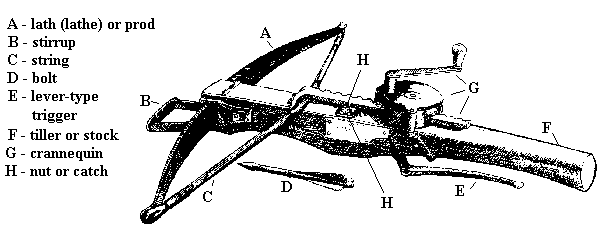
I think you are referring to something along the lines of this.
As stated previously, the crossbow could not be full size, but there is no reason a man on horseback could not use a more normal sized crossbow as long as there was a crannequin or some form of ratchet draw in order to wind.
As stated previously, the crossbow could not be full size, but there is no reason a man on horseback could not use a more normal sized crossbow as long as there was a crannequin or some form of ratchet draw in order to wind.
Mainline Maintainer: AOI, DM, NR, TB and THoT.
UMC Maintainer: Forward They Cried, A Few Logs, A Few More Logs, Start of the War, and Battle Against Time
UMC Maintainer: Forward They Cried, A Few Logs, A Few More Logs, Start of the War, and Battle Against Time

Re: Loyalist Portrait Series
These portraits are astonishingly amazing.
I can't wait to see the mounted units' finished portraits!
Keep up the good work LordBob!
I can't wait to see the mounted units' finished portraits!
Keep up the good work LordBob!
"Lancers are among the bravest and most feared riders in all of Wesnoth."
-
LordBob

- Portrait Director
- Posts: 1322
- Joined: December 8th, 2008, 8:18 pm
- Location: Lille, France
- Contact:
Re: Loyalist Portrait Series
Revised linework for the cavalier. Still a very rough sketch, but I hope the new perspective on the horse fits our style better.
- Attachments
-
- human-cavalier.png (155.33 KiB) Viewed 5065 times
Want to see more of my art ? Visit my portfolio !
-
Sgt. Groovy

- Art Contributor
- Posts: 1471
- Joined: May 22nd, 2006, 9:15 pm
- Location: Helsinki
Re: Loyalist Portrait Series
It's much better now, except fot the shield whose perspective looks skewy to me. The only way it makes even half a sense to me is that the backside of the shield is facing viewer, and even then the centreline shouldn't be exactly vertical. I've outlined (roughly) a how the shield would look if the top edge of the original would be about right (the shield is curved, so the half to our left is bending towards viewer, that's why it looks asymmetric).
- Attachments
-
- human-cavalier2.png (177.51 KiB) Viewed 5032 times
Tiedäthän kuinka pelataan.
Tiedäthän, vihtahousua vastaan.
Tiedäthän, solmu kravatin, se kantaa niin synnit
kuin syntien tekijätkin.
Tiedäthän, vihtahousua vastaan.
Tiedäthän, solmu kravatin, se kantaa niin synnit
kuin syntien tekijätkin.

Re: Loyalist Portrait Series
Lordbob: one teensy request: I would personally like, on the knights and grand knights (possibly also paladins) to see wings added to their helms. It's one aspect of the design that I'm rather personally attached to. The entire rest of the way the helmet is designed is totally up for grabs, as far as I'm concerned, I just want the wing decorations tacked on.
At least on the grand knight, (knight can be considerably simplified), I'd like the general design to be a lot like this:
http://www.nigelcarren.co.uk/polish-win ... helmet.htm
It's a really cool design element, IMO, that doesn't seem to get used a lot in modern depictions of knights, and I think it would help wesnoth look unique. That's just my wishlist item.
I have to say these horse units are really looking amazing. You're working a monumental blessing for the polish of this game.
Play Frogatto & Friends - a finished, open-source adventure game!
Re: Loyalist Portrait Series
Perhaps it's because I'm a newb at art and it's only a sketch, but I frankly can't understand the position of the shield in -either- of those drawings. I was under the impression that shields were attached perpendicularly to the forearm, but an examination of google images for reference shows that I could be wrong:

I'm not sure if my comment is useful, just saying that at this stage of the drawing I can't understand how the shield is positioned either.
I'm not sure if my comment is useful, just saying that at this stage of the drawing I can't understand how the shield is positioned either.
-
LordBob
- Portrait Director
- Posts: 1322
- Joined: December 8th, 2008, 8:18 pm
- Location: Lille, France
- Contact:
Re: Loyalist Portrait Series
This picture (look at the man on the left) that Groovy pointed earlier served as reference when positionning the shield. I find coherent with Jozrael's shield ref, but it obviously is difficult to translate into the particular perspective I'm using. Does anyone have a shield at home ? 
Jetryl: I will do the wings design on the Grand Knight and Paladin, I like them a lot. Might simplify on the knight, though, because it'll be difficult to fit them with his helm design.
Jetryl: I will do the wings design on the Grand Knight and Paladin, I like them a lot. Might simplify on the knight, though, because it'll be difficult to fit them with his helm design.
Want to see more of my art ? Visit my portfolio !
-
thespaceinvader

- Retired Art Director
- Posts: 8414
- Joined: August 25th, 2007, 10:12 am
- Location: Oxford, UK
- Contact:
Re: Loyalist Portrait Series
I could be wrong, but I'm pretty sure that the shields of cavalry would attach differently to the shields of infantry - as makes sense, since someone sitting on a horse will have their arm at a different angle than someone standing.
http://thespaceinvader.co.uk | http://thespaceinvader.deviantart.com
Back to work. Current projects: Catching up on commits. Picking Meridia back up. Sprite animations, many and varied.
Back to work. Current projects: Catching up on commits. Picking Meridia back up. Sprite animations, many and varied.
-
Sgt. Groovy
- Art Contributor
- Posts: 1471
- Joined: May 22nd, 2006, 9:15 pm
- Location: Helsinki
Re: Loyalist Portrait Series
OK, that would make more sense for the actual usability of the shield, but the perspective of your shield is still skewed. It's the angle between the centreline and the upper edge, which in real world should be a straight angle. In your perspective it's far from it, and I find it hard to imagine a position where it would look like that. It is my opinion that the centreline should not be vertical in the perspective you suggested.
Try this: make paper cut-out of the shield shape and hold it in front of the screen when the cavalier sketch is on it. The rotate the paper shield into the position that it should be if it was the cavalier's shield. This should give you some idea what the perspective should look like.
Try this: make paper cut-out of the shield shape and hold it in front of the screen when the cavalier sketch is on it. The rotate the paper shield into the position that it should be if it was the cavalier's shield. This should give you some idea what the perspective should look like.
Tiedäthän kuinka pelataan.
Tiedäthän, vihtahousua vastaan.
Tiedäthän, solmu kravatin, se kantaa niin synnit
kuin syntien tekijätkin.
Tiedäthän, vihtahousua vastaan.
Tiedäthän, solmu kravatin, se kantaa niin synnit
kuin syntien tekijätkin.
-
LordBob
- Portrait Director
- Posts: 1322
- Joined: December 8th, 2008, 8:18 pm
- Location: Lille, France
- Contact:
Re: Loyalist Portrait Series
More riders linework. They're complex drawings, so I work simultaneously on the entire series.
This one's the horseman.
The head and neck of the horse definitely deserve some polishing, but it's difficult to treat without any reference of an actual horse in a similar position
This one's the horseman.
The head and neck of the horse definitely deserve some polishing, but it's difficult to treat without any reference of an actual horse in a similar position
- Attachments
-
Want to see more of my art ? Visit my portfolio !

Re: Loyalist Portrait Series
I think adding size to the horse's cheek will give you a better sense of polish:
ref
ref
ref
Although none of these horses are in the position your drawing is in, it shows how the cheek relates to the rest of the head pretty well. In your drawing the face seems too narrow, mainly because the cheek seems to make no impact on the shape of the head. I also feel that the head may be too skinny, but altering the cheek shape may change that.
ref
ref
ref
Although none of these horses are in the position your drawing is in, it shows how the cheek relates to the rest of the head pretty well. In your drawing the face seems too narrow, mainly because the cheek seems to make no impact on the shape of the head. I also feel that the head may be too skinny, but altering the cheek shape may change that.
Re: Loyalist Portrait Series
Awesome. Also, simplifying it for the knight makes sense because he's a lesser level, so that'd be just fine.LordBob wrote:Jetryl: I will do the wings design on the Grand Knight and Paladin, I like them a lot. Might simplify on the knight, though, because it'll be difficult to fit them with his helm design.
Play Frogatto & Friends - a finished, open-source adventure game!
Re: Loyalist Portrait Series
As you noted , you really have to work on the horses neck and front. It´s way too wide and front-heavy.
What I usually do whenever I draw from reference is to try to get as picture from as many angles and situtations as possible, so I get a feel of the object in 3D, then paste them into a group in photoshop and have them near whatever I´m drawing so I can all the time reference them. That way I´m not bound to a single pose as I would be if I just used one piece of the reference for the exact pose. And I learn more about drawing the object than I would with either direct reference or tracing.
Apart from that I´m fascinated with how you do your linework. Do you set your brush to no line-weight variation?
-
LordBob
- Portrait Director
- Posts: 1322
- Joined: December 8th, 2008, 8:18 pm
- Location: Lille, France
- Contact:
Re: Loyalist Portrait Series
Thanks for the advice, I'm often struggling with the search for valid reference.
As far as lines are concerned, I do a bit of everything. Vector for armour parts that have to be regular and nicely curved, brush with line-weight variation for hair, hands and the like, without for clothing...I don't have a definite rule, I work mostly on gut feeling.
As far as lines are concerned, I do a bit of everything. Vector for armour parts that have to be regular and nicely curved, brush with line-weight variation for hair, hands and the like, without for clothing...I don't have a definite rule, I work mostly on gut feeling.
Want to see more of my art ? Visit my portfolio !