LordBob's commissionned work
Moderator: Forum Moderators
Forum rules
Before posting critique in this forum, you must read the following thread:
Before posting critique in this forum, you must read the following thread:

Re: LordBob's commissionned work
I too like the middle one best.


Re: LordBob's commissionned work
I'd personally go for the middle one's brownish-orange outside cloak, but with the more saturated right one's red inner cloak and green robe.
Jazz is not dead, it just smells funny - Frank Zappa
Current projects: Internet meme Era, The Settlers of Wesnoth
Current projects: Internet meme Era, The Settlers of Wesnoth
Re: LordBob's commissionned work
Middle one.
Creator of Shadows of Deception (for 1.12) and co-creator of the Era of Chaos (for 1.12/1.13).
SurvivalXtreme rocks!!!
What happens when you get scared half to death...twice?
SurvivalXtreme rocks!!!
What happens when you get scared half to death...twice?
-
LordBob

- Portrait Director
- Posts: 1322
- Joined: December 8th, 2008, 8:18 pm
- Location: Lille, France
- Contact:
Re: LordBob's commissionned work
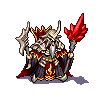
Hehe, for once there's a clear choice 
Compared to the earlier version, I fixed the atrocious folds of his robes - since they were meant to be robes and not baggy trousers - and fiddled with overal colours. So he's finished, and I can now begin his human-clad alternate.
Compared to the earlier version, I fixed the atrocious folds of his robes - since they were meant to be robes and not baggy trousers
- Attachments
-
Want to see more of my art ? Visit my portfolio !
Re: LordBob's commissionned work
Formerly known as the creator of Era of Chaos and maintainer of The Aragwaithi and the Era of Myths.
Re: LordBob's commissionned work
Really, really nice! Isn't his free hand pretty big though? Foreshortening accounts for why the staff hand is pretty large, but the free hand is (from wrist to fingertips) about as tall as his head. If it's a stylistic choice then nevermind, but it was just the only detail which instantly caught my attention.

Re: LordBob's commissionned work
You know what they say about mages with big hands.
They can summon big lightning.
They can summon big lightning.
Maintainer of the Imperial Era and the campaigns Dreams of Urduk, Epic of Vaniyera, Up from Slavery, Fall of Silvium, Alfhelm the Wise and Gali's Contract.
But perhaps 'maintainer' is too strong a word.
But perhaps 'maintainer' is too strong a word.
Re: LordBob's commissionned work
Woah, it looks great!
Creator of Shadows of Deception (for 1.12) and co-creator of the Era of Chaos (for 1.12/1.13).
SurvivalXtreme rocks!!!
What happens when you get scared half to death...twice?
SurvivalXtreme rocks!!!
What happens when you get scared half to death...twice?
-
Blarumyrran
- Art Contributor
- Posts: 1700
- Joined: December 7th, 2006, 8:08 pm
Re: LordBob's commissionned work
The colors look washed-out, how about higher contrast, something like ?
-
LordBob
- Portrait Director
- Posts: 1322
- Joined: December 8th, 2008, 8:18 pm
- Location: Lille, France
- Contact:
Re: LordBob's commissionned work
I don't know. You might have a point, but it didn't seem that bad on my home screen. Either way, I'd rather avoid the burnt colours that often result from contrast fixes.
I'll see if I give it a shot before I produce the final cropped image.
I'll see if I give it a shot before I produce the final cropped image.
Nope, it's a good catch. So I've fixed that and a few other details and posted the final image, along with a face closeup, over herezookeeper wrote: Isn't his free hand pretty big though? Foreshortening accounts for why the staff hand is pretty large, but the free hand is (from wrist to fingertips) about as tall as his head. If it's a stylistic choice then nevermind, but it was just the only detail which instantly caught my attention.
Want to see more of my art ? Visit my portfolio !
Re: LordBob's commissionned work
Cool. So now we just need the transparent version, and speaking of that, I don't think we got the one for Moremirmu yet either?
-
LordBob
- Portrait Director
- Posts: 1322
- Joined: December 8th, 2008, 8:18 pm
- Location: Lille, France
- Contact:
Re: LordBob's commissionned work
Not yet. I'll do a group set of these once I'm done with the HttT cast.
Want to see more of my art ? Visit my portfolio !

Re: LordBob's commissionned work
hmmm, the contrast thing- to me the face looks better with more contrast, but doing the entire image is blowing out the whites in the fur, and the shadows are too abrupt in the cloth. But here we go with monitor calibration 

Re: LordBob's commissionned work
why does Delfador's action pose (especially the version with the big hands) remind me so strongly of vultraz's avatar 
surely this doesnt foreshadow a mainline future as a nightgaunt for our esteemed wizard?
surely this doesnt foreshadow a mainline future as a nightgaunt for our esteemed wizard?