The War of Terrador - Complete overhaul time!
Moderator: Forum Moderators
Forum rules
Before posting critique in this forum, you must read the following thread:
Before posting critique in this forum, you must read the following thread:

Re: The War of Terrador - Complete overhaul time!
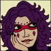
I think you should move it a bit left,or maybe reduce the width on the right side.I hope you understand what i mean,if not i can do an edit.
My sprites,My Minitroops
Philip II of Macedon:"If I win this war, you will be slaves forever."
The Spartan ephors:"If."
Subsequently, both Philip and Alexander would avoid Sparta entirely.
Philip II of Macedon:"If I win this war, you will be slaves forever."
The Spartan ephors:"If."
Subsequently, both Philip and Alexander would avoid Sparta entirely.
-
artisticdude

- Moderator Emeritus
- Posts: 2424
- Joined: December 15th, 2009, 12:37 pm
- Location: Somewhere in the middle of everything
Re: The War of Terrador - Complete overhaul time!
I think it's good to have him be bigger than the other levels. Most units in mainline get bigger throughout their level progression, and while it perhaps most don't enlarge quite to the extent of this unit line, I think it suits the nature of the unit and provides a visual distinction from previous levels.Kanapka wrote:Yeah, he's pretty big, but I think you need to be this big to handle a minigun, and he's the ultimate pwner, so I thought it'll be ok.
As for the unit art: Yes, the head does come across as being rather flat, and small in comparison to the body. Actually, this head/body ratio is pretty close to RL proportions, but those are generally discarded in favor of the standard Wesnoth sprite proportions. The backpack seems to stick out farther on his left shoulder than it does on his right, as Vranca pointed out. Bringing it in some behind his left shoulder should solve that issue. And the machinegun is awesome. There are a few nitpicks I have with it, but overall it's really well done. I have a bit of trouble reading the area behind the barrel though, and perhaps the guard should be rounded rather than flat and square, since that would make the stock of the weapon seem less square and blocky.
A couple things I feel would improve your art overall would be:
Adding more contrast to your sprites. You also tend to rely too much on the outlines to define the shape of the object. The outline is the basis for the shape, certainly, but the shading is what really helps define the object and give it three-dimensionality. So an outlined shape that you might not think would work can sometimes work if given the proper shading. And beware of banding... it's a hard habit to break, once you get into it.
On a side note, I've been fiddling around with the antennas for these guys' helmets and such, and I've found that giving them a certain level of transparency helps them appear thinner while still making them visible to the player. It's not that big a deal, really, but it's something you might want to fiddle around with.
EDIT: Some concept sketches for some sci-fi airships I might be using in an upcoming project (just ignore the extra stuff):
Any look worth finishing?
"I'm never wrong. One time I thought I was wrong, but I was mistaken."
Re: The War of Terrador - Complete overhaul time!
Thanks for all the replies and hints.
I think I fixed the backpack and the gun.
Most kinds of mecha armor have a small head (and helmets have weird shapes) and some other parts are exaggerated, I guess I'll have to work on it a bit more, as it isn't clear. I did not want him to have a round blob for a head like the previous levels. I'd be grateful for some ideas on how to make him more 'mechanical'.
Now that you said it I can see that the previous guys have too little contrast. Do you mean that this sprite also lacks contrast, or that I'm using contrast the wrong way here?
I've seen people here talking about banding and I'm trying to avoid it, of course point it out if I fail.
The antena thing is cool, I'll use it.
Those airships look great, I'd like to see them finished. The bottom one looks like a scout helicopter though, and probably would need either some wings to look more plane-y or a bit different engine type to allow hovering - at least I'd expect an airship like that to be able to hand in mid-air. The other two are awesome the way they are now
I think I fixed the backpack and the gun.
Most kinds of mecha armor have a small head (and helmets have weird shapes) and some other parts are exaggerated, I guess I'll have to work on it a bit more, as it isn't clear. I did not want him to have a round blob for a head like the previous levels. I'd be grateful for some ideas on how to make him more 'mechanical'.
Now that you said it I can see that the previous guys have too little contrast. Do you mean that this sprite also lacks contrast, or that I'm using contrast the wrong way here?
I've seen people here talking about banding and I'm trying to avoid it, of course point it out if I fail.
The antena thing is cool, I'll use it.
- finest.png (2.48 KiB) Viewed 3281 times
Re: The War of Terrador - Complete overhaul time!
These remind me of C&C3.artisticdude wrote:I think it's good to have him be bigger than the other levels. Most units in mainline get bigger throughout their level progression, and while it perhaps most don't enlarge quite to the extent of this unit line, I think it suits the nature of the unit and provides a visual distinction from previous levels.Kanapka wrote:Yeah, he's pretty big, but I think you need to be this big to handle a minigun, and he's the ultimate pwner, so I thought it'll be ok.
As for the unit art: Yes, the head does come across as being rather flat, and small in comparison to the body. Actually, this head/body ratio is pretty close to RL proportions, but those are generally discarded in favor of the standard Wesnoth sprite proportions. The backpack seems to stick out farther on his left shoulder than it does on his right, as Vranca pointed out. Bringing it in some behind his left shoulder should solve that issue. And the machinegun is awesome. There are a few nitpicks I have with it, but overall it's really well done. I have a bit of trouble reading the area behind the barrel though, and perhaps the guard should be rounded rather than flat and square, since that would make the stock of the weapon seem less square and blocky.
A couple things I feel would improve your art overall would be:
Adding more contrast to your sprites. You also tend to rely too much on the outlines to define the shape of the object. The outline is the basis for the shape, certainly, but the shading is what really helps define the object and give it three-dimensionality. So an outlined shape that you might not think would work can sometimes work if given the proper shading. And beware of banding... it's a hard habit to break, once you get into it.
On a side note, I've been fiddling around with the antennas for these guys' helmets and such, and I've found that giving them a certain level of transparency helps them appear thinner while still making them visible to the player. It's not that big a deal, really, but it's something you might want to fiddle around with.
EDIT: Some concept sketches for some sci-fi airships I might be using in an upcoming project (just ignore the extra stuff):
Any look worth finishing?
Spoiler:


Formerly known as the creator of Era of Chaos and maintainer of The Aragwaithi and the Era of Myths.
Re: The War of Terrador - Complete overhaul time!
I've reached the 'I've had it with this sprite' point, so no more fixes.
- finest.png (2.43 KiB) Viewed 3235 times
-
Dragonchampion
- Posts: 758
- Joined: November 6th, 2007, 7:46 pm
- Location: North Carolina
Re: The War of Terrador - Complete overhaul time!
The new idea for the Terrador's finest is GORGEOUS. I LOVE it! Makes him stand out from the other soldiers easily!
And Artistic, the fighters and ships look amazing... If you could do every ship styles like that it would be incredible. I have only been using the spacenoth sprites because there isn't that much that I can use otherwise.
And that level up of the other unit in the bottom right... I took a lot of the Xylash from the Galactic Empires and User designed items in the now locked spacenoth forums. If you could make them all one style, it would be incredibly awesome.
And the deal with the chain minigun is that it would need several barrels because of the reactor core overheating... the backpack would essentially be a nuclear reactor and house a total of 6 different reactors that fire bursts at alternating times to prevent overheating. So yes, that Terrador's Finest would work perfectly.
Now, a bit of an update. I have already posted the Steelhive faction and got with Zerovirus, who says he will not be updating it. Because of all of these excellent new sprites, I have a request... does anyone want to redo the Steelhive Era and make it match the newer sprites?
And also, we could use someone on terrain again. I am planning a total rework of the Main Campaign soon, hopefully beig able to make maps with some otherworldly terrain. The metal flooring is very nice, and I have found some as well, but we need walls and perhaps some differing floors (rusty or half-broken flooring anyone?) Anyone that wants to take a shot at this is welcome to.
And, I also want to apologize for my inactivity in this thread. I have had a lot of things on my mind recently, and haven't really had time to sit down and work on TWOT. But that will change soon, I hope.
Ehhhh... don't mind me, I'm just the annoying little modder who gets on peoples nerves. I'll just lurk till Someone says my name. :P
Oh, and also Creator of The War Of Terrador
Oh, and also Creator of The War Of Terrador
-
artisticdude
- Moderator Emeritus
- Posts: 2424
- Joined: December 15th, 2009, 12:37 pm
- Location: Somewhere in the middle of everything
Re: The War of Terrador - Complete overhaul time!
I don't know about every ship, but I'll certainly try and finish these.Dragonchampion wrote:And Artistic, the fighters and ships look amazing... If you could do every ship styles like that it would be incredible. I have only been using the spacenoth sprites because there isn't that much that I can use otherwise.
"I'm never wrong. One time I thought I was wrong, but I was mistaken."

Re: The War of Terrador - Complete overhaul time!
Not him, no. But some other guy appears to have taken over. Don't think he's actually done anything though...Dragonchampion wrote:I have already posted the Steelhive faction and got with Zerovirus, who says he will not be updating it.
"What do you mean, "a dwarvish dragonguard with marksman is overpowered"?"
Story of a Drake Outcast | The Nonsense Era
Played HttT-Underground Channels? Thought it was rubbish? Help us develop it here!
Story of a Drake Outcast | The Nonsense Era
Played HttT-Underground Channels? Thought it was rubbish? Help us develop it here!

Re: The War of Terrador - Complete overhaul time!
I'm back open for pixel-art work after a rather lengthy break for composing purposes. I'll see if I can't finish the Captain and make some more tank units... I've also decided to try my hand at doing a 'rust' floor terrain. I make no promises, but we'll see how it goes. 
BTW, Dragonchampion, any idea when the next release will be? We've definitely got enough art for another release.
BTW, Dragonchampion, any idea when the next release will be? We've definitely got enough art for another release.
Check out the FOSS game Sumwars
Wish I had more time for composing music...
Wish I had more time for composing music...
-
artisticdude
- Moderator Emeritus
- Posts: 2424
- Joined: December 15th, 2009, 12:37 pm
- Location: Somewhere in the middle of everything
Re: The War of Terrador - Complete overhaul time!
Fair enough, but I'd like to post an edit to demonstrate some things that could help you improve.Kanapka wrote:I've reached the 'I've had it with this sprite' point, so no more fixes.
1. The angle of the weapon's barrel was slightly off to the right (our right), given the position in which he was holding the weapon's stock.
2. More contrast throughout, and continuing on that note:
3. Pallette changes. There tends to be a lot of blue in shadows, so it's always a good idea to add some blue into the darkest shades of your pallette. It'll help give depth to the sprite.
4. Headsize. It's a Wesnoth proportion standard to give units larger heads than they would have IRL.
5. Backpack. It's no longer weighing down his left side more than his right.
Hope that helps you somewhat.
- Attachments
-
- finest copy2.png (5.1 KiB) Viewed 3145 times
"I'm never wrong. One time I thought I was wrong, but I was mistaken."
-
Dragonchampion
- Posts: 758
- Joined: November 6th, 2007, 7:46 pm
- Location: North Carolina
Re: The War of Terrador - Complete overhaul time!
That change of helmet style makes him look a bit scary. 
How about the single strip visor, or maybe the regular full face visor like the others?
As for a release soon, I have to sort out the new artwork, and then commit it. Not to mention the crashes on my computer.
But I will release an update as soon as I possibly can. Maybe even recode a couple of the new race's foot units so that I can test them for balance.
Ehhhh... don't mind me, I'm just the annoying little modder who gets on peoples nerves. I'll just lurk till Someone says my name. :P
Oh, and also Creator of The War Of Terrador
Oh, and also Creator of The War Of Terrador
-
artisticdude
- Moderator Emeritus
- Posts: 2424
- Joined: December 15th, 2009, 12:37 pm
- Location: Somewhere in the middle of everything
Re: The War of Terrador - Complete overhaul time!
I didn't intend for you to actually use him, since Kanapka's already provided a decent rendition.Dragonchampion wrote:That change of helmet style makes him look a bit scary.
How about the single strip visor, or maybe the regular full face visor like the others?
"I'm never wrong. One time I thought I was wrong, but I was mistaken."
Re: The War of Terrador - Complete overhaul time!
You're right, I'm fixing those. I never thought that this much hue change can actually work, it's pretty cool. Thanks for the help and the redraw.artisticdude wrote:(blah blah) ...the yellow guy sucks in such and such way... (blah blah)
In the meantime, WiP for SpecOps L2 advancing from Soldier.
- SpecOps.png (1.56 KiB) Viewed 3050 times
- Attachments
-
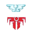
- Zederian_Icon1.png (977 Bytes) Viewed 3050 times

Re: The War of Terrador - Complete overhaul time!
I reckon the icon would look much nicer in vector. 
I guess it depends on what your actually going to use it for.
I guess it depends on what your actually going to use it for.
My spritework can be seen here.
Want to play Roll 2 Dodge, or even start your own game?http://rolltododge.freeforums.org/index.php We need you!
Want to play Roll 2 Dodge, or even start your own game?http://rolltododge.freeforums.org/index.php We need you!
-
Dragonchampion
- Posts: 758
- Joined: November 6th, 2007, 7:46 pm
- Location: North Carolina
Re: The War of Terrador - Complete overhaul time!
Like the Terradorian Icon is the logo and insignia of the Terradorians, I wish for the Logo to be for everything Zederian. The red one is my pathetic excuse of trying to edit the terradorian one. Any new logo for the Zederians would be welcome.
Ehhhh... don't mind me, I'm just the annoying little modder who gets on peoples nerves. I'll just lurk till Someone says my name. :P
Oh, and also Creator of The War Of Terrador
Oh, and also Creator of The War Of Terrador