Valk's Art Dump
Moderator: Forum Moderators
Forum rules
Before posting critique in this forum, you must read the following thread:
Before posting critique in this forum, you must read the following thread:

Re: Valk's Art Dump
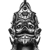
I like the horns personally. Without them he looks kind of boring. I may need to put some more decoration stuff here and there on the rest to make it flow better, but I think this is nearly ready for coloring and finalizing.
- Attachments
-
Win if you can. Lose if you must. But always cheat.

Re: Valk's Art Dump
Yeah, it needs the horns. They really make the character.
I just wanted to pop in and note how awesome these are.
I just wanted to pop in and note how awesome these are.
Play Frogatto & Friends - a finished, open-source adventure game!
-
artisticdude

- Moderator Emeritus
- Posts: 2424
- Joined: December 15th, 2009, 12:37 pm
- Location: Somewhere in the middle of everything
Re: Valk's Art Dump
I completely agree. Not only does it look awesomeJetrel wrote:Yeah, it needs the horns. They really make the character.
"I'm never wrong. One time I thought I was wrong, but I was mistaken."
Re: Valk's Art Dump
Decided to just start the coloring and rework some details later if I find them. Still need to come up with a background for it.
- Attachments
-
Win if you can. Lose if you must. But always cheat.
Re: Valk's Art Dump
oddly enough, after these changes those horns started looking fitting even for me
background eh? how about part of some ruinned gateway beneath a full-moon, lightly clouded night sky?
background eh? how about part of some ruinned gateway beneath a full-moon, lightly clouded night sky?
Like cats? I've made a whole faction of them to kick ass with!
Don't like cats? I've made a whole faction of them to kick their asses! So everyone's happy :)
Felinian faction is part of the Beyond Southern Hells era
kitties need sprites! art topic here
Don't like cats? I've made a whole faction of them to kick their asses! So everyone's happy :)
Felinian faction is part of the Beyond Southern Hells era
kitties need sprites! art topic here
Re: Valk's Art Dump
Pretty much the way it's gonna be. May go in and work on something a little more concrete later, but I've worked on this far too long at this point and need to continue other things before I go crazy.
- Attachments
-
Win if you can. Lose if you must. But always cheat.

Re: Valk's Art Dump
The sword's blood looks a bit more pink than red. Also, I'm not sure what's going on with the semi-loincloth pieces. Why aren't they hanging straight down or at least trying to?
Besides that, though, that is awesome. Especially the horns. I can never do curly things like that and have them look realistic.
Besides that, though, that is awesome. Especially the horns. I can never do curly things like that and have them look realistic.

Re: Valk's Art Dump
Maybe they are bristles/brushes?Zerovirus wrote:Also, I'm not sure what's going on with the semi-loincloth pieces. Why aren't they hanging straight down or at least trying to?
Would his right upper arm have more lighting or speculars? Based on the lighting of the horns, I think it would, but maybe I'm not seeing it correctly.
Looks good though, especially the horns and face.
BfW 1.12 supported, but active development only for BfW 1.13/1.14: Bad Moon Rising | Trinity | Archaic Era |
| Abandoned: Tales of the Setting Sun
GitHub link for these projects
| Abandoned: Tales of the Setting Sun
GitHub link for these projects
Re: Valk's Art Dump
So I decided I liked it more in black and White with the red standing out. Even made a wallpaper out of it for 1680x1050 in case anyone cares. Suits my Desktop pretty well.
- Attachments
-
Win if you can. Lose if you must. But always cheat.

Re: Valk's Art Dump
The blood on the sword and axe seems to be too bright and "dust-like." Remember that wet blood pools, and dry blood is even darker then wet blood.
I would suggest making his right hand just a tad larger, to aid perspective.
The loincloth looks battleworn, but also looks like it's been recently washed. I would suggest making some dirt patches/whatever to accent it.
Your work is awesome.
I would suggest making his right hand just a tad larger, to aid perspective.
The loincloth looks battleworn, but also looks like it's been recently washed. I would suggest making some dirt patches/whatever to accent it.
Your work is awesome.
Re: Valk's Art Dump
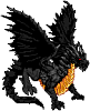
No rest for the wicked.
- Attachments
-
Win if you can. Lose if you must. But always cheat.
Re: Valk's Art Dump
Awesome.
A few things:
- that's not quite the way neck muscles work. Those lateral muscles are far too thick even for a muscular man, and they don't split at the clavicle (collarbone) like that.
- The fingers of the left hand need... work. I'm afraid it's difficult to be more specific. The thumb is excellent.
- The tongue is very thick. I would suggest toning the muscle mass down.
Re: Valk's Art Dump
Wicked awesome, that is.  Honestly, this piece is mostly formed on the bases of anatomy and lighting, and we all know how awesome Valkier is at light direction. I'm no anatomical master (kinda comes with too many nonproportional sprites) so I can't really help here.
Re: Valk's Art Dump
Thanks for the crits so far. I'm trying something different out with this guy, so I'm seeing what has an effect on what. Mostly I'm experimenting with proportion and muscle description in an attempt to make him look purposely unnatural. It may work, it may not. Either way, I'll keep it all in mind as you see fit to comment.
- Attachments
-
Win if you can. Lose if you must. But always cheat.