Background story images
Moderator: Forum Moderators
Forum rules
Before posting critique in this forum, you must read the following thread:
Before posting critique in this forum, you must read the following thread:
-
Blarumyrran
- Art Contributor
- Posts: 1700
- Joined: December 7th, 2006, 8:08 pm
apparently, yes they wouldthespaceinvader wrote:One VERY slight niggle: would they really write 'Ye Olde' on the sign...?
Last edited by Blarumyrran on September 23rd, 2007, 12:45 pm, edited 1 time in total.
-
thespaceinvader

- Retired Art Director
- Posts: 8414
- Joined: August 25th, 2007, 10:12 am
- Location: Oxford, UK
- Contact:
lol. When they built it it wasn't olde 
http://thespaceinvader.co.uk | http://thespaceinvader.deviantart.com
Back to work. Current projects: Catching up on commits. Picking Meridia back up. Sprite animations, many and varied.
Back to work. Current projects: Catching up on commits. Picking Meridia back up. Sprite animations, many and varied.
-
Blarumyrran
- Art Contributor
- Posts: 1700
- Joined: December 7th, 2006, 8:08 pm
well, Helicrom says something along "it was rebuilt lots of times", and you might see that some parts of it are rather demolished too (the hand of the statue, a tower almost falling over), so i could say the sign was added later.thespaceinvader wrote:lol. When they built it it wasn't olde
or, i could just say its for the pun. which would be a bit more true.
-
thespaceinvader
- Retired Art Director
- Posts: 8414
- Joined: August 25th, 2007, 10:12 am
- Location: Oxford, UK
- Contact:
Lol
I'm far too into the whole realism thing, huh?
I'm far too into the whole realism thing, huh?
http://thespaceinvader.co.uk | http://thespaceinvader.deviantart.com
Back to work. Current projects: Catching up on commits. Picking Meridia back up. Sprite animations, many and varied.
Back to work. Current projects: Catching up on commits. Picking Meridia back up. Sprite animations, many and varied.
-
Blarumyrran
- Art Contributor
- Posts: 1700
- Joined: December 7th, 2006, 8:08 pm
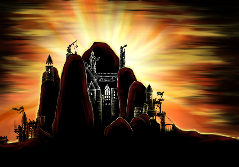

Looks...pretty good, but I have a few issues with it: firstly, the center part looks odd in various ways. It has all those white outlines, which, while possibly justifiable by lighting, still looks rather odd. I'm not quite sure yet if it's a major problem or whether I could fix it myself. Secondly, I'd wish there were a bit more walls and towers. The gates at the left and right corners look excellent (there could be one in the middle too, perhaps?), but there could be more stuff between those columns of rock (something similar to the center part being visible between those two left-most columns, for example?).
In any case, good work!
In any case, good work!

This is not justifiable by lighting. It's wrong - the problem is following a "procedure" for those that mimics a rare phenomenon, rather than a more general procedure.zookeeper wrote:Looks...pretty good, but I have a few issues with it: firstly, the center part looks odd in various ways. It has all those white outlines, which, while possibly justifiable by lighting, still looks rather odd. I'm not quite sure yet if it's a major problem or whether I could fix it myself.
-
Blarumyrran
- Art Contributor
- Posts: 1700
- Joined: December 7th, 2006, 8:08 pm
well, i know the light shouldnt shine on the edges of anything behind the hill on the other side of sun, but i made them just to look cool. i really didnt consider realism important. still dont. i mean, the ridiculous color scheme should make the unrealisticness of edges that shouldnt exist a lot less important by itself.
btw if its about the whiteness of the edges, it can be changed easily, its actually transparency and the sky is white at that point.

added some stuff. and, like since the beginnings of time, you may still click on the image for enlargement.
btw if its about the whiteness of the edges, it can be changed easily, its actually transparency and the sky is white at that point.
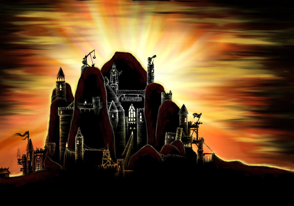
added some stuff. and, like since the beginnings of time, you may still click on the image for enlargement.
Great, those extra constructions add a lot. I might still want to edit out the statue and the name sign from the final version, but anyway, will get used.
Actually, I might start committing these rather soon, as these three already form a small set of a kind (one for first scenario, one for the last one, and one for the epilogue). If you can pump out more at this pace, all the better!
Actually, I might start committing these rather soon, as these three already form a small set of a kind (one for first scenario, one for the last one, and one for the epilogue). If you can pump out more at this pace, all the better!
Re: Background story images
Interesting - Somehow I remember this.vonHalenbach wrote:Hi there!
I have made a background picture with a castle on a hill as eye candy in any campaign. It is inspired by a small picture from user mille from this forum. I can render it much bigger or smaller if you want or change the colors to appear as night time image with the moon in the background.
How is it?
Personally i like the orginal better, but thats a matter of style only.
Feel free to use it.
As you seem to like the original i sponsor some futher renderings of a ruin, even the building isn´t perfect, i really like the mood of the image. Perhaps its of more use in your workflow:)
- Attachments
-
- tempel3.jpg (7.84 KiB) Viewed 5304 times
-
- tempel1.jpg (16.7 KiB) Viewed 5307 times
-
Blarumyrran
- Art Contributor
- Posts: 1700
- Joined: December 7th, 2006, 8:08 pm
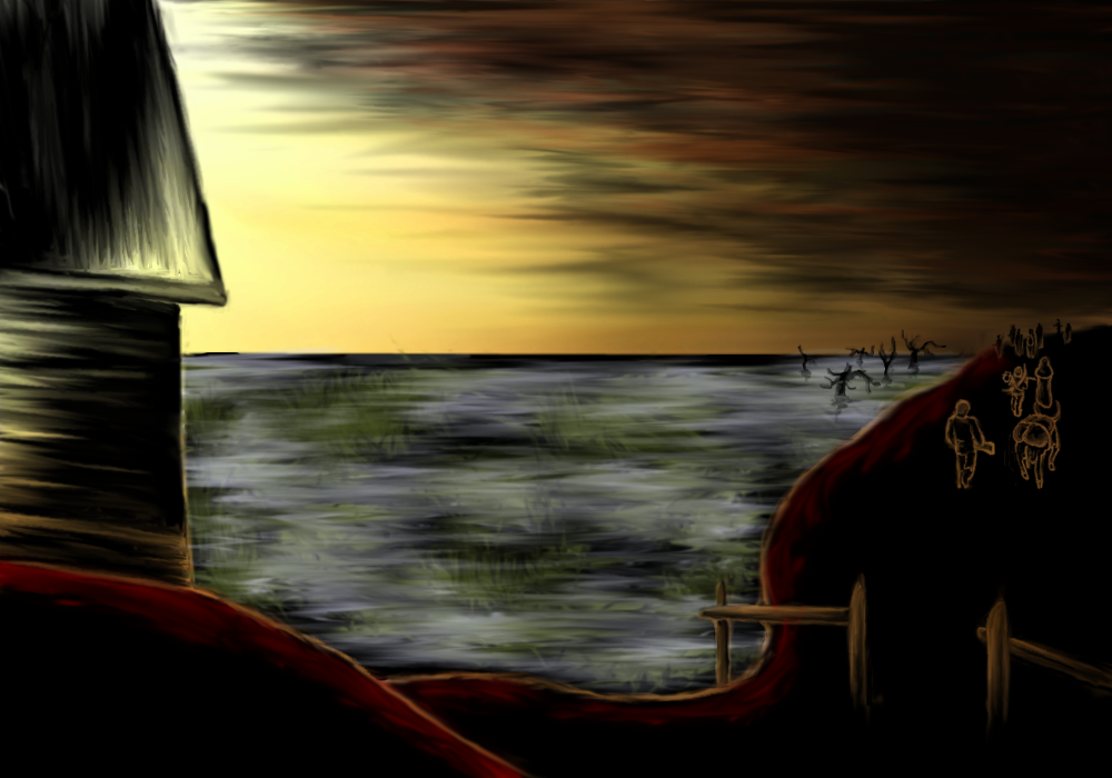
villagers abandoning their settlement with their clubs&bows&stuff.
EDIT: changed the pic by putting some trees, intensifying red edges for consistency with other images
Last edited by Blarumyrran on October 2nd, 2007, 5:26 pm, edited 1 time in total.
-
vonHalenbach

- Translator
- Posts: 398
- Joined: May 3rd, 2006, 10:23 am
- Location: united europe
Wow. It has really some dark atmosphere. Syntax, you have your own style to draw things.
http://brilliantanyway.blogspot.com/ Brilliant Anyway
-
Blarumyrran
- Art Contributor
- Posts: 1700
- Joined: December 7th, 2006, 8:08 pm
Hmm i have very little experience with this sort of things. But i just wanted to know how far from usefull something like this is?
- Attachments
-
- Fortress2.png (582.53 KiB) Viewed 4617 times
Last edited by JAP on November 4th, 2007, 1:23 am, edited 1 time in total.