Portraits for Coming of the Storm. WIP.
Moderator: Forum Moderators
Forum rules
Before posting critique in this forum, you must read the following thread:
Before posting critique in this forum, you must read the following thread:
Re: Portraits for Coming of the Storm. WIP.
you know what I jsut remembered?
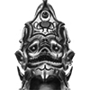
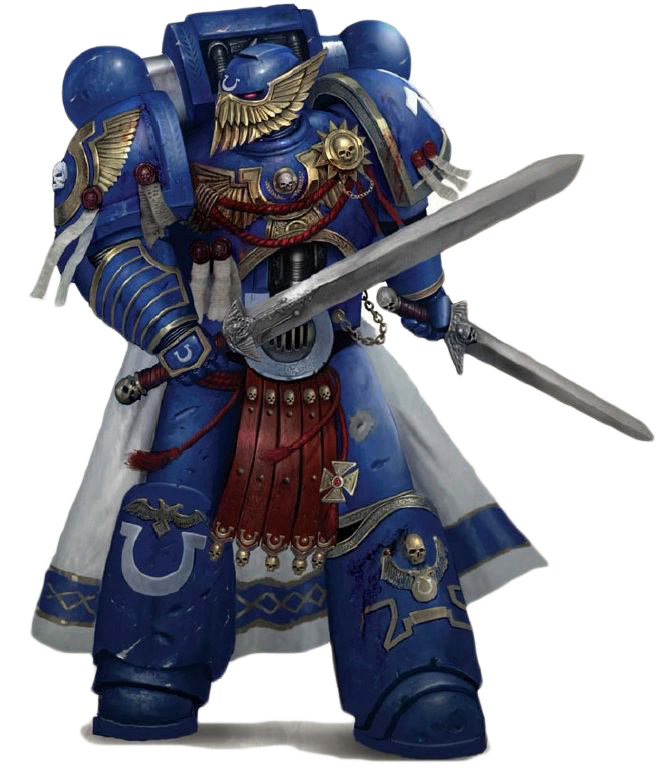
Ultramarine Honor guard helmets:
http://images1.wikia.nocookie.net/__cb2 ... _Guard.jpg
http://images.wikia.com/warhammer40k/im ... _Guard.jpg
Anyone think the PK might look better with something like that? Hmmm......
Ultramarine Honor guard helmets:
http://images1.wikia.nocookie.net/__cb2 ... _Guard.jpg
http://images.wikia.com/warhammer40k/im ... _Guard.jpg
Anyone think the PK might look better with something like that? Hmmm......
Light travels much faster than sound, that's why some people seem bright until you hear them speak.
>>> MY LITTLE LAB! <<<
>>> MY LITTLE LAB! <<<

Re: Portraits for Coming of the Storm. WIP.
(Not a portrait artist, nor do I know much about this project, so feel free to write my opinion off as irrelevant.)
Firstly, I really like the direction Valk is taking with these. They're of high quality, obviously, and they're shaping up pretty well so far.
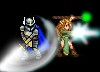
There are some really sweet artistic choices here - love the blue secondary light on the Phoenix Knight and the subtle contrast it has with the red-ish color on the scabbard and cape. I think the red secondary on the Avenger could be toned down a bit, though; it seems a tad too saturated. The armor designs are also pretty spiffy and, personally, I don't think the breastplate makes the Avenger look fat. Image searching "breastplate" shows a lot of results that look about like what the Avenger currently has. Still, I'm no expert.
About the helmet design, those links Trash Man posted look pretty sweet, but I really like way the PK's current design flows. The phoenix motifs are obviously there, but they don't jut out, whereas the other design looks kind of like someone just stuck on the gold parts.
Anyway, just my two cents.
Firstly, I really like the direction Valk is taking with these. They're of high quality, obviously, and they're shaping up pretty well so far.
There are some really sweet artistic choices here - love the blue secondary light on the Phoenix Knight and the subtle contrast it has with the red-ish color on the scabbard and cape. I think the red secondary on the Avenger could be toned down a bit, though; it seems a tad too saturated. The armor designs are also pretty spiffy and, personally, I don't think the breastplate makes the Avenger look fat. Image searching "breastplate" shows a lot of results that look about like what the Avenger currently has. Still, I'm no expert.
About the helmet design, those links Trash Man posted look pretty sweet, but I really like way the PK's current design flows. The phoenix motifs are obviously there, but they don't jut out, whereas the other design looks kind of like someone just stuck on the gold parts.
Anyway, just my two cents.
Re: Portraits for Coming of the Storm. WIP.
The more comments the better.
I think any artists appreciates feedback and creative process is something that is done in stages/iterations and is by nature fluid.
And yes, kings and nobles had armor custom made for them even when they grew fat. So there is armor with more space in the belly area. But that's not the armor for an aerage, young knight.
Light travels much faster than sound, that's why some people seem bright until you hear them speak.
>>> MY LITTLE LAB! <<<
>>> MY LITTLE LAB! <<<
Re: Portraits for Coming of the Storm. WIP.
Rough updates. Figured I'd keep them simple in case further changes are requested. Pending approval, I'll clean them up and outline them.
- Attachments
-
- phoenixknight.png (165.45 KiB) Viewed 5584 times
-
- avenger.png (161.52 KiB) Viewed 5584 times
Win if you can. Lose if you must. But always cheat.
Re: Portraits for Coming of the Storm. WIP.
PK looks good...but the chest insignia still looks a bit off when you trace a line from the neck protector. Shouldn't that spherical thing sit on the immaginary line?
Avenger:
loose the scabbard and the huge neck protector.
Go for the arms exactly like your first attemt (or my overdrawing of it)
posted again for refference:

EDIT: Yeah, definately some differnece in posture when you compare them.
Avenger:
loose the scabbard and the huge neck protector.
Go for the arms exactly like your first attemt (or my overdrawing of it)
posted again for refference:
EDIT: Yeah, definately some differnece in posture when you compare them.
Light travels much faster than sound, that's why some people seem bright until you hear them speak.
>>> MY LITTLE LAB! <<<
>>> MY LITTLE LAB! <<<
Re: Portraits for Coming of the Storm. WIP.
Dropped the Avengers arm to position, cleaned and fancied him up a bit. Removed the scabbard and neck guard.TrashMan wrote:PK looks good...but the chest insignia still looks a bit off when you trace a line from the neck protector. Shouldn't that spherical thing sit on the immaginary line?
Avenger:
loose the scabbard and the huge neck protector.
Go for the arms exactly like your first attemt (or my overdrawing of it)
posted again for refference:
EDIT: Yeah, definately some differnece in posture when you compare them.
Phoenix Knight emblem is corrected and he is polished. Really I only have outlining left to do on him.
Roughed out Aquae
- Attachments
-
- phoenixknight.png (182 KiB) Viewed 5529 times
-
- avenger.png (173.45 KiB) Viewed 5529 times
-
- aquae.png (101.6 KiB) Viewed 5529 times
Win if you can. Lose if you must. But always cheat.
Re: Portraits for Coming of the Storm. WIP.
PK looks gret.
Avenger looks great.
I have to aplogize for not making my comment clear - I was referring to the other arm. The one grasping the handle. Two handed swords are long and the forearm beign angled lower with a slightly twisted grip gives the impression of a bigger and heavier weapon.
Aquae....
Can you go for rather bland/normal robes and posture like on the example pic?
Also long hair.
I'll see if I can find some images that convey the feel better.
Light travels much faster than sound, that's why some people seem bright until you hear them speak.
>>> MY LITTLE LAB! <<<
>>> MY LITTLE LAB! <<<
Re: Portraits for Coming of the Storm. WIP.
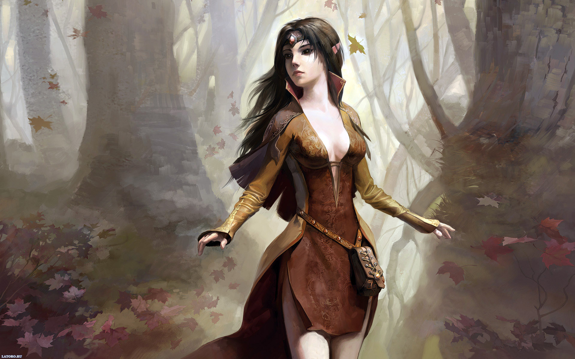
HEre I find a few.
for clothing:
http://wallpaper.metalship.org/walls/elf1.jpg
for cloting/face: (I'd be using this one (with a smaller clevage) if it wasn't copyrighted )
)
http://images4.alphacoders.com/275/275456.jpg
face and upper body clothing is good here:
http://static.minitokyo.net/downloads/06/37/221856.jpg
for clothing:
http://wallpaper.metalship.org/walls/elf1.jpg
for cloting/face: (I'd be using this one (with a smaller clevage) if it wasn't copyrighted
http://images4.alphacoders.com/275/275456.jpg
face and upper body clothing is good here:
http://static.minitokyo.net/downloads/06/37/221856.jpg
Light travels much faster than sound, that's why some people seem bright until you hear them speak.
>>> MY LITTLE LAB! <<<
>>> MY LITTLE LAB! <<<
Re: Portraits for Coming of the Storm. WIP.
This is part of the reasons I had it the way I originally did (on the back) because trying to have a two handed sword in full view on a Wesnoth portrait is frustrating and difficult to faithfully pull off. The main problem is two handed swords simply aren't all that heavy. I think they're something like 8lbs? Even that feels too high as I type it. Basically it wouldn't be enough to warrant having him torquing his wrist in an uncomfortable position. To give you an idea, most of those weapons could (though clumsily due to size, not weight) be swung one handed.TrashMan wrote:Avenger looks great.
I have to aplogize for not making my comment clear - I was referring to the other arm. The one grasping the handle. Two handed swords are long and the forearm beign angled lower with a slightly twisted grip gives the impression of a bigger and heavier weapon.
The other problem is that nothing is allowed to go off to the ride side of a Wesnoth portrait since it just looks weird to have it disappear behind text or whatever. It leaves us with the scant few options of having it go off the top, to the left, or down at the bottom some way as per the PK portrait. In short, no it's not necessarily going to be pretty. If you *really* want me to I can angle his arm down and break his wrist over this, but I can almost promise you it's going to look weird because then the rest of him will be relaxed and postured but then we'll just have this one little area where he's straining to hold a sword for the camera.
Alternatives I can think of:
-As I just mentioned, we can simply choose a different exit point for the sword.
-We can go a little fantasy here and just veeeery slightly increase the width of the blade, lengthen it off the top of the portrait, or both.
-We can do what I did with the PK and have it angle off the bottom with the cross guard as the indication of what this thing actually is. We would be able to get more detail on the character then, but it would look much less dynamic this way.
-The best way I can think of personally is I actually raise the handle arm and have his sword going back in to space. This seems like the most viable option to me, but it will give the blade of the sword less presence overall, which seems to be counter to what you've been angling towards.
Edit: The quickest and easiest way is I can shrink him down a bit and just free up more room in the top right. Wouldn't really lose any detail, you'd get your entire sword, and his wrist won't be broken in the process.
I'll send you a PM about Aquae.
Win if you can. Lose if you must. But always cheat.
Re: Portraits for Coming of the Storm. WIP.
hm... is it necessary for the whole sword to be visible to begin with?
Hm..I guess you could technicly move his arm down a bit and leave the rest as it is. The pommel of the sword won't be visible (since the handle would move then with the arm a bit), but who cares?
I honestly don't know. I can try making a quick mockup with your new picture to see how it will look.
But if you think it won't look good I'll trust your instinct.
Light travels much faster than sound, that's why some people seem bright until you hear them speak.
>>> MY LITTLE LAB! <<<
>>> MY LITTLE LAB! <<<
Re: Portraits for Coming of the Storm. WIP.

Moklup time. This is how it would look with the hand moved (and a more full helmet)
I'll leave the hand position to you, but a more robust helmet defiantely looks better ot me.
b.t.w - the wrist in the gauntlet was almost always fully mobile. Only the heaviest of armor had decreased agiltiy there.
Light travels much faster than sound, that's why some people seem bright until you hear them speak.
>>> MY LITTLE LAB! <<<
>>> MY LITTLE LAB! <<<
Re: Portraits for Coming of the Storm. WIP.
Finished Avenger
Finished PK.
Finished PK.
- Attachments
-
- avengersmall.png (42.72 KiB) Viewed 5383 times
-
- avenger.png (140.78 KiB) Viewed 5383 times
-
- phoenixknightsmall.png (48.69 KiB) Viewed 5409 times
-
- phoenixknight.png (164.87 KiB) Viewed 5409 times
Win if you can. Lose if you must. But always cheat.
Re: Portraits for Coming of the Storm. WIP.
Excellent.
But I do have a few comments:
For the HA:
The handguard and the parrying prongs don't seem alinged, thus the blade seems twisted.
Also if you could saturate the cloak a bit...darker, more pronounced blue.
Maybe a few very faint, light blue runes on the blade?
PK is fantastic, even if a bit desaturated and dark. But I guess vibrant colors for the "tails" and decoration would really clash and look out of place.
Anyway, great wrok as always
Light travels much faster than sound, that's why some people seem bright until you hear them speak.
>>> MY LITTLE LAB! <<<
>>> MY LITTLE LAB! <<<
Re: Portraits for Coming of the Storm. WIP.
I'll throw on a hue/saturation adjustment on it when I upload Aquae. My laptop screen always has much better contrast and saturation than when I upload them for whatever reason. Always a pain to try to compensate as I draw. Either way it's a two second tweek so no big deal.TrashMan wrote:Excellent.
But I do have a few comments:
For the HA:
The handguard and the parrying prongs don't seem alinged, thus the blade seems twisted.
Also if you could saturate the cloak a bit...darker, more pronounced blue.
Maybe a few very faint, light blue runes on the blade?
PK is fantastic, even if a bit desaturated and dark. But I guess vibrant colors for the "tails" and decoration would really clash and look out of place.
Anyway, great wrok as always
Win if you can. Lose if you must. But always cheat.
Re: Portraits for Coming of the Storm. WIP.
Yeah, I have a similar problem on my laptop. My desktops contrast is excellent tough and I never have problem there.
Oh, one question - is the white-ish smudge above the HA arm supposed to be the reflection on the armor? If so, a very nice touch.
It might be the contrast issue again, but that entire part of the armor looks really dark. I could swear his lower armor isn't even metallic, but it might just be the shadow. Then again, I I'm not exactly sure of the angle of the light on that image, but it still seems it shouldnt' be that dark.
Light travels much faster than sound, that's why some people seem bright until you hear them speak.
>>> MY LITTLE LAB! <<<
>>> MY LITTLE LAB! <<<