Piko's random art
Moderator: Forum Moderators
Forum rules
Before posting critique in this forum, you must read the following thread:
Before posting critique in this forum, you must read the following thread:
-
Alternatic

- Posts: 43
- Joined: October 27th, 2012, 10:58 am
- Location: Czech Republic
Re: Piko's random art
You are making progress!
But, you need higher contrast! That includes both your pallete and different pieces of clothing. Also I don't see no reason why his skin should be getting darker . And also, you don't have to change the pose for every level, it only makes it look weird sometimes. But it is definitely better then the sprites before, keep it up!
But, you need higher contrast! That includes both your pallete and different pieces of clothing. Also I don't see no reason why his skin should be getting darker
All mistakes included in the message above are intentional.
You can buy a version without mistakes for 5$ each.
You can buy a version without mistakes for 5$ each.
Re: Piko's random art
I tried to don't make contrast too high, bcoz they wear a skin - not a shining armor. I tried earlier a higher one than now but it wasn't looking very well. I'm still not sure how will it look in the game, maybe I'll need to change it anyway.
About the skin - I see no reason why it shouldn't do. However I agree it can look a bit strange - I propably shall tone it down a bit.
'Bout the pose - yes, I surely have to! It's an important thing while making next levels of a unit. Without it these can look too similar, especially if other things didn't changed much. Look on default units, and these from good eras - it's used pretty often.
-
Great_Mage_Atari

- Posts: 932
- Joined: July 26th, 2011, 5:07 pm
Re: Piko's random art
IMO (and this is the one thing I never understood about Wesnoth), the arms need to be a bit longer. Making the arms longer will make the legs seem a lot less long. The way the arms are now seem to make the waist and legs unequal to the torso.
Re: Piko's random art
I don't think long arms would look naturally in Wesnoth. Anyway I think it's worth a try - I made something with these:
- A beign from another dimension's skeleton sketch
- a_skeleton.png (1.09 KiB) Viewed 7097 times
Re: Piko's random art
Some more images:
I'll maybe post my attempt at portraiting later, not sure anyway. It's pretty hard. 
- A 3rd lvl of the leader - only for hero.
- cthw_spearman_leader3.png (1.26 KiB) Viewed 7006 times
- A 4th lvl of the leader - also only for hero.
- cthw_spearman_leader4.png (1.3 KiB) Viewed 7006 times
- Fleshed beign from another dimension. Propably 'll redraw the arms.
- a_unit.png (1.16 KiB) Viewed 7006 times
-
artisticdude

- Moderator Emeritus
- Posts: 2424
- Joined: December 15th, 2009, 12:37 pm
- Location: Somewhere in the middle of everything
Re: Piko's random art
Beware of relying too heavily on single-pixel lines to define shapes. It's always better to use shading to define the shape of an object, and then have outlines complement that. If you have any single-pixel lines, they should either be necessary for the proper shading of an object, or for the outline around the edge of the unit. Personally, I prefer to block my units using blobs of solid color rather than outlines, because when starting from outlines it's very easy to fall into the 'coloring book' trap, where you're shading based on the shape dictated by the outlines rather than the actual 3D shape of the object.
With regard to the spearmen leaders, I'd suggest adding a bit more differentiation between levels. Right now you're relying mostly on changing the size of the weapon and the length of the torso to create that difference, but you might want to try playing around with different poses/bigger shield/different armor and helmet/more bling (plumes, gold outlining on the armor, spikes, jewels, tassels, etc.). Also, higher levels don't just have to be taller than lower level units; they can also be broader, which helps them bulk up and appear more powerful than the lower levels.
With regard to the spearmen leaders, I'd suggest adding a bit more differentiation between levels. Right now you're relying mostly on changing the size of the weapon and the length of the torso to create that difference, but you might want to try playing around with different poses/bigger shield/different armor and helmet/more bling (plumes, gold outlining on the armor, spikes, jewels, tassels, etc.). Also, higher levels don't just have to be taller than lower level units; they can also be broader, which helps them bulk up and appear more powerful than the lower levels.
"I'm never wrong. One time I thought I was wrong, but I was mistaken."
Re: Piko's random art
Thank you for advice. I propably won't change existing sprites much, at least not now, but I'll remember about it when making new ones.
I tried to give to the leader a helmet, but I'm not sure do it fit:
I tried to give to the leader a helmet, but I'm not sure do it fit:
- cthw_spearman_leader3.png (1.29 KiB) Viewed 6908 times
- cthw_spearman_leader4.png (1.32 KiB) Viewed 6908 times

Re: Piko's random art
The helmet looks quite good, but maybe you could change his armor a bit. If you make it a bit darker at the side it would look more plastic. Also there is a random pixel floating around in the first picture.
Re: Piko's random art
I erased the pixel, thanks. I'll work on the armor later.

Re: Piko's random art
The torso length makes them look really odd. If you are going to add height you should add few pixels here and there. Just stretching the torso makes them look unbalanced (from artistic viewpoint). For higher level units you could give bigger and more colorful shields. Also, a cloak is quite common thing for higher level units.artisticdude wrote:the length of the torso to create that difference
Re: Piko's random art
Hmm... You seems to be right. I'll work on it later.
Btw, I made some sort of a dark faerie:
Btw, I made some sort of a dark faerie:
- cthw_hero_faerie.png (1.54 KiB) Viewed 6766 times
Re: Piko's random art
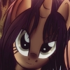
At the moment I'm trying to learn how to make a BfW portrait. I finished only the head yet, which looks noobish in my opinion anyway.  I'm really in need of advice.
- Attachments
-
- Some sort of a steampunk green fox... No, I have no idea what can it be. ;P
- Something.png (10.64 KiB) Viewed 6718 times

Re: Piko's random art
You should start out with sketches first, then a cleaner sketch to scan or import into your paint program. It can be tough to just wing it digitally, pencil and paper is a fast way to work out a concept, and don't worry about making one perfect one, experiment on several loose ideas then build up a character from the better parts. I've attached an example of a couple of sketches I did, these are from a group of four total. I was just working out a basic feel, in a "T" pose (not really a T, but a neutral pose), so that the only concern was the armor and hair.
* I also want to say it's good to know about the character you are creating, their race, personality, etc. At least for me anyway, some constraints can help the creative process.
* I also want to say it's good to know about the character you are creating, their race, personality, etc. At least for me anyway, some constraints can help the creative process.
- Attachments
-
Re: Piko's random art
Trust me or not, but I'm sketching before making a portrait as well. But this portrait is just to know am I making lines correct, am I shading well etc. It's just for practice.
I made just the armlets, but I already think I screwed it up:
I made just the armlets, but I already think I screwed it up:
- Attachments
-
- Something.png (12.91 KiB) Viewed 6660 times
Re: Piko's random art
Well, as far as lighting goes, you almost have a flash photo, straight on source happening. Think more that the light comes from a diagonal in one of the upper corners. Also look at how shiny objects reflect light and have more contrast, while more matte surfaces are subtle in the shading. http://blender.howto.cz/blender-links/m ... ew-cat.jpg is a nice reference to start, as are mainline portraits/books on armor and weapons. Don't be afraid to punch up the highlights and dark parts.