LordBob's commissionned work
Moderator: Forum Moderators
Forum rules
Before posting critique in this forum, you must read the following thread:
Before posting critique in this forum, you must read the following thread:

Re: LordBob's commissionned work
Number 3, and number 24 are my favourite woses. 
Author of Antar, Son of Rheor ( SP Campaign) | Development Thread + Feedback Thread + Replays of ASoR

Re: LordBob's commissionned work
I'm OK with that as I've already expressed (page 22 of this thread) that Wesnoth already has multiple humanoid races, so making Woses more monstrous is refreshing (of course it's up to art directors to decide this matter). I like sketches 5, 10 and 21.Though a good half of these creatures are spookier and/or more aggressive than we'd want our woses to be...
My first campaign:
Inky's Quest - the Cuttlefish Campaign
Inky's Quest - the Cuttlefish Campaign
-
thespaceinvader

- Retired Art Director
- Posts: 8414
- Joined: August 25th, 2007, 10:12 am
- Location: Oxford, UK
- Contact:
Re: LordBob's commissionned work
19 is my preference.
http://thespaceinvader.co.uk | http://thespaceinvader.deviantart.com
Back to work. Current projects: Catching up on commits. Picking Meridia back up. Sprite animations, many and varied.
Back to work. Current projects: Catching up on commits. Picking Meridia back up. Sprite animations, many and varied.

Re: LordBob's commissionned work
I liked 8,15 and 24 the most. But everything you're doing is great...
-
homunculus

- Posts: 537
- Joined: July 21st, 2010, 9:47 pm
Re: LordBob's commissionned work
I don't think it is bad if a wose looks spooky, I remember some campaign where even humans said that elvish architecture looked ghastly.
And I think old trees looking scary in the dark is probably part of the creation of the living/walking tree folklore.
I like all the woses except 2 and 3 because of the arms becoming thicker towards the end, like the bigfoot and bigfist crossbreeds we see in some popular games.
Some of those look like they could be interesting challenges.
Ok, I just pick... 18 (the "winged gargoyle" tree), looks nice and interesting. How would you make that face look like it's a big tree and not a tiny detail enlarged?
Re: LordBob's commissionned work
4, 12, and 26 are the ones I like best.
Creator of Shadows of Deception (for 1.12) and co-creator of the Era of Chaos (for 1.12/1.13).
SurvivalXtreme rocks!!!
What happens when you get scared half to death...twice?
SurvivalXtreme rocks!!!
What happens when you get scared half to death...twice?
-
beetlenaut

- Developer
- Posts: 2825
- Joined: December 8th, 2007, 3:21 am
- Location: Washington State
- Contact:
Re: LordBob's commissionned work
I see nothing wrong with spooky either. If someone needs a good elder wose, they can recycle kindly old Rithrandil from TRoW. I don't have a favorite, but some of them look old and decayed, rather than old and very powerful, which they are in the game.
Campaigns: Dead Water,
The Founding of Borstep,
Secrets of the Ancients,
and WML Guide
The Founding of Borstep,
Secrets of the Ancients,
and WML Guide
Re: LordBob's commissionned work
It reminds me the times of drawing crazy bonsai. I would go with 1 or 3.

Re: LordBob's commissionned work
Yeah, I agree with this. One or two light modifications (like a pair of extra arms) are fine, but going too crazy (like having skeletal horse legs or whatnot) is probably out.beetlenaut wrote:I think the generic ancient lich should remain mostly humanoid to provide more contrast for the bizarre bodies of the campaign-specific ones.
It may be more helpful to point out aspects of individual thumbnail sketches which you like, rather than the whole sketch. By pointing that out, those can be kept if he ends up combining aspects for a final design. Then again they might not work from all angles; some designs need a pose to be evident.
I'm going to contradict my own suggestion and list some of the liches I like without individual justification (although it's mostly their stance/poses I'm saying that I like). 1 2 3 5 6 12 19 20 21 23 26 27 28 29
Play Frogatto & Friends - a finished, open-source adventure game!
-
LordBob

- Portrait Director
- Posts: 1309
- Joined: December 8th, 2008, 8:18 pm
- Location: Lille, France
- Contact:
Re: LordBob's commissionned work
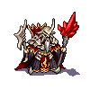
Duly noted. And so, here's a run of mostly-humanoid (too much so, perhaps ?) concepts. Whichever is retained, I will most likely add some bling, decay and weird body parts, because right now some of those feel more Lich than Ancient. 
Absolutely !Jetrel wrote:It may be more helpful to point out aspects of individual thumbnail sketches which you like, rather than the whole sketch. By pointing that out, those can be kept if he ends up combining aspects for a final design.
- Attachments
-
Want to see more of my art ? Visit my portfolio !

Re: LordBob's commissionned work
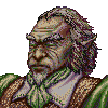
I'd say A, G or H. I really like G, it looks so dark.
Formerly known as the creator of Era of Chaos and maintainer of The Aragwaithi and the Era of Myths.
Re: LordBob's commissionned work
I like F and H. And unless I'm mistaken H and I are meant to resemble ancient Egypt to make them feel more ancient, right? (cool idea!)
My first campaign:
Inky's Quest - the Cuttlefish Campaign
Inky's Quest - the Cuttlefish Campaign
Re: LordBob's commissionned work
New ancient liches: I like D (aggressive) and G (threatening). F is also good as an alternative if the circumstances of encounter of a lich are hmm... unusual and peculiar.
-
Sleepwalker

- Art Contributor
- Posts: 416
- Joined: October 23rd, 2008, 6:34 am
- Location: Sweden
Re: LordBob's commissionned work
"I" looks more like ancient egypt to me, with the Set-like appearance. "H" looks more renaissance style with the puffy hat and shoulders. I really like "I" btw, maybe with some more bling.
I'm not a big fan of them being impaled, it doesn't make much sense to leave stuff like that inside yourself. I'd imagine it would be a quite a hindrance. It's alright for the less sentient like the skeleton line.
The "G" is cool but it would indeed need something more to make it look less like a normal lich.
I'm not sure how "F" would translate into an actual unit in game. It would be a bit on the odd side if he stayed on his hoverrock at all times during combat. If you want to use the concept then it would better be used for a 2-stage special campaign lich I think.
Imo, I'd go with "I". Second the pose of "G", using some of the more traditional gear of A, B, C. Or you could go with "D", using some gear of the others (not "H", with "H" I think it's current pose would be better).
Sometimes we must be hurt in order to grow, fail in order to know, lose in order to gain, and sometimes we must have to be broken so we can be whole again...
- Nercy Masayon
- Nercy Masayon
-
TheCripple
- Posts: 103
- Joined: March 19th, 2011, 3:30 am
Re: LordBob's commissionned work
I quite like G's pose, though it needs a little more in the way of ornament and I'm not particularly fond of it being impaled in the portrait.