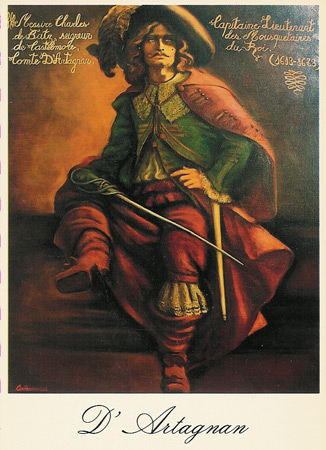
Portrait attempt: Master at Arms
Moderator: Forum Moderators
Forum rules
Before posting critique in this forum, you must read the following thread:
Before posting critique in this forum, you must read the following thread:
-
musketaquid
- Art Contributor
- Posts: 117
- Joined: July 18th, 2006, 12:23 am
-
Kestenvarn

- Inactive Developer
- Posts: 1307
- Joined: August 19th, 2005, 7:30 pm
- Contact:
It's a nice start. I like his outfit.

- What is he looking at? Portraits are generally shown when the character is
speaking to another, so he should be facing the player. - Eyes are somewhat symbolic in current pose - oval-shaped with perfectly
centered pupils. They are also drawn as if he was facing forward while the rest of him is not. - The line thickness is uniform, giving it the impression of a cutout. Making lines heavier
where appropriate aids the illusion of three dimensions. - Some colors could use a little desaturating, such as the skin and hair.
- Weapon does not look convincing, seemingly added as an afterthought. It is not always
necessary to add the sprite's accessories, especially if they do not fit with the rest of the portrait. - Goatee forming a cone seems odd.
- The clothing is quite flat when eyeing the different pieces. Adding shadows underneath
and making the clothing 'thick' around the edges helps. Ex. instead of the right corner
of the hat coming to a sharp point, blunting the end would give this impression.
Ex. Making the hat a bit a looser around the forehead/hair so it seems
as if he is wearing it and it is not a part of him.
-
thespaceinvader

- Retired Art Director
- Posts: 8414
- Joined: August 25th, 2007, 10:12 am
- Location: Oxford, UK
- Contact:
WRT the sword: Kest's comment made me realise another flaw - it doesn't look like he's actually holding it. If you extended the blade back, the hilt would be about at elbow level. It's an easy mistake to make when you're just drawing a bust and the hand is out-of-crop - i've done it myself. Bringing the blade either further across or more towards the vertical would help this issue.
http://thespaceinvader.co.uk | http://thespaceinvader.deviantart.com
Back to work. Current projects: Catching up on commits. Picking Meridia back up. Sprite animations, many and varied.
Back to work. Current projects: Catching up on commits. Picking Meridia back up. Sprite animations, many and varied.
-
Kestenvarn
- Inactive Developer
- Posts: 1307
- Joined: August 19th, 2005, 7:30 pm
- Contact:
-
thespaceinvader
- Retired Art Director
- Posts: 8414
- Joined: August 25th, 2007, 10:12 am
- Location: Oxford, UK
- Contact:
Honestly, i like the look of it in there, but it does crowd the image. Maybe the solution is a wider crop - drawing in the sword arm and body to about waist level and cropping wider with more background would make it less crowded. After all, the entire frame does not need to be filled.
http://thespaceinvader.co.uk | http://thespaceinvader.deviantart.com
Back to work. Current projects: Catching up on commits. Picking Meridia back up. Sprite animations, many and varied.
Back to work. Current projects: Catching up on commits. Picking Meridia back up. Sprite animations, many and varied.

Things I agree with:

Namely:Kestenvarn wrote:
- Eyes are somewhat symbolic in current pose - oval-shaped with perfectly
centered pupils. They are also drawn as if he was facing forward while the rest of him is not.- Some colors could use a little desaturating, such as the skin and hair.
- Weapon does not look convincing, seemingly added as an afterthought. It is not always
necessary to add the sprite's accessories, especially if they do not fit with the rest of the portrait.- The clothing is quite flat when eyeing the different pieces. Adding shadows underneath
and making the clothing 'thick' around the edges helps. Ex. instead of the right corner
of the hat coming to a sharp point, blunting the end would give this impression.
Ex. Making the hat a bit a looser around the forehead/hair so it seems
as if he is wearing it and it is not a part of him.
- On the eyes, try breaking the outline in places - it doesn't have to be a continuous edge, and might do better with having gaps at specific spots - like the corner of the eye, and having a line only where it would be darkest - e.g. the borders where the lashes are thickest.
- It's hard to say - some of the colors look fine, but for example, the skin is a -little- bit yellow. What I might criticize more, is the lack of deeper shadows in certain places.
- Go ahead and remove the sword entirely.
- What kestenvarn said.
Kestenvarn wrote:
- What is he looking at? Portraits are generally shown when the character is
speaking to another, so he should be facing the player.- Goatee forming a cone seems odd.
- The line thickness is uniform, giving it the impression of a cutout. Making lines heavier
where appropriate aids the illusion of three dimensions.
- Uh, if you look at the other Lutes portraits, they're not gazing at the player either. They're looking out, and a bit to our right; as if they're looking past the player at the landscape behind him. The eyes on this guy do look "a little odd", and I suspect the biggest reason for that is that the entire iris is visible - it creates a sensation of "surprise". Bringing the lids down would make him look calmer.
- No, that's totally normal for the musketeer age. They trimmed and waxed their beards to that shape. Cripes; it's almost like my avatar, except that one is more blunt.
- There's some variability to the lines, but I think kestenvarn is talking about things like the cuff of the sleeve, etc.
Kestenvarn and Jetryl, thanks for your detailed feedback  You are very helpful.
I think one mistake with the eyes was to put the pupil in the center of the iris (as if he was looking at the viewer), while centering the iris in the eye (as if he was staring parallel to his nose).
As for the "surprised" look i kept it in this version, since it was intented to make him look more affected/foppish showing off his blue eyes. My reference for this was Derek Zoolander On the other hand he is a caricature and therefore possibly too extreme.
So if this edit does not fix it (i always had problems to decide if eyes are drawn right) i'll definitely try getting down his eyelids next.
So here is another version, which hopefully solves most of mentioned problems (while creating not too many new).
---------
@thespaceinvader: I actually made a very rough sketch of his arm using quickly created elliptic "arm dummies", but i foreshortened his arms much too much. When i did a "real" sketch following your suggestion, the sabre imho covers the rest of the image at untimely spots
I tried to do so. I am not really sure where this would exactly be appropriate, though.Making lines heavier where appropriate aids the illusion of three dimensions.
Uh, if you look at the other Lutes portraits, they're not gazing at the player either. They're looking out, and a bit to our right; as if they're looking past the player at the landscape behind him. The eyes on this guy do look "a little odd", and I suspect the biggest reason for that is that the entire iris is visible - it creates a sensation of "surprise". Bringing the lids down would make him look calmer.
I think one mistake with the eyes was to put the pupil in the center of the iris (as if he was looking at the viewer), while centering the iris in the eye (as if he was staring parallel to his nose).
As for the "surprised" look i kept it in this version, since it was intented to make him look more affected/foppish showing off his blue eyes. My reference for this was Derek Zoolander
So if this edit does not fix it (i always had problems to decide if eyes are drawn right) i'll definitely try getting down his eyelids next.
So here is another version, which hopefully solves most of mentioned problems (while creating not too many new).
---------
@thespaceinvader: I actually made a very rough sketch of his arm using quickly created elliptic "arm dummies", but i foreshortened his arms much too much. When i did a "real" sketch following your suggestion, the sabre imho covers the rest of the image at untimely spots
- Attachments
-
- Stutzer5.png (35.03 KiB) Viewed 4046 times
Differentiated shadows on clothing a bit. Also played a little around with his eyes (somewhat subtle, but existant) and his eyebrows. I think editing both actually harmed his foppish expression, but i still don't feel sure about this. As usual critique and feedback is appreciated.
- Attachments
-
- Comparison_Eyes_Brows.png (75.72 KiB) Viewed 3967 times
-
Shadow
- Posts: 1264
- Joined: September 9th, 2004, 10:27 am
- Location: Following the steps of Goethe
- Contact:
For the left side of the face another shade tone might be good. To smoothe the transition.
Else not bad.
example to show what I mean
Else not bad.
example to show what I mean
... all romantics meet the same fate someday
Cynical and drunk and boring someone in some dark cafe ...
All good dreamers pass this way some day
Hidin’ behind bottles in dark cafes
Cynical and drunk and boring someone in some dark cafe ...
All good dreamers pass this way some day
Hidin’ behind bottles in dark cafes
-
Kestenvarn
- Inactive Developer
- Posts: 1307
- Joined: August 19th, 2005, 7:30 pm
- Contact:


-
Kestenvarn
- Inactive Developer
- Posts: 1307
- Joined: August 19th, 2005, 7:30 pm
- Contact:
Now look, this is poor reasoning. Much of the clothing is currently flat, not just "a little thin". Flat as in two-dimensional.Weeksy wrote:A Musketeer-style character might be able to afford silk, and would definitally have the ego to flaunt it if he did, so a little thin clothing wouldn't be out of place.
It doesn't look as though he is wearing the hat; rather, it sort of springs forth from his forehead. Same with the various lapels, collars and cuffs.