Silver Mage Portrait
Moderator: Forum Moderators
Forum rules
Before posting critique in this forum, you must read the following thread:
Before posting critique in this forum, you must read the following thread:
-
irrevenant

- Moderator Emeritus
- Posts: 3692
- Joined: August 15th, 2005, 7:57 am
- Location: I'm all around you.
Zhukov wrote:Did you didn't accidentally post the same image twice?
Look at where his head and neck are relative to the jewelled clasp (or most importantly relative to the centre of his chest).
Want to post a Wesnoth idea? Great! Read these:
Frequently Posted Ideas Thread
Giving your idea the best chance of acceptance
Frequently Posted Ideas Thread
Giving your idea the best chance of acceptance


You sure see who's the artist here. 
And to Darth Foo: I agree to all that stuff there and I would be very happy to be listed in the credits if you want to put me there. (Just as Eternal...)
Sorry if I haven't been around for a while. I got this new game (Fallout 2) and i've been busy with it.
And to Darth Foo: I agree to all that stuff there and I would be very happy to be listed in the credits if you want to put me there. (Just as Eternal...)
Sorry if I haven't been around for a while. I got this new game (Fallout 2) and i've been busy with it.
I wish I had more time in my hands.
He looks like Kevin Bacon.charlieg wrote:Looks great now except his nose looks a little weird... kinda snoutish.
Hope springs eternal.
Wesnoth acronym guide.
Wesnoth acronym guide.

*Googles "Kevin Bacon"*
Hehe, you're right. I think it's the line on his cheek that invokes the Bacon look, it gives his face a hollow quality.
A criticism of my own regarding the nose: A human nose does not have a point like that. If the nose stays the way it is now, I reckon it should give him a 2-2 pierce attack with backstab. If you look in a mirror you will see that your nose (hopefully) has a rounded tip, it does not curve outwards into a lethal tip.
Other then that, great job. I love the texture on the robes, especially the sleeve.
-
Darth Fool
- Retired Developer
- Posts: 2633
- Joined: March 22nd, 2004, 11:22 pm
- Location: An Earl's Roadstead
The latest version has been committed. This means that Eteranal: you are officially now a wesnoth art contributor. This doesn't mean that you have to stop making improvements to the portrait. The portrait is not currently used in any campaigns or scenarios, but it is available for use.
"you can already do that with WML"
Fight Creeeping Biggerism!
http://www.wesnoth.org/forum/viewtopic. ... 760#131760
http://www.wesnoth.org/forum/viewtopic. ... 1358#11358
-
SmokemJags
- Posts: 580
- Joined: February 14th, 2006, 3:24 am
- Location: New Avalon
- Contact:

-
irrevenant
- Moderator Emeritus
- Posts: 3692
- Joined: August 15th, 2005, 7:57 am
- Location: I'm all around you.
I'm flattered that my edit got incorporated but it was only ever intended to demonstrate how the figure looked with the head shifted back, not to be part of the commit.
Specifically the circled bit is temporary patchwork that I added solely to stop the cut-out section from distracting the eye. The colouring (and possibly the positioning) of the folds is incorrect. I unfortunately don't have the expertise to fix that (or I would have done it right in the first place!) so if someone else could please correct that, it would be much appreciated!
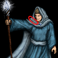
Specifically the circled bit is temporary patchwork that I added solely to stop the cut-out section from distracting the eye. The colouring (and possibly the positioning) of the folds is incorrect. I unfortunately don't have the expertise to fix that (or I would have done it right in the first place!) so if someone else could please correct that, it would be much appreciated!
Want to post a Wesnoth idea? Great! Read these:
Frequently Posted Ideas Thread
Giving your idea the best chance of acceptance
Frequently Posted Ideas Thread
Giving your idea the best chance of acceptance
-
SmokemJags
- Posts: 580
- Joined: February 14th, 2006, 3:24 am
- Location: New Avalon
- Contact:
He was thinking about doing something or other with his campaign about a silver mage and a portrait, just used the post and a PM to bring his attention to this thread.Why? He hasn't even posted on this page (and I'm too lazy to check the previous one).
"A wise man speaks when he has something to say. A fool speaks when he has to say something."
-
irrevenant
- Moderator Emeritus
- Posts: 3692
- Joined: August 15th, 2005, 7:57 am
- Location: I'm all around you.
Heh, I just noticed your avatar. Neat. 
Maybe a little shading on the left hand - it looks a little stark in comparison to everything else.
But essentially, as far as I can tell, it's done. I guess you'll just have to create a new artwork to wow us all with.
I'm glad; it was so close to finished anyway.Eternal wrote:Irrevenant: Your edit helped a lot. I gave me a kick to continue with the Silver Mage...
Just that bit I circled (which is an error that I introduced). It really does leap out at the eye in comparison to the rest of the cloak, so I assume I stuffed up the shading somehow.Anything to tweak and fix?
Maybe a little shading on the left hand - it looks a little stark in comparison to everything else.
But essentially, as far as I can tell, it's done. I guess you'll just have to create a new artwork to wow us all with.
Want to post a Wesnoth idea? Great! Read these:
Frequently Posted Ideas Thread
Giving your idea the best chance of acceptance
Frequently Posted Ideas Thread
Giving your idea the best chance of acceptance