New attack buttons
Moderator: Forum Moderators
-
irrevenant

- Moderator Emeritus
- Posts: 3692
- Joined: August 15th, 2005, 7:57 am
- Location: I'm all around you.
As I understand it, the other thread is for Works-In-Progress, then when people think a work is up to snuff, it's posted here.Thrawn wrote:Shouldn't non committed ones be in other thread, or did that change with forum restructuring?
I posted the orc-sword in the other thread on 13 February and have received zero comment to date. I personally figured it was probably ready, so I submitted it here.
I'm not quite sure what you mean re: fuzziness. Hopefully this edit has fixed the problem and it's okay to submit now. If not, please let me know in the WIP thread and I'll continue work on it there.
 (border removed as per Jetryl's preference).
Want to post a Wesnoth idea? Great! Read these:
Frequently Posted Ideas Thread
Giving your idea the best chance of acceptance
Frequently Posted Ideas Thread
Giving your idea the best chance of acceptance
Hi irrevenant! I like your sword, but took the freedom to have a go at it, enhancing outlines and so... Two versions, since I can't figure out which one I prefer.
- Attachments
-
- orcsword_2 (modified human_sword_188)_step1.png (3.51 KiB) Viewed 5284 times
-
- orcsword_2 (modified human_sword_188)_step2.png (3.66 KiB) Viewed 5285 times
-
Darth Fool
- Retired Developer
- Posts: 2633
- Joined: March 22nd, 2004, 11:22 pm
- Location: An Earl's Roadstead
#1Leonhard wrote:Hi irrevenant! I like your sword, but took the freedom to have a go at it, enhancing outlines and so... Two versions, since I can't figure out which one I prefer.
"you can already do that with WML"
Fight Creeeping Biggerism!
http://www.wesnoth.org/forum/viewtopic. ... 760#131760
http://www.wesnoth.org/forum/viewtopic. ... 1358#11358

-
Kestenvarn

- Inactive Developer
- Posts: 1307
- Joined: August 19th, 2005, 7:30 pm
- Contact:
-
irrevenant
- Moderator Emeritus
- Posts: 3692
- Joined: August 15th, 2005, 7:57 am
- Location: I'm all around you.
Since more work is clearly required, I've taken this WIP back here.
Want to post a Wesnoth idea? Great! Read these:
Frequently Posted Ideas Thread
Giving your idea the best chance of acceptance
Frequently Posted Ideas Thread
Giving your idea the best chance of acceptance

Thing is, irrevenant's sword doesn't seem to fit the Grunt. But i guess that is okay, we have the archers, which i can see using a crude, machete-looking sword like that one.
For Grunts, however, seems like something more close to a scimitar would be the way to go, it looks like they praise swordmanship, and while a shining sword may not be neccesary, something less rusty/damaged, although grizzly/crude, would be a better option IMO.
If a curve sword can be shown in the icon, and if the crude smithing style can be kept, i would be very interested in seeing the result.
Cuyo Quiz,where madness meets me 
Turn on, tune in, fall out.
"I know that, but every single person nags about how negative turin is; it should be in the FPI thread "Turin should give positive comments" =)"-Neorice,23 Sep 2004
Turn on, tune in, fall out.
"I know that, but every single person nags about how negative turin is; it should be in the FPI thread "Turin should give positive comments" =)"-Neorice,23 Sep 2004
Here is a new version of plague staff. Human skull -> goat-like skull.
Trivial note: the symbol in the forehead has a real shamanistic meaning in one specific culture..
I also tried to add more ethereal feeling to the bane blade, but it wasn't very succesful attempt. The image's layer structure is not too flexible for pushing the picture to that direction. Maybe I'll try again later..
- Attachments
-
- plaguestaff3.png (8.2 KiB) Viewed 5010 times

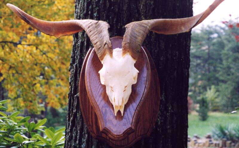
http://students.msj.edu/SmithJessee/art ... tskull.jpg
http://www.wildlifeskulls.com/Merchant2 ... Tall-s.jpg
http://www.forgetjones.com/pit/modules/ ... -skull.jpg
http://www.martinstaxidermy.homestead.c ... _mount.jpg
hmmm...
Not quite "goat" enough for me, I'd say, but we can get it there.
http://www.wildlifeskulls.com/Merchant2 ... Tall-s.jpg
http://www.forgetjones.com/pit/modules/ ... -skull.jpg
http://www.martinstaxidermy.homestead.c ... _mount.jpg
hmmm...
Not quite "goat" enough for me, I'd say, but we can get it there.
Play Frogatto & Friends - a finished, open-source adventure game!
Hello there!
Having (more or less) successfully passed their first crash test in the open forum, I post here the two following icons for the remaining tweaking they require. Any comments?


Having (more or less) successfully passed their first crash test in the open forum, I post here the two following icons for the remaining tweaking they require. Any comments?
Last edited by Leonhard on March 7th, 2006, 3:03 pm, edited 1 time in total.
Here is the plague staff with layers, so the shape of the skull is more easily edited. It is in photoshop format.
- Attachments
-
 pstaff_simplified_layer_structure.zip
- (36.59 KiB) Downloaded 280 times
-
Eleazar

- Retired Terrain Art Director
- Posts: 2481
- Joined: July 16th, 2004, 1:47 am
- Location: US Midwest
- Contact:
Since there's no reason the player should specificly expect an actual goat skull, i don't see that it matters. It's just a stylized caving of a evil horned skull, which may or may not bring "goat" to the players mind.
Leohard:
the gleaming tip of the scorpion's tail is probably overdone. If there was a drop of poison dripping from the tip you might expect a smaller star-burst, otherwise that one particular part doesn't fit with the realism of the new icons IMHO.
Leohard:
the gleaming tip of the scorpion's tail is probably overdone. If there was a drop of poison dripping from the tip you might expect a smaller star-burst, otherwise that one particular part doesn't fit with the realism of the new icons IMHO.
Feel free to PM me if you start a new terrain oriented thread. It's easy for me to miss them among all the other art threads.
-> What i might be working on
Attempting Lucidity
-> What i might be working on
Attempting Lucidity