LordBob's commissionned work
Moderator: Forum Moderators
Forum rules
Before posting critique in this forum, you must read the following thread:
Before posting critique in this forum, you must read the following thread:
Re: LordBob's commissionned work
Anvils can vary in size a lot, the one 15 meters away from me is certainly smaller, but googling "big anvil" gives some seriously huge results. It all depends on what you're working on. (and if you're trying to shape a big armor plate without the use of rollers, a big anvil probably wouldn't hurt)
After reading homunculus's post, I also find my vision not being drawn towards his face at first, but that might just be bias from his post.
After reading homunculus's post, I also find my vision not being drawn towards his face at first, but that might just be bias from his post.

Re: LordBob's commissionned work
I've committed the young ogre portrait, and as we'd discussed, the "great troll" is going in as a hero alternate. Wiring it in is a matter of going into individual campaigns, and deciding that specific enemy leaders are going to use it rather than than the default one. We loosely have at least 7 or 8 "troll hero" leader characters in campaigns, so he'll get plenty of use.
This is how you solve catch-22s in collaborative work; you make a point of providing one side of the equation, and it massively greases the gears towards making the other side resolve itself.
I suggest that you post an uncropped version, and we'll commit it alongside the cropped version. We'll use the cropped version, but the uncropped one will be available in the event that someone wants to add code support.LordBob wrote:I'm all for removing the crop, but it implies either:
- fitting the entire body plus hammer inside a 500*500 frame, which will make him look a lot smaller,
- or cutting the right-side shoulder instead,
- or having a 600 pix width. So far, we know that the 500*500 limit can be exceeded without any major side effects, which has already been done for the elder wose in tRoW.
If any I'd go for the third option, but I'll leave that decision to the smart people around who've a long-term vision for what the game should and should not do in manner of display
@Vultraz: that's partly because some of them do rely on photo overlays(the rock, namely). The rest is careful observation of lots of reference.
This is how you solve catch-22s in collaborative work; you make a point of providing one side of the equation, and it massively greases the gears towards making the other side resolve itself.
Play Frogatto & Friends - a finished, open-source adventure game!
-
LordBob

- Portrait Director
- Posts: 1309
- Joined: December 8th, 2008, 8:18 pm
- Location: Lille, France
- Contact:
Re: LordBob's commissionned work
Duly noted. Until I can post said uncropped version, here's a work in progress of the ogre. He doesn't have lines yet, but other than that he's final.
Want to see more of my art ? Visit my portfolio !

Re: LordBob's commissionned work
Perfect! Again.
-
LordBob
- Portrait Director
- Posts: 1309
- Joined: December 8th, 2008, 8:18 pm
- Location: Lille, France
- Contact:
Re: LordBob's commissionned work
@Jet: Here's my half of the equation, then.
@Zookeeper: Thanks
@Homunculus: I reckon you do have a point regarding the scale of that anvil: it could afford being a tad smaller. Although for indication of scale, one shouldn't pay too much attention to the shields : they're a vague guess on my part, and there are inconsistencies between the different ornaments anyway. However, just this once I'm going to leave it untouched. This is one of those matters on which reaching a widely-shared consensus seems difficult at best, so for now I'd rather move forward than start a round of neverending tweaks. MAybe later, when the rest of the series is concluded.
@Zookeeper: Thanks
@Homunculus: I reckon you do have a point regarding the scale of that anvil: it could afford being a tad smaller. Although for indication of scale, one shouldn't pay too much attention to the shields : they're a vague guess on my part, and there are inconsistencies between the different ornaments anyway.
- Attachments
-
Want to see more of my art ? Visit my portfolio !
-
Simons Mith

- Posts: 821
- Joined: January 27th, 2005, 10:46 pm
- Location: Twickenham
- Contact:
Re: LordBob's commissionned work
Peanut gallery comments. Hope you don't mind:
Definitely don't pay attention to the scale of the 'shield', because it's far too small to be a human-scale shield, unless that guy's literally 30 feet tall. A heater shield would normally be about the length of your arm. But if it was just a heraldic badge, it can be shield-shaped and pretty much any size you please. I did do an image search but I haven't found any wooden badges of about the right size with any indicators of scale.
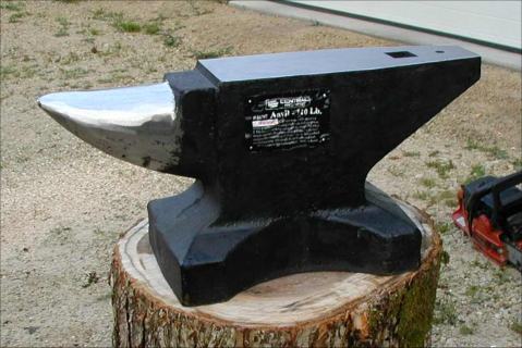
I did find an anvil pic for a 110 pound anvil on top of a log for some scale here:
http://www.spaco.org/Anvil110pound.jpg
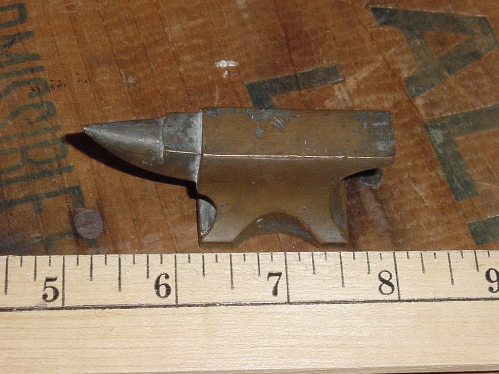
But as AI says, anvils come in all sizes, including smaller rather than larger, as this anvil tree and this jeweler's anvil show:
http://www.habairon.org/Interviews/anvil_tree_6.jpg
http://img0.etsystatic.com/il_fullxfull.275317660.jpg
So, like the 'shields', the anvil can be whatever size the artist decrees it to be. I love the idea that it's a jeweler's anvil and this guy is only a foot and a bit tall.
Definitely don't pay attention to the scale of the 'shield', because it's far too small to be a human-scale shield, unless that guy's literally 30 feet tall. A heater shield would normally be about the length of your arm. But if it was just a heraldic badge, it can be shield-shaped and pretty much any size you please. I did do an image search but I haven't found any wooden badges of about the right size with any indicators of scale.
I did find an anvil pic for a 110 pound anvil on top of a log for some scale here:
http://www.spaco.org/Anvil110pound.jpg
But as AI says, anvils come in all sizes, including smaller rather than larger, as this anvil tree and this jeweler's anvil show:
http://www.habairon.org/Interviews/anvil_tree_6.jpg
http://img0.etsystatic.com/il_fullxfull.275317660.jpg
So, like the 'shields', the anvil can be whatever size the artist decrees it to be. I love the idea that it's a jeweler's anvil and this guy is only a foot and a bit tall.
-
homunculus

- Posts: 537
- Joined: July 21st, 2010, 9:47 pm
Re: LordBob's commissionned work
...and next to the heraldic shield, drawn to the same scale, is the heraldic buckler used as a belt buckle, I guess you will have even more trouble finding a reference for that : )Simons Mith wrote:[...]Definitely don't pay attention to the scale of the 'shield', because it's far too small to be a human-scale shield, unless that guy's literally 30 feet tall. A heater shield would normally be about the length of your arm. But if it was just a heraldic badge, it can be shield-shaped and pretty much any size you please. I did do an image search but I haven't found any wooden badges of about the right size with any indicators of scale.[...]
Are we making an effort trying to deny the obvious?
I mean, one could certainly make things smaller and larger, and maybe the shield is dwarven size but human style, etc, but that would be intriguing rather than stereotypical.
Not that I would be very much interested in starting a holy war over it, but rather it was all the crits I saw at that moment.
As for the shield attracting most attention, it does have that kind of detail and gradient which I believe might be the cause, but in the smaller scaled picture my attention seems to go to the hands rather, and the contrasting paint on the face, which should be good, I guess.
-
LordBob
- Portrait Director
- Posts: 1309
- Joined: December 8th, 2008, 8:18 pm
- Location: Lille, France
- Contact:
Re: LordBob's commissionned work
Tonight's lesson : how poor design and botched research can -and will- ruin any efforts you put in draftsmanship
See, this is all a matter of relative scale : you simply don't realize how large this troll is meant to be because I did't properly define the tools that should help you do so. They're all individually a good indication of how I perceive his size, but no two of them are coherent in their relative scale :
- First, the belt buckle thing ought to be a kettle hat (but isn't recognizable as such due to poor shading)
- Then there's no such thing as a kite shield on him, merely various heater shields. But they're small compared to the anvil.
- Then there are the blades, which while not necessarily swords are very much reminiscent of them, and so are too large compared to the shields and hat
- And then the bones, which more or less fit together but are yet on a different scale compared to all of the above.
- And then the anvil, which has to reach a proper balance with all the rest while remaining bad ass enough for the taste of the average player.
All in all I'd rather avoid the human skull for scale because it's a terrible cliché, but I'll throw one in if I have to.
I really should have thought this over before shading, because it's going to be hell to fix. But like I said : later...
For now, here comes the lined ogre.
- Attachments
-
- ogres-ogre_small.png (56.5 KiB) Viewed 3864 times
-
- ogres-ogre.png (392.36 KiB) Viewed 3864 times
Want to see more of my art ? Visit my portfolio !
Re: LordBob's commissionned work
As for the troll, I seriously doubt whether it's worth "fixing". If as an artist you yourself want to fix it, then by all means do so, but it's not really any sort of a problem if it's possible to find (if you really look for it) a few somewhat inconsistently sized items in a portrait of a creature which is wearing all sorts of random junk you can imagine.

Re: LordBob's commissionned work
For what it's worth, I recognized the belt buckle as a helmet right away. The intended scale seems pretty obvious to me. The only element that stands out in my mind is the anvil, but considering how it will be partially cut off (making its scale fairly irrelevant) I can't see any reason to edit this troll. On the other hand if you were to shrink the anvil, I think it would probably be the simplest way to make all these scale issues go away for the full version.
The detail on your ogre is very nice, BTW!
The detail on your ogre is very nice, BTW!
http://www.wesnoth.org/wiki/User:Sapient... "Looks like your skills saved us again. Uh, well at least, they saved Soarin's apple pie."
-
LordBob
- Portrait Director
- Posts: 1309
- Joined: December 8th, 2008, 8:18 pm
- Location: Lille, France
- Contact:
Re: LordBob's commissionned work
Thanks
You've nailed it: this is me being perfectionist. It very likely beats the quality standards of half my old portraits, but from a designer's point of view if it requires explaination, then it's not good enough - real good art speaks for itself . In other words, while definitely usable in Wesnoth, it still lacks the polish that makes the difference between decent art and portfolio material. And building up a portfolio is important to me
You've nailed it: this is me being perfectionist.
Want to see more of my art ? Visit my portfolio !

Re: LordBob's commissionned work
This troll [edit: oops, I mean ogre] is a great improvement over the earlier version. He now looks both dumb and dangerous.
I find his teeth strange. First I can't figure out how his jaws could get two teeth to point down and one to point up. Perhaps eliminate the tooth on the right. I also think these teeth are too long and too narrow, but that's just an opinion.
I think he would look better if his large ear was somewhat smaller. I think elf when I see that ear.
Last edited by rmj on June 21st, 2012, 5:07 am, edited 1 time in total.
rmj
-
homunculus
- Posts: 537
- Joined: July 21st, 2010, 9:47 pm
Re: LordBob's commissionned work
"ruin" LOL.
The troll is a rather complicated piece, most people will certainly die before they will be able to draw such thing without getting more than three crits from me, some of which seem to have been invalid.
Was it da Vinci who never completed any of his paintings?
And who knows, maybe avoiding unnecessary perfection can also be good for your portfolio.
Therefore I will better not comment on the arm lengths of the ogre
Makes me think that your attention might be too much focused, but I can be wrong, and furthermore such statement without the longer story is somewhat useless anyway.
-
LordBob
- Portrait Director
- Posts: 1309
- Joined: December 8th, 2008, 8:18 pm
- Location: Lille, France
- Contact:
Re: LordBob's commissionned work
Yes, "ruin". I really mean it. No matter how detailed and polished a drawing/painting will be, if it's not supported by good design and solid composition, then albeit beautiful, it's little more than an empty vessel. (admittedly, I wouldn' call the troll a "ruin", but still. Those are some severe mistakes...)
Besides, I would say that becoming -and, more importatly, remaining- a good illustrator is also about how much you ask of yourself in the long run. Constant dissatisfaction is a good fuel for progress.
 The way I understand it it, portfolio material should be either outstanding or not included in portfolio. Once you enter the game business -which I am trying to do- there are many people who can pull off pieces of such quality, and I'm under the impression that art directors are accordingly demanding. But maybe this is a biased view ?
As for the ogre, yes, he does have an arm shorter than the other. And uneven shoulders and almost no neck ; this is yet another not-so-fortunate design choice.
Since ogres are meant to be grotesque, deformed creatures, I willingly kept him out of proportion. However, I didn't manage to make it look like an anomaly of nature (maybe atrophied muscles, swollen joints or deformed bones would have been a better choice). There's a thin line between deformity and imprecise anatomy, and I'd say I'm still looking for it.
But enough self-bashing: here's a study of the generic lich/brown lich. I'm setting the crazy stuff aside for ancient liches, so it retains its human shape and I focused instead on robes that would befit the sorcerer he once was.
Besides, I would say that becoming -and, more importatly, remaining- a good illustrator is also about how much you ask of yourself in the long run. Constant dissatisfaction is a good fuel for progress.
Now there's an interesting discussion.And who knows, maybe avoiding unnecessary perfection can also be good for your portfolio.
As for the ogre, yes, he does have an arm shorter than the other. And uneven shoulders and almost no neck ; this is yet another not-so-fortunate design choice.
Since ogres are meant to be grotesque, deformed creatures, I willingly kept him out of proportion. However, I didn't manage to make it look like an anomaly of nature (maybe atrophied muscles, swollen joints or deformed bones would have been a better choice). There's a thin line between deformity and imprecise anatomy, and I'd say I'm still looking for it.
But enough self-bashing: here's a study of the generic lich/brown lich. I'm setting the crazy stuff aside for ancient liches, so it retains its human shape and I focused instead on robes that would befit the sorcerer he once was.
- Attachments
-
Want to see more of my art ? Visit my portfolio !

Re: LordBob's commissionned work
It's a cool design. but atm has child, or really short person, proportions, only about 5-5.5 heads high.