peasant & spearman
Moderator: Forum Moderators
Forum rules
Before posting critique in this forum, you must read the following thread:
Before posting critique in this forum, you must read the following thread:

peasant & spearman
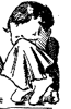
The beginnings of a peasant.

I have linked the image in order to get around the nifty feature this forum has of screwing up posted images. It's more of a problem with shaded images.
I have linked the image in order to get around the nifty feature this forum has of screwing up posted images. It's more of a problem with shaded images.
- Attachments
-
Last edited by doofus-01 on September 2nd, 2008, 1:47 pm, edited 2 times in total.
-
Blarumyrran
- Art Contributor
- Posts: 1700
- Joined: December 7th, 2006, 8:08 pm
Re: peasant
1) i presume the things on his hat are supposed to be loose straws; they look really weird - either change the hats edge to be more irregular, or remove the long loose straws, or both.
2) all faces you draw look exactly the same - and this time, i dont think this kind of jaw fits. peasants should probably have submissive look, and the jaw should look less sharp and "heroic" too. and peasants dont have to be excessively thin - their sprite looks normal.
3) iirc portraits should face right, due to future implementation (yeah, just a flip will too)
4) a white shirt (with some light dirt stains on it) would imo fit better than cyan one - peasants generally wouldnt dye clothes.
* * *
i am not someone who should comment on anatomy tho.

Re: peasant
Note that the figure is slightly off-balance. You need to adjust the positions of the arms, shoulders, hips, and legs, such that he looks correctly 'in-balance'.
Also, a slight tinging of blue in highlights/lowlights can make it appear much 'cleaner' than the ruddy-hued surrounding clothes - it accentuates an already distinct separation between the white and reddish color areas. However, this kind of trick is better used on sprites.
Make the line delineating the edge of the hat have notches in it, occasionally, indicating the separation between the straws that make it up. This kind of thing is a major trick to doing good linework.Syntax_Error wrote:1) i presume the things on his hat are supposed to be loose straws; they look really weird - either change the hats edge to be more irregular, or remove the long loose straws, or both.
No, this kind of gaunt face looks fine for a peasant.Syntax_Error wrote:2) all faces you draw look exactly the same - and this time, i dont think this kind of jaw fits. peasants should probably have submissive look, and the jaw should look less sharp and "heroic" too. and peasants dont have to be excessively thin - their sprite looks normal.
Make sure it flips nicely - this is actually something you should do to all of your drawings, because if it looks weird when you flip it, something is inconsistent about the perspective, and needs to be fixed. No clue if that's the case here, haven't tried it with this one. The difference tends to hit hardest on the original artist doing the drawing, because they have the strongest tunnel-vision about it.Syntax_Error wrote:3) iirc portraits should face right, due to future implementation (yeah, just a flip will too)
Yes, the color choices are a bit wacky. Blue on a shirt like that would only be blue reflected from the white sky above.Syntax_Error wrote:4) a white shirt (with some light dirt stains on it) would imo fit better than cyan one - peasants generally wouldnt dye clothes.
Also, a slight tinging of blue in highlights/lowlights can make it appear much 'cleaner' than the ruddy-hued surrounding clothes - it accentuates an already distinct separation between the white and reddish color areas. However, this kind of trick is better used on sprites.
Play Frogatto & Friends - a finished, open-source adventure game!
Re: peasant
Hrumph.Syntax_Error wrote:all faces you draw look exactly the same
It nearly knocks me out of my chair sometimes. I flipped this peasant a lot before I posted it to make sure that didn't happen.Jetryl wrote:The difference tends to hit hardest on the original artist doing the drawing, because they have the strongest tunnel-vision about it.
The straws were a last minute thing that I regret adding. I probably need to take another pass at the hat, and I also know his right hand isn't so great. But the rest is fixed?
--------Image removed for housekeeping reasons. It was very similar to the one below.--------------------
Last edited by doofus-01 on August 21st, 2008, 1:56 pm, edited 1 time in total.
Re: peasant
It still looks to me like he's unbalanced (falling backwards). I'm not an artist, but would a mild rotation of the image work? Like 3 degrees clockwise or w.e? Or do rotations not bode well for drawings <.<?
Re: peasant
Maybe for a relatively flat and simple image like this it could be OK, but in general I doubt rotating is an acceptable method. Details of the image were drawn with down pointing straight down and they'll become slanted.
He's on his heels, but I don't think he's falling over. I prefer it the way it is, but for comparison (rotated ~5 degrees, flipped):
EDIT: The image is too big, I shouldn't have linked it.
He's on his heels, but I don't think he's falling over. I prefer it the way it is, but for comparison (rotated ~5 degrees, flipped):
EDIT: The image is too big, I shouldn't have linked it.
- Click Me!
Last edited by doofus-01 on August 22nd, 2008, 8:10 pm, edited 1 time in total.
Re: peasant (updated)
Got something done with the hat.
------image removed---------
------image removed---------
Last edited by doofus-01 on August 23rd, 2008, 3:06 pm, edited 1 time in total.

Re: peasant (updated)
The pesant is looking nicer and nicer! The hat, well, it looks nicer, but that is just not how hats look. If you are aiming for a ragged hat look, try curving the rags sticking out, as straw hats are made with a circular pattern. The texturing in the hat suggests the straw coming from the center out, whereas the straw would actually loop around the head. 
I mean, you can make it different if you want, or maybe it is just a wesnoth fashion, but...
I mean, you can make it different if you want, or maybe it is just a wesnoth fashion, but...
Re: peasant (updated)
You're right, the hat is no good. Don't know what I was thinking...
I'm scrapping the loose straw idea, I'll try to make it more like this, looks like it might be more appropriate.
I'm scrapping the loose straw idea, I'll try to make it more like this, looks like it might be more appropriate.
- Attachments
-

Re: peasant (updated)
then remove all the spike or whatever things that are sticking out and make it rounded.
Mica says one who cheats, cheats himself.
You are an Elvish Shyde - Beautiful, natural, and helpful, though sometimes under-appreciated.
You are an Elvish Shyde - Beautiful, natural, and helpful, though sometimes under-appreciated.
-
catwhowalksbyhimself
- Posts: 411
- Joined: January 23rd, 2006, 8:28 am
Re: peasant (updated)
Why? Just because the round style of hat is what we'd expect in our world doesn't mean it would be the common fashion in Wesnoth. It's different, but I sort of like it.
Re: peasant (updated)
To be blunt, it looks dumb in my opinion.
If you're going to keep it that way, honestly, it's one portrait I'll avoid using. No offense, but the hat just looks stupid the way it is now. To be blunt, that is.
If you're going to keep it that way, honestly, it's one portrait I'll avoid using. No offense, but the hat just looks stupid the way it is now. To be blunt, that is.
Mica says one who cheats, cheats himself.
You are an Elvish Shyde - Beautiful, natural, and helpful, though sometimes under-appreciated.
You are an Elvish Shyde - Beautiful, natural, and helpful, though sometimes under-appreciated.
Re: peasant (updated)
imo the foreshortening on this weapon is too much. Also the pants don't wrap all the way around on his right.
Bawling Little Man...
Re: peasant (updated)
My father has had some straw hats, like that one, break. It does not spring out, rather, is simply rips without changing shape.