Portrait attempt: Master at Arms
Moderator: Forum Moderators
Forum rules
Before posting critique in this forum, you must read the following thread:
Before posting critique in this forum, you must read the following thread:
Next try.
- Tried to sculpt drapery. Added fabric edges.
- Added/Emphasized wrapping for hat, cuff and collar. Did not find more spots where this would be appropriate. Perhaps i should do something with his hair.
- Realized that red collar should either curl or white part of collar should be visible. Did something about that.
- Added another face shade like Shadow suggested.
Tell me if you think this was too inconsequently done, a wrong approach or whatever C&C comes to your mind (positive feedback is also appreciated )
)
- Tried to sculpt drapery. Added fabric edges.
- Added/Emphasized wrapping for hat, cuff and collar. Did not find more spots where this would be appropriate. Perhaps i should do something with his hair.
- Realized that red collar should either curl or white part of collar should be visible. Did something about that.
- Added another face shade like Shadow suggested.
Tell me if you think this was too inconsequently done, a wrong approach or whatever C&C comes to your mind (positive feedback is also appreciated
- Attachments
-
- Stutzer7.png (36.98 KiB) Viewed 4014 times

I like your drawing Geirroed.
However, position of his left arm should be fixed. Imagine that you place bones in that arm. If you do that, you'll notice that humerus and ulna/radius do not connect. What I mean to say is that upper part of arm (from shoulder to elbow) is parallel with head, and lower part (elbow to wrist) is almost perpendicular to it (going towards the had), which just can't be.
Having said that, I'd like to repeat that I think you're doing great job, and think picture should be great when arm is fixed
My $0.02
I.

Fixing that isn't a matter of altering the drawn position of it, such as it is, but would best be done by having the fabric bunch up a bit on the inside of the shoulder/armpit.ijuric wrote:I like your drawing Geirroed.
However, position of his left arm should be fixed. Imagine that you place bones in that arm. If you do that, you'll notice that humerus and ulna/radius do not connect. What I mean to say is that upper part of arm (from shoulder to elbow) is parallel with head, and lower part (elbow to wrist) is almost perpendicular to it (going towards the had), which just can't be.
Having said that, I'd like to repeat that I think you're doing great job, and think picture should be great when arm is fixed
My $0.02
I.
-
Shadow
- Posts: 1264
- Joined: September 9th, 2004, 10:27 am
- Location: Following the steps of Goethe
- Contact:
It is a bit more fundamental.
If the arm is in a 90° to the body.
The forearm is correct while the upper arm looks wrong.
If the arm is 180° to the body then for example the frills must be visible from the side.
It is hard to describe what is wrong because the elbow is missing but somewhere the 2 poses are mixed up.
If the arm is in a 90° to the body.
The forearm is correct while the upper arm looks wrong.
If the arm is 180° to the body then for example the frills must be visible from the side.
It is hard to describe what is wrong because the elbow is missing but somewhere the 2 poses are mixed up.
... all romantics meet the same fate someday
Cynical and drunk and boring someone in some dark cafe ...
All good dreamers pass this way some day
Hidin’ behind bottles in dark cafes
Cynical and drunk and boring someone in some dark cafe ...
All good dreamers pass this way some day
Hidin’ behind bottles in dark cafes
I'm not sure if I was clear enough in my last post, but Shadow got it. Imagine that you can take a look at that picture from bird's-eye view and rotate it clockwise a bit so that shoulders are parallel to the edges of the picture.
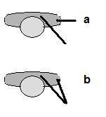
Current picture would look like part a), not b)*.
I.
*I'm aware that position of arm on b is not the greatest. It was quick and dirty sketch in paint.
Current picture would look like part a), not b)*.
I.
*I'm aware that position of arm on b is not the greatest. It was quick and dirty sketch in paint.

you have a great portrait here! he as the true spirite of the master at arms!
the arm question doesn't bother me that much, it may be true - but he still looks great!
your new approach on the materials added a lot to it!
but i'm bothered by the red collar, too. i think it's highlights are too much, they are near the level plastic reflects light. what fabric intended you it to be?
and i think the collars other problem are the planes of clothing. where is it?
is it stiff as board and lies on the grey collars edge? or should it hang over it? or would it lie behind it? that's again the question of the fabric it is made of....
(but again: it is a great portrait!!!)
The drop-shadows you've used for the collar could use a little work. The line of the shadow follows the collar, but doesn't take the distance to the surface underneath into account. For example the shadow over the lapel is the same size as the shadow over the coat, but if the lapel is raised a bit (as the shadow to its left implies), the shadow from the collar onto the lapel would be less pronounced, as the distance is smaller.
Also the directions of the shadows in general are a little inconsistent. Some are pointing more to the left while some are pointing more down.
This is really monor criticism though. I think he looks great, and your latest version is a big improvement over the original posted.
Also the directions of the shadows in general are a little inconsistent. Some are pointing more to the left while some are pointing more down.
This is really monor criticism though. I think he looks great, and your latest version is a big improvement over the original posted
- Attachments
-
- collarshadow.png (5.07 KiB) Viewed 3582 times