A few new item images
Moderator: Forum Moderators
Forum rules
Before posting critique in this forum, you must read the following thread:
Before posting critique in this forum, you must read the following thread:
-
Eleazar

- Retired Terrain Art Director
- Posts: 2481
- Joined: July 16th, 2004, 1:47 am
- Location: US Midwest
- Contact:
Re: A few new item images
It would be helpful if you posted the originals next to your edited version.highhole wrote:I changed the item images:
Citic please...
the armor is "mushy". It needs some crisper edges and stronger lines.
Feel free to PM me if you start a new terrain oriented thread. It's easy for me to miss them among all the other art threads.
-> What i might be working on
Attempting Lucidity
-> What i might be working on
Attempting Lucidity
Thank'stoms wrote: But it looks alieased so both of yours are better, the second try a bit more.
Here are two more versions of the armor.
OK, the second one is to much blue... Maybe it is usual fore a night scenario in the sea
- Attachments
-
- armor2.png (4.38 KiB) Viewed 2062 times
-
- armor.png (4.33 KiB) Viewed 2064 times
Actually,they got the title of the best RPG game.But as for me,that game seems more like eye candy than a real challenging game.As wesnoth is,so let´s not ruin the beauty of it.romnajin wrote:One of the best graphiced games out there(as in in game), Elder Scrolls IV Oblivion, has some of the first icon images of any current game, while, wesnoth is beat in-game, but it's icons are actually better.
-
Eleazar
- Retired Terrain Art Director
- Posts: 2481
- Joined: July 16th, 2004, 1:47 am
- Location: US Midwest
- Contact:
OK, it's better. i've commited it.highhole wrote:OK here is my new storm-triedent try...
I add the normal staff to my version.
how do you want your name in the credits?
Feel free to PM me if you start a new terrain oriented thread. It's easy for me to miss them among all the other art threads.
-> What i might be working on
Attempting Lucidity
-> What i might be working on
Attempting Lucidity
Great thank'sEleazar wrote:OK, it's better. i've commited it.highhole wrote:OK here is my new storm-triedent try...
I add the normal staff to my version.
how do you want your name in the credits?
I'm very happy to be at the credits!!
Fore the time being I want to be unknown... ( I don't want to post my real name...)
I think it is saver...
Last edited by highhole on April 24th, 2006, 12:08 pm, edited 1 time in total.
-
irrevenant

- Moderator Emeritus
- Posts: 3692
- Joined: August 15th, 2005, 7:57 am
- Location: I'm all around you.
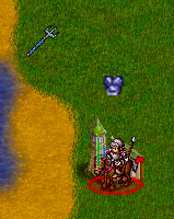
Your trident looks natural in a hex; like it's lying on the ground.highhole wrote:Here are two more versions of the armor.
OK, the second one is to much blue... Maybe it is usual fore a night scenario in the sea...
But the armour looks like it's being worn by an invisible unit. Can you make the armour look like it's lying on the ground like the trident?
Want to post a Wesnoth idea? Great! Read these:
Frequently Posted Ideas Thread
Giving your idea the best chance of acceptance
Frequently Posted Ideas Thread
Giving your idea the best chance of acceptance