Does anyone else think 1.12 looked better than 1.14?
Moderator: Forum Moderators

Does anyone else think 1.12 looked better than 1.14?
Ok that was a total clickbait title. So to clear it up, I'm only talking about the intro screen look.
I don't mean to dis any of the contributions, but I think previous artwork was superior here, and I wonder why it was replaced?
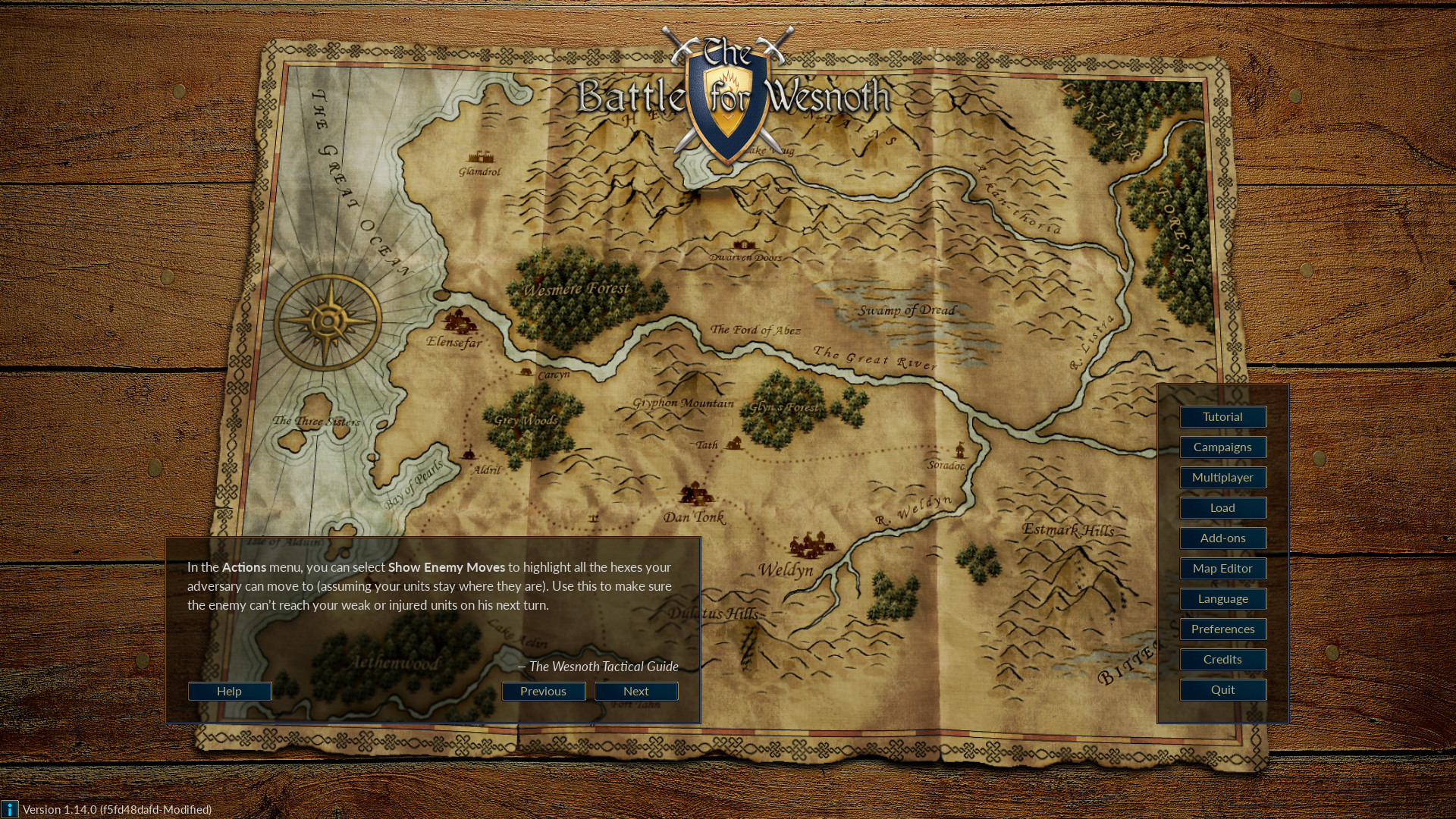
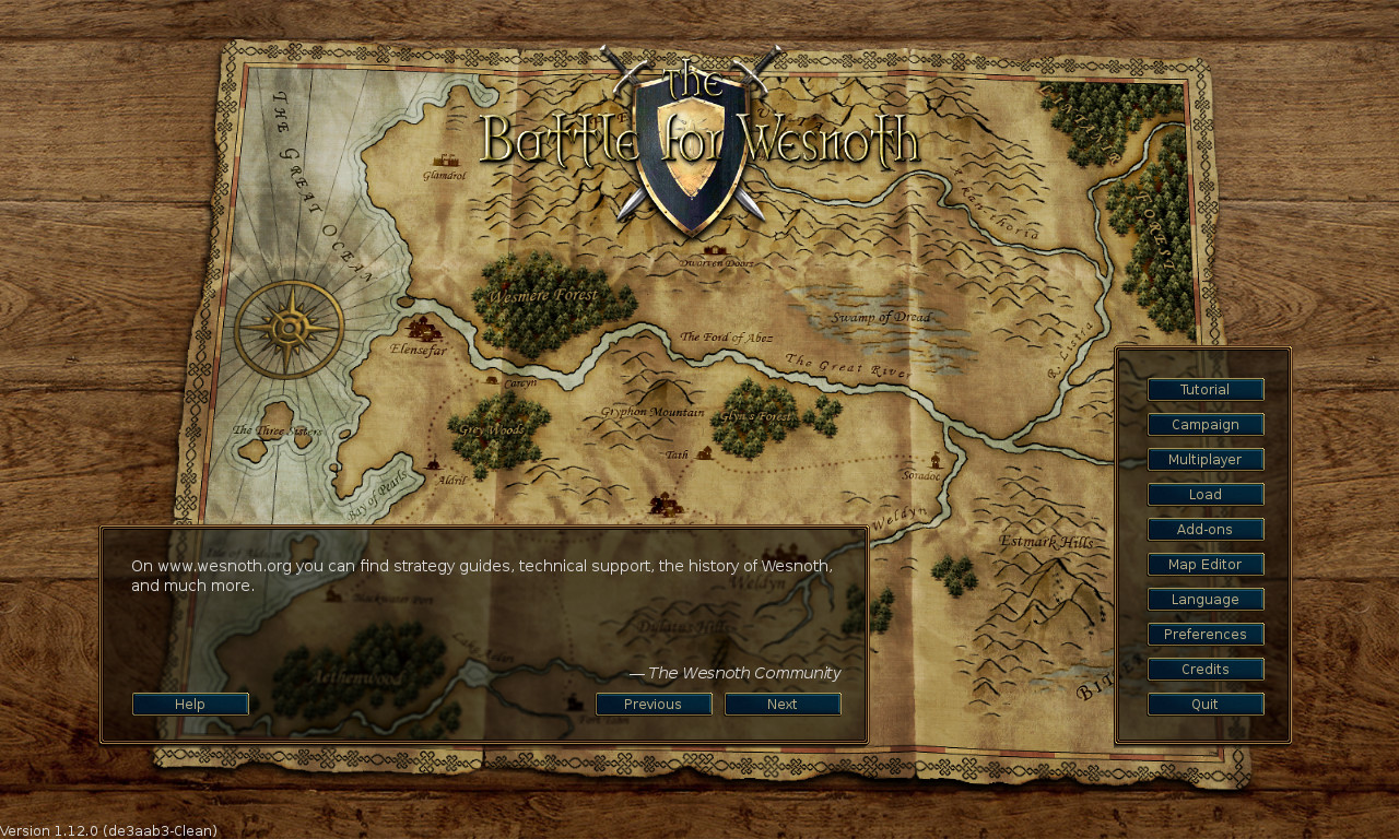
If I check the main menu screens of Wesnoth 1.14 and 1.12 side-by-side, I see several differences.
https://www.wesnoth.org/images/sshots/w ... 14.0-1.jpg
https://www.wesnoth.org/images/sshots/w ... 12.0-1.jpg
Here the details, which one looks better?
Background:
On the right side that looks like a wooden desk-top; on the left that looks like, I don't know... a plastic replica of wood?
Tryhard on the material depth-map or something. Good enough for a render, but why, when the texture-version looked so good?
Interface:
Perhaps only visible to the gfx-nutcases, but the border of the left is a simple square border, whereas the right version is beveled, shadowed and has rounded corners.
It looks much more like being overlaid on the background screen than the left version (which looks flat and painted-on), especially on the big picture.
I liked those slightly rounded borders, they had something - which is missing now.
Logo:
If I wouldn't know which one is newer, I'd totally pick the lower one as the improvement. The only improvement I can find in the new logo is, maybe, the font on top being more legible.
I don't know about anyone else, but to me those Swords seem to have a lot more realisticly reflective surfaces on the bottom (perhaps excepting the Guards). They look like steel blades, not like tin.
The Shield had just the right amount of reflective burn (on the contours reflections) and embossing in the center, the new version looks just ...meh. Looks like it only had 256 colors to choose from; the edge has no more reflective surface but rather looks discolored with age?
And the banner/standard in the center... that doesn't look realistic at all, anymore. It would work painted on cloth, but that filigree design is not something you would really ask someone to emboss into your shield? (Cue some embarrassment when getting laughed out of town.)

In short, it looks more like a Shield some artist would make for a game, which only needs to look like a shield enough for people to know it's supposed to be a shield.

I'm sure there were good reasons for those changes (missing higher resolutions maybe?), but I'm sad to see the old look go, nonetheless.
(And yes, I'm sure late in noticing the "new" looks, but I live on a debian release cycle )
)
I don't mean to dis any of the contributions, but I think previous artwork was superior here, and I wonder why it was replaced?
If I check the main menu screens of Wesnoth 1.14 and 1.12 side-by-side, I see several differences.
https://www.wesnoth.org/images/sshots/w ... 14.0-1.jpg
https://www.wesnoth.org/images/sshots/w ... 12.0-1.jpg
Here the details, which one looks better?
Background:
Tryhard on the material depth-map or something. Good enough for a render, but why, when the texture-version looked so good?
Interface:
It looks much more like being overlaid on the background screen than the left version (which looks flat and painted-on), especially on the big picture.
I liked those slightly rounded borders, they had something - which is missing now.
Logo:
I don't know about anyone else, but to me those Swords seem to have a lot more realisticly reflective surfaces on the bottom (perhaps excepting the Guards). They look like steel blades, not like tin.
The Shield had just the right amount of reflective burn (on the contours reflections) and embossing in the center, the new version looks just ...meh. Looks like it only had 256 colors to choose from; the edge has no more reflective surface but rather looks discolored with age?
In short, it looks more like a Shield some artist would make for a game, which only needs to look like a shield enough for people to know it's supposed to be a shield.
I'm sure there were good reasons for those changes (missing higher resolutions maybe?), but I'm sad to see the old look go, nonetheless.
(And yes, I'm sure late in noticing the "new" looks, but I live on a debian release cycle
Re: Does anyone else think 1.12 looked better than 1.14?
Dude - you gots way too much time on your hand. 
I did not even notice. Even now looking at it I realize that I do not even care to look at such details.
I am mostly interested in gameplay related aspects per se.
I did not even notice. Even now looking at it I realize that I do not even care to look at such details.
I am mostly interested in gameplay related aspects per se.
Re: Does anyone else think 1.12 looked better than 1.14?
I suppose it doesn't matter much when playing on an IPhone ?
Well. I don't look for awesome graphics either when playing Dwarf Fortress.
The point is just... why go backwards in graphic quality? Or perhaps I have strange taste in aesthetics and everyone else actually likes it better.
Well. I don't look for awesome graphics either when playing Dwarf Fortress.
The point is just... why go backwards in graphic quality? Or perhaps I have strange taste in aesthetics and everyone else actually likes it better.