homunculus's two pixels
Moderator: Forum Moderators
Forum rules
Before posting critique in this forum, you must read the following thread:
Before posting critique in this forum, you must read the following thread:
-
homunculus

- Posts: 537
- Joined: July 21st, 2010, 9:47 pm
Re: homunculus's two pixels
@Sleepwalker
Perhaps I got confused about the author, because that guy had another somewhat similar mermaid (which I can no longer find).
That mermaid initiate was super easy to recolor, because the blue, green and yellow parts were quite separate as far as hue-saturation understood them.
A pity it has not been desaturated and scaled to a bit smaller than ogre size (compared to other merfolk).
About the fur wearing creature with the sword not looking enough like an orc, I don't see many characteristic facial features on orc sprites, if a part of the face is visible at all.
So I don't really know what you meant, maybe I should look more at goblins? Or bring the teeth part more forward?
Different from some other people, I am quite comfortable with featureless bulb sprite heads myself, but maybe I am overdoing it.
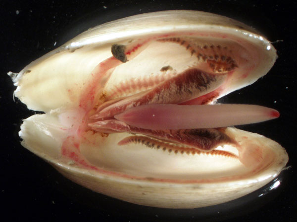
Ok, clam time.
Did some alternatives (including more true to nature shell with ridges becoming less pronounced towards the sides), but the improvements were marginal and I was going for more "sailor's tale" looks anyway, something like: "One of the strangest creatures imaginable--clams--are truly turned inside out. They have bone outside, and flesh and skin inside, and they even have their foot in their mouth!" etc.
And I experimented with leaving the mantle flat magenta, because the mantle is not supposed to be glossy. Is this disturbing?
About the glossy lips: I am not targeting this for mainline (of course the shell could be reused at will), but for a somewhat humorous UMC "Inky's Quest", and the campaign author wrote it was ok.
edit:
made the foot smaller and less zombie color, and experimented with some shell colors (traditional painting shell color vs wesnoth bone color).
Perhaps I got confused about the author, because that guy had another somewhat similar mermaid (which I can no longer find).
That mermaid initiate was super easy to recolor, because the blue, green and yellow parts were quite separate as far as hue-saturation understood them.
A pity it has not been desaturated and scaled to a bit smaller than ogre size (compared to other merfolk).
About the fur wearing creature with the sword not looking enough like an orc, I don't see many characteristic facial features on orc sprites, if a part of the face is visible at all.
So I don't really know what you meant, maybe I should look more at goblins? Or bring the teeth part more forward?
Different from some other people, I am quite comfortable with featureless bulb sprite heads myself, but maybe I am overdoing it.
Ok, clam time.
Did some alternatives (including more true to nature shell with ridges becoming less pronounced towards the sides), but the improvements were marginal and I was going for more "sailor's tale" looks anyway, something like: "One of the strangest creatures imaginable--clams--are truly turned inside out. They have bone outside, and flesh and skin inside, and they even have their foot in their mouth!" etc.
And I experimented with leaving the mantle flat magenta, because the mantle is not supposed to be glossy. Is this disturbing?
About the glossy lips: I am not targeting this for mainline (of course the shell could be reused at will), but for a somewhat humorous UMC "Inky's Quest", and the campaign author wrote it was ok.
- clamanim5.gif (7.48 KiB) Viewed 6237 times
made the foot smaller and less zombie color, and experimented with some shell colors (traditional painting shell color vs wesnoth bone color).
- clamrecolor.png (4.27 KiB) Viewed 6196 times

Re: homunculus's two pixels
The shell is nice, but I'm not sure about the lips. They look like they are pasted on there - not facing the same direction as the shell (more east-southeast instead of southeast) and still looking too much like an ape's lips. I'm sure you can find an example of a clam that has lips like that, but it is still too easy to associate them with a human or chimpanzee mouth. The fact that they are floating is not helping, maybe if the flesh around it were not flat & dark, it could work (and maybe you just haven't gotten to that yet, but it's hard to say before then).
BfW 1.12 supported, but active development only for BfW 1.13/1.14: Bad Moon Rising | Trinity | Archaic Era |
| Abandoned: Tales of the Setting Sun
GitHub link for these projects
| Abandoned: Tales of the Setting Sun
GitHub link for these projects
-
homunculus
- Posts: 537
- Joined: July 21st, 2010, 9:47 pm
Re: homunculus's two pixels
I don't think I can find such clam example, but surely I can find a good analogous example on another subject (cotton history): "There grew there [India] a wonderful tree which bore tiny lambs on the endes of its branches. These branches were so pliable that they bent down to allow the lambs to feed when they are hungrie [sic]."doofus-01 wrote:I'm sure you can find an example of a clam that has lips like that[...]
With a picture like this: http://upload.wikimedia.org/wikipedia/c ... cotton.jpg
An analogous thing is what I am attempting with the clam, this is why the human-like lips and the human-leg-like leg rather than tongue-like leg.
I hope the lips no longer look like ape lips, and that they appear at the correct location now.
And a stab at shading the mantle. Though I want low contrast on the mantle for two reasons: the mantle should be more velvet unlike the lips, and I would need too many colors to create such a large gradient with more contrast. But maybe I have overdone the low contrast and there should be more?
- clamanim8.gif (8.43 KiB) Viewed 6069 times
- clamwalk.gif (1.4 KiB) Viewed 6055 times
 clam.zip
- (162.95 KiB) Downloaded 349 times
Last edited by homunculus on April 18th, 2013, 5:12 pm, edited 1 time in total.
-
Sleepwalker

- Art Contributor
- Posts: 416
- Joined: October 23rd, 2008, 6:34 am
- Location: Sweden
Re: homunculus's two pixels
That is freaky, I thought at first it was a human victim eaten by the clam... I'm not going to have an opinion about the design decisions, just say it is all well made.  Animations and rendering. Don't have any critique except that I doubt the mantle look right being very smooth... Some texture or creases would improve it I think.
I can't quite say what I mean with the orc. A lot of people have made different orc faces for their sprites which I think could be improved. Well I haven't tried to do it myself so I should keep my mouth shut I guess.
I can't quite say what I mean with the orc.
Sometimes we must be hurt in order to grow, fail in order to know, lose in order to gain, and sometimes we must have to be broken so we can be whole again...
- Nercy Masayon
- Nercy Masayon
-
homunculus
- Posts: 537
- Joined: July 21st, 2010, 9:47 pm
Re: homunculus's two pixels
That was major helpful comment, didn't think of that. So perhaps I should do a tongue-like leg after all. Add to that the human leg having a bone inside which might not go well with the campaign main theme.Sleepwalker wrote:That is freaky, I thought at first it was a human victim eaten by the clam...
I did consider this most awesome pattern, but I would need to distort it. Got to see what the new gimp features offer, but the old iWarp didn't seem to enable guides while iWarping. And there is the concern of making the image complicated for the eye. And there is considerable extra work involved to try out which way is better. So far I have more things to try like palette changes.Sleepwalker wrote:Don't have any critique except that I doubt the mantle look right being very smooth... Some texture or creases would improve it I think.
Well, as you don't see my thread being spammed exactly so that I get overworked reading the C&C, I appreciate people's opinions. Although right now commenting on the orc may turn out as time wasted for 2 reasons:Sleepwalker wrote:I can't quite say what I mean with the orc.
1) I should post an update about face changes first.
2) your akladians center column look like better and more interesting orcs than what I had in mind.
- Attachments
-
- association with rotting zombie foot in mouth is not fun.
tongue-like leg is closer to real clam leg after all. - clamwalk2.gif (1.34 KiB) Viewed 5867 times
Last edited by homunculus on April 18th, 2013, 5:13 pm, edited 1 time in total.
-
Sleepwalker
- Art Contributor
- Posts: 416
- Joined: October 23rd, 2008, 6:34 am
- Location: Sweden
Re: homunculus's two pixels
While the pattern is cool by its own, I highly doubt it is fitting for a sprite of that scale (never mind a clam having fish pictures on it). I was more thinking in the way of this or similar.
The kind of jump it does when biting is nice. Though I was thinking how it can bite with its mouth without anything to propel it forward, but I don't want to open that can of worms. Some things have to go unexplained.
Looking good otherwise.
The kind of jump it does when biting is nice. Though I was thinking how it can bite with its mouth without anything to propel it forward, but I don't want to open that can of worms. Some things have to go unexplained.
Looking good otherwise.
Sometimes we must be hurt in order to grow, fail in order to know, lose in order to gain, and sometimes we must have to be broken so we can be whole again...
- Nercy Masayon
- Nercy Masayon

Re: homunculus's two pixels
the lips on that clam look quite human, i'd be afraid of it trying to kiss me

Re: homunculus's two pixels
I just don't get this clam, it creeps me out. Generally clams are hinged and have a tongue type thing, not lips 
-
homunculus
- Posts: 537
- Joined: July 21st, 2010, 9:47 pm
Re: homunculus's two pixels
Well, in a way I guess I get your point about the flying fish pattern as opposed to, say, a clam shell pattern, as humans also wear clothing with skull pattern sometimes (but not always).Sleepwalker wrote:While the pattern is cool by its own, I highly doubt it is fitting for a sprite of that scale (never mind a clam having fish pictures on it). I was more thinking in the way of this or similar.
The kind of jump it does when biting is nice. Though I was thinking how it can bite with its mouth without anything to propel it forward, but I don't want to open that can of worms. Some things have to go unexplained.
Looking good otherwise.
If it would be a patterned mantle, I would prefer a real pattern suitable for a mantle (clothing) over a random noise pattern realistic for a clam.
The jump is related to the pattern thing, originally it was supposed to look like the clam shell opening would lift it a bit higher because ground will not move when the shell opens, and then water flowing in from the forward opened mouth would push it forward. A pattern would make the mantle volume (and the implied flow of water) more readable.
But a reasonable amount of movement from those causes did not look like a threat to the attack target.
So, although starting with best intentions it didn't work and I had to exaggerate it way beyond convincing.
@Crow_T & troll:
It is supposed to be a terrible and creepy monster.
As for the hinge, it is supposed to be behind the clam in the picture (look at the walk cycle sketch, there is a hinge).
About the mantle, you can google it (giant clam, not scallop).
- Attachments
-
- gargantuan-clam.gif (9.04 KiB) Viewed 5557 times
-
- giant-clam.gif (7.67 KiB) Viewed 5557 times

Re: homunculus's two pixels
Nice work! I'm loving some of the textures here. The only thing that's bugging me is that the melee attack animation of both clams seem a little weak - i.e. the actual attack doesn't do justice to the big windup it had. I think they could use more squash upon clamping down, and some motion-blurring might help.
I made a quick edit on the giant clam, mostly just added the motion blur.
However, I'm not much of an animator at this point, so take my word with a grain of salt or two.
I made a quick edit on the giant clam, mostly just added the motion blur.
However, I'm not much of an animator at this point, so take my word with a grain of salt or two.
- Attachments
-
- giant-clam_edit.gif (7.88 KiB) Viewed 5535 times
-
homunculus
- Posts: 537
- Joined: July 21st, 2010, 9:47 pm
Re: homunculus's two pixels
Yes, it seems much better with your motion blur, which I couldn't think of how it could be done on such large moving shell myself.
I will certainly try to incorporate it in the frames, I hope next weekend I'll have some more time for it and the clam can get packaged (if people have more comments, I hope they reach me before that).
I feel there is something fishy about the shading of the mantle and the geometry of the tongue that I cannot yet understand, but the sprite seems usable already even if I will not be able to figure out what is wrong there.

Re: homunculus's two pixels
I like it. It could certainly be used for my adult version of Wesnoth.
Last edited by 8680 on April 8th, 2013, 6:41 am, edited 1 time in total.
Reason: This was posted twice, by accident I assume; I deleted the other post.
Reason: This was posted twice, by accident I assume; I deleted the other post.
-
homunculus
- Posts: 537
- Joined: July 21st, 2010, 9:47 pm
Re: homunculus's two pixels
revisiting some sprites from about a year ago.
back to the clam, removed some deformations that i started to notice, and tried re-shading the mantle up to the point of feeling clueless about how it should be done.
- experimenting with hair colors, keeping the specular highlight the same pure white at constant opacity (45% opacity in this case, layer above the diffuse highlight) for all hair colors
- peasant-woman.png (4.75 KiB) Viewed 5343 times
- groundfish.png (2.04 KiB) Viewed 5331 times
- Attachments
-
- giant-clam.gif (7.64 KiB) Viewed 5316 times
-
Sleepwalker
- Art Contributor
- Posts: 416
- Joined: October 23rd, 2008, 6:34 am
- Location: Sweden
Re: homunculus's two pixels
Not sure what to say. You have done well with the few colors you are using for all of these sprites.
The peasant woman's pose looks a little ill-at-ease, like her back has endured years of hard labor and is paying for it. Was it your intent? The hair colors look nice... Maybe her arms could be a little more defined, they are kind of tubular right now. Otherwise I like it.
The groundfish is very bizarre, is it supposed to be coming out of the ground?
The mantle's shading looks fine to me consider shape and lightning... I don't think there's anything you can do about it without adding colors or texturing/adding creases. You could consider making the sprite counter-lit from the left... Or how about rows of a patter like http://oceanexplorer.noaa.gov/explorati ... am_600.jpg?
Sometimes we must be hurt in order to grow, fail in order to know, lose in order to gain, and sometimes we must have to be broken so we can be whole again...
- Nercy Masayon
- Nercy Masayon
-
homunculus
- Posts: 537
- Joined: July 21st, 2010, 9:47 pm
Re: homunculus's two pixels
You mean, I am using too few colors and should use more because the shading creates contrast lines between the areas?Sleepwalker wrote:You have done well with the few colors you are using for all of these sprites.
The peasant woman's pose is what I previously called "Where are my buckets?" pose, like being busy with farm-work, and as soon as she sees some buckets anywhere she will pick them up and go. It is meant to be more like a ready-stance, ready to pick up the buckets, but if it looks like suffering from severe back pain then I have overdone it and it is a flaw to be corrected. As for the tubular arms, I have noticed it myself, also. Actually I call them "sausage arms", but I lack the anatomy knowledge to create the correct highlight variations there (if someone is interested, redraws are welcome).Sleepwalker wrote:The peasant woman's pose looks a little ill-at-ease, like her back has endured years of hard labor and is paying for it. Was it your intent? The hair colors look nice... Maybe her arms could be a little more defined, they are kind of tubular right now. Otherwise I like it.
I guess it is meant to be swimming in ground. I don't know, because I remember I was bit drunk when I read in the forum that someone wanted a giant man-eating fish which was half-way out of the ground (I even misread that, it was supposed to be man-sized, not man-eating). And I wanted to draw a fish like in this picture (now my version will look pathetic, but it's ok):Sleepwalker wrote:The groundfish is very bizarre, is it supposed to be coming out of the ground?