homunculus's two pixels
Moderator: Forum Moderators
Forum rules
Before posting critique in this forum, you must read the following thread:
Before posting critique in this forum, you must read the following thread:
-
homunculus

- Posts: 537
- Joined: July 21st, 2010, 9:47 pm
Re: homunculus's two pixels
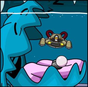
after several wesbreaks, some progress on the clam.
i hope the shell no longer looks angular the wrong way, and the timing of the frames is better.
i don't think it is near completion yet, because i still need the mantle.
i think the mantle could have some teamcolored pattern on it, if i can pull such thing off.
but so far all patterns i have tried look overdone.
- Attachments
-
- clamanim.gif (7.86 KiB) Viewed 6000 times
-
dirtywhitellama

- Posts: 45
- Joined: February 4th, 2011, 3:42 pm
Re: homunculus's two pixels
I'm guessing the flexible bit in the middle is supposed to be, in a manner of speaking, the "mouth" (such as clams have one). it seems like it should extend farther toward the sides to me.
the shape definitely looks more appropriate now though, did good on that.
TC could be spots or stripes on the shell, also, if it doesn't work on the mantle.
the shape definitely looks more appropriate now though, did good on that.
TC could be spots or stripes on the shell, also, if it doesn't work on the mantle.
-
homunculus
- Posts: 537
- Joined: July 21st, 2010, 9:47 pm
Re: homunculus's two pixels
the way i understood the references, the mouth is even smaller.
this is a good one, with mouth on one side and anus (i guess i won't draw everything) on the other side:
http://en.wikipedia.org/wiki/File:Trida ... t_clam.jpg
i am not saying too much realism is good, so if mouth is too small to fit expectations, it might rather be a flaw.
not sure what to do about it, though, if i made the mouth larger it looked out of proportion with the shell.
maybe i made it too small in this version, and should try something in between.
-
dirtywhitellama
- Posts: 45
- Joined: February 4th, 2011, 3:42 pm
Re: homunculus's two pixels
I see what you were going for.
I think typically in illustration we (the viewer) expect to see something more like these idealized, non realistic clams:
http://torrrmund.files.wordpress.com/20 ... =300&h=297
http://rlv.zcache.com/happy_giant_clam_ ... 9p_400.jpg
Especially if the illustration tends toward cartoonishness in general as opposed to realism.
-
homunculus
- Posts: 537
- Joined: July 21st, 2010, 9:47 pm
Re: homunculus's two pixels
so people expect it to look like a giant scallop.
if the lips were to stretch the whole length, they would need to be much bigger.
i did think of doing a scallop for a lower level, but i couldn't stretch the mouth so much.
i made a comparison of smaller mouth like in the last animation on the left, and a larger mouth on the right.
i don't think i can make it larger than that in the baseframe, maybe the mouth could be larger in the more open frames.
- Attachments
-
- clamlips.gif (1.85 KiB) Viewed 5920 times
-
dirtywhitellama
- Posts: 45
- Joined: February 4th, 2011, 3:42 pm
Re: homunculus's two pixels
yes that's probably a more fair description.
As far as a clam, I don't know the mouth itself would even be involved in combat. Maybe I'm wrong but after looking at photos and so on I wouldn't think a clam's mouth would have any particular strength or power. I'd think it more likely to just be the mantle and shell.
I did just realize one set of your animation frames was labelled ranged. what sort of attack were you thinking?
-
homunculus
- Posts: 537
- Joined: July 21st, 2010, 9:47 pm
Re: homunculus's two pixels
yes, the clam would "bite" with the sharp edge of the shell.
as far as i know, the clam in inky's quest has melee attack type 'blade'.
the ranged attack is the clam shooting a pearl like this first sketch:
http://forums.wesnoth.org/download/file.php?id=53996
it would make sense that the clam would shoot pearls from the anus, like here:
http://www.arkive.org/giant-clam/tridac ... G1049.html
but as i wrote earlier, i don't think i will try to make sense here.
seems i got some thinking to do, the impression of "glossy lips" would come from the prominent edge of the mantle at the edge of the shell, like in that first sketch.
but in the later version i am rather keeping the edge bare and having the mantle attached in the inner side of the shell.

Re: homunculus's two pixels
So you're neither going for anatomical correctness nor for 'what the viewer expects' (as dirtywhitellama put it)?
I can't help it, the human mouth in clamlips.gif and especially the human lips on the ranged attack just seem grotesque to me.
I can't help it, the human mouth in clamlips.gif and especially the human lips on the ranged attack just seem grotesque to me.
I have a cunning plan.
-
homunculus
- Posts: 537
- Joined: July 21st, 2010, 9:47 pm
Re: homunculus's two pixels
even worse, a clam has its foot in its mouth, probably will be recognizable in the open mouth frames.nuorc wrote:So you're neither going for anatomical correctness nor for 'what the viewer expects' (as dirtywhitellama put it)?
I can't help it, the human mouth in clamlips.gif and especially the human lips on the ranged attack just seem grotesque to me.
-
Sleepwalker

- Art Contributor
- Posts: 416
- Joined: October 23rd, 2008, 6:34 am
- Location: Sweden
Re: homunculus's two pixels
I think people would better accept the clam once you see the fleshiness around the mouth inside attached to the shell... True it looks a bit bizarre with what looks like a human womans mouth inside, something looking less like a woman's lips would change that. The rendering so far and animations look good.
Sometimes we must be hurt in order to grow, fail in order to know, lose in order to gain, and sometimes we must have to be broken so we can be whole again...
- Nercy Masayon
- Nercy Masayon
-
homunculus
- Posts: 537
- Joined: July 21st, 2010, 9:47 pm
Re: homunculus's two pixels
put the clam aside for a bit, because i couldn't decide if i should change the shape of the shell or not (because then i could draw a larger mouth, methinks).
but as i wanted to animate something, i tried defense animation on the creature from page 4 of this thread.
one is with intermediate frame and one is without, and i wonder which one is better, or if the sword is too large, or what other suggestions people might have.
but as i wanted to animate something, i tried defense animation on the creature from page 4 of this thread.
one is with intermediate frame and one is without, and i wonder which one is better, or if the sword is too large, or what other suggestions people might have.
- Attachments
-
- def2.gif (1.1 KiB) Viewed 5735 times
-
- def3.gif (2.05 KiB) Viewed 5735 times
-
Sleepwalker
- Art Contributor
- Posts: 416
- Joined: October 23rd, 2008, 6:34 am
- Location: Sweden
Re: homunculus's two pixels
The two frame looks best, it gives much more sense of motion... not sure why you would expect any other opinion.
Well, the motion looks good for a 2 frame animation. If you want small critique I'd say the pose he strikes looks a little awkward and not too stable. It's different than any other units defense pose and I like that, though It gives the impression that if he was blocking a strong blow he might stagger or fall backwards.
The sword don't look too big to wesnoth standards I think. The creature looks like it has the physique anyway to handle a thick sword, whatever it is. (golem, homonculus? )
)
The light source seems different comparing his right leg (from our view) to the rest of the body.
Well, the motion looks good for a 2 frame animation. If you want small critique I'd say the pose he strikes looks a little awkward and not too stable. It's different than any other units defense pose and I like that, though It gives the impression that if he was blocking a strong blow he might stagger or fall backwards.
The sword don't look too big to wesnoth standards I think. The creature looks like it has the physique anyway to handle a thick sword, whatever it is. (golem, homonculus?
The light source seems different comparing his right leg (from our view) to the rest of the body.
Sometimes we must be hurt in order to grow, fail in order to know, lose in order to gain, and sometimes we must have to be broken so we can be whole again...
- Nercy Masayon
- Nercy Masayon
-
homunculus
- Posts: 537
- Joined: July 21st, 2010, 9:47 pm
Re: homunculus's two pixels
The problem was that the middle 'reflection frame' was much brighter originally, and the result was a 'blinking sword', and then I felt like making it darker and darker, but as I already knew about the blinking problem, I couldn't help noticing it no matter how dark I made it.Sleepwalker wrote:The two frame looks best, it gives much more sense of motion... not sure why you would expect any other opinion.
And also, perhaps I should try making the frames more on the 'brightest highlight on some bodypart' principle (I hope this is self-explanatory, but maybe it is not).
I was trying to overdo, and there is indeed poor balance there. And the legs are foreshortened/shaded incorrectly.Sleepwalker wrote:Well, the motion looks good for a 2 frame animation. If you want small critique I'd say the pose he strikes looks a little awkward and not too stable. It's different than any other units defense pose and I like that, though It gives the impression that if he was blocking a strong blow he might stagger or fall backwards. [...] The light source seems different comparing his right leg (from our view) to the rest of the body.
Well, since the very beginning I have not been a huge fan of orcs wearing bronze plate, so I tried if I could do something that looks like leather/furs.Sleepwalker wrote:The sword don't look too big to wesnoth standards I think. The creature looks like it has the physique anyway to handle a thick sword, whatever it is. (golem, homonculus?
But then I tried to make the point about rotation around center of mass (like the sword in this animation) and some more physics that the eye should recognize intuitively and created the animation on page 4, thinking of it as some orcish hermit swordsman.
And then someone wrote he would want more primitive orcs for a campaign.
It is an opportunity to try if I can make an animation that takes into account the center of mass and perhaps also has some sloppy-looking relaxed sword fighting (possibly drunken) style influence.
Which will turn out un-pro, of course, because I know neither sword fighting nor the drunken styles (references appreciated, though, especially picture series of basic strikes and blocks, especially with saber).
-----------edit-----------
A quick change of topic to something completely different.
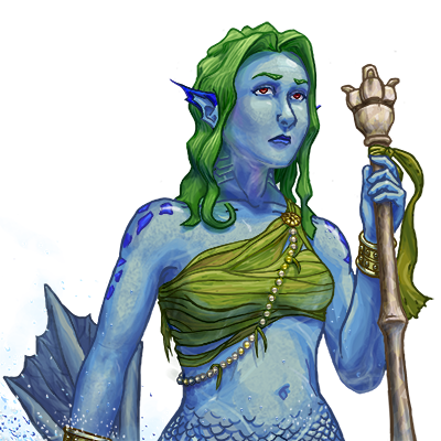
Was looking at my old outdated campaign, and saw the mermaid initiate portrait and thought: what if it would be less saturated? Did some quick hue-saturation and brightness-contrast things, and now I am wondering why such simple adjustment had not been done already.
(I like the other mermaid initiate by the same author better, though, but it seems to be censored in deviantart.)
Also, the WTactics portraits seem to need some more contrast to fit with other Wesnoth merfolk portraits, but that seems to be more complicated.
- Attachments
-
- initiate.png (218.2 KiB) Viewed 5534 times
-
Sleepwalker
- Art Contributor
- Posts: 416
- Joined: October 23rd, 2008, 6:34 am
- Location: Sweden
Re: homunculus's two pixels
Ah, I think if more work was put on the face it would be more easily recognized as an orc. The animation is good, perhaps a bit lacking in momentum. Relaxed swordplay look a little out of place on an orc.
Actually, I did that one, it was my first portrait. Yeah it's old and not that great looking back at it. Hyper saturated and cartoony etc. I did mention to kitty that the old initiate could be desaturated to fit in better with her mermen but it didn't happen. Bet I could do a better portrait now.
I think you might have overdone the contrast/ desaturation a tad. But it is closer to Kitty's style yeah.
Sometimes we must be hurt in order to grow, fail in order to know, lose in order to gain, and sometimes we must have to be broken so we can be whole again...
- Nercy Masayon
- Nercy Masayon
Re: homunculus's two pixels
@sleepwalker
You did this?
I think an update keeping the original mermaids spirit would be so awesome!
You did this?
I think an update keeping the original mermaids spirit would be so awesome!