The Hammer of Thursagan portrait repaints
Moderator: Forum Moderators
Forum rules
Before posting critique in this forum, you must read the following thread:
Before posting critique in this forum, you must read the following thread:
Re: The Hammer of Thursagan portrait repaints
I don't think you've addressed these yet.LordBob wrote:While his gear is rather on the detailed side, the helm and pauldrons are very cartoonish. This is due to :
a) very round shapes
b) lack of details such as rivets, strips of metal, dents, ...
I'm duly noting that you're not done yet and this might already be planned as part of the polishing, but I'll insist there's a lot to be gained in overall quality by getting rid of those cartoonish details.
ride on shooting star
-
homunculus

- Posts: 537
- Joined: July 21st, 2010, 9:47 pm
Re: The Hammer of Thursagan portrait repaints
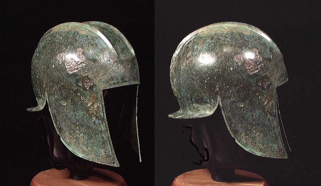
i understand you are attempting this kind of helmet?
http://www.edgarlowen.com/b1094.jpg
well, the cheek guards, might become narrow in the lower part.
having it the other way round seems to contribute to the cartoony looks.
and the cheek guards might be wider and actually cover the ear.
you might try to wear an ordinary cap that way with ears out of the cap.
i guess it would be even more uncomfortable if the cap was made from iron.
there is probably some leather or cloth cap under the helmet, so metal against skin would not be a problem with ears inside.
right now it seems the ears would need to be torn because blows to the side of the head would do exactly that.
and there might be a little rim (or brim, whatever the english-speaking people might call it) at the front edge of the helmet, otherwise the rain would flow straight onto the face.
wider cheek guards (or maybe they should be called ear guards) and a rim might also help to protect the face more.
now all blows deflected from the helmet would be very likely to cut into the face.
and in the face, the mouth seems too far back, or else the jaw is so strong and protruding that it looks cartoony again.
i think bringing the teeth part forward might be better idea, but i am not really pro at facial features.
the neck seems thin like the neck of a teenager.
and there might be some muscle between shoulder and neck so that this part would not look so angular as if there was just the collar bone.
and the edges of the visible part of the breastplate make it look like it is just a metal collar on top of the cloth.
and the sword is hanging at such angle that, considering the points where the scabbard is probably hung to the belt from, the blade of the sword seems almost weightless.
there's something blurry about the arrows in the quiver so that they look bit strange, but i guess that is a really microscopic nitpick.
i hope you got some inspiration where to look for possible minor fixes.
Re: The Hammer of Thursagan portrait repaints
None of the changes you ask for are minor. They might be correct, but when they come in towards the end of the process they´re major fixes. So thanks, but I won´t change any of it unless the portrait directors tell me to.
-
homunculus
- Posts: 537
- Joined: July 21st, 2010, 9:47 pm
Re: The Hammer of Thursagan portrait repaints
well, sorry for that.DUHH wrote:None of the changes you ask for are minor. They might be correct, but when they come in towards the end of the process they´re major fixes. So thanks, but I won´t change any of it unless the portrait directors tell me to.
none of them minor?
you do have the picture in layers, don't you?

Re: The Hammer of Thursagan portrait repaints
Even with layers, you're asking him to redraw major chunks of something that's already shaded.
I think the LordBob quote raised by em3 can be addressed by adding rivets and a rim or lip to the metal around his head and neck. Without really redrawing anything, just detailing.
I think the LordBob quote raised by em3 can be addressed by adding rivets and a rim or lip to the metal around his head and neck. Without really redrawing anything, just detailing.
BfW 1.12 supported, but active development only for BfW 1.13/1.14: Bad Moon Rising | Trinity | Archaic Era |
| Abandoned: Tales of the Setting Sun
GitHub link for these projects
| Abandoned: Tales of the Setting Sun
GitHub link for these projects
Re: The Hammer of Thursagan portrait repaints
Yes. The layers are the problem. Then I have to change the outlines, do new shading, and replicate some of the effects. Had it been a straight painterly style, I could do any fixes on a single layer, now I have to rework many layers.homunculus wrote:well, sorry for that.DUHH wrote:None of the changes you ask for are minor. They might be correct, but when they come in towards the end of the process they´re major fixes. So thanks, but I won´t change any of it unless the portrait directors tell me to.
none of them minor?
you do have the picture in layers, don't you?
The pauldrons are more realistic then they were. I´ll adress the helmet a bit.doofus-01 wrote:Even with layers, you're asking him to redraw major chunks of something that's already shaded.
I think the LordBob quote raised by em3 can be addressed by adding rivets and a rim or lip to the metal around his head and neck. Without really redrawing anything, just detailing.
Re: The Hammer of Thursagan portrait repaints
Better? Worse?
Gah! Getting tired of this one.
Gah! Getting tired of this one.
- Attachments
-
- PeliasF.png (220.87 KiB) Viewed 4895 times

Re: The Hammer of Thursagan portrait repaints
Almost unchanged.DUHH wrote:Better? Worse?
Gah! Getting tired of this one.
I think what LordBob meant is you need to change the helmet and pauldrons so they're made of multiple pieces, because this current "single piece of metal" looks unrealistic. They need to be made of several parts attached together. As far as I understand it, historically, it was very, very difficult to shape free-form pieces of metal like that, so they tended to have armor that was multiple parts of metal riveted together.
For a quick-and-dirty edit to illustrate it, here's a change to the helmet that makes it look like it's comprised of multiple parts of metal:
- Attachments
-
- PeliasX.png (227.83 KiB) Viewed 4676 times
Play Frogatto & Friends - a finished, open-source adventure game!
-
thespaceinvader

- Retired Art Director
- Posts: 8414
- Joined: August 25th, 2007, 10:12 am
- Location: Oxford, UK
- Contact:
Re: The Hammer of Thursagan portrait repaints
Similar things with the leather pauldrons would also help - it's similarly difficult to mould one flat piece of leather into a deep bowl like that. Adding some rivets holding all the pieces together would similarly add realism.
Keep it up =)
Keep it up =)
http://thespaceinvader.co.uk | http://thespaceinvader.deviantart.com
Back to work. Current projects: Catching up on commits. Picking Meridia back up. Sprite animations, many and varied.
Back to work. Current projects: Catching up on commits. Picking Meridia back up. Sprite animations, many and varied.
-
LordBob

- Portrait Director
- Posts: 1309
- Joined: December 8th, 2008, 8:18 pm
- Location: Lille, France
- Contact:
Re: The Hammer of Thursagan portrait repaints
Thanks guys, you totally got my meaning. 
One last fix which my thick brain hadn't deemed good to report earlier : the lighting of the message/scroll. It receives a very bright light, with a constant intensity all along the length of the scroll ; which is hardly coherent with the lighting of his left side and arm. After realizing this, my brain won't stop telling me that the scroll rests on thin air, a foot closer to us than the rider. For a better result, only the tip of the scroll should be lit in such a way. The part that plunges leftwards would be shadowed.
Same goes for the leather of the scabbard.
Thanksfully they're tiny fixes : a couple of brush strokes in darken or multiply mode ought to take care of them.
Re: The Hammer of Thursagan portrait repaints
Scrapped the helmet and started one directly from reference. More of a boring archers-helmet, but it should fit the character.
Will try try finish this one within a week. Gonna go through and look at all the issues raised in these posts, plus make him a little younger.
Will try try finish this one within a week. Gonna go through and look at all the issues raised in these posts, plus make him a little younger.
- Attachments
-
- Pelias2a.png (214.47 KiB) Viewed 3995 times
Re: The Hammer of Thursagan portrait repaints
This is exactly where we were hoping you would go with the helmet. Remember to give the upper edge of that riveted rim some highlighting (only where appropriate, though - it'd disappear in the deep shadow).
Thanks for sticking with this.
Thanks for sticking with this.
Play Frogatto & Friends - a finished, open-source adventure game!
Re: The Hammer of Thursagan portrait repaints
Thanks for the feedback!
Tried to follow all the relevant comments I could find. Committable?
Tried to follow all the relevant comments I could find. Committable?
- Attachments
-
- Pelias2b.png (217.29 KiB) Viewed 3755 times

Re: The Hammer of Thursagan portrait repaints
The helm appears lit from the back and front while nothing else is. The brightest highlight also cuts into the shadow in a strange way, making it feel a little like the large shadow (I'm presuming the side of the helm is supposed to be pretty much flat, right?) is spray-painted on instead of being part of the shading itself. I also feel that a few of the rivets in the shadowed area could use a little more highlighting - mediaeval, or at least Industrial Revolution-age, rivets weren't completely flat like nails, they were more like screws.
Other than those little nitpicks though, I think it's a very good portrait, and the new design is very nice.
Other than those little nitpicks though, I think it's a very good portrait, and the new design is very nice.
"What do you mean, "a dwarvish dragonguard with marksman is overpowered"?"
Story of a Drake Outcast | The Nonsense Era
Played HttT-Underground Channels? Thought it was rubbish? Help us develop it here!
Story of a Drake Outcast | The Nonsense Era
Played HttT-Underground Channels? Thought it was rubbish? Help us develop it here!