Valkiers portraits: It's like I can touch you!
Moderator: Forum Moderators
Forum rules
Before posting critique in this forum, you must read the following thread:
Before posting critique in this forum, you must read the following thread:
-
beetlenaut

- Developer
- Posts: 2825
- Joined: December 8th, 2007, 3:21 am
- Location: Washington State
- Contact:
Re: Valkiers portraits: It's like I can touch you!
This may be a time where two portraits are necessary: a scruffy one and a heroic one. Half the work could be reused, so it wouldn't be as much work as two different characters, and it may be less frustrating than trying to do one impossible drawing.Valkier wrote:It's really the initial part of the story that gives me the most trouble...
Campaigns: Dead Water,
The Founding of Borstep,
Secrets of the Ancients,
and WML Guide
The Founding of Borstep,
Secrets of the Ancients,
and WML Guide
Re: Valkiers portraits: It's like I can touch you!
I've considered the possibility. Not opposed to the idea, just want to make sure every character gets a portrait first. After that I'll go back and add a second. Would just need everyone to be aware of the subtext "OMG THERE WILL BE ANOTHER PORTRAIT STOP TELLING ME <insert random nitpick about minor story continuity detail>" If we can get that dialogue established, then I'll be ready to roll.beetlenaut wrote:This may be a time where two portraits are necessary: a scruffy one and a heroic one. Half the work could be reused, so it wouldn't be as much work as two different characters, and it may be less frustrating than trying to do one impossible drawing.Valkier wrote:It's really the initial part of the story that gives me the most trouble...
Anyhow, I'll be revamping the current portrait with the suggestions people have given me in a few days. Keep em' coming, folks!
Win if you can. Lose if you must. But always cheat.

Re: Valkiers portraits: It's like I can touch you!
Just for a quick reference: There is the difference also in Tallin's sprite, where he starts off as a peasant slave in rags, but once he levels and meets the dwarves he'll get armour and whatnot. That being said, it wouldn't be a bad idea possibly to draw two variants, one for the early scenarios, one for the later ones. One waystone being trained by Hamel, possibly? Who knows.
Then, the second thing is that you'll have a wide choice of weaponry to pick for him: swordsman, pike/halberd or a bow. Making hsi portrait to not have weapons could be a nice touch.
Also, I see your problem in trying to figure out the pose, details and whatnot. But I agree with TSI here: the cocked head makes him look like a wanna-be-ladies-man kid, with a couple of pranks in his mind.
With the pose I'd go as neutral and natural as possible with Tallin and go wild with the rest of the cast. I mean, he'll be in the spotlight all the time anyways. Camerin, the priests, all the wacky stuff can have as weird portraits as you can manage, I'd say. Propably leave Tallin for later?
Just peanuts, listen to the highups! And keep at it! This is one of the most intersting projects in some time.
By the way, the orc's looking so good!
Then, the second thing is that you'll have a wide choice of weaponry to pick for him: swordsman, pike/halberd or a bow. Making hsi portrait to not have weapons could be a nice touch.
Also, I see your problem in trying to figure out the pose, details and whatnot. But I agree with TSI here: the cocked head makes him look like a wanna-be-ladies-man kid, with a couple of pranks in his mind.
With the pose I'd go as neutral and natural as possible with Tallin and go wild with the rest of the cast.
Just peanuts, listen to the highups! And keep at it!
By the way, the orc's looking so good!
"Oh, to the hades with the manners - he's a complete [censored], and calling him that insults bastards everywhere!"
-Nalia De'Arnise
-Nalia De'Arnise
Re: Valkiers portraits: It's like I can touch you!
Just wanted to say thanks to EELuminatus and Kraus for the feedback.
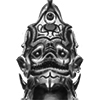
And an update to Rakshas. Narrowed hips, bigger shoulders, blah blah. Probably about ready to be outlined and finished up barring anything the art devs may want.
edit: Made the forearm bigger.
And an update to Rakshas. Narrowed hips, bigger shoulders, blah blah. Probably about ready to be outlined and finished up barring anything the art devs may want.
edit: Made the forearm bigger.
- Attachments
-
- rakshasnew.png (203.72 KiB) Viewed 4801 times
Last edited by Valkier on April 12th, 2011, 9:07 pm, edited 2 times in total.
Win if you can. Lose if you must. But always cheat.
-
thespaceinvader

- Retired Art Director
- Posts: 8414
- Joined: August 25th, 2007, 10:12 am
- Location: Oxford, UK
- Contact:
Re: Valkiers portraits: It's like I can touch you!
While you're at it, add some bulk to the forearm of his axe hand. It looks good at the moment, until you realise that it must be really spindly under all that armour 
http://thespaceinvader.co.uk | http://thespaceinvader.deviantart.com
Back to work. Current projects: Catching up on commits. Picking Meridia back up. Sprite animations, many and varied.
Back to work. Current projects: Catching up on commits. Picking Meridia back up. Sprite animations, many and varied.
Re: Valkiers portraits: It's like I can touch you!
That sounds an awful lot like Luke Skywalker, doesn't it?Valkier wrote:The main problem, and the reason I have tended to stay away from working on Tallin for a bit, is because he's a very conflicting character by description. He's supposed to be this young heroic guy in around his early 20's. He's supposed to fight hordes and hordes of orcs and lead a revolution, but he's a farmer. He's supposed to look tough, but still boyish and handsome enough to attract an elven princess. These are the descriptors I've been given by the campaign caretaker, and honestly they're a bit maddening to try to come to a conclusion with. Add to the fact that everyone has their own idea of what a plucky young hero should look like... Well things just get plain hairy.
It's spelled "definitely", not "definately". "Defiantly" is a different word entirely.
-
thespaceinvader
- Retired Art Director
- Posts: 8414
- Joined: August 25th, 2007, 10:12 am
- Location: Oxford, UK
- Contact:
Re: Valkiers portraits: It's like I can touch you!
It's not really surprising, farmboy made good is a very common trope, and Tallin is a troperiffic hero.
I'd be inclined to go with YOUR interpretation of the character as you have experienced him/had him described. Trying to satisfy everyone equally is asking for problems.
I'd be inclined to go with YOUR interpretation of the character as you have experienced him/had him described. Trying to satisfy everyone equally is asking for problems.
http://thespaceinvader.co.uk | http://thespaceinvader.deviantart.com
Back to work. Current projects: Catching up on commits. Picking Meridia back up. Sprite animations, many and varied.
Back to work. Current projects: Catching up on commits. Picking Meridia back up. Sprite animations, many and varied.
Re: Valkiers portraits: It's like I can touch you!
I'll keep it in mind as a fall back. I do care what the community thinks because they have much more attachment to the project than I do. That is to say, they know the characters better, played more of the campaign (If I sat down and tried to play it I'd have never even gotten to start. I'm THAT bad at Wesnoth), and the experience was just much more intimate for them than what I'll get. But I have spoken to ESR in the past and he's given me his opinion of how things should be done, often in conflict with what the community has in mind.thespaceinvader wrote:It's not really surprising, farmboy made good is a very common trope, and Tallin is a troperiffic hero.
I'd be inclined to go with YOUR interpretation of the character as you have experienced him/had him described. Trying to satisfy everyone equally is asking for problems.
Win if you can. Lose if you must. But always cheat.

Re: Valkiers portraits: It's like I can touch you!
hey, thumbs up for Rakshas portrait. One small thing I'd like to warn you about though, it's a very easy fix anyway. The axe and his right shoulder pad make a tangent, so I guess either cropping the axe or making it a bit bigger in size should fix the problem.
comics, comics
Re: Valkiers portraits: It's like I can touch you!
Addressing my frustrations with my previous Morvin, here's a new version.
As for Talin, I'm still debating with myself here, but I keep leaning more and more towards the previous portrait I started. Not that I am not considering what you guys are saying, I hope you believe that I am, but as I said before I think I should just make a good portrait in general. Whether it fits with everyone's perceptions of what the main character SHOULD look like is impossible for me worry about.
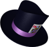
Edit: Also a lich.
As for Talin, I'm still debating with myself here, but I keep leaning more and more towards the previous portrait I started. Not that I am not considering what you guys are saying, I hope you believe that I am, but as I said before I think I should just make a good portrait in general. Whether it fits with everyone's perceptions of what the main character SHOULD look like is impossible for me worry about.
Edit: Also a lich.
- Attachments
-
-
Win if you can. Lose if you must. But always cheat.

Re: Valkiers portraits: It's like I can touch you!
That morvin guy looks like quite a character. Because it is early on, I'll mention that I think his right arm could be a bit too small and the elbow too low. The perspective complicates it, but something clashes with that arm and the head-neck-shoulders.
BfW 1.12 supported, but active development only for BfW 1.13/1.14: Bad Moon Rising | Trinity | Archaic Era |
| Abandoned: Tales of the Setting Sun
GitHub link for these projects
| Abandoned: Tales of the Setting Sun
GitHub link for these projects
Re: Valkiers portraits: It's like I can touch you!
Yeah, I am having a bit of trouble getting his right arm to look right. I also think his head might be a touch too big and showing a touch too much of the underside of his jaw. I'll get some fixes done and push him along tonight.
Thanks for the response.
Thanks for the response.
Win if you can. Lose if you must. But always cheat.
Re: Valkiers portraits: It's like I can touch you!
Main problem with the arm is that the upper arm is too long, I think. If I follow it up from the elbow, I get the impression that his shoulder should be behind his left wrist (ie. connected halfway down his torso).
It also seems like the perspective is a bit weird in general to me... if you look at the belt in particular, it seems a bit like his hips are wider front-to-back than side-to-side. I get the impression that a little more of the (his) right side of his body should be visible, his right shoulder set just a little wider, and the lower body line on (our) right should be further left.
The lich looks pretty cool, though I'm not sure that top hats are in fashion in Wesnoth... while it is an awesome hat, they make me think more of the industrial age than medieval times.
Re: Valkiers portraits: It's like I can touch you!
Progress on Tallin. Classes are over, so I can start kicking this thing down and finally finish it all up.
edit:
Issues I see so thus far:
Sword alignment is a little off
Looks very plain
Cape could look more clothy.
edit:
Issues I see so thus far:
Sword alignment is a little off
Looks very plain
Cape could look more clothy.
- Attachments
-
Win if you can. Lose if you must. But always cheat.

Re: Valkiers portraits: It's like I can touch you!
Hi there again!
I like the blocky approach you're using for Tallin! The outfit and colour scheme are pretty nice.
But I have some structural issues. Especially the head is wonky: You would never see that much of the top of the head if you have the face at this angle! Due to that the size is also mangled – the overall size of the head is right but because the hairline is way too low the face's size is too small. Are you using reference? Also the ear is too tiny and should be at more of an angle, the rear eye is too high and seems blind (due to being too white) and the jaw-line extends a tad too far back.
The rear arm's forearm could stand to be a bit shorter. I am by no means a weapon expert but to me the sword handle seems too long to be handled single-handedly and too short for a two-handed one.
And finally, the front arm: I'm confused by the middle-brown spot between upper and lower arm – what's that supposed to be? Apart from that, the foreshortening has some problems. It simply is too extreme. It's not really wrong but it's more of a photography-kind of distortion than what we generally do for Wesnoth. Whether tone it down (a lot) or get rid of it completely. Also the lower arm is too slender and tube-like.
Do you also want critiques on Morvin and the lich or are those only preliminary studies?