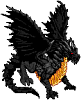
little creation for fun
Moderator: Forum Moderators
Forum rules
Before posting critique in this forum, you must read the following thread:
Before posting critique in this forum, you must read the following thread:
Re: little creation for fun
I do this tomorrow, it's time for sleeeeeeeeeping ^^ But i will use your tutorial ty 

Re: little creation for fun
I think you're slightly missing the point. Wesnoth art that looks properly like Wesnoth art must be drawn pixel by pixel. Vector art is going to look like a blurry mess because the scale's too small.Memrarch wrote:YEs but if you resize your image ( add or remove size ) the pixels's location change and finally, its not the original pic readjusted..It's a completely different pic. MAybe with vector graphic ?
"What do you mean, "a dwarvish dragonguard with marksman is overpowered"?"
Story of a Drake Outcast | The Nonsense Era
Played HttT-Underground Channels? Thought it was rubbish? Help us develop it here!
Story of a Drake Outcast | The Nonsense Era
Played HttT-Underground Channels? Thought it was rubbish? Help us develop it here!

Re: little creation for fun
You really need to put giant images like that in spoilers.
My spritework can be seen here.
Want to play Roll 2 Dodge, or even start your own game?http://rolltododge.freeforums.org/index.php We need you!
Want to play Roll 2 Dodge, or even start your own game?http://rolltododge.freeforums.org/index.php We need you!
-
homunculus

- Posts: 537
- Joined: July 21st, 2010, 9:47 pm
Re: little creation for fun
yeah, the sprite's body is facing south-east, but the left edge of the cloak looks like it is too much in the front, it just brings the left side towards us, and what little is seen of the breastplate does not quite change the impression to south-east.
i think it is both about the visible shape of the left side of the cloak and also about its shading.
btw they say in the forums that the light direction should be about 45 degrees from the right (although to me it seems most wesnoth sprites are done with light much more from the front).
as for the smooth transitions that you have there, the sprite will look more crisp if you use less shades of colors.
people in the forum say 4 shades of a color should usually be enough.
depending on the size of the surface, if it is a large surface with smooth transition from light to shadow and you use too few shades and you see some contrast effect between two shades, then you might want to use more shades to make it smooth.
i sometimes draw with soft brushes and then use posterize in gimp or convert to indexed palette (that method is probably frowned upon and i think i am starting to figure out why, but it is a quick one).
Re: little creation for fun
i'm working about that Look and enjoy ( its not finish ) its an position SE more dynamic.
- Attachments
-
- project.png (58.68 KiB) Viewed 3249 times
Re: little creation for fun
That's why your sprites look odd, blurry, and half-transparent: you work at an incredibly large size, x400 or so.Memrarch wrote:i'm working about that
See, when you scale down something that big to 72x72, you lose detail and shading, the lineart vanishes, and it becomes half-transparent. That's why it doesn't look Wesnoth style, not just that it (was) facing the wrong way.I wrote:Wesnoth art that looks properly like Wesnoth art must be drawn pixel by pixel
I suppose I'd better drop this before someone yells at me for critiquing style differences while not being an Art Dev though.
"What do you mean, "a dwarvish dragonguard with marksman is overpowered"?"
Story of a Drake Outcast | The Nonsense Era
Played HttT-Underground Channels? Thought it was rubbish? Help us develop it here!
Story of a Drake Outcast | The Nonsense Era
Played HttT-Underground Channels? Thought it was rubbish? Help us develop it here!
Re: little creation for fun
seems like he's missing his right elbow..and the above
from my own experience most work shrunk into spritesize needs pixelisation corrections
there's no reason why not to do it this way, but resizing shouldn't be the last step
from my own experience most work shrunk into spritesize needs pixelisation corrections
there's no reason why not to do it this way, but resizing shouldn't be the last step
Like cats? I've made a whole faction of them to kick ass with!
Don't like cats? I've made a whole faction of them to kick their asses! So everyone's happy :)
Felinian faction is part of the Beyond Southern Hells era
kitties need sprites! art topic here
Don't like cats? I've made a whole faction of them to kick their asses! So everyone's happy :)
Felinian faction is part of the Beyond Southern Hells era
kitties need sprites! art topic here
Re: little creation for fun
It's done, i had worked pixel by pixel and the result...i think is good :


Re: little creation for fun
hmm..getting better, but somethingwill have to be done about those shoes, and the mask could probably use having a pixel or two more vertically, or at least the mouth part should move a pixel downwards
Like cats? I've made a whole faction of them to kick ass with!
Don't like cats? I've made a whole faction of them to kick their asses! So everyone's happy :)
Felinian faction is part of the Beyond Southern Hells era
kitties need sprites! art topic here
Don't like cats? I've made a whole faction of them to kick their asses! So everyone's happy :)
Felinian faction is part of the Beyond Southern Hells era
kitties need sprites! art topic here
-
thespaceinvader

- Retired Art Director
- Posts: 8414
- Joined: August 25th, 2007, 10:12 am
- Location: Oxford, UK
- Contact:
Re: little creation for fun
As a general rule of art in general, and spriting in particular: don't ever use pure black. Nothing in nature is pure black, there is always ambient light and there is no perfectly absorbent surface. Look at the human assassin sprite - that's about as close as you ought to be going to pure black, and is a good example of how to shade black clothing.
http://thespaceinvader.co.uk | http://thespaceinvader.deviantart.com
Back to work. Current projects: Catching up on commits. Picking Meridia back up. Sprite animations, many and varied.
Back to work. Current projects: Catching up on commits. Picking Meridia back up. Sprite animations, many and varied.
Re: little creation for fun
well done.. thanks for advised comments and support !! i had finished my first picture  Shadow + colors + SE + good size !

Uploaded with ImageShack.us
Feel the power of blood !! muahahahah ! :p

Uploaded with ImageShack.us
Feel the power of blood !! muahahahah ! :p
Re: little creation for fun
Corrected the arms' metal shading. Metal has spectacular highlights, so where the light's shining on it, it should be almost white. Yours looks more like an exceptionally dull plastic at the moment.
- I fixed part of the black outline and shadow while I was at it.
- sanguinus00006.png (8.14 KiB) Viewed 3166 times
"What do you mean, "a dwarvish dragonguard with marksman is overpowered"?"
Story of a Drake Outcast | The Nonsense Era
Played HttT-Underground Channels? Thought it was rubbish? Help us develop it here!
Story of a Drake Outcast | The Nonsense Era
Played HttT-Underground Channels? Thought it was rubbish? Help us develop it here!
Re: little creation for fun
The shining's effect is very complex... Many variables issues... With fire, pure light , ice bolt, ect...( done )
- Attachments
-
- sanguinus00006.png (5.81 KiB) Viewed 3138 times
Re: little creation for fun
Defense 
Cast
Attack ( miss one picture between first an second )


3 mistakes in correction ; ) ( cloak and hat )

Cast

Attack ( miss one picture between first an second )


3 mistakes in correction ; ) ( cloak and hat )

Re: little creation for fun
Two points:
1) Defense animations typically consist of two frames, so you might want to add a second one.
2) Your animation suffer a great flaw, oft-seen in newcomers' works: only the active elements are moving. There is no cheap and easy way to do animations by reusing 90% of the base sprite: it won't look good. Take that sword slash: shouldn't the unit lunge forward, rolling his waist and shoulders, which would make the cape fly around or something? Look at some mainline animations: you'll see that very little is left still throughout.
Jazz is not dead, it just smells funny - Frank Zappa
Current projects: Internet meme Era, The Settlers of Wesnoth
Current projects: Internet meme Era, The Settlers of Wesnoth