Vranca´s artwork
Moderator: Forum Moderators
Forum rules
Before posting critique in this forum, you must read the following thread:
Before posting critique in this forum, you must read the following thread:
Re: Vranca´s artwork
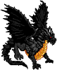
wait wait wait..is that a polearm..or are those his arms??
Like cats? I've made a whole faction of them to kick ass with!
Don't like cats? I've made a whole faction of them to kick their asses! So everyone's happy :)
Felinian faction is part of the Beyond Southern Hells era
kitties need sprites! art topic here
Don't like cats? I've made a whole faction of them to kick their asses! So everyone's happy :)
Felinian faction is part of the Beyond Southern Hells era
kitties need sprites! art topic here
-
JackBarber

- Posts: 272
- Joined: October 27th, 2009, 4:43 pm
- Location: In your head.
Re: Vranca´s artwork
It's a Double Sided Scythe/Sickle...
"Do YOU know the muffin man?"
."Don't wake me if I'm dreaming."
.."Even words can drive a man to madness."
."Don't wake me if I'm dreaming."
.."Even words can drive a man to madness."
-
PeterPorty

- Translator
- Posts: 310
- Joined: January 12th, 2010, 2:25 am
- Location: Chair, In-Front-Of-Computer
Re: Vranca´s artwork
StDrake wrote:wait wait wait..is that a polearm..or are those his arms??

Red are the arms and blue is the sickle/polearm/halberd/whatever, weapon.
At least that's how I read it...
EDIT: Although I do think the weapon's not-blade part should be another color, maybe... something metallic? Or the same color severely desaturated and darkened/lightened up?
"The real world is for people who can't imagine anything better."
-
thespaceinvader

- Retired Art Director
- Posts: 8414
- Joined: August 25th, 2007, 10:12 am
- Location: Oxford, UK
- Contact:
Re: Vranca´s artwork
OOOOH right. Now I see how it works. Yeah, it's a good sprite, but you really, REALLY need to use a different colour to distinguish the weapon's haft from his... skin? carapace? armour?
http://thespaceinvader.co.uk | http://thespaceinvader.deviantart.com
Back to work. Current projects: Catching up on commits. Picking Meridia back up. Sprite animations, many and varied.
Back to work. Current projects: Catching up on commits. Picking Meridia back up. Sprite animations, many and varied.

Re: Vranca´s artwork
You read it well.Red are the arms and blue is the sickle/polearm/halberd/whatever, weapon.
I see the problem,it is hard to read,i'll change the color of the weapon tomorrow and i'll post him then. Thanks for crit everyone
EDIT:I did an edit,is it good?
- Attachments
-
- Reaper1.png (3.33 KiB) Viewed 3643 times
My sprites,My Minitroops
Philip II of Macedon:"If I win this war, you will be slaves forever."
The Spartan ephors:"If."
Subsequently, both Philip and Alexander would avoid Sparta entirely.
Philip II of Macedon:"If I win this war, you will be slaves forever."
The Spartan ephors:"If."
Subsequently, both Philip and Alexander would avoid Sparta entirely.
-
PeterPorty
- Translator
- Posts: 310
- Joined: January 12th, 2010, 2:25 am
- Location: Chair, In-Front-Of-Computer
Re: Vranca´s artwork
I think it's better, and the only advice I can give is... well, the back is weird. I know it's supposed to be big, and maybe his head is down, but it looks just... strange to me. Also, just because I am strange and all, I kind of think the upper part of the weapon is too short, I almost see he's cleaning his ear with it.
"The real world is for people who can't imagine anything better."

Re: Vranca´s artwork
I think it is because the way his head is positioned. I noticed it, too. Atm, it appears that he's a hunchback, except his head slid down his neck instead of being bent overPeterPorty wrote:well, the back is weird. I know it's supposed to be big, and maybe his head is down, but it looks just... strange to me.
I would move the head a bit upwards, but not quite on top of his shoulders. About halfway between his shoulders and his present location would be nice.
Re: Vranca´s artwork
Since that guy will be redrawn i did the other lvl3 so here it is. Crit welcome as always.
- Attachments
-
- Guard of Ean.png (3.61 KiB) Viewed 3597 times
My sprites,My Minitroops
Philip II of Macedon:"If I win this war, you will be slaves forever."
The Spartan ephors:"If."
Subsequently, both Philip and Alexander would avoid Sparta entirely.
Philip II of Macedon:"If I win this war, you will be slaves forever."
The Spartan ephors:"If."
Subsequently, both Philip and Alexander would avoid Sparta entirely.

Re: Vranca´s artwork
I'm having a little trouble reading their faces. The advantage to the doll-like proportions of most Wesnoth sprites is that key features can be emphasized & detailed. This last one looks a little more "realistically" proportioned.
BfW 1.12 supported, but active development only for BfW 1.13/1.14: Bad Moon Rising | Trinity | Archaic Era |
| Abandoned: Tales of the Setting Sun
GitHub link for these projects
| Abandoned: Tales of the Setting Sun
GitHub link for these projects
Re: Vranca´s artwork
Yeah his head is the same size as the one of lvl2,should i make it larger?
There isn't a lot of details in their faces they should look similar to this
There isn't a lot of details in their faces they should look similar to this
My sprites,My Minitroops
Philip II of Macedon:"If I win this war, you will be slaves forever."
The Spartan ephors:"If."
Subsequently, both Philip and Alexander would avoid Sparta entirely.
Philip II of Macedon:"If I win this war, you will be slaves forever."
The Spartan ephors:"If."
Subsequently, both Philip and Alexander would avoid Sparta entirely.
Re: Vranca´s artwork
If having no face is part of what they are, I guess it makes sense to not emphasize that part. But I would still try to draw fewer details, to allow room for the important ones. He would still have eyes, for example?
His right shoulder pad has a strong outline, while the hand below it doesn't. If you think of the outline sort of like a shadow - so there is some consistency in how it is applied, I also think that will help clear things up. It looks like you did that to some extent, maybe you just missed a few places.
His right shoulder pad has a strong outline, while the hand below it doesn't. If you think of the outline sort of like a shadow - so there is some consistency in how it is applied, I also think that will help clear things up. It looks like you did that to some extent, maybe you just missed a few places.
BfW 1.12 supported, but active development only for BfW 1.13/1.14: Bad Moon Rising | Trinity | Archaic Era |
| Abandoned: Tales of the Setting Sun
GitHub link for these projects
| Abandoned: Tales of the Setting Sun
GitHub link for these projects
Re: Vranca´s artwork
You are right,I forgot a few places good catch,thanks.His right shoulder pad has a strong outline, while the hand below it doesn't. If you think of the outline sort of like a shadow - so there is some consistency in how it is applied, I also think that will help clear things up. It looks like you did that to some extent, maybe you just missed a few places.
Well he does have them,they are blue,I thought it was obviousHe would still have eyes, for example?
My sprites,My Minitroops
Philip II of Macedon:"If I win this war, you will be slaves forever."
The Spartan ephors:"If."
Subsequently, both Philip and Alexander would avoid Sparta entirely.
Philip II of Macedon:"If I win this war, you will be slaves forever."
The Spartan ephors:"If."
Subsequently, both Philip and Alexander would avoid Sparta entirely.

Re: Vranca´s artwork
Now that you mention it... Sort of. If you include a brow, or dark pixel for shade of a sunken eye, it might help. If you need to make the head bigger, you could make the shoulders bigger to prevent him from looking child-like.Vranca wrote:Well he does have them,they are blue,I thought it was obvious :(
BfW 1.12 supported, but active development only for BfW 1.13/1.14: Bad Moon Rising | Trinity | Archaic Era |
| Abandoned: Tales of the Setting Sun
GitHub link for these projects
| Abandoned: Tales of the Setting Sun
GitHub link for these projects

Re: Vranca´s artwork
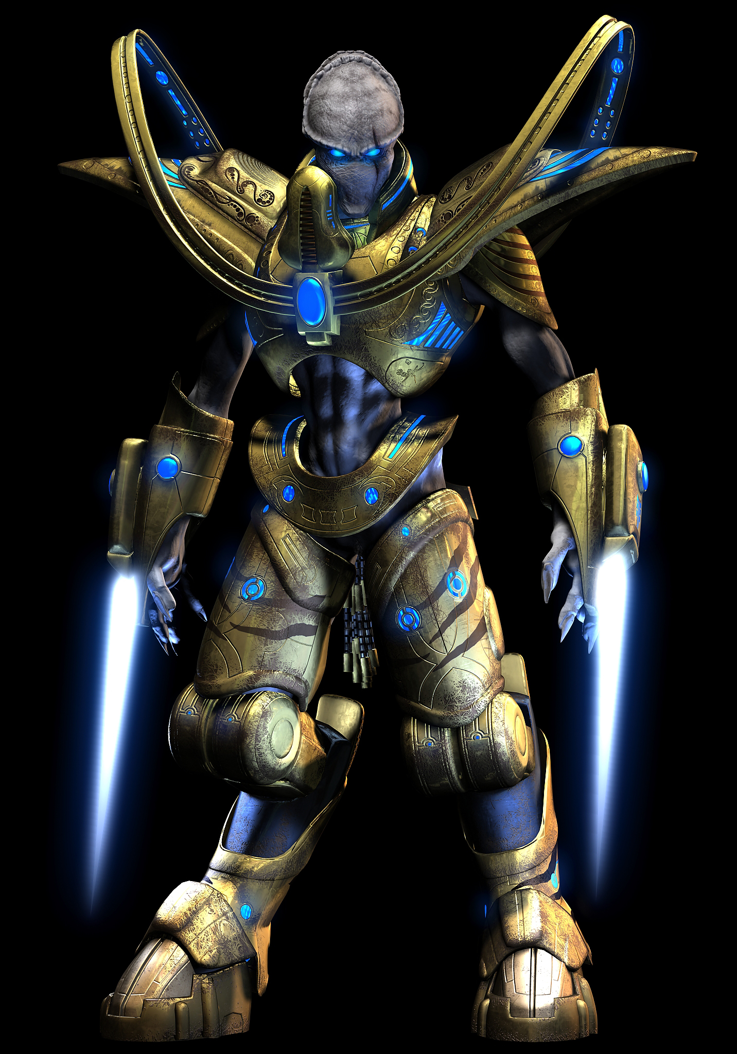
Maybe you should change the blue to magenta to give it some TC?