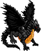
Frogger's art. Possible UMC story art.
Moderator: Forum Moderators
Forum rules
Before posting critique in this forum, you must read the following thread:
Before posting critique in this forum, you must read the following thread:

Re: Frogger has a second fresh attempt at spriting.
Scary big az swords indeed!  Hide!
Hide!
Only big problems are:
• The big az horns are facing south, but the visor is looking southeast.
• The gold looks like there are only two shades. Try having a dark shade, a normal shade, a bright shade and a near-white shade (use sparingly) perhaps?
• One sword is vertical and the other looks, er, like he's stabbing himself in the heel...
But otherwise, awesome! OTT FTW!
"What do you mean, "a dwarvish dragonguard with marksman is overpowered"?"
Story of a Drake Outcast | The Nonsense Era
Played HttT-Underground Channels? Thought it was rubbish? Help us develop it here!
Story of a Drake Outcast | The Nonsense Era
Played HttT-Underground Channels? Thought it was rubbish? Help us develop it here!

Re: Frogger has a second fresh attempt at spriting.
There more than two shades. 
• There is the darkest blue, which is used only for outlines.
• There is the lighter blue, used for the darkest shadows.
• A dark brown
• A lighter brown
• A golden yellow
• A lighter golden yellow
• And white

The fact that you can only see two shades is probably a good thing.
I'll bear all that in mind when I edit it next.
And those horns, yes
• There is the darkest blue, which is used only for outlines.
• There is the lighter blue, used for the darkest shadows.
• A dark brown
• A lighter brown
• A golden yellow
• A lighter golden yellow
• And white
The fact that you can only see two shades is probably a good thing.
I'll bear all that in mind when I edit it next.
And those horns, yes
My spritework can be seen here.
Want to play Roll 2 Dodge, or even start your own game?http://rolltododge.freeforums.org/index.php We need you!
Want to play Roll 2 Dodge, or even start your own game?http://rolltododge.freeforums.org/index.php We need you!

Re: Frogger has a second fresh attempt at spriting.
That's not bad! You're markedly improving with pallete usage and placement, though proportions could be worked on a little. Notably, your legs are a bit too short to sustain such a top-heavy unit, making the unit look stumpy overall. The horns and sword pull the visual balance further up as well, adding to the unit's top-heavy look. Maybe I'll try a fix in a second.
EDIT: Alright, here's a short seminar and stuff.
Every spriter has a slightly different set of Internalized Proportions in Pixelart. That is, they tend to focus on different things when they do pixelart and emphasize them accordingly. On this tiny scale of pixels, proportions are necessarily exaggerated in order to create focus. Differences in proportions are expected and can be used artistically at a high skill level. Everyone has their own set and one of the things to do at this level is to figure out what you tend to like drawing and what you don't. I can tell from your sprite you like the torsos and arms. For me, I trend towards longer legs to fit more detail in, and larger weapons for the same reason. In my edit, I simply shortened your arms a bit, lengthened your legs, and shortened the horns (they looked absurdly huge, compare to my first example sprite).
About your pallete- it's oversaturated. In comparison to two of my other gold-ish sprites, in zooming in you can tell that the first one has an extremely desaturated, almost-copper pallete that converts to gold under 1:1 resolution due to eye trickery. Same with the next one- there's even a shade of pink and a shade of gray-offwhite in there too. Notably, your blue is a bit too saturated. Such color scheme would be more usable for a large-scale piece of pixelart, something less realistic and more stylistic, than application to Wesnoth. (I tried using MS Paint to recolor your sprite's pallete, but for some reason it didn't like the pallete you used.)
And there you have it- the two major issues with your sprite, proportions and palette. Notably, I once did a sprite that's approximately on the same skill-level and efficiency of pallete usage. I think it might be... enlightening (and a bit comedic to say the least). Note the incredible pallete inefficiencies and the top-heavy nature of the sprite. (ugh, hate looking at my old stuff lol)
- Attachments
-
- Frogger's yellow dood.PNG (10.68 KiB) Viewed 4457 times
Re: Frogger has a second fresh attempt at spriting.
Look on the bright side, he'd be awesome at American football.
Thanks for those tips, I'd better get to work on this.
Thanks for those tips, I'd better get to work on this.
My spritework can be seen here.
Want to play Roll 2 Dodge, or even start your own game?http://rolltododge.freeforums.org/index.php We need you!
Want to play Roll 2 Dodge, or even start your own game?http://rolltododge.freeforums.org/index.php We need you!
Re: Frogger has a second fresh attempt at spriting.
Sorry for the double post.
Anyway, I tweaked the proportions a little, I experimented a bit with the colours, and this is what came out.
Original palette, proportion tweaks
Proportion tweaks with Darker colours replaced by Zero's palette
No proportion tweaks, almost completely replaced by Zero's palette.\
What do people think?
Anyway, I tweaked the proportions a little, I experimented a bit with the colours, and this is what came out.
- 41 copy 1.png (2.7 KiB) Viewed 4428 times
- 41 copy z.png (6.06 KiB) Viewed 4428 times
- 41 copy.png (6.1 KiB) Viewed 4428 times
What do people think?
My spritework can be seen here.
Want to play Roll 2 Dodge, or even start your own game?http://rolltododge.freeforums.org/index.php We need you!
Want to play Roll 2 Dodge, or even start your own game?http://rolltododge.freeforums.org/index.php We need you!
Re: Frogger has a second fresh attempt at spriting.
I think you may be using the palette badly. See, if you look at the gold trim (or whatever) on the Overlord - that's the guy with the axe - it looks gold.
Yours somehow came out green...
EDIT: You might be able to get some ideas for this sort of thing from Eternal's golden armour recolouring.
Yours somehow came out green...
EDIT: You might be able to get some ideas for this sort of thing from Eternal's golden armour recolouring.
Last edited by Reepurr on December 29th, 2010, 10:55 am, edited 1 time in total.
"What do you mean, "a dwarvish dragonguard with marksman is overpowered"?"
Story of a Drake Outcast | The Nonsense Era
Played HttT-Underground Channels? Thought it was rubbish? Help us develop it here!
Story of a Drake Outcast | The Nonsense Era
Played HttT-Underground Channels? Thought it was rubbish? Help us develop it here!
Re: Frogger has a second fresh attempt at spriting.
Made his legs longer and added a cape.
Not sure it really worked out though.
Not sure it really worked out though.
- 41 copy z.png (3.8 KiB) Viewed 4354 times
My spritework can be seen here.
Want to play Roll 2 Dodge, or even start your own game?http://rolltododge.freeforums.org/index.php We need you!
Want to play Roll 2 Dodge, or even start your own game?http://rolltododge.freeforums.org/index.php We need you!
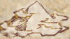
Re: Frogger departs pixeland, and ventures to vectorland.
Having a break from pixel art, and needing to practice the other form of computer art that I am actually not so crappy at, vector, I decided to throw around for some ideas for the presentation of the new Roll2Dodge forum which will be arriving at the internet sometime this year. Actually, Dragonchampions' probably doing the art himself, but hey! i need the practice.
My idea for a header.
Yes ok, I know the pistols are stupid, but It's just an idea.
Logo ideas.
Crap quality because i took a screenshot.
Practically no one around here actually does vector, except the awesome sgt groovy, but, your criticism will be appreciated none the less.
My idea for a header.
Logo ideas.
Practically no one around here actually does vector, except the awesome sgt groovy, but, your criticism will be appreciated none the less.
My spritework can be seen here.
Want to play Roll 2 Dodge, or even start your own game?http://rolltododge.freeforums.org/index.php We need you!
Want to play Roll 2 Dodge, or even start your own game?http://rolltododge.freeforums.org/index.php We need you!
Re: Frogger departs pixeland, and ventures to vectorland.
Blame it on my disgraphy, but I see the R right leg not ending in the same line as the left one, but a little higher (would say a few pix higher, but since that's vector sizing it over would make that invalid)
Like cats? I've made a whole faction of them to kick ass with!
Don't like cats? I've made a whole faction of them to kick their asses! So everyone's happy :)
Felinian faction is part of the Beyond Southern Hells era
kitties need sprites! art topic here
Don't like cats? I've made a whole faction of them to kick their asses! So everyone's happy :)
Felinian faction is part of the Beyond Southern Hells era
kitties need sprites! art topic here
Re: Frogger departs pixeland, and ventures to vectorland.
Yeah, I see what you mean. Unfortunately, it's a fault of the typeface, so it's difficult to fix. 
My spritework can be seen here.
Want to play Roll 2 Dodge, or even start your own game?http://rolltododge.freeforums.org/index.php We need you!
Want to play Roll 2 Dodge, or even start your own game?http://rolltododge.freeforums.org/index.php We need you!
Re: Frogger departs pixeland, and ventures to vectorland.
Not really--do a Convert Text to Outline (or equivalent command) on the R, select the individual nodes forming the curl-serif-thing at the end of the front leg, and yank them down a bit.
(I do vector art, but so far not here.)
(I do vector art, but so far not here.)
Re: Frogger departs pixeland, and ventures to vectorland.
Can you do that on illustrator? I know you can on Photoshop.
My spritework can be seen here.
Want to play Roll 2 Dodge, or even start your own game?http://rolltododge.freeforums.org/index.php We need you!
Want to play Roll 2 Dodge, or even start your own game?http://rolltododge.freeforums.org/index.php We need you!
Re: Frogger departs pixeland, and ventures to vectorland.
I don't have a copy of Illustrator here to check, but manipulating text as a path is a very basic operation in a vector art package (done all the time by designers making logos), so if it wasn't capable of it I'm sure someone would have noticed and complained to Adobe by now. ;P The worst problem is probably going to be selecting just the nodes you need--I recall Illustrator as being painfully bad at that.
Re: Frogger departs pixeland, and ventures to vectorland.
Fancied up versions. Critique is very much appreciated.
- r2d13.jpg (619.81 KiB) Viewed 4082 times
- R2d21.jpg (69.7 KiB) Viewed 4082 times
My spritework can be seen here.
Want to play Roll 2 Dodge, or even start your own game?http://rolltododge.freeforums.org/index.php We need you!
Want to play Roll 2 Dodge, or even start your own game?http://rolltododge.freeforums.org/index.php We need you!
Re: Frogger departs pixeland, and ventures to vectorland.
The stem of the R sticking out of the diamond looks really weird when no other letter sticks out.
"What do you mean, "a dwarvish dragonguard with marksman is overpowered"?"
Story of a Drake Outcast | The Nonsense Era
Played HttT-Underground Channels? Thought it was rubbish? Help us develop it here!
Story of a Drake Outcast | The Nonsense Era
Played HttT-Underground Channels? Thought it was rubbish? Help us develop it here!