The new Wesnoth logo and the Loyalist sigil
Moderator: Forum Moderators
Forum rules
Before posting critique in this forum, you must read the following thread:
Before posting critique in this forum, you must read the following thread:

Re: The new Wesnoth logo and the Loyalist sigil
Feel free to redo that gimp effect, rather than imitating what we've got - my idea was to have the original text in a very /\ triangular extrusion (kind of like the TRoW logo), although I'm not wedded to that.Sgt. Groovy wrote:Further progress on the text front. I have now an effect that can be easily applied to any shape, all the translators need to do is to provide the glyphs properly laid out and kerned in a black silhouette bitmap that I can trace into vector.
I have tried to emulate the "official" L10n GIMP effect (top), though less saturated and more shiny. There's some added bumpiness too to make it rougher on larger sizes (bottom).
I do worry about that white "rim lighting" you have in the lower-right edges of the current gradient, because of how that tends to look like "cutout paper edges" at a small size.
Play Frogatto & Friends - a finished, open-source adventure game!
-
Sgt. Groovy

- Art Contributor
- Posts: 1471
- Joined: May 22nd, 2006, 9:15 pm
- Location: Helsinki
Re: The new Wesnoth logo and the Loyalist sigil
That's good, because I'm itching to try something quite different. That raised metal lettering is rather bland and overused.
Tiedäthän kuinka pelataan.
Tiedäthän, vihtahousua vastaan.
Tiedäthän, solmu kravatin, se kantaa niin synnit
kuin syntien tekijätkin.
Tiedäthän, vihtahousua vastaan.
Tiedäthän, solmu kravatin, se kantaa niin synnit
kuin syntien tekijätkin.
-
LordBob

- Portrait Director
- Posts: 1309
- Joined: December 8th, 2008, 8:18 pm
- Location: Lille, France
- Contact:
Re: The new Wesnoth logo and the Loyalist sigil
I had two options in mind :Sgt. Groovy wrote:What do you mean by "mix of shadowing and contour." The shadows are quite inescapeable, since they are needed to separate the different levels (background-swords-shield-text). They could be sharper, though (as Gaussian blur is actually not very close approximation of a real shadow).
#1 in addition to the shadows, a dark (possibly black) outline that would sharpen the letters while retaining the different levels
#2 sharper shadows, aiming for a similar result.
Whichever works best for you. I'd go for option #1, but I have little knowledge of vector art and you might know a better, simpler method.
-
Sgt. Groovy
- Art Contributor
- Posts: 1471
- Joined: May 22nd, 2006, 9:15 pm
- Location: Helsinki
Re: The new Wesnoth logo and the Loyalist sigil
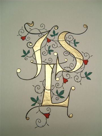
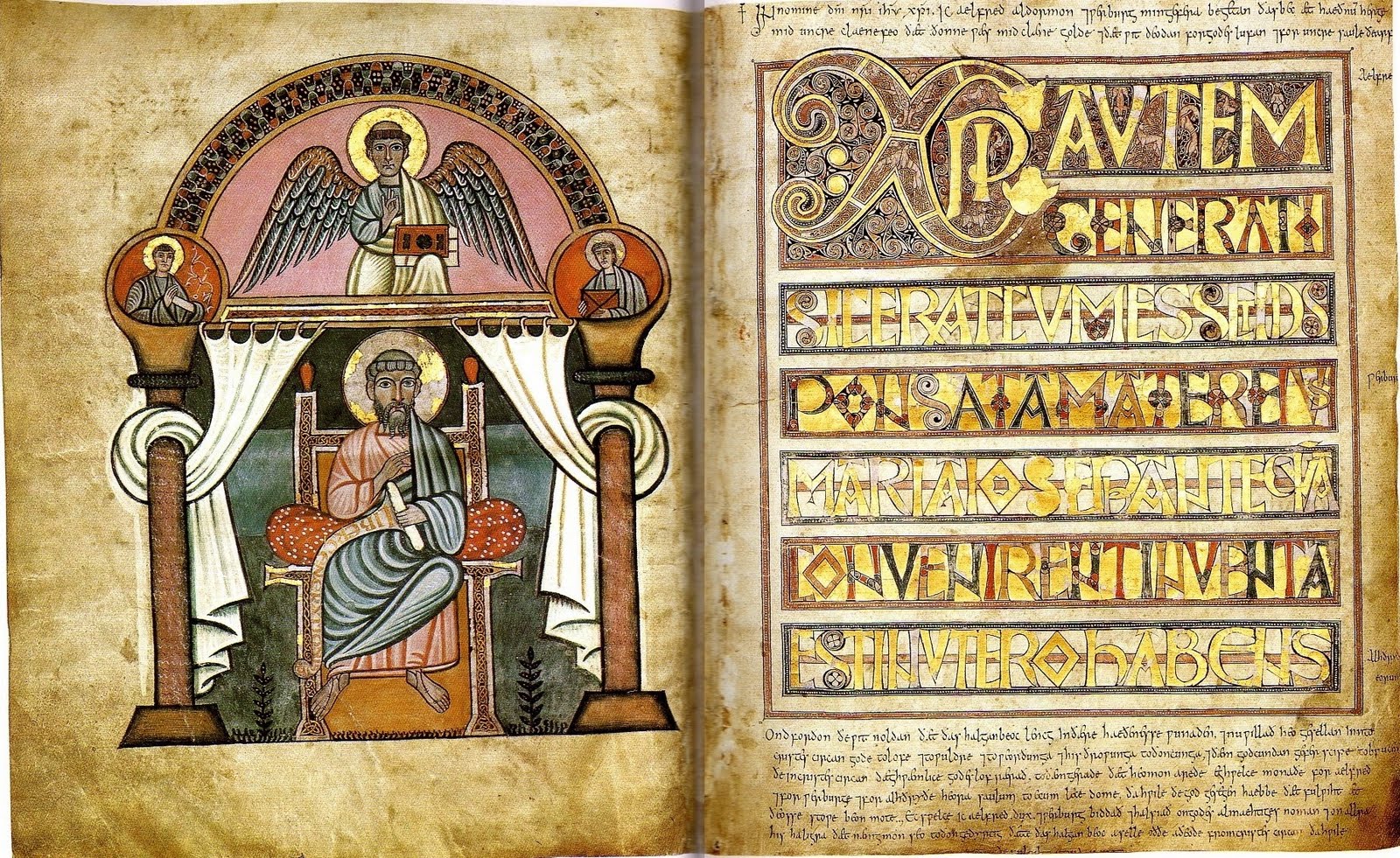
A new concept for the text, like gilded letters from a manuscript (the bottom is my inspiration). It still needs work, but what about the concept?
Tiedäthän kuinka pelataan.
Tiedäthän, vihtahousua vastaan.
Tiedäthän, solmu kravatin, se kantaa niin synnit
kuin syntien tekijätkin.
Tiedäthän, vihtahousua vastaan.
Tiedäthän, solmu kravatin, se kantaa niin synnit
kuin syntien tekijätkin.
-
thespaceinvader

- Retired Art Director
- Posts: 8414
- Joined: August 25th, 2007, 10:12 am
- Location: Oxford, UK
- Contact:
Re: The new Wesnoth logo and the Loyalist sigil
Conceptually I think it could work, but I think you need to work on the texture, and particularly the lighting, a bit more - the letters should probably be brighter, partly to look more like gilding, partly to stand out more from the shield.
http://thespaceinvader.co.uk | http://thespaceinvader.deviantart.com
Back to work. Current projects: Catching up on commits. Picking Meridia back up. Sprite animations, many and varied.
Back to work. Current projects: Catching up on commits. Picking Meridia back up. Sprite animations, many and varied.
-
Sgt. Groovy
- Art Contributor
- Posts: 1471
- Joined: May 22nd, 2006, 9:15 pm
- Location: Helsinki
Re: The new Wesnoth logo and the Loyalist sigil
More metallic, more texture:
- Attachments
-
Tiedäthän kuinka pelataan.
Tiedäthän, vihtahousua vastaan.
Tiedäthän, solmu kravatin, se kantaa niin synnit
kuin syntien tekijätkin.
Tiedäthän, vihtahousua vastaan.
Tiedäthän, solmu kravatin, se kantaa niin synnit
kuin syntien tekijätkin.
-
Simons Mith

- Posts: 821
- Joined: January 27th, 2005, 10:46 pm
- Location: Twickenham
- Contact:
Re: The new Wesnoth logo and the Loyalist sigil
The idea of illuminated-style text is far more in keeping with the Wesnoth setting than the older 'hovering metal' text. I think this new approach is a darn good idea.
-
Sgt. Groovy
- Art Contributor
- Posts: 1471
- Joined: May 22nd, 2006, 9:15 pm
- Location: Helsinki
Re: The new Wesnoth logo and the Loyalist sigil
I've been put on sick leave for couple of weeks after a bicycle accident. Fortunately, my injury doesn't prevent me from working on the computer, so this would be a good opportunity to complete this work once and for all. For that, I would need few directions from Jetrel:
Here's a latest iteration of the text, less granular:
- Are there still notable deficiencies in contrasts, particularly in metal parts? (personally, I'm not completely happy with the embossed sigil, some stronger speculars might be in order)
- Is the leather part OK? I think it looks good, it's interesting, yet non-descript enough not to steal too much attention from the main details. It also works well in small size. It might still need some small scale granularity to look more organic in high resolution.
- Is the new text concept OK? I think it stands out pretty well from the image (without any smudgy shadows), yet follows the same colour scheme (yellow metal on dark background). It also has the added benefit that the same text can be used in other contexts, without the image, where it would be attached to the background (paper, vellum, leather cover of a book, etc.)
- As of now, the image is pretty clean, no dents, scratches or grime. Should something like that be added?
- Anything else that needs to be done?
Here's a latest iteration of the text, less granular:
- Attachments
-
Tiedäthän kuinka pelataan.
Tiedäthän, vihtahousua vastaan.
Tiedäthän, solmu kravatin, se kantaa niin synnit
kuin syntien tekijätkin.
Tiedäthän, vihtahousua vastaan.
Tiedäthän, solmu kravatin, se kantaa niin synnit
kuin syntien tekijätkin.
-
thespaceinvader
- Retired Art Director
- Posts: 8414
- Joined: August 25th, 2007, 10:12 am
- Location: Oxford, UK
- Contact:
Re: The new Wesnoth logo and the Loyalist sigil
The main problem I see is that the sigil and boss don't have enough shadows and darker areas. it needs some deep shades as well as bright speculars.
http://thespaceinvader.co.uk | http://thespaceinvader.deviantart.com
Back to work. Current projects: Catching up on commits. Picking Meridia back up. Sprite animations, many and varied.
Back to work. Current projects: Catching up on commits. Picking Meridia back up. Sprite animations, many and varied.
Re: The new Wesnoth logo and the Loyalist sigil
Hopefully it’s not presumptuous of me to say that I think the current logotype letter shapes need a lot of work. In particular, the apparent x height is inconsistent, and the “texture” (density of positive vs. negative space) varies quite a bit from letter to letter. Parts are pretty cramped seeming, especially once shading has been added, while a few letter combinations have weird gaps. The curvy bit of the r, and both the curve and the cross-bar of the f seem pretty wimpy. The "a" just seems generally out of place in the context of the rest. The stroke angle varies quite a bit from letter to letter without a design goal that I can see. Etc.
Anyway though, I’m really not a type design expert, so I’d strongly recommend asking for an opinion over at http://typophile.com/forum/23 where I would guess the real pros would be happy to weigh in, giving better informed and more concrete advice than I ever could.
Cheers.
Also, unrelatedly, I’m not convinced that sticking the word “for” in gold directly above the gold bit of the shield is the best idea. It gets kind of lost that way, even with the outline. I’m not sure whether there’s any easy fix for that though.
-
Eleazar

- Retired Terrain Art Director
- Posts: 2481
- Joined: July 16th, 2004, 1:47 am
- Location: US Midwest
- Contact:
Re: The new Wesnoth logo and the Loyalist sigil
I don't believe it is working. It doesn't look like illuminated lettering and it doesn't look like metal. It's just yellow type partially on a yellow background. If you want the look of an illuminated manuscript (something i'm personally fond of) you should have larger, ornate initial capitals.Sgt. Groovy wrote:* Is the new text concept OK? I think it stands out pretty well from the image (without any smudgy shadows), yet follows the same colour scheme (yellow metal on dark background). It also has the added benefit that the same text can be used in other contexts, without the image, where it would be attached to the background (paper, vellum, leather cover of a book, etc.)
Metal is highly reflective. And since people seldom hang around in uniformly white, featureless rooms, we expect metal object to reflect some darker and some lighter areas. See my 5 minute example, for one example of how to make something look metallic, even if it's flat:
A couple other points:
* This logo isn't seen on a light grey background-- it's most commonly seen against the tan of the main-screen map and the black of the loading screen. You should tune your lightness values to actual common use cases. Also examples of your progress would be better in one or both of those contexts.
* Yellow on yellow isn't a good idea no matter what treatment the letters are given. Either the text of the metal parts of the shield should be a different color.
* i'd get rid of the leading "the"-- it's unnecessary and confuses the flow of the text.
* Drop-shaddows are not evil. They can be over-used and badly used, but when wisely used they can separate text from a busy background (i.e. our map) like nothing else. I'm not saying you need to use a drop-shaddow. Just make sure that what you do works as well (or preferably better) than what we currently have.
* Jacobolus is right about the kerning. The amount of space between letters is inconsistent and ungraceful.
Feel free to PM me if you start a new terrain oriented thread. It's easy for me to miss them among all the other art threads.
-> What i might be working on
Attempting Lucidity
-> What i might be working on
Attempting Lucidity
-
Sgt. Groovy
- Art Contributor
- Posts: 1471
- Joined: May 22nd, 2006, 9:15 pm
- Location: Helsinki
Re: The new Wesnoth logo and the Loyalist sigil
I don't see Eleazar's example as terribly more metallic, only "make it metallic by throwing random contrast in." The surface of the text is pretty flat, and metal only picks up widely varying intensities when it has surface normals pointing in different directions. I'm not saying my current version works better, but I've studied lot of reference and I'm not convinced about your example. Flat metallic surfaces are hard to make to look authentic.
The yellow-on-yellow is a bit of a problem, I admit, the metal could be also silver (there is already gray metal on the swords, so it wouldn't bring completely new visual component in there), or the specular hotspot could be situated so that the text over the central boss would be practically white.
The font change has bee discussed in this thread before, and for my part, if this text concept is adopted, then a more manuscript-like font might work better with it. But then again, the old font, with all its faults, has been there for a long long time, so it already has recognition value. (As for the bad kerning, that's not really a feature of the font, everything needs to be handkerned to put it into overall balance, and I followed the shape of the old logo).
Tiedäthän kuinka pelataan.
Tiedäthän, vihtahousua vastaan.
Tiedäthän, solmu kravatin, se kantaa niin synnit
kuin syntien tekijätkin.
Tiedäthän, vihtahousua vastaan.
Tiedäthän, solmu kravatin, se kantaa niin synnit
kuin syntien tekijätkin.
-
Eleazar
- Retired Terrain Art Director
- Posts: 2481
- Joined: July 16th, 2004, 1:47 am
- Location: US Midwest
- Contact:
Re: The new Wesnoth logo and the Loyalist sigil
Like i said, it's a 5 minute example.Sgt. Groovy wrote:I don't see Eleazar's example as terribly more metallic, only "make it metallic by throwing random contrast in."
That's only true if:Sgt. Groovy wrote:The surface of the text is pretty flat, and metal only picks up widely varying intensities when it has surface normals pointing in different directions.
1) the surface is perfectly flat, AND
2) the background that it is reflecting is uniform
Like i said, people seldom encounter metal under both these conditions, so theoretically accurate perfectly flat metal in a featureless room doesn't look metallic. But there's no particular reason you should be trying for that effect.
But even more importantly;
I certainly agree with that.Sgt. Groovy wrote:Flat metallic surfaces are hard to make to look authentic.
White on yellow wouldn't be much better.Sgt. Groovy wrote:...or the specular hotspot could be situated so that the text over the central boss would be practically white.
The font and concept are a package-- i don't think they would be "adopted" independently.Sgt. Groovy wrote:The font change has bee discussed in this thread before, and for my part, if this text concept is adopted, then a more manuscript-like font might work better with it. But then again, the old font, with all its faults, has been there for a long long time, so it already has recognition value. (As for the bad kerning, that's not really a feature of the font, everything needs to be handkerned to put it into overall balance, and I followed the shape of the old logo).
I don't love the font, but it does have recognition value. Bad kerning doesn't have recognition value.
Feel free to PM me if you start a new terrain oriented thread. It's easy for me to miss them among all the other art threads.
-> What i might be working on
Attempting Lucidity
-> What i might be working on
Attempting Lucidity
-
Sgt. Groovy
- Art Contributor
- Posts: 1471
- Joined: May 22nd, 2006, 9:15 pm
- Location: Helsinki
Re: The new Wesnoth logo and the Loyalist sigil
The surface for the text I'm after is something like in these examples: 1, 2 and 3. Please note that none of them exhibit the kind of large-scale contrast of your example, yet they all look very much metallic. I think the secret is that the surface is composed of two layers, the "hills" and "valleys" of the small scale surface variations, each covering part of the visible surface, and the critical thing is the contrast between these, which consists of not only intensity contrast but saturation and hue as well.Like i said, people seldom encounter metal under both these conditions, so theoretically accurate perfectly flat metal in a featureless room doesn't look metallic. But there's no particular reason you should be trying for that effect.
Why I think this kind of surface might be good is that it's very different from the metal effects of the shield, so it should stand out better. It's also fairly uniform and clear in large scale, which I hope helps to make it stand out from the messy background of the map.
Valid point, but as I've understood, the point of making a high-res logo is that it would be useful in other contexts as well (like posters, t-shirts, mouse pads, g-strings, coffee mugs etc.). While it certainly should work with the map and black backgrounds, it shouldn't work only on them.This logo isn't seen on a light grey background-- it's most commonly seen against the tan of the main-screen map and the black of the loading screen. You should tune your lightness values to actual common use cases. Also examples of your progress would be better in one or both of those contexts.
Yeah, but we actually need also to have the font, that is, one which fits the manuscript style and Wesnoth setting in general, is of high quality, includes latin, greek and cyrillic fonts, preferably even more, and comes with a free license. Suggestions are welcome.The font and concept are a package-- i don't think they would be "adopted" independently.
Here's another attempt of gilded surface texture, with the map and black backgrounds. For the latter, the text outline might be lighter outside the shield, to stand out from black.
- Attachments
-
-
- Icon-text-map.jpg (40.35 KiB) Viewed 3474 times
Tiedäthän kuinka pelataan.
Tiedäthän, vihtahousua vastaan.
Tiedäthän, solmu kravatin, se kantaa niin synnit
kuin syntien tekijätkin.
Tiedäthän, vihtahousua vastaan.
Tiedäthän, solmu kravatin, se kantaa niin synnit
kuin syntien tekijätkin.
-
thespaceinvader
- Retired Art Director
- Posts: 8414
- Joined: August 25th, 2007, 10:12 am
- Location: Oxford, UK
- Contact:
Re: The new Wesnoth logo and the Loyalist sigil
The gilded concept, I get on board with. But currently , unless you look really close, it just looks like a generically gradiented yellow, even up fairly close, and I fear it's an impression that might be difficult to avert. I wonder if we might not be better going back to an embossed or carved/raised look - in fact, stone letters might work. It might also be easier to come up with something that doesn't blend in with the boss that way?
Just a suggestion
Just a suggestion
http://thespaceinvader.co.uk | http://thespaceinvader.deviantart.com
Back to work. Current projects: Catching up on commits. Picking Meridia back up. Sprite animations, many and varied.
Back to work. Current projects: Catching up on commits. Picking Meridia back up. Sprite animations, many and varied.