Valkiers portraits: It's like I can touch you!
Moderator: Forum Moderators
Forum rules
Before posting critique in this forum, you must read the following thread:
Before posting critique in this forum, you must read the following thread:
-
JackBarber

- Posts: 272
- Joined: October 27th, 2009, 4:43 pm
- Location: In your head.
Re: Valkiers portraits: Draug incoming
Oh, right, I meant the sprite not the portrait just so you know.JackBarber wrote:Does the left horn (Our right) look a bit fat compared to the other one to anyone else?
Something else I noticed is the blood looks to pink...
"Do YOU know the muffin man?"
."Don't wake me if I'm dreaming."
.."Even words can drive a man to madness."
."Don't wake me if I'm dreaming."
.."Even words can drive a man to madness."
Re: Valkiers portraits: Draug incoming
Hello Valkier.
You are worrying to much in making it to look like your portrait, the sprite can not have a lot of details cause the limit that pixels naturally make. If you try, you will end with a very blurry sprite (just like resizing an image to match the size). You need to drop some details (like the blood and shadows), specially in small parts (like the horns), and work with a very reduced palette. If you want to use a lot of colors, you need to watch them very careful, putting one color next to another very different one can make the trick (for this take a look to the tails of the mermans of Jetrel), cause if you use very similar colors, it will look fuzzy. Also, don't forget to add outlines, but they can be a little tricky to put in curves.
Good work.
In quechquixcauh maniz cemanahuatl, ayc pollihuiz yn itenyo, yn itauhca in Mexico-Tenochtitlan
As long as the world exists, no one will forget the glory and honor of Mexico-Tenochtitlan - Culhuacan memorial
As long as the world exists, no one will forget the glory and honor of Mexico-Tenochtitlan - Culhuacan memorial
-
Thrawn

- Moderator Emeritus
- Posts: 2047
- Joined: June 2nd, 2005, 11:37 am
- Location: bridge of SSD Chimera
Re: Valkiers portraits: Draug incoming
While the way you presented this was quite crass (once again, please read this before posting critique people), something to keep in mind, Valkier is that wesnoth type sprites, and most successful ones, imo, exaggerate the face and upper body slightly more than your first attempt here does, usually because they are simply not that interesting. I don't see a problem w/ their size--their bulkiness doesn't look fat so much as it overpowers the rest of the armor, which seems a bit oddFrogger5 wrote:To me his legs look too fat for his arms and body. Particularly his left one.
@tsi: while some skills transfer, spriting does take a couple aspects that differ greatly from actual drawing
This is important too--taking a look at some of neorice/tsi drakes up close illustrates this very well ^__^If you want to use a lot of colors, you need to watch them very careful, putting one color next to another very different one can make the trick (for this take a look to the tails of the mermans of Jetrel), cause if you use very similar colors, it will look fuzzy. Also, don't forget to add outlines, but they can be a little tricky to put in curves.
...please remember that "IT'S" ALWAYS MEANS "IT IS" and "ITS" IS WHAT YOU USE TO INDICATE POSSESSION BY "IT".--scott
this goes for they're/their/there as well
this goes for they're/their/there as well
-
artisticdude

- Moderator Emeritus
- Posts: 2424
- Joined: December 15th, 2009, 12:37 pm
- Location: Somewhere in the middle of everything
Re: Valkiers portraits: Draug incoming
First off, I want to tell you great job, Valkier! For your first ever sprite, this is awesome (far better than I could have done when I first started spriting, and possibly better than I could now). I don't really have anything to add to the list of critique, but I though maybe if you studied the chaos sprites it might help somewhat (since they have a similar feel to them). I really like this unit though, please pull it through to completion. 
"I'm never wrong. One time I thought I was wrong, but I was mistaken."

Re: Valkiers portraits: Draug incoming
Indeed.jdsampayo wrote:You are worrying to much in making it to look like your portrait, the sprite can not have a lot of details cause the limit that pixels naturally make. If you try, you will end with a very blurry sprite (just like resizing an image to match the size). You need to drop some details (like the blood and shadows), specially in small parts (like the horns), and work with a very reduced palette. If you want to use a lot of colors, you need to watch them very careful, putting one color next to another very different one can make the trick (for this take a look to the tails of the mermans of Jetrel), cause if you use very similar colors, it will look fuzzy. Also, don't forget to add outlines, but they can be a little tricky to put in curves.
Essentially, pixel art is poetry, whereas large-scale illustrations/paintings/drawings are lengthy prose.
On pixel art of any 'normal' size (e.g. <200x200), you absolutely have to drop details, because there just aren't enough atomic (e.g. individual/separate) elements to show each of them. You need at least one, if not several pixels to show 'an element' of a drawing, such as a finger. When you're down to a 3x3 patch, this is impossible; literally impossible, no matter what you do, to separate 3x3 pixels into 5 fingers.
The essence of pixel art is to embrace this limitation, and stop trying to directly show elements; oftentimes, this means reducing a complex object into a 'sum' object that's shaped like all the component parts added together. On a wesnoth sprite, our hands are not separated into fingers; they're just a single, carefully shaped blob. The shape of the blob suggests an overall pose of the hand. Sometimes there will be a thumb jutting out, but generally it's just a blob. The same is true for our faces; wesnoth characters have no noses or mouths(!). But they feel like they do, because we shade the center of the face as if it's jutting outwards, which gets across the protrusion of the nose.
The essential limitation of poetry exists in pixel art: lossy compression, and furthermore, compression that requires the decompressor to be familiar with the depicted thing that's being abbreviated. We can 'decompress' blob hands and blob faces because we've seen the real thing. It's much harder when it's not a human, and when we're depicting something the person hasn't seen before. Often, they end up seeing something completely different from what we intended.
But the same sort of beauty that poetry has, and has uniquely compared with prose, is present in pixel art; we see simplified symbols, but we marvel at how they resolve into suggesting the intended thing in our heads so consistently. We also get a kick out of certain patterns and just generally fun tricks, just like people like hearing rhyme in poetry.
Play Frogatto & Friends - a finished, open-source adventure game!
Re: Valkiers portraits: Draug incoming
Well put.Jetrel wrote:Indeed.jdsampayo wrote:You are worrying to much in making it to look like your portrait, the sprite can not have a lot of details cause the limit that pixels naturally make. If you try, you will end with a very blurry sprite (just like resizing an image to match the size). You need to drop some details (like the blood and shadows), specially in small parts (like the horns), and work with a very reduced palette. If you want to use a lot of colors, you need to watch them very careful, putting one color next to another very different one can make the trick (for this take a look to the tails of the mermans of Jetrel), cause if you use very similar colors, it will look fuzzy. Also, don't forget to add outlines, but they can be a little tricky to put in curves.
Essentially, pixel art is poetry, whereas large-scale illustrations/paintings/drawings are lengthy prose.
On pixel art of any 'normal' size (e.g. <200x200), you absolutely have to drop details, because there just aren't enough atomic (e.g. individual/separate) elements to show each of them. You need at least one, if not several pixels to show 'an element' of a drawing, such as a finger. When you're down to a 3x3 patch, this is impossible; literally impossible, no matter what you do, to separate 3x3 pixels into 5 fingers.
The essence of pixel art is to embrace this limitation, and stop trying to directly show elements; oftentimes, this means reducing a complex object into a 'sum' object that's shaped like all the component parts added together. On a wesnoth sprite, our hands are not separated into fingers; they're just a single, carefully shaped blob. The shape of the blob suggests an overall pose of the hand. Sometimes there will be a thumb jutting out, but generally it's just a blob. The same is true for our faces; wesnoth characters have no noses or mouths(!). But they feel like they do, because we shade the center of the face as if it's jutting outwards, which gets across the protrusion of the nose.
The essential limitation of poetry exists in pixel art: lossy compression, and furthermore, compression that requires the decompressor to be familiar with the depicted thing that's being abbreviated. We can 'decompress' blob hands and blob faces because we've seen the real thing. It's much harder when it's not a human, and when we're depicting something the person hasn't seen before. Often, they end up seeing something completely different from what we intended.
But the same sort of beauty that poetry has, and has uniquely compared with prose, is present in pixel art; we see simplified symbols, but we marvel at how they resolve into suggesting the intended thing in our heads so consistently. We also get a kick out of certain patterns and just generally fun tricks, just like people like hearing rhyme in poetry.
I'm sure given enough time I could come up with a decent pixel, but I think for now I'm better off sticking to portraits. Plus, classes begin again very shortly, so my time to learn this is limited.
But I may try again anyways since I hate having a skill dangled in front of me without mastering it.
Win if you can. Lose if you must. But always cheat.
Re: Valkiers portraits: Draug incoming
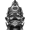
Not really sure what to say with these. The archers still need formal outlines done to them, and the ghoul is still a WIP. I guess I'll answer questions or make changes as you guys crit.
- Attachments
-
- ghoullarge.png (162.46 KiB) Viewed 3814 times
-
- boneshooterlarge.png (183.46 KiB) Viewed 3814 times
-
- banebowlarge.png (165.57 KiB) Viewed 3814 times
-
- archerlarge.png (178.22 KiB) Viewed 3814 times
-
- Drauglarge.png (176.74 KiB) Viewed 3814 times
Win if you can. Lose if you must. But always cheat.

Re: Valkiers portraits: I assure you, we are open
When I looked at the banebow, it almost seemed like the trim on his hood goes in through his far eye, drapes inside his skull, then exits through the middle of the jawbone. The line of shadow matches the line of the cloak too well, and the dimple on the chin only emphasizes this. It's a fairly minor illusion, and it went away when I blinked, but it was a bit disconcerting and you might want to de-mphasize it somehow or move the lower end of the hood, or...something.
"When a man is tired of Ankh-Morpork, he is tired of ankle-deep slurry" -- Catroaster
Legal, free live music: Surf Coasters at Double Down Saloon, Las Vegas on 2005-03-06. Tight, high-energy Japanese Surf-Rock.
Legal, free live music: Surf Coasters at Double Down Saloon, Las Vegas on 2005-03-06. Tight, high-energy Japanese Surf-Rock.
Re: Valkiers portraits: I assure you, we are open
Awesome sauce, and so many!  I love the pose of the archer, in particular, it's kind of creepy and unnatural how he doesn't even appear to care where he's "looking" or what his right arm is doing. It fits him well.
I can get used to it, but in my mind's eye I saw the draug with more armor on. But I really like the style of his skull better than the helmet I would have expected, so expectation from a non-artist can only go so far...
Thanks,
Ben
I can get used to it, but in my mind's eye I saw the draug with more armor on. But I really like the style of his skull better than the helmet I would have expected, so expectation from a non-artist can only go so far...
Thanks,
Ben

Re: Valkiers portraits: I assure you, we are open
To me the draug looks more like a normal skeleton. The unit is much bigger than normal skeletons. Also it has more armor and cape. The biggest problem might be the doublebladed axe, that is missing.
The archers look good. It's a bit hard to say which matches to whitch unit and who is higher level than other, but I don't think it matters.
The archers look good. It's a bit hard to say which matches to whitch unit and who is higher level than other, but I don't think it matters.
Re: Valkiers portraits: I assure you, we are open
Thanks for the replies so far.
The Draug has been a real problem, so I approached it from a couple different angles. All of the cool armor you guys want to see is basically on its waist and down, which Wesnoth portraits don't show. The sprite also only shows it with shoulder pads and a helmet along with the weapon/shield. Now if you guys want to go ahead and have me ignore the sprite and make a hulking looking skeleton decked out in armor and spikes and death, sure! Give me a couple hours and I'll have that posted. I'll even go do one now as an alternative (hopefully I can find the one I originally started) and post it in a bit. But in this case I either follow the sprite or I give you what you want to see.
All fun to me, so no matter.
Sfault: The archer line was more troublesome than the melee. They actually lose armor as they progress in the line. I tried to at least imply superiority over the other two with the glowy eye and runes of the Banebow, but again if I stick to the sprites to any reasonable level, I can only do so much. As for the axe, I originally had a one handed double axe on him, however that looked REALLY cheesy. Much like armor made of bones, the concept sounds awesome and such, but there's really no good way to do it. Liberties were taken.
Bad Dog: I liked the spikes and such on the skull the most about him. Originally, I tried to incorporate that look in place of all of his armor, but he would have ended up being much more spindly than what you guys are observing all ready.
xtifr: I see what you're talking about. It's a very unfortunate line up. I'll nudge it on over a bit.
Win if you can. Lose if you must. But always cheat.
-
thespaceinvader

- Retired Art Director
- Posts: 8414
- Joined: August 25th, 2007, 10:12 am
- Location: Oxford, UK
- Contact:
Re: Valkiers portraits: I assure you, we are open
I'd go ahead and try out the bulky armoured draug
You could do a double handed axe that didn't look cheesy though - I saw the first one, it looked cheesy because you stuck too closely to the one on the sprite - duplicate the current blade on the back it would look better. Beyond that, you've had most of my crit on IRC.
You could do a double handed axe that didn't look cheesy though - I saw the first one, it looked cheesy because you stuck too closely to the one on the sprite - duplicate the current blade on the back it would look better. Beyond that, you've had most of my crit on IRC.
http://thespaceinvader.co.uk | http://thespaceinvader.deviantart.com
Back to work. Current projects: Catching up on commits. Picking Meridia back up. Sprite animations, many and varied.
Back to work. Current projects: Catching up on commits. Picking Meridia back up. Sprite animations, many and varied.
-
Sleepwalker

- Art Contributor
- Posts: 416
- Joined: October 23rd, 2008, 6:34 am
- Location: Sweden
Re: Valkiers portraits: I assure you, we are open
You could go with a smaller head on the draug to make it look bigger of course. Yeah lets see some more armor .
Crit. well, i guess you could go with a more detailed spine. The one on your boneshooter looks great while the other skeletons have a bit simpler one. The area surrounding the mouth of the banebow could use some improvement i think. To me the anatomy doesn't make sense.
A little tip, not necessary of course : maybe you could take a look at kitty's elven archer portraits regarding the bowstring... I remember they had some variations in lightness depending what background the string was crossing, simulating the way the human eye would see it.
Besides what the others said that's what i can tell... Looking good.
Crit. well, i guess you could go with a more detailed spine. The one on your boneshooter looks great while the other skeletons have a bit simpler one. The area surrounding the mouth of the banebow could use some improvement i think. To me the anatomy doesn't make sense.
A little tip, not necessary of course
Besides what the others said that's what i can tell... Looking good.
Sometimes we must be hurt in order to grow, fail in order to know, lose in order to gain, and sometimes we must have to be broken so we can be whole again...
- Nercy Masayon
- Nercy Masayon
Re: Valkiers portraits: I assure you, we are open
I'll take another look at the skull. As for the spines, they just look boring from the front. That's why I did the bone shooter in the first place, to give me something new and challenging to do. Otherwise, they just look like segments with little stubs coming out of the sides from the back.Sleepwalker wrote:Crit. well, i guess you could go with a more detailed spine. The one on your boneshooter looks great while the other skeletons have a bit simpler one. The area surrounding the mouth of the banebow could use some improvement i think. To me the anatomy doesn't make sense.
A little tip, not necessary of course
Anyhow, you guys wanted an armored beast? Let it not be said I don't listen.
- Attachments
-
Last edited by Valkier on June 9th, 2010, 1:02 pm, edited 1 time in total.
Win if you can. Lose if you must. But always cheat.

Re: Valkiers portraits: I assure you, we are open
That Ghoul is really awesome! Can't wait to see it finished!
(all others are great too, but I like the Ghoul most)
(all others are great too, but I like the Ghoul most)
Check out my sprites!