The User Art Topic
Moderator: Forum Moderators
-
Girgistian

- Art Contributor
- Posts: 668
- Joined: April 5th, 2008, 8:23 pm
- Location: The lands of perkele
Re: The User Art Topic
Thanks, my old schoolbooks and papers are actually full of... things like this. This is just a rework of one of them.
For the dark gods!
-
Blarumyrran
- Art Contributor
- Posts: 1700
- Joined: December 7th, 2006, 8:08 pm
Re: The User Art Topic
Devoted disciple of pillowshading as always 
Re: The User Art Topic
These are some various attempts I made at doing character sprites for a project I've been working on. None of them are done, most of them suck. This forum's the best place I can think of to get actually useful feedback on this kind of thing, being home of the spriting masters, so I figure it's worth posting them here; if I can't get some good pointers here I doubt I'll find them anywhere.


At the top is a minor enemy in a "painted" style.
The hooded guy below that was a try at a player sprite. I'm actually rather fond of the look of the top half where it's more finished, but the animation looks very bad when it's in motion.
There's another attempt at the same minor enemy in a more pixeled style. Highly unfinished and a bit weird in the ribs. The human in the horned helmet was an earlier attempt at a player design, but I decided it didn't look mage-like enough (since the character uses magic weapons).
The thing with the green "guts" mass hanging out of it was a discarded enemy design. I don't like it.
At the bottom are two iterations of attempts at a miniboss. The first one was painted and isn't that great, especially since his crystal mass looks like some crappy plastic UFO. At the bottom is the most recent thing, blocked out for a more pixeled style but very rough and with some inconsistencies between frames that I'm somewhat aware of.
(The bounds for sprite sizes here aren't too strict, but in general 64px give or take a few is about the size for a human-ish thing, 128px high for a big bad monster.)
In general,
A) I'm currently terrible at animation (and haven't had much luck finding good ref/pointers),
and B) I'm not that great at anatomy and perspective, either, but can at least practice those some when I've the time (well, it's rather hard to find anything about how to apply perspective in a useful way if you're not just drawing a neatly-placed block... but aside from that.)
Good pointers/corrections are appreciated. I mean real useful crits, not just "X looks weird" unless you have some idea why so I can fix it.
-
Blarumyrran
- Art Contributor
- Posts: 1700
- Joined: December 7th, 2006, 8:08 pm
Re: The User Art Topic
[quote="Stilgar"]
Last edited by Blarumyrran on August 30th, 2014, 11:33 am, edited 1 time in total.
-
ghyr-easeus
- Posts: 24
- Joined: August 2nd, 2009, 4:12 pm
Re: It is gone again Art Topic
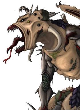
I think this is a new form of Necrophage and Ghoul.Girgistian wrote:I'll have to say those are cool... as a yet inproficient shader, I'll also admit I couldn't have drawn anything like that with just charcoal - meaning Elvish Pillager's works. As for Corvvs' bird-fella, you've still got something to learn about drawing itself, I think the idea is nice. It's kinda amusing, a bird carrying a bird-cage.
Something of my own then. Meet Mr. Revolting.
Pfft. Just noticed the jpeg form messed it up a bit. Oh well.

Re: The User Art Topic
Re: Stilgar:
Animation is hard. The way I first cut my teeth on doing things like walk cycles and such was 'studying from the masters', which amounted to doing traceovers for my very first attempts. Simply: find some really good example of the thing you want to make, and attempt recreating it to try and figure out what makes it good. It's quite foolish and demotivating to expect yourself to succeed in recreating something, and to measure yourself up to a pro, but you'll inevitably learn a lot from the experience if you can emotionally take it.
Part of this will involve locking variables - ensuring that you're only varying certain aspects of the drawing, in order to make sure you know what's actually contributing to the quality difference. This can actually go all the way to frankensteining from commercial stuff for an 'off the record' learning experience - it's illegal, but testing good sprites from a commercial game (with similar color/lighting conditions!) against your background compared to their background can reveal things to you that are hard to tell with your sprites on top of it (if you're a beginner). You can't ever release something using these commercial bits in it, but it's a great learning tool.
Seriously - people back in da vinci's day - in fact up to the 1900s, traced and copied art all the time and didn't think anything wrong of it. Which is part of why they were so damn good. Most artists worth their salt these days have done the same thing (even neoriceisgood has shown me 'study-from-the-masters' imitation he's done of the snes game SD3), although for cultural reasons of the mid 1900s, they tended to be 'in the closet' about it. Don't be; it's an incredible learning tool, so long as you're using it as such (aping someone else's work to get a job done is a different story) - we assume you're constantly analyzing the master's work to try and figure out why it's good, rather than blindly copying.
Basically you're using the scientific method. Art is mostly science - it's mostly a series of experiments where you're trying to determine what cause makes your art look better; both to make the immediate piece better, and to make it so you do the right thing on the first try, later. Techniques like locking variables help, but so does the general scientific mindset. There are a lot of tricks there - the psychological tricks to fight observer bias are really important, too.
Getting to specifics:
- What's really the big problem with your walk cycle here is way too little motion. Legs need to raise much higher. Right now his feet are barely lifting off the ground, and it looks, I'm guessing, ingame, more like he's tapdancing. Use a reference. Either use a game you know to look very fluid and natural, or grab a video of someone running off of youtube, download it, and step through it frame by frame in a video app such as quicktime player (we live in an age of miracles and wonders where that's actually possible - I can imagine animators from days past being willing to trade a finger for that good of a reference resource). Look carefully at how far the legs move. You need more, and strict realism might be too stilted.
- Also, the game very much appears to be seen from directly to the side, without any sort of perspective (which is uncommon even for platformers, and even for a doom-like game).
- everything synerr said.
- Lighter lights, and darker darks - right now most everything except some whites are squeezed into a middle region of brightnesses; you need to spread stuff out more and use more of both the brighter shades and the darker.
- you're pillowshading. You're picking the right shading brightnesses, but you're failing at where the lights and darks go. It's close to right on the greaves (exactly the one situation where pillowshading is right), but it's bad on everything else.)
How to shade in one paragraph:
Pick a light source, and then know that the brightest spot on any surface is the spot facing perpendicular to the light source. Not at the light source. Not at the camera (which is what you're doing now). You have to consider each surface separately; every plane on the body is usually facing a totally different direction. This feels jarring and slow because you have to stop and rethink about it for each body part (or even side thereof), but you'll get wicked fast at this over time. This is not optional, though; you absolutely must think it over again for each one.
Play Frogatto & Friends - a finished, open-source adventure game!
Re: The User Art Topic
Thanks, guys. Been busy with classes, so haven't been checking in here much.
Regarding the black background, in GIMP I have a background layer and then draw on a layer over that, so I can flip the background color from black to white or anything else pretty easily. I'm not aware of there being any "ideal" color to use as a background for such work?
I'll have to check that site out. I hadn't been aware that there was any sprite-art community site out there that wasn't centered around "look at the leet Megaman/Sonic frankensteins I made".Blarumyrran wrote: Not to discriminate or anything, but you might be overrating us. But eg i posted something on http://www.wayofthepixel.net/, and look what an awesome paintover some kind soul gave (especially the folds):
These two points seem to be contradicting where the shading levels are concerned... are the brightnesses right or not? Or were these referring to two different pieces on the image?Jetrel wrote: - Lighter lights, and darker darks - right now most everything except some whites are squeezed into a middle region of brightnesses; you need to spread stuff out more and use more of both the brighter shades and the darker.
- you're pillowshading. You're picking the right shading brightnesses, but you're failing at where the lights and darks go. It's close to right on the greaves (exactly the one situation where pillowshading is right), but it's bad on everything else.)
Regarding the black background, in GIMP I have a background layer and then draw on a layer over that, so I can flip the background color from black to white or anything else pretty easily. I'm not aware of there being any "ideal" color to use as a background for such work?
Re: The User Art Topic
Sorry, the brightnesses are wrong; not terribly horribly wrong, but somewhat wrong. I was kind of pulling a stock-phrase out of my hat there.Stilgar wrote:These two points seem to be contradicting where the shading levels are concerned... are the brightnesses right or not? Or were these referring to two different pieces on the image?Jetrel wrote: - Lighter lights, and darker darks - right now most everything except some whites are squeezed into a middle region of brightnesses; you need to spread stuff out more and use more of both the brighter shades and the darker.
- you're pillowshading. You're picking the right shading brightnesses, but you're failing at where the lights and darks go. It's close to right on the greaves (exactly the one situation where pillowshading is right), but it's bad on everything else.)
The gist of the stock-phrase was basically, where you put shading is by far the most important thing. For an extreme example, you can have only two distinct brightnesses, and be very careless about picking them, and still have what you drew be recognizable, and have it have a sense of it's 3d shape. That's what shading does - it fools our brains into seeing a 2d object as 3d.
So in your case, your brightnesses are a little bit off in terms of how bright they are, but that's irrelevant due to the fact that they're being placed in the wrong spots. Place them in the right spots, and then worry about getting the brightnesses and colors right. It's all about where you put them.
Not really. The real ideal is to use the actual background(s) of your game.Stilgar wrote:Regarding the black background, in GIMP I have a background layer and then draw on a layer over that, so I can flip the background color from black to white or anything else pretty easily. I'm not aware of there being any "ideal" color to use as a background for such work?
The presence of the background will skew your perception of colors, so as you're doing, switching it around occasionally really helps. If you don't switch it around, and you're using something more extreme (like jet black or white), you can have some unpleasant surprises when you trying using it in-game. Personally, when drawing stuff, I tend to use a more neutral earth-tone around maybe 50% luminosity, but it's really up for grabs.
Play Frogatto & Friends - a finished, open-source adventure game!
Re: The User Art Topic
some practice on walk cycle animation.
Bad (also lacking a rear arm, which I didn't bother finishing because I realized the arm motion was OOS with the legs and had to be totally redone):
Improved:
C&C on the 'improved' one welcome. I'm still a complete noob at walk cycles.
Bad (also lacking a rear arm, which I didn't bother finishing because I realized the arm motion was OOS with the legs and had to be totally redone):
- walk-cycle-practice-2.gif (1.42 KiB) Viewed 3410 times
- walk-cycle-practice-3.gif (1.6 KiB) Viewed 3410 times
Play Frogatto & Friends - a finished, open-source adventure game!
Re: The User Art Topic
with that much forward bending it'd call it more of a run cycle. Well not just cause of that, overally looks like run rather than walk.
Like cats? I've made a whole faction of them to kick ass with!
Don't like cats? I've made a whole faction of them to kick their asses! So everyone's happy :)
Felinian faction is part of the Beyond Southern Hells era
kitties need sprites! art topic here
Don't like cats? I've made a whole faction of them to kick their asses! So everyone's happy :)
Felinian faction is part of the Beyond Southern Hells era
kitties need sprites! art topic here
-
thespaceinvader

- Retired Art Director
- Posts: 8414
- Joined: August 25th, 2007, 10:12 am
- Location: Oxford, UK
- Contact:
Re: The User Art Topic
Indeed - were it not for the legs being in continual contact with the floor, it would be a run. Walking has the body MUCH more upright. And generally, shorter steps, too.
http://thespaceinvader.co.uk | http://thespaceinvader.deviantart.com
Back to work. Current projects: Catching up on commits. Picking Meridia back up. Sprite animations, many and varied.
Back to work. Current projects: Catching up on commits. Picking Meridia back up. Sprite animations, many and varied.
-
Skizzaltix
- Posts: 1114
- Joined: December 9th, 2005, 2:38 am
Re: The User Art Topic
...I walk like that, sometimes...
My only comment would be that his elbows feel like they go back a little far--exaggeration is good (we all know that), but it feels extreme even just looking at it.
I'm not sure, though, could just be me.
Edit: The other possibility is that I'm misreading his arms entirely, ho ho.
My only comment would be that his elbows feel like they go back a little far--exaggeration is good (we all know that), but it feels extreme even just looking at it.
I'm not sure, though, could just be me.
Edit: The other possibility is that I'm misreading his arms entirely, ho ho.

Re: The User Art Topic
Quite a coincidence, I also practice drawing proper walks cycles right now
Not at pixel-art scale though
Not at pixel-art scale though
-
Girgistian
- Art Contributor
- Posts: 668
- Joined: April 5th, 2008, 8:23 pm
- Location: The lands of perkele
Re: The User Art Topic
Onward to unemployment! Means I've got more time for both drawing and wesnoth. This calls for a comeback to spriting n' portraiture!

For the dark gods!
Re: The User Art Topic
@pixelmind: very good stuff. 
Obviously it's running, I just called it a walk cycle because that's loosely the 'umbrella term' I'm using for animation of any sort of ambulatory motion. Be it running, skipping, or whatever. I was just calling it a walk cycle because I didn't care, it was 3 am, and I just wanted to post a damn image and get to bed. Seriously. Being obsessed with those kinds of semantics is one of the worst qualities of nerds - to argue about them when they don't f**king matter. (Especially since walking<->running is a continuum, not two separate and discrete states.)
Anyways, moving along, this was a simple exercise I did of some stretch-and-squish animation, and some animation of puffs of air after an impact.
(Not really angry, just annoyed):thespaceinvader wrote:Indeed - were it not for the legs being in continual contact with the floor, it would be a run. Walking has the body MUCH more upright. And generally, shorter steps, too.
Obviously it's running, I just called it a walk cycle because that's loosely the 'umbrella term' I'm using for animation of any sort of ambulatory motion. Be it running, skipping, or whatever. I was just calling it a walk cycle because I didn't care, it was 3 am, and I just wanted to post a damn image and get to bed.
Anyways, moving along, this was a simple exercise I did of some stretch-and-squish animation, and some animation of puffs of air after an impact.
- Attachments
-
- block-fall.gif (1.44 KiB) Viewed 3254 times
Play Frogatto & Friends - a finished, open-source adventure game!