JustinOperables Portraits- Great Troll
Moderator: Forum Moderators
Forum rules
Before posting critique in this forum, you must read the following thread:
Before posting critique in this forum, you must read the following thread:

Re: JustinOperables Portraits- Great Troll
Ivanovic (the maintainer of Two Brothers, amongst other things) would prefer to see Bjarn finished as well before committing these, to update the current campaign menu image accordingly.kitty wrote:Somebody please commit him.
Am I a messenger pigeon or what?
Author of the unofficial UtBS sequels Invasion from the Unknown and After the Storm.
-
JustinOperable
- Art Contributor
- Posts: 175
- Joined: March 3rd, 2009, 1:41 am
Re: JustinOperables Portraits- Great Troll
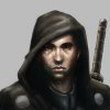
*sighs* fair enough, here's the start of Bjarn. Needs a lot of redrawing.
Edit: replaced the image to a newer version.
Edit: replaced the image to a newer version.
- Attachments
-
- Bjarn.png (85.15 KiB) Viewed 5237 times
-
JustinOperable
- Art Contributor
- Posts: 175
- Joined: March 3rd, 2009, 1:41 am
Re: JustinOperables Portraits- Great Troll
hmmm... folks seem disinterested but here's another version.
- Attachments
-
- Bjarn.png (99.29 KiB) Viewed 5114 times
-
thespaceinvader

- Retired Art Director
- Posts: 8414
- Joined: August 25th, 2007, 10:12 am
- Location: Oxford, UK
- Contact:
Re: JustinOperables Portraits- Great Troll
Anatomy looks reasonable, but needs darker lines, and more contrast in the clothing.
http://thespaceinvader.co.uk | http://thespaceinvader.deviantart.com
Back to work. Current projects: Catching up on commits. Picking Meridia back up. Sprite animations, many and varied.
Back to work. Current projects: Catching up on commits. Picking Meridia back up. Sprite animations, many and varied.

Re: JustinOperables Portraits- Great Troll
It's so good to see the campaign characters getting an update from their old cartoon-like portraits. Looks good.
-
JustinOperable
- Art Contributor
- Posts: 175
- Joined: March 3rd, 2009, 1:41 am
Re: JustinOperables Portraits- Great Troll
another round of updates.
- Attachments
-
- Bjarn.png (114.49 KiB) Viewed 5021 times
-
Thrawn

- Moderator Emeritus
- Posts: 2047
- Joined: June 2nd, 2005, 11:37 am
- Location: bridge of SSD Chimera
Re: JustinOperables Portraits- Great Troll
looking better  a couple comments from my limited skill >_>
1. The beard looks wonky right now--it actually looks like the skin is a mask *over* it on the views left, rather than the beard growing out of the skin. I think this is because of the very inorganic shape of the edge of the beard, coupled with a dark outline between the beard and skin that looks like the skin's casting a shadow on it.
2. The browning belt looks as if it's simply a stripe in his robe--it has the same texture and shading as the robe, and there is nothing to suggest that it's thicker/an object going over (hard to explain) than the robe.
3. The biggest thing I can see is the relationship between the book and the hand holding it. They don't seem to be quite together--perhaps this is an instance where holding a book to your chest and looking at it in a mirror would help? In addition (and prolly the reason I noticed this), the linework around the hand and book is still less high quality than the rest of the image--it's very think and standard, pops out from the actual hand. (and even has the book line passing through his hand !)
!)
Otherwise, impressive work, and I too am glad to see older campaign portraits being replaced! ^__^
1. The beard looks wonky right now--it actually looks like the skin is a mask *over* it on the views left, rather than the beard growing out of the skin. I think this is because of the very inorganic shape of the edge of the beard, coupled with a dark outline between the beard and skin that looks like the skin's casting a shadow on it.
2. The browning belt looks as if it's simply a stripe in his robe--it has the same texture and shading as the robe, and there is nothing to suggest that it's thicker/an object going over (hard to explain) than the robe.
3. The biggest thing I can see is the relationship between the book and the hand holding it. They don't seem to be quite together--perhaps this is an instance where holding a book to your chest and looking at it in a mirror would help? In addition (and prolly the reason I noticed this), the linework around the hand and book is still less high quality than the rest of the image--it's very think and standard, pops out from the actual hand. (and even has the book line passing through his hand
Otherwise, impressive work, and I too am glad to see older campaign portraits being replaced! ^__^
...please remember that "IT'S" ALWAYS MEANS "IT IS" and "ITS" IS WHAT YOU USE TO INDICATE POSSESSION BY "IT".--scott
this goes for they're/their/there as well
this goes for they're/their/there as well
-
LordBob

- Portrait Director
- Posts: 1309
- Joined: December 8th, 2008, 8:18 pm
- Location: Lille, France
- Contact:
Re: JustinOperables Portraits- Great Troll
In addition to what Thrawn says* , there is quite a difference in skin tones . Next to the brightly lit face, the hand seem to have a cadaveric complexion : you should align the skin tones of the hand on those from the face.
Other than that :
- his left elbow out to stand out more - it currently feels that this side of the picture is a little flattened perspective-wise.
- you still have the same contrast problem that has been pointed with the Great Troll. If you take a look at the paintover below, all I did was to fiddle with the levels. Pushing the black point up to 10 adds depth to the shadows, while pulling the white one down to 240 adds luminosity. Notice how next to the modified version, yours seems veiled by a thin layer of grey dust.
* Thrawn's absolutely right about the hand, do use reference or if lacking any, your own hand in a mirror
- Attachments
-
Want to see more of my art ? Visit my portfolio !
Re: JustinOperables Portraits- Great Troll
small detail, just posting to make sure you don't miss it: one of the books borderlines gets off the book and crosses the thumb, probably a leftover from when the thumb wasnt there
Like cats? I've made a whole faction of them to kick ass with!
Don't like cats? I've made a whole faction of them to kick their asses! So everyone's happy :)
Felinian faction is part of the Beyond Southern Hells era
kitties need sprites! art topic here
Don't like cats? I've made a whole faction of them to kick their asses! So everyone's happy :)
Felinian faction is part of the Beyond Southern Hells era
kitties need sprites! art topic here
Re: JustinOperables Portraits- Great Troll
I thought that line was for his thumbnail.

Re: JustinOperables Portraits- Great Troll
Perhaps it's meant to be... but if it is, then the perspective on it seems wrong. The thumbnail would be pointing more to our right, and we'd see part of the thumb beside it.
-
lostnumber
- Posts: 198
- Joined: September 23rd, 2008, 1:06 am
Re: JustinOperables Portraits- Great Troll
LordBobs recolor is a massive improvement.
From a non-artists perspective I think it looks quite good once the "covered in dust" effect is gone. Although I also notice the odd line on his thumb.
From a non-artists perspective I think it looks quite good once the "covered in dust" effect is gone. Although I also notice the odd line on his thumb.

Re: JustinOperables Portraits- Great Troll
Hey, it's looking great; especially after that color adjustment.
Also -- you might get more comments if you updated the title of your thread *hint, hint*
Also -- you might get more comments if you updated the title of your thread *hint, hint*
http://www.wesnoth.org/wiki/User:Sapient... "Looks like your skills saved us again. Uh, well at least, they saved Soarin's apple pie."

Re: JustinOperables Portraits- Great Troll
Good to see you really continueing on this project!
You've already got a lot of comments thus I'll just add few techincal points:
* The folds of his robe and hood look random. Did you use a reference for them? Making up realistic folds is really hard... And the cloth is verry shiny - is that on purpose? Or do you plan to soften that in the process? And of course I'd like to see some of the official red mages ornamentation on his robe to make him clearly part of that order.
* Apart from the already risen angle of the book/hands issue the upper hand is too flat and the thumb is missing a digit.
* Thrawn already said that the beard looks glued on - this is due to the lighter outline around it and to the missing transition to the skin. Beards don't start suddenly, there is a transitional area. The lower lip also seems exteremely fleshy which makes him appear a bit as if he was sulking.
* And it seems as if he was floating or as if his bottom was sticking out a lot.
-
esr

- Retired Developer
- Posts: 228
- Joined: November 26th, 2006, 6:40 pm
- Location: Pennsylvania, USA
- Contact:
What's the state of the Wose portrait?
What's the state of the Wose portrait? DM could stiill use it.