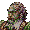
Mefisto in vegetative state
Moderator: Forum Moderators
Forum rules
Before posting critique in this forum, you must read the following thread:
Before posting critique in this forum, you must read the following thread:
Re: Some sketches
Thanks for comments and clues.
There are men with long necks - I am an example. But yes, the head is still too small. I didn't intend to draw somebody extremely unproportional so this is something to fix.
The flat shading is the effect of my mistake. I experimented with the new method of shading. First I did the layer with black outlines, below was the layer with dark grey silhouette, the third was the layer with light grey silhouette and at the bottom was white background. Then I did the skading on the dark grey layer using the eraser set to partial transparency, so I could achieve shaded and normal parts. Then I treated the light grey silhouette with eraser to expose white background partially. this way I achieved Fencer in greyscale. The last step was to select areas of the same intended colour and fill them with bucket. During this operation I unlocked the transparency of light grey layer by accident when I was filling the fencer's doublet. And this was found only today.
I have one question. My experimental method is good when you have one-colour areas separated with clear contour lines. But I would like to know if is it possible to make a pattern on fencer's doublet and port it as a whole into the layer with locked transparency instead of filling areas with one colour? I mean, using GIMP, of course.
The light setting is below:
- Attachments
-
-
thespaceinvader

- Retired Art Director
- Posts: 8414
- Joined: August 25th, 2007, 10:12 am
- Location: Oxford, UK
- Contact:
Re: Some sketches
You could put the pattern into its own locked tranparency layer without too much trouble - that's how i've been doing the filligree patterning on my armour recently.
But one issue strikes me with your colouring method: you won't get any hue variation. One of the most important things i've learned from kitty over the past year or so is that you should never shade by simply adding black for shadows and white for highlights - real life simply doesn't work that way. assuming a relatively neutral light like daylight out of strong sun, you'll tend to get shadows which shade slightly more towards the blue end of the spectrum, and highlights which shade more towards the yellows and reds. It's usually only a small difference, but it can make all the difference.
Check out the Dragonguard's cloak here, for example:

You can see that the base colour is a mid-saturation reddish colour. The shadows are fairly purple, whilst the highlights shade more into orange. Similarly, the cannon has a fairly orange base, with brown shadows and yellow and white highlights. It adds a touch of life to the image which would otherwise be absent.
But one issue strikes me with your colouring method: you won't get any hue variation. One of the most important things i've learned from kitty over the past year or so is that you should never shade by simply adding black for shadows and white for highlights - real life simply doesn't work that way. assuming a relatively neutral light like daylight out of strong sun, you'll tend to get shadows which shade slightly more towards the blue end of the spectrum, and highlights which shade more towards the yellows and reds. It's usually only a small difference, but it can make all the difference.
Check out the Dragonguard's cloak here, for example:
You can see that the base colour is a mid-saturation reddish colour. The shadows are fairly purple, whilst the highlights shade more into orange. Similarly, the cannon has a fairly orange base, with brown shadows and yellow and white highlights. It adds a touch of life to the image which would otherwise be absent.
http://thespaceinvader.co.uk | http://thespaceinvader.deviantart.com
Back to work. Current projects: Catching up on commits. Picking Meridia back up. Sprite animations, many and varied.
Back to work. Current projects: Catching up on commits. Picking Meridia back up. Sprite animations, many and varied.
Re: Some sketches
I would. I just pick colours more saturated and slightly moved toward blue on hue scale when I am colouring the darker layer and the colours less saturated and moved more toward yellow when I am colouring the brighter layer.But one issue strikes me with your colouring method: you won't get any hue variation.
Anyway: below is the next iteration of my work. I hope that the progress is visible.
- Attachments
-
- fencer 0.35-400p.png (134.4 KiB) Viewed 5649 times
-
- fencer 0.35-205p.png (40.98 KiB) Viewed 5641 times
Re: Some sketches
Maybe some pattern on his doublet? And the new sketch.
- Attachments
-
- duelist-pose-2a.png (44.39 KiB) Viewed 5524 times
-
- fencer 0.37.png (144.72 KiB) Viewed 5530 times
-
- fencer 0.37-205p.png (42.11 KiB) Viewed 5527 times
-
LordBob

- Portrait Director
- Posts: 1309
- Joined: December 8th, 2008, 8:18 pm
- Location: Lille, France
- Contact:
Re: Some sketches
The pattern could get stronger, it feels faded like an old cloth right now.
The edge of the cape he's cleaning his sword with deserves intense light: the contrast with the darker parts is not high enough - compare with the contrast on his vest and trousers.
Last but not least, you simply cannot keep this amount of black lineart. The folds of cape are especially disturbing and the tip of the sword can't be found against the black background. Dark tones instead of black (brown cape linework, for instance) would help.
Want to see more of my art ? Visit my portfolio !
Re: Some sketches
This fencer begins to be tiring. OK, I'll bring the adjusted version tomorrow.
Now something different.
1. Concept of warlord pose - I have a problem with the composition. Isn't his body too small for the whole picture?
2. Sketch of another warlord.
Now something different.
1. Concept of warlord pose - I have a problem with the composition. Isn't his body too small for the whole picture?
2. Sketch of another warlord.
- Attachments
-
- orc_warlord1.png (51.92 KiB) Viewed 5281 times
-
- orc-warlord2-real.png (79.69 KiB) Viewed 5281 times
-
Sgt. Groovy

- Art Contributor
- Posts: 1471
- Joined: May 22nd, 2006, 9:15 pm
- Location: Helsinki
Re: Some sketches
No. 2 is pretty nice, but I would suggest bringing the head down and forward a bit, giving him a proper "orcish hunch". No. 1 is too dynamic for a portrait, IMO.
Tiedäthän kuinka pelataan.
Tiedäthän, vihtahousua vastaan.
Tiedäthän, solmu kravatin, se kantaa niin synnit
kuin syntien tekijätkin.
Tiedäthän, vihtahousua vastaan.
Tiedäthän, solmu kravatin, se kantaa niin synnit
kuin syntien tekijätkin.
-
Simons Mith

- Posts: 821
- Joined: January 27th, 2005, 10:46 pm
- Location: Twickenham
- Contact:
Re: Some sketches
I dunno ... orc leaders are often used in 'now we will smite the hated whoever-it-is' roles, so when you see an orc portrait it'll often be a leader calling his warriors to arms, or celebrating a victory over the wimpy defeated whoever-it-was before feeding their corpses to the wolves. Garnished with parsley. The corpses, not the wolves. You wouldn't garnish a wolf unless you were planning to eat it. And obviously I'm also assuming wolves actually like parsley, otherwise there'd be no point. But this means portraits with dynamic poses may be more useful for orc leaders than for many other races - so perhaps a couple of such portraits might be worth having.
Re: Some sketches
I'm going to make a double post. I prepared two variants of Fencer's final version. One has brighter contours, the other has slightly darkened contours (I prefer this one). I also added some rose tint on face and added more light on cape. And I hope to finish this.
The brighter version:
The brighter version:
- Attachments
-
- fencer 0.40-400p.png (148.29 KiB) Viewed 5052 times
-
- fencer 0.40-205p.png (48.38 KiB) Viewed 5046 times
Re: Some sketches
The darker version. And the new warlord's project with lighting concept.
- Attachments
-
- fencer 0.40-400p-darkcontour.png (149.6 KiB) Viewed 5038 times
-
- fencer 0.40-205p-darkcontour.png (48.68 KiB) Viewed 5039 times
-
- orc-warlord3-polar.png (81.42 KiB) Viewed 5047 times

Re: Some sketches
i read that you declared your last version finished, but the shading and some other details aren't up to mainline quality, yet.
i think there's still a problem with his left arm/hand and the rendering of his hair doesn't work. i really like the little details and patterns you put in his outfit! but most of all, your shading doesn't convey enough volume. white-ish lights on his blouse look too random, the shadows are too saturated and you miss a lot of cast shadows (if your light source is top-left, why doesn't the figure cast a shadow on his cape? etc.).
again, i really like your sketches, but you need to improve your painting.
Re: Some sketches
Kitty, could you make a quick sketch to show me what you see wrong in his arm and in highlights distribution? I can't see it, maybe because I have been redrawing him constantly for four weeks, day after day. Yes, I see the progress I made thanks to your and other's advices, but right now I feel tired and I would like to get rid of him.
EDIT: Better?
EDIT: Better?
- Attachments
-
- fencer 0.46-400p.png (148 KiB) Viewed 4523 times
-
- fencer 0.46-205p.png (41.36 KiB) Viewed 4527 times
Re: Some sketches
i just did a quick sketch with a suggestion how to fix the arm, but i don't have time to do one for the lighting right now. 
thus i just suggest again, what i said last time - go back to the flat base colour, pick one dark shade and one light shade - block in the lights and shadows according to your lightsource. work really, really rough. try to give him form and depth, not make him pretty. then try to think about castshadows and add them. then post what you have after these steps. if those basic lights and shadows work properly start blending, introducing highlights, texturizing etc.
i really, really like your sketch but the colouring doesn't work yet. if you are tired of him for now, why not start a new project and come back to him later?
- Attachments
-
- fencer%200.46-400p.png (43.9 KiB) Viewed 4508 times
Re: Some sketches
Thanks for the answer. Re: left arm - I was afraid that there is still something wrong with the proportions. I see from your sketch that you don't like how the wrist bends. This pose was copied from the mirror. I modelled it on myself and I used a bedspread to emulate the cape.
I tried something similar to your sketch at the beginning, when this guy was cleaning his blade with a kerchief, but now he is using a piece of quite heavy and thick cloth. So he would rather make a tight grip with whole palm, not just with the fingertips. This is how I interprete your sketch.
Re: lighting - I made some additional changes in lighting and lessened the saturation of the darkest parts and of overall picture but I'm afraid that there is no point with littering this thread with more versions of this picture with only slight differences. I'll return to this later.
By now I already started with warlords. In a couple of days I should be ready to post the first one. But it looks like LordBob is going to draw them better and faster than me. :/
Well, we'll see.
EDIT: work in progress:
- Attachments
-
- orc-warlord2-0.7.png (127.25 KiB) Viewed 4347 times
Re: Some sketches
The next warlord. It's difficult to design something decent when simple grunts have such elaborate armours.
- Attachments
-