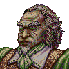
Mefisto in vegetative state
Moderator: Forum Moderators
Forum rules
Before posting critique in this forum, you must read the following thread:
Before posting critique in this forum, you must read the following thread:

Re: Some sketches
While it does prove your point, I do not know that using a statue with irregular proportions is your best reference.Mefisto wrote:An explanation.
I think that you could argue that a noble would not mind wiping his sword on his cape. While it seems a bit low-brow for them, they also have the money to easily replace a cape, and it is likely to be cut, torn or dirty from any battle that may have just happened. Thus rendering it fit for the trash heap in their minds anyways.
Mainline Maintainer: AOI, DM, NR, TB and THoT.
UMC Maintainer: Forward They Cried, A Few Logs, A Few More Logs, Start of the War, and Battle Against Time
UMC Maintainer: Forward They Cried, A Few Logs, A Few More Logs, Start of the War, and Battle Against Time
-
Skizzaltix
- Posts: 1114
- Joined: December 9th, 2005, 2:38 am
Re: Some sketches
I was thinking that... But I was also thinking that he might be wearing an expensive cape 
But as I said, you're free to ignore it
I would have thought that he'd need to be wearing tighter trousers for that to come into play.Mefisto wrote:An explanation.
But as I said, you're free to ignore it
-
LordBob

- Portrait Director
- Posts: 1309
- Joined: December 8th, 2008, 8:18 pm
- Location: Lille, France
- Contact:
Re: Some sketches
The colour scheme has improved (though it still carries eye-burning levels of saturation  ), I rather like how it all works together.
Unfortunately, I still find his left forearm a lot longer than his right. Check your image, I think there's roughly the length of a fist between the two. This could easily be changed by moving his left hand further down the blade & forearm. As far as I'm concerned, I'd really like to see this solved before you start shading. But then you're the artist, do what you feel is best.
Unfortunately, I still find his left forearm a lot longer than his right. Check your image, I think there's roughly the length of a fist between the two. This could easily be changed by moving his left hand further down the blade & forearm. As far as I'm concerned, I'd really like to see this solved before you start shading. But then you're the artist, do what you feel is best.
Want to see more of my art ? Visit my portfolio !
Re: Some sketches
I couldn't find what was wrong with this arm. Just now I realized that imagined the right elbow far too left. I forgot that the elbow joint is not a mathematical point and it has to fill some space and that it is seen from certain angle, not perpendicular. So the rignt forearm looked longer in my eyes and I gave the same lenght to the left forearm. Well, now I know why it looked wrong. It won't be dificult to fix it. Unfortunately I have already begun shading but the arm will require only a minor correction.
The saturation is a matter of monitor calibration, on my laptop the colours aren't so vivid. No worries, the last phase will be casting overall shadow so I will desaturate whole picture.
Right now the fencer looks like this:
The saturation is a matter of monitor calibration, on my laptop the colours aren't so vivid. No worries, the last phase will be casting overall shadow so I will desaturate whole picture.
Right now the fencer looks like this:
- Attachments
-
- fencer 0.22.png (108.19 KiB) Viewed 4227 times
-
mnewton1

- Posts: 777
- Joined: November 12th, 2008, 4:31 am
- Location: On my pretty teal horsey.
- Contact:
Re: Some sketches
NIce, why did you use that pattern for his jacket?
Creator of Ageless Era
Check out Frogatto & Friends, it's made by the same people who created The Battle for Wesnoth!
Check out Frogatto & Friends, it's made by the same people who created The Battle for Wesnoth!
-
Sgt. Groovy

- Art Contributor
- Posts: 1471
- Joined: May 22nd, 2006, 9:15 pm
- Location: Helsinki
Re: Some sketches
Not really, every colour in the picture can be expressed in absolute HSV-values, and in your image the S (saturation) of many colours go to 60%-80%, even to full 100% in some places. If your image doesn't look vivid to you, then the problem is with your monitor.The saturation is a matter of monitor calibration
In the real world, you can consider 50% saturation as the baseline for "bright" colours, anything that goes significantly beyond that is supersaturated. In the Wesnoth world where there are no chemically synthesized "neon" pigments, such colours are rare.
Actually, even though it sounds counterintuitive, it's not shadows but lights that desaturate (as a general rule). The issue has been discussed in length in this thread.No worries, the last phase will be casting overall shadow so I will desaturate whole picture.
I'll wait for your shading before more criticism, but be aware that lots of desaturation should take place.
Tiedäthän kuinka pelataan.
Tiedäthän, vihtahousua vastaan.
Tiedäthän, solmu kravatin, se kantaa niin synnit
kuin syntien tekijätkin.
Tiedäthän, vihtahousua vastaan.
Tiedäthän, solmu kravatin, se kantaa niin synnit
kuin syntien tekijätkin.
-
Skizzaltix
- Posts: 1114
- Joined: December 9th, 2005, 2:38 am
Re: Some sketches
Looking good!
Though, is it just me, or does that one tear on his shirt look a little lonely? Maybe another on one arm? Up to you
Though, is it just me, or does that one tear on his shirt look a little lonely? Maybe another on one arm? Up to you
...Why not?mnewton1 wrote:why did you use that pattern for his jacket?
Re: Some sketches
Sorry, I should have been more precise. Of course it is a matter of my monitor calibration. The colours don't look excessively saturated for me but I will fix them to be more eyes friendly.
About the light and shadow - point taken.
About the light and shadow - point taken.

Re: Some sketches
apart from the eyesoreing colours your shading doesn't seem to follow an unified lightsource... you really need to establish one in order to create depth and form. skip all those fancy patterns and just use one dark and one light shade of your base colour and try to give him depth by doing that. when those work you can start shading and blending and adding fx - but you need a solid fundament.
Re: Some sketches
Thanks for comment. It appeared that I wanted to be too quick. I will take some time before I'll post something new, but no worries, the progress is going on. I just need to find more references and practice shading.
Re: Some sketches
One more incarnation of Fencer.
- Attachments
-
- fencer 0.30-400.png (138.14 KiB) Viewed 3721 times
-
- fencer 0.30-205.png (46.04 KiB) Viewed 3721 times
-
scienceguy8

- Posts: 226
- Joined: June 27th, 2007, 2:54 pm
- Location: Middle of Nowhere, U.S.A.
- Contact:
Re: Some sketches
While I'm no artist, and I'm sure the real artists on this board will probably find one or two faults my untrained eyes missed, his mustache blends in with his upper lip, making it hard to see that there is a mustache there.
"You can't kill an unarmed, upside down man!"
Dr. Rodney McKay
Stargate Atlantis
Runner
Gilberti Industries
scienceguy8
Proud Member of the Marching Salukis
Dr. Rodney McKay
Stargate Atlantis
Runner
Gilberti Industries
scienceguy8
Proud Member of the Marching Salukis
-
thespaceinvader

- Retired Art Director
- Posts: 8414
- Joined: August 25th, 2007, 10:12 am
- Location: Oxford, UK
- Contact:
Re: Some sketches
It still feels a little flat - something's still up with the lightsource. I can't work out exactly what, though. I'll consider it, and get back to you. I think part of the issue is a lack of contrast.
http://thespaceinvader.co.uk | http://thespaceinvader.deviantart.com
Back to work. Current projects: Catching up on commits. Picking Meridia back up. Sprite animations, many and varied.
Back to work. Current projects: Catching up on commits. Picking Meridia back up. Sprite animations, many and varied.
-
LordBob
- Portrait Director
- Posts: 1309
- Joined: December 8th, 2008, 8:18 pm
- Location: Lille, France
- Contact:
Re: Some sketches
Same as TSI, I find him flat. I think this is because your shadows lack depth and your light source is still unclear. More contrast between light and shadow would help.
Also, I can't help finding his head a little small.
Also, I can't help finding his head a little small.
Want to see more of my art ? Visit my portfolio !
-
thespaceinvader
- Retired Art Director
- Posts: 8414
- Joined: August 25th, 2007, 10:12 am
- Location: Oxford, UK
- Contact:
Re: Some sketches
Now that you mention it, his head also sits very high up...
Keep up the good work - with a bit of effort, you can get this looking really nice.
Keep up the good work - with a bit of effort, you can get this looking really nice.
http://thespaceinvader.co.uk | http://thespaceinvader.deviantart.com
Back to work. Current projects: Catching up on commits. Picking Meridia back up. Sprite animations, many and varied.
Back to work. Current projects: Catching up on commits. Picking Meridia back up. Sprite animations, many and varied.