Loyalist Portrait Series
Moderator: Forum Moderators

Re: Loyalist Portrait Series
The swordsman seems to be holding his sword so that the tip is pointing somewhat away from us, which would imply that he's scratching his own shin with it or something. There's something wrong with the hand-sword relationship.

Re: Loyalist Portrait Series
Agreed with zookeeper, it might just be the current state it is in as a raw sketch, but the way the eye processes the image first makes it seem as if his hand is facing the other way (then it currently is), implying an awkward angle of the sword. I feel that this will be fixed when you add the detail to differentiate parts of the figure, but possibly considering tilting the sword a bit further away from the swordsman might help.
Mainline Maintainer: AOI, DM, NR, TB and THoT.
UMC Maintainer: Forward They Cried, A Few Logs, A Few More Logs, Start of the War, and Battle Against Time
UMC Maintainer: Forward They Cried, A Few Logs, A Few More Logs, Start of the War, and Battle Against Time

Re: Loyalist Portrait Series
I think part of the problem is simply that that's not a natural way to hold a sword. With a natural grip, the thumb and index finger are always closest to the blade. Turning the grip completely around like that so that the little finger is closest to the blade is simply not a natural (or easy) thing to do, so the eye tends to reject that interpretation unless it's made very obvious--and even then, I think it might look awkward.
The most natural way to let a sword (or club or mace or whatever) rest is to let it fall back against the shoulder of the arm that's holding it. If you actually want to stick the business end in the ground, you're unlikely to rotate your grip more than ninety degrees, i.e. with the palm parallel to the ground and perpendicular to the sword (or whatever), covering the top of the now-inverted sword.
While expert swordsmen may be rare these days, I think the basic movements are instinctive enough that the reversed grip in that sketch is going to look awkward to most people even if you do make it more obvious.
"When a man is tired of Ankh-Morpork, he is tired of ankle-deep slurry" -- Catroaster
Legal, free live music: Surf Coasters at Double Down Saloon, Las Vegas on 2005-03-06. Tight, high-energy Japanese Surf-Rock.
Legal, free live music: Surf Coasters at Double Down Saloon, Las Vegas on 2005-03-06. Tight, high-energy Japanese Surf-Rock.

Re: Loyalist Portrait Series
you've already got tons of comments and advise but i'd like to add a few minor points...
first of all: i love them! they are beautifully painted, they are realistic and they have character!
the spearman:
wonderful design - true to the sprite! the spearhead looks a tad small? his face bothers me a bit, especially the nose. think of the bone structure beneath and the facial planes! and the mouth is almost comically broad. i attach a rough and quick paintover of the face - but of course feel free to disregard it! the other thing that bothers me is the helmet. serveral people mentioned that the head is too small, but that's not the case. but if you look at the head's proportions the helmet would have to be skin tight. but i assume that a hemet has a certain thickness and the hair, too. thus: increase the helmet size, but not the head itself.
the swordsman:
he is cool, i like that you made him short and chubby and not a stereotypical hero! the pose with the sword is awkward, but that has already been mentioned. your going for a norman type of shild, right? your's looks flat right now, while they should be bent outwards more. and i just read that those shilds have a strap that goes around the neck. that's not important for the portrait at all but could be a nice touch.
and one further general information, somebody said that the top and both sides of portraits shouldn't be cropped. that's false. one side can be cropped, if the unit appears in the left bottom corner of the screen the left side and vice versa.
- Attachments
-
- human-spearman.png (34.46 KiB) Viewed 6547 times
-
LordBob

- Portrait Director
- Posts: 1309
- Joined: December 8th, 2008, 8:18 pm
- Location: Lille, France
- Contact:
Re: Loyalist Portrait Series
Thanks for the facial advice : the spearman really looks better this way ! Regarding his helmet though, I did try to resize it as adviced, but wasn't satisfied with the result : no matter what logic told, I couldn't help thinking there was large a head under there  Medieval helms being little more than a sheet of steel with optional layers of leather inside, thickness shouldn't pose much of a problem (especially for a low-rank unit, who really ought to bid its chances of survival on skill rather than armor
  ).
).
Now the spear, it does look small. This is because :
1. the tip of a spear doesn't have to be big, only lethal
2. couldn't crop the top of the picture , but drawing a large blade on a short handle doesn't improve things.
I'm also posting the final version of the peasant, with revised right hand and an afternnon to the smithy for his pitchfork.
Last but not least, the finished swordsman. I was indeed aiming for a norman type of shield : tried to correct it thanks to Kitty's advice, though I'm not sure the final shield looks bent enough. I also tried to include the strap, but without a model of how it's actually worn, I can only hope for the best
The peasant and spearman are ready for the taking.
- Attachments
-
-
-
Want to see more of my art ? Visit my portfolio !
Re: Loyalist Portrait Series
The peasant looks much more natural now, both given his hand placement and his eyes being less saturated.
Agreed, as spears are about thrusting swiftly and powerfully, so the point does not have to be overly large to be effective.LordBob wrote:1. the tip of a spear doesn't have to be big, only lethal
Mainline Maintainer: AOI, DM, NR, TB and THoT.
UMC Maintainer: Forward They Cried, A Few Logs, A Few More Logs, Start of the War, and Battle Against Time
UMC Maintainer: Forward They Cried, A Few Logs, A Few More Logs, Start of the War, and Battle Against Time
Re: Loyalist Portrait Series
Great pictures. The only thing that bothers me slightly are the eyes of the peasant, they're a little bright IMHO. At least for me they draw the attention completely at first glance.
WesCamp-i18n - Translations for User Campaigns:
http://www.wesnoth.org/wiki/WesCamp
Translators for all languages required: contact me. No geek skills required!
http://www.wesnoth.org/wiki/WesCamp
Translators for all languages required: contact me. No geek skills required!
-
thespaceinvader

- Retired Art Director
- Posts: 8414
- Joined: August 25th, 2007, 10:12 am
- Location: Oxford, UK
- Contact:
Re: Loyalist Portrait Series
The chainmail on the swordsman looks fantastic! But i think the shield could still look a little more rounded outwards, as kitty was suggesting, and that the sword looks at a bit of a strange angle - like if it continued down, it would end up between his heels, instead of in front of his feet.
Looking great, though, i look forward to seeing the rest of the loys =D
Looking great, though, i look forward to seeing the rest of the loys =D
http://thespaceinvader.co.uk | http://thespaceinvader.deviantart.com
Back to work. Current projects: Catching up on commits. Picking Meridia back up. Sprite animations, many and varied.
Back to work. Current projects: Catching up on commits. Picking Meridia back up. Sprite animations, many and varied.
-
Thrawn

- Moderator Emeritus
- Posts: 2047
- Joined: June 2nd, 2005, 11:37 am
- Location: bridge of SSD Chimera
Re: Loyalist Portrait Series
yeah, the peasants eye's are very vivid looking still, especially with the shadowyness of the rest of his face under the hat.
The swordman looks awesome, but ditto other's comment on the shield.
The swordman looks awesome, but ditto other's comment on the shield.
...please remember that "IT'S" ALWAYS MEANS "IT IS" and "ITS" IS WHAT YOU USE TO INDICATE POSSESSION BY "IT".--scott
this goes for they're/their/there as well
this goes for they're/their/there as well

Re: Loyalist Portrait Series
The swordsman and spearman are both very good. Although both of them have the shield too close to the body; I don't see anything else wrong about them. 
As for the peasant... well...
The peasant is not quite so good. It's not just the eyes: The peasant is facing directly towards us, which is an awfully dull pose to look at. The hands don't quite work either, and they are in a very big role in that picture.
I'd say for the peasant: A complete redo. Figure a new pose altogether because the current picture is fundamentally off. (Right? Jet? Kitty?)
As for the peasant... well...
The peasant is not quite so good. It's not just the eyes: The peasant is facing directly towards us, which is an awfully dull pose to look at. The hands don't quite work either, and they are in a very big role in that picture.
I'd say for the peasant: A complete redo. Figure a new pose altogether because the current picture is fundamentally off.
I wish I had more time in my hands.
Re: Loyalist Portrait Series
Well, clearly it's still better than nothing, so if the other portraits go in, the peasant should as well. Then if he or someone else makes a better one, we can replace it.Eternal wrote:The swordsman and spearman are both very good. Although both of them have the shield too close to the body; I don't see anything else wrong about them.
As for the peasant... well...
The peasant is not quite so good. It's not just the eyes: The peasant is facing directly towards us, which is an awfully dull pose to look at. The hands don't quite work either, and they are in a very big role in that picture.
I'd say for the peasant: A complete redo. Figure a new pose altogether because the current picture is fundamentally off.
Re: Loyalist Portrait Series
the swordsman is just perfect imho! i love the padded tunic and the way you rendered the chainmail!
i'd say commit him and the spearman as they are! (but wait for jet's final say just to be sure...)
and please ignore those shield to close to the body etc comments - those are portraits for a fantasy game, that's just historical correctness nitpicking. (if you are interested how normanic shields were worn this picture is the best ref i could find, but please don't change your portrait just because of that!)
regarding the peasant, i don't think that he is unsalvageable at all, just his face is a bit strange and especially his eyes seem to glow (too white and too blue). i just did a paintover, perhaps it gives you some ideas. and the straw hat's yellow should be toned down to a more straw-like colour. plain frontal poses aren't the most exiting ones, but they are surely ok, i have at least four frontal posse portraits ingame.
i'm curious - who do you plan to do next?
- Attachments
-
-
Cloud
- Art Contributor
- Posts: 502
- Joined: December 17th, 2008, 7:43 pm
- Location: The land of pixels
- Contact:
Re: Loyalist Portrait Series
Great work 
The Spearman and Swordsman are fantastic, and the Peasant is also shaping up nicely, though it might be a dull pose, it is a dull unit, and the expression of slight fear is just perfect for the unit.
I also like how you've matched the spearhead to the sword blade (that little raised 'v'), those little things can make the biggest difference sometimes.
I look forward to seeing more of your work keep it up
The Spearman and Swordsman are fantastic, and the Peasant is also shaping up nicely, though it might be a dull pose, it is a dull unit, and the expression of slight fear is just perfect for the unit.
I also like how you've matched the spearhead to the sword blade (that little raised 'v'), those little things can make the biggest difference sometimes.
I look forward to seeing more of your work
Softly/SoftlySplinter on IRC. Will be lurking around more these days
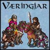
Mainline Animations|The Væringjar
Art for these mead-sodden, bearded mushroom-junkies by Girgistian!
Mainline Animations|The Væringjar
Art for these mead-sodden, bearded mushroom-junkies by Girgistian!
-
LordBob
- Portrait Director
- Posts: 1309
- Joined: December 8th, 2008, 8:18 pm
- Location: Lille, France
- Contact:
Re: Loyalist Portrait Series
Well weeell, thanks for all the love 
I'll make one last version of the peasant, but certainly not a complete redo. Three reasons to that : the hands aren't all that bad and have already come a long way ; the pose - while dull - is suitable for an ill-at-ease peasant who's been dragged away from home onto certain death ; and, last but not least, there are far more interesting portraits left to do !
The spearman I'm done with, so should there be any particular requirements to commit him, just tell and I will comply
The swordsman still has a few tidbits I'm not satisfied with, so god willing he might get that rounded shield and straightened sword.
But that's only might since I have begun work on the royal guard, after which I intend to give a try to the heavy infantry
Want to see more of my art ? Visit my portfolio !

Re: Loyalist Portrait Series
I agree with what kitty said in her latest post.
I'm ready to commit (e.g. "add into the game") any of these whenever you feel you're done working on them, LordBob. I take from your previous comments that the spearman is precisely that, so I'll go ahead and do it.
Since we usually put these in folders according to the artist's name - what is your full name (or if you don't want that used for this), what "name" would you like on the folder?
Play Frogatto & Friends - a finished, open-source adventure game!