A non-distracting grid alternative
Moderator: Forum Moderators
Forum rules
Before posting critique in this forum, you must read the following thread:
Before posting critique in this forum, you must read the following thread:
A non-distracting grid alternative
Well, this isn't art but I wasn't sure where to put it... I was reading this thread and regarding the last comment by sapient:
I don't know if it's good enough to be considered as the default, but hopefully at least some will find this useful. Personally, I like it even better than I expected.
Edit: Grid image is attached now.
Either this statement is incorrect or I belong to a third camp, because I would prefer a soft and thin cardbox-boardgame-look, which does not distract from the amazing graphics of the game. I'm not concerned about visibility, as long as it slightly helps me to visually separate the hexagons. So I made a less opaque version of Eleazar's design, which looks like this:I wouldn't be opposed to two different hex grids, since there seem to be two different schools of thought on the matter 1) those who want a thin and highly contrasty seperator 2) those who like the raised-edge/quilted effect which is far softer transition (and more pleasant on the eyes, IMO).
I don't know if it's good enough to be considered as the default, but hopefully at least some will find this useful. Personally, I like it even better than I expected.
Edit: Grid image is attached now.
- Attachments
-
- Save as $wesnothdir/images/terrain/grid.png
- grid.png (391 Bytes) Viewed 5993 times
Last edited by dborg on January 5th, 2007, 3:56 pm, edited 1 time in total.
-
Maeglin Dubh

- Moderator Emeritus
- Posts: 1154
- Joined: November 16th, 2005, 8:38 pm
- Location: Valley of the Shadow of Death
- Contact:

-
Maeglin Dubh
- Moderator Emeritus
- Posts: 1154
- Joined: November 16th, 2005, 8:38 pm
- Location: Valley of the Shadow of Death
- Contact:
^2007th post!^
I actually prefer this to the examples shown in Art Development....
Could we have Jetryl pass judgment on this?
I actually prefer this to the examples shown in Art Development....
Could we have Jetryl pass judgment on this?
Cuyo Quiz wrote:I really should push for Temuchin's brainstorming with all my might someday, when the skies are cloudy, the winds dance and the light is free to roam over the soil along the fog.

-
irrevenant

- Moderator Emeritus
- Posts: 3692
- Joined: August 15th, 2005, 7:57 am
- Location: I'm all around you.
I likes. Aesthetically pleasing and clearly distinctive.
Apparently you can have your cake and eat it too...
Apparently you can have your cake and eat it too...
Want to post a Wesnoth idea? Great! Read these:
Frequently Posted Ideas Thread
Giving your idea the best chance of acceptance
Frequently Posted Ideas Thread
Giving your idea the best chance of acceptance

*throws one more rock into the vase*
I have accomplished my duty with the city. This is dinamyte.
I have accomplished my duty with the city. This is dinamyte.
Cuyo Quiz,where madness meets me 
Turn on, tune in, fall out.
"I know that, but every single person nags about how negative turin is; it should be in the FPI thread "Turin should give positive comments" =)"-Neorice,23 Sep 2004
Turn on, tune in, fall out.
"I know that, but every single person nags about how negative turin is; it should be in the FPI thread "Turin should give positive comments" =)"-Neorice,23 Sep 2004
You can test it easily by replacing your grid.png. Thanks for all the positive feedback!Gus wrote:I like the look of it, but i'd nee dto test it in-game. My concern is that it might be a tad bit too transparent, not giving clear distinction between hexes, thus being a bit tiring for the eye. I cannot be sure tho.
I don't think that the grid needs to have highly visible borders. Most of the time the shape of the hexes is obvious anyway and on plain areas the shadows provide more than enough guidance in my opinion.

Hmm it's nice, btw i'm not sure it works well on all terrains...irrevenant wrote:I likes. Aesthetically pleasing and clearly distinctive.
Apparently you can have your cake and eat it too...
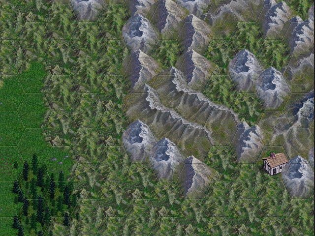
It doesn't look very distinguishable on hills to me.
"Ooh, man, my mage had a 30% chance to miss, but he still managed to hit! Awesome!"  -- xtifr
Stupid me, i hadn't noticed the download link. I'll test it thendborg wrote: You can test it easily by replacing your grid.png.
That's what i thought as well, but i want to se how it works with me (because i guess it's very dependant on the person seeing it). Looks very promising anyway =)I don't think that the grid needs to have highly visible borders. Most of the time the shape of the hexes is obvious anyway and on plain areas the shadows provide more than enough guidance in my opinion.
Hard work may pay off in the long run, but laziness always pays off right away.

This wins, IMHO.
What dborg has shown here is that the hex grid doesn't need to shove itself in your face. I don't play with the hex grid on to make Wesnoth look like a boardgame. I play with it on because when it isn't on, I occasionally have trouble counting hex distances. This will do fine for that purpose, and isn't overly intrusive.
What dborg has shown here is that the hex grid doesn't need to shove itself in your face. I don't play with the hex grid on to make Wesnoth look like a boardgame. I play with it on because when it isn't on, I occasionally have trouble counting hex distances. This will do fine for that purpose, and isn't overly intrusive.
For I am Turin Turambar - Master of Doom, by doom mastered. On permanent Wesbreak. Will not respond to private messages. Sorry!
And I hate stupid people.
The World of Orbivm
And I hate stupid people.
The World of Orbivm
-
Eleazar

- Retired Terrain Art Director
- Posts: 2481
- Joined: July 16th, 2004, 1:47 am
- Location: US Midwest
- Contact:
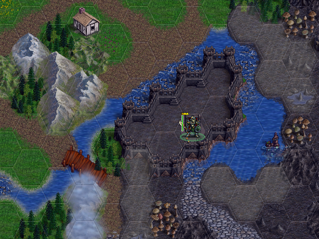
No, worst case is probably the snow forest, because of the high contrast of white and nearly-black.dborg wrote:Tweaked the shadow a bit to make it look more like a ridge and visibility on hills is better now (I think they are the worst case):
A good stress test would be snow, snow trees, and cave hills, and some normal terrains, like grass.
I would prefer a less opaque version like this, if it can be spotted everywhere.
Feel free to PM me if you start a new terrain oriented thread. It's easy for me to miss them among all the other art threads.
-> What i might be working on
Attempting Lucidity
-> What i might be working on
Attempting Lucidity