New attack buttons - scratchpad
Moderator: Forum Moderators
Forum rules
Before posting critique in this forum, you must read the following thread:
Before posting critique in this forum, you must read the following thread:


-
irrevenant

- Moderator Emeritus
- Posts: 3692
- Joined: August 15th, 2005, 7:57 am
- Location: I'm all around you.

-
Elvish_Pillager

- Posts: 8137
- Joined: May 28th, 2004, 10:21 am
- Location: Everywhere you think, nowhere you can possibly imagine.
- Contact:

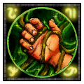
Looks great, but I'd like to see the smaller version. Since it might not look so good smaller. The hand and vines may need a little more contrast in the smaller version.
me: Welcome to the real world. If everyone says your art and opinions suck, it's because they DO suck. Even if you're too damned proud/stupid/both to realize it.
danny_california: yep keep telling fairy tales.
danny_california: yep keep telling fairy tales.
-
Darth Fool
- Retired Developer
- Posts: 2633
- Joined: March 22nd, 2004, 11:22 pm
- Location: An Earl's Roadstead
I actually kind of like leonhard's entangle simply because the shadow view of a humanoid figure is less restrictive on what the target is than having a human hand.
"you can already do that with WML"
Fight Creeeping Biggerism!
http://www.wesnoth.org/forum/viewtopic. ... 760#131760
http://www.wesnoth.org/forum/viewtopic. ... 1358#11358
-
irrevenant
- Moderator Emeritus
- Posts: 3692
- Joined: August 15th, 2005, 7:57 am
- Location: I'm all around you.
Actually, they're both Leonhard's entangle (border by Wolfy).Darth Fool wrote:I actually kind of like leonhard's entangle simply because the shadow view of a humanoid figure is less restrictive on what the target is than having a human hand.
The trouble with the humanoid one is that it's just not as distinct as to what's going on at the 60x60 size.


And neither icon works for Cockatrices, or Tentacles of the Deep.
-
Darth Fool
- Retired Developer
- Posts: 2633
- Joined: March 22nd, 2004, 11:22 pm
- Location: An Earl's Roadstead
Hmm... It seems perfectly clear to me what is going on.irrevenant wrote:
The trouble with the humanoid one is that it's just not as distinct as to what's going on at the 60x60 size.
edit: in fact, I would argue that it is clearer than the one with the hand!
"you can already do that with WML"
Fight Creeeping Biggerism!
http://www.wesnoth.org/forum/viewtopic. ... 760#131760
http://www.wesnoth.org/forum/viewtopic. ... 1358#11358
Well, the main problem is, that runic icon's should be more... "monocoloristic".irrevenant wrote:Actually, they're both Leonhard's entangle (border by Wolfy).Darth Fool wrote:I actually kind of like leonhard's entangle simply because the shadow view of a humanoid figure is less restrictive on what the target is than having a human hand.
The trouble with the humanoid one is that it's just not as distinct as to what's going on at the 60x60 size.
And neither icon works for Cockatrices, or Tentacles of the Deep.
Jetryl's example:
I'm working on something more similiar to this. Beside that- it look's very good.