New attack buttons - scratchpad
Moderator: Forum Moderators
Forum rules
Before posting critique in this forum, you must read the following thread:
Before posting critique in this forum, you must read the following thread:

So much talk about things how they should be, so little own efforts to correct those things. So much plain noise of quickly made judgements based on the first feelings. Is that valuable critisism? Should I really care?
I'm not trying to point or offend anyone special. If I still did, I'm sorry. If someone comments this post somehow, don't expect me to reply. If someone thinks I'm offended somehow, I'm not. I'm just tired of mere posts without real participation to the work, even to the designing work. I must admit that there is some good critique here too, but it is usually under tons of I-feel-like-this-and-that-chatter.
Maybe the biggest problem here is only me and the Internet forums are unfitting media for my persistent communication habits. If I truly find it so I'm out of here. (Using another medias, though)
Yours sincerely, Pekka
EDIT: I see the art development forum has been split in open and restricted sections. Someone other has propably been also frustrated of the same thing. I hope he/she made my brimstone monologue unnecessary.
Pekka, you're absolutely right. "Everyone's a critic," as the old saying goes, and it gets annoying really fast.
 Don't hang on anyone's words, and ignore most of the criticism. We're doing a cracking good job here, and getting a lot done.
If you haven't been given access to the restricted art development forum, message frame, and he can give it to you. There, we can continue making these things without these peripheral and wasteful comments.
If you haven't been given access to the restricted art development forum, message frame, and he can give it to you. There, we can continue making these things without these peripheral and wasteful comments.
Jetryl wrote:If you haven't been given access to the restricted art development forum, message frame, and he can give it to you. There, we can continue making these things without these peripheral and wasteful comments.
frame wrote:Don´t ask the developers for joining in a group, because this will never work.
First read, then think. Read again, think again. And then post!
Frame and I had a chat, and we've decided that pekka is basically an official art developer now, like neoriceisgood, or eleazar. This was mostly becausetoms wrote:frame wrote:Don´t ask the developers for joining in a group, because this will never work.I know that pekka is good, but thanks for clarification.
• He works hard to make stuff for us
• He is skilled at creating graphics
• He works hard to hone his skills and judgement
All three are important points to have; the last can be hard to see, but time has told it clearly here.
-
irrevenant

- Moderator Emeritus
- Posts: 3692
- Joined: August 15th, 2005, 7:57 am
- Location: I'm all around you.
I can't speak for anyone else, but I always figured art submissions were up for open comment.Jetryl wrote:Pekka, you're absolutely right. "Everyone's a critic," as the old saying goes, and it gets annoying really fast.
But I also figured the artists were finding the comments helpful.
If people aren't finding my constructive criticism helpful, I'm perfectly happy to stop offering it. It uses a lot of my time. If those efforts are wasted (or worse, offending people), I'd rather save us all (and especially me
So how do we know whose critiques the artists want, and whose they'd rather not see? (Should there be an 'FPI'-equivalent for offering art critiques?).
P.S. Conversely, I would've appreciated more constructive criticism on my second lightning icon. I realise we went with Pekka's instead, and that's cool, but I received zero input for for a while before that happened. I'd appreciate the input to improve my work so maybe my next submission will be accepted.
-
Eleazar

- Retired Terrain Art Director
- Posts: 2481
- Joined: July 16th, 2004, 1:47 am
- Location: US Midwest
- Contact:
Great!jetryl wrote:...pekka is basically an official art developer now, like neoriceisgood, or eleazar.
Unfortunately there's no simple answer. Part of the problem is that like every other discipline, some people are good at art, while others have no clue. Unfortunately while many people recognise they have no clue about finance, auto-mechanics, coding, skiing, etc, very few people realize they have no clue about art. Even worse, when the art-clueless get involved with trying to evaulate art, their judgement tends to get worse. (i see it all the time at workirrevenant wrote:I can't speak for anyone else, but I always figured art submissions were up for open comment.Jetryl wrote:Pekka, you're absolutely right. "Everyone's a critic," as the old saying goes, and it gets annoying really fast.
But I also figured the artists were finding the comments helpful.
If people aren't finding my constructive criticism helpful, I'm perfectly happy to stop offering it. It uses a lot of my time. If those efforts are wasted (or worse, offending people), I'd rather save us all (and especially me) the hassle.
So how do we know whose critiques the artists want, and whose they'd rather not see? (Should there be an 'FPI'-equivalent for offering art critiques?).
The main artists now have some control over how much feedback they get, they can post in either art forum. Some artists may enjoy the volume of vauge feedback/praise from everyone. Others (like me) are primarily intersted in getting the art in the game as efficiently as possible.
In general, feedback is appreciated by artists in direct proportion to the critic's artistic skill. Membership in the art contributors group generally indicates recognition of a high level of skill and/or volume of contributions.
Though we are not currently trying to limit feedback to only the "art contributors" group, conversely membership in the "trusted users" group != a solicitation to comment on art. Please consider if your comment is backed up by any understanding before posting.
Disclaimer: The above is my opinion: i haven't discussed it with other art devs yet, but i think they will basicly agree.
Irrevenant, yes, it's unfortunate that there has been so little contructive feedback on the this topic, but like you said it takes time and energy. I'm not trying to say you belong in the "no clue" catagory. Hopefully the forum reorganization will produce a more friendly dynamic.
Feel free to PM me if you start a new terrain oriented thread. It's easy for me to miss them among all the other art threads.
-> What i might be working on
Attempting Lucidity
-> What i might be working on
Attempting Lucidity
One thing that I would do(hope I'm not being in the "No Clue" category here), is make the green gem overly large, on the big version, it looks fine, but on the normal, it barely shows up, sometimes, for small icons, you have to overdo some details, so that they actually show up.wolfy wrote:Sorry to interupt this fascinating discussion...
Tentacle Attack.
And something special- Elven Captain Sword.
Jetryl?
Also, I see how you're tilting the blade towards the camera, but I would lessen the tilt a little bit, because it makes it look disproportionate(even though it's nnot) because the blade is SO much bigger than the handle.
Hope I've helped.
Sorry for the meaningless post
-
irrevenant
- Moderator Emeritus
- Posts: 3692
- Joined: August 15th, 2005, 7:57 am
- Location: I'm all around you.
Here's what I've done on the trollfist. I'm concerned it's a bit too 'painterly' and am not sure how to make it more 'icony'.
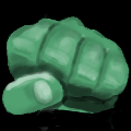

P.S. I realise that a trollfist has already been accepted, but I thought it would look still better with more 'meat on its bones'.
P.P.S. It's modelled heavily on my fist, which is plenty meaty.
P.S. I realise that a trollfist has already been accepted, but I thought it would look still better with more 'meat on its bones'.
P.P.S. It's modelled heavily on my fist, which is plenty meaty.
-
irrevenant
- Moderator Emeritus
- Posts: 3692
- Joined: August 15th, 2005, 7:57 am
- Location: I'm all around you.
Me too; both on the troll-fist and on the orc-sword.wolfy wrote:Well, I'm still waiting for some response.
BTW, the list of required icons here is a bit confusing. It says "human sword" has been done, but doesn't indicate a need for swords for other races. I've assumed an orc sword is needed; is it?
Well, you may choose in which direction I should follow in entagle icon.
Because I'm not a trusted user, I'm prepared to take lesser "quality of critiques"
Awesome...
At the other hand- I'm not working at it now. Cause- without respond I don't know if it' s apreciated, needed or even- noticed.
Because I'm not a trusted user, I'm prepared to take lesser "quality of critiques"
Awesome...
At the other hand- I'm not working at it now. Cause- without respond I don't know if it' s apreciated, needed or even- noticed.
- Attachments
-
- ensnare1-3.png (8.31 KiB) Viewed 2969 times
-
- ensnare1-4.png (11.47 KiB) Viewed 2969 times
-
Thrawn

- Moderator Emeritus
- Posts: 2047
- Joined: June 2nd, 2005, 11:37 am
- Location: bridge of SSD Chimera
I think you should just have all but the circle and runes in black--which seems to be the uniform background.
maybe feet with vines/roots wrapped around it?
maybe feet with vines/roots wrapped around it?
...please remember that "IT'S" ALWAYS MEANS "IT IS" and "ITS" IS WHAT YOU USE TO INDICATE POSSESSION BY "IT".--scott
this goes for they're/their/there as well
this goes for they're/their/there as well
-
Sangel
- Moderator Emeritus
- Posts: 2232
- Joined: March 26th, 2004, 10:58 pm
- Location: New York, New York
It's not that your work isn't appreciated, wolfy, it's more that it has certain qualities that make it difficult to critique. Nevertheless, perhaps this opinion (which is solely mine - I don't know if others share it) might help explain the lack of feedback.wolfy wrote:Well, you may choose in which direction I should follow in entagle icon.
Because I'm not a trusted user, I'm prepared to take lesser "quality of critiques"
Awesome...
At the other hand- I'm not working at it now. Cause- without respond I don't know if it' s apreciated, needed or even- noticed.
Firstly, your proportions are generally pretty solid. There aren't clear disproportionate features on your icons - and clearly disproportionate features are easy to critique.
Secondly, your choice in tones is also pretty solid. You use clear, simple colour schemes, appropriate to the icons, and so suggesting colour changes, another easy critique, is not necessary.
So, what's the problem? In my opinion, your works (in general), suffer from a slight "blurriness". While icons by Jetryl or Pekka have a "crisp" feel to them which gives a very distinct feel of surface textures and form, your icons do not share this; the edges and features of the objects presented are not distinct.
This is not easy to critique, and it is not easy to fix - which is why I have refrained from posting about it. I simply am not in a position to suggest the exact techniques and changes you might make to work on it.
This doesn't mean your work is not appreciated - It's just the area that needs improvement is not one which many people are able to give help in.
"Pure logic is the ruin of the spirit." - Antoine de Saint-Exupéry