TSI gets back into it: Drake Enforcer & Warden
Moderator: Forum Moderators
Forum rules
Before posting critique in this forum, you must read the following thread:
Before posting critique in this forum, you must read the following thread:
-
Sleepwalker

- Art Contributor
- Posts: 416
- Joined: October 23rd, 2008, 6:34 am
- Location: Sweden
Re: TSI gets back into it: Drake Enforcer & Warden
I think Pewskeepski and Stdrake might be on to something. The finger can be bent in that angle, but if it was I think it wouldn't be able to reach that far over the shaft to our left. As it is it looks longer that the other fingers. You also seem to have forgotten to shade the hand overall though i might be wrong reading the position.
If I read the armor shape and light source right I don't think there would be speculars on the area of his chest armor to our left. Also take strong note of Bob's advice of treating the surface as somewhat of a mirror, though it can be tricky it makes wonders for the metal look.
If I read the armor shape and light source right I don't think there would be speculars on the area of his chest armor to our left. Also take strong note of Bob's advice of treating the surface as somewhat of a mirror, though it can be tricky it makes wonders for the metal look.
Sometimes we must be hurt in order to grow, fail in order to know, lose in order to gain, and sometimes we must have to be broken so we can be whole again...
- Nercy Masayon
- Nercy Masayon
-
homunculus

- Posts: 537
- Joined: July 21st, 2010, 9:47 pm
Re: TSI gets back into it: Drake Enforcer & Warden
if it is a medieval suit of armor meant for humans, then the one and perhaps only correct thing that it should reflect is a clearly identifiable row of tungsten lamps in the ceiling of the museum.Sleepwalker wrote:[...]Also take strong note of Bob's advice of treating the surface as somewhat of a mirror, though it can be tricky it makes wonders for the metal look.
a row of tungsten lamps (the double bar type with an elongated rectangular cover) going into the distance in the ceiling, reflected from armor has been used to great effect in several wesnoth portraits.
maybe this could also be applicable to drake armor?
-
thespaceinvader

- Retired Art Director
- Posts: 8414
- Joined: August 25th, 2007, 10:12 am
- Location: Oxford, UK
- Contact:
Re: TSI gets back into it: Drake Enforcer & Warden
Dude's starting to get mega on-my-nerves at the moment.
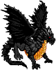
Rendering pass #1 for the bronze. Probably continues to need significantly more detail. Going to move on to the remainder of the piece.
Rendering pass #1 for the bronze. Probably continues to need significantly more detail. Going to move on to the remainder of the piece.
- Attachments
-
http://thespaceinvader.co.uk | http://thespaceinvader.deviantart.com
Back to work. Current projects: Catching up on commits. Picking Meridia back up. Sprite animations, many and varied.
Back to work. Current projects: Catching up on commits. Picking Meridia back up. Sprite animations, many and varied.

Re: TSI gets back into it: Drake Enforcer & Warden
The armor is looking more metallic 
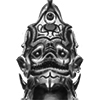
The shape of the helmet is difficult to discern though. Is it supposed to be mostly flat on the sides?
The shape of the helmet is difficult to discern though. Is it supposed to be mostly flat on the sides?
BfW 1.12 supported, but active development only for BfW 1.13/1.14: Bad Moon Rising | Trinity | Archaic Era |
| Abandoned: Tales of the Setting Sun
GitHub link for these projects
| Abandoned: Tales of the Setting Sun
GitHub link for these projects
-
thespaceinvader
- Retired Art Director
- Posts: 8414
- Joined: August 25th, 2007, 10:12 am
- Location: Oxford, UK
- Contact:
Re: TSI gets back into it: Drake Enforcer & Warden
Yes. Mostly flat, with a slight curve.
http://thespaceinvader.co.uk | http://thespaceinvader.deviantart.com
Back to work. Current projects: Catching up on commits. Picking Meridia back up. Sprite animations, many and varied.
Back to work. Current projects: Catching up on commits. Picking Meridia back up. Sprite animations, many and varied.
Re: TSI gets back into it: Drake Enforcer & Warden
TSI, good buddy! It's been.. well I guess nearly a year. School sucks up a lot of time doesn't it?
Well looking at your Warden, there's a couple things I can suggest as far as metal rendering. I've been messing around with it a lot while I've been away and have come up with some interesting bits on the matter.
First, make it less saturated. From what I can tell, making it so saturated kind of messes with your head and throws the entire process out of whack. If you MUST make it that extreme yellow, build up to it. I don't know if you're still using Gimp or if you've moved on to Photoshop, but use the tools you have and gradually work it in. I've adapted this policy and I believe its done wonders for both my time management and overall results.
Second, all that shine and such? Generally not as required as you'd think. Make it look reflective (vague colors work as well as fancy details here) and give it some highlights, sure. But I think most people will fill in a lot of the blanks on their own. Making it look really polished and clean just doesn't seem visually interesting. To this end, sell the material with the scratches and dings. Put rust and blood/dirt or whatever you feel most comfortable with grunging it up. The bottom line is that going for the museum showroom look gets in the way of the intent I think.
I say this not as an insult, but just an observation of how you've progressed within this threat. I get the impression you have the same opinion but are just reluctant to try to put it in to practice. I'm almost positive if you give it a go you'll come out with better results, if only because you're paying more attention while exploring a new way of doing things.
I have some other suggestions, but they really only apply if you're using photoshop. Anyways, I love what you've done with the drakes, both Sprite and portrait, and can't wait to see more from you.
Cheers!
Win if you can. Lose if you must. But always cheat.

Re: TSI gets back into it: Drake Enforcer & Warden
I get a gold vibe from this, despite the fact you're aiming for bronze. Obviously take this with several pinches of salt, but I'd suggest going for a darkish brown overall with thick, orangey-brown highlights.
Then again my opinion counts for nothing whatsoever so...
so...
Then again my opinion counts for nothing whatsoever
"What do you mean, "a dwarvish dragonguard with marksman is overpowered"?"
Story of a Drake Outcast | The Nonsense Era
Played HttT-Underground Channels? Thought it was rubbish? Help us develop it here!
Story of a Drake Outcast | The Nonsense Era
Played HttT-Underground Channels? Thought it was rubbish? Help us develop it here!
-
thespaceinvader
- Retired Art Director
- Posts: 8414
- Joined: August 25th, 2007, 10:12 am
- Location: Oxford, UK
- Contact:
Re: TSI gets back into it: Drake Enforcer & Warden
Eh, it can be gilded. That could be fun, actually, to have the gilding flaking off around the damaged portions.
EDIT: want finished. Shading complete. Pick away.
EDIT: want finished. Shading complete. Pick away.
- Attachments
-
- warden.png (57.32 KiB) Viewed 4117 times
-
- warden.png (293.55 KiB) Viewed 4117 times
http://thespaceinvader.co.uk | http://thespaceinvader.deviantart.com
Back to work. Current projects: Catching up on commits. Picking Meridia back up. Sprite animations, many and varied.
Back to work. Current projects: Catching up on commits. Picking Meridia back up. Sprite animations, many and varied.
Re: TSI gets back into it: Drake Enforcer & Warden
Lovely work on that white steel, I'd pick on a few details, but you're probably longing to get on with Meridia
Like cats? I've made a whole faction of them to kick ass with!
Don't like cats? I've made a whole faction of them to kick their asses! So everyone's happy :)
Felinian faction is part of the Beyond Southern Hells era
kitties need sprites! art topic here
Don't like cats? I've made a whole faction of them to kick their asses! So everyone's happy :)
Felinian faction is part of the Beyond Southern Hells era
kitties need sprites! art topic here
Re: TSI gets back into it: Drake Enforcer & Warden
I like the flame engraving on the halberd, but at first sight it looks like really bizarre, like some sort of random scratches. I have to look closely to see the pattern.
"What do you mean, "a dwarvish dragonguard with marksman is overpowered"?"
Story of a Drake Outcast | The Nonsense Era
Played HttT-Underground Channels? Thought it was rubbish? Help us develop it here!
Story of a Drake Outcast | The Nonsense Era
Played HttT-Underground Channels? Thought it was rubbish? Help us develop it here!
-
beetlenaut

- Developer
- Posts: 2827
- Joined: December 8th, 2007, 3:21 am
- Location: Washington State
- Contact:
Re: TSI gets back into it: Drake Enforcer & Warden
Your rendering of armor/metal has improved quite a bit since the dwarf days. Nice work!
Campaigns: Dead Water,
The Founding of Borstep,
Secrets of the Ancients,
and WML Guide
The Founding of Borstep,
Secrets of the Ancients,
and WML Guide
-
thespaceinvader
- Retired Art Director
- Posts: 8414
- Joined: August 25th, 2007, 10:12 am
- Location: Oxford, UK
- Contact:
Re: TSI gets back into it: Drake Enforcer & Warden
Don't say that, you'll make me want to go back over them >.<
Seriously though, I do genuinely think that the Lord, in particular, would benefit from a rework.
Seriously though, I do genuinely think that the Lord, in particular, would benefit from a rework.
http://thespaceinvader.co.uk | http://thespaceinvader.deviantart.com
Back to work. Current projects: Catching up on commits. Picking Meridia back up. Sprite animations, many and varied.
Back to work. Current projects: Catching up on commits. Picking Meridia back up. Sprite animations, many and varied.
-
LordBob

- Portrait Director
- Posts: 1309
- Joined: December 8th, 2008, 8:18 pm
- Location: Lille, France
- Contact:
Re: TSI gets back into it: Drake Enforcer & Warden
Please excuse the late comment, I hadn't realized this was waiting for review.
There are a couple of details bothering me :
- something in the blade of the halberd makes it seem curved inwards (concave) instead of flat. I think it has to do with the middle part being lighter than both spikes >> the overall shading should read as a linear gradient with the top spike lighter.
- the shadow cast by the left arm on his thigh feels awkward, because it doesn't to follow the curve of the surface. >> you can increase, even exaggerate, the curve of the shadow, and add blurr as the shaded area gets further form the interfering object (here the gauntlet).
- the spike on his elbow is confusing : lineart says "round' (because of the base curve where it joins the elbow), shading says "flat" >> both options work, as long as lines and shading are coherent.
- the (our) left wing cover feels as if it were on the exact same level as the right one, whereas we expect it to look closer with this pose. I think it's because both are shaded with very similar values >> fiddling with brightness/contrast/saturation ought to help pushing the left wing forward and right wing backwards.
Side note: I noticed all along the drake series that you're very often struggling with the lighting levels and the definition of a coherent light source. If it may help, I'm attaching below an example of an improved process I've recently been taught. The idea behind it is to clearly define light & shadow in binary values (i.e. a single shade of grey on white background) before applying any colour. Once you're satisfied with the binary values, you can start adding colour, darker shadows, mid-tones, and so forth.
Doing so removes the complexity of colour interpretation in earlier steps and saves a lot of time : such as shown, it's a lot easier to tell wether or not a lightsource works, and correcting it is a lot faster. Plus, if your picture has issues in binary values, no amount of texturing and shading will ever solve them.
If you're working with separate colour layers as I do, you can either merge a copy of your binary shadow on each layer or keep it as a single "shadow" layer with "multiply" merging style, that you further define. It's really up to your working habits.
Once you get used to it, this kind of process is so helpful that it ought to be compulsory
- Attachments
-
- Shading-example.jpg (25.64 KiB) Viewed 3847 times
-
thespaceinvader
- Retired Art Director
- Posts: 8414
- Joined: August 25th, 2007, 10:12 am
- Location: Oxford, UK
- Contact:
Re: TSI gets back into it: Drake Enforcer & Warden
After quite some time... Tweaks as suggested.
- Attachments
-
- warden.png (292.95 KiB) Viewed 3596 times
-
- warden.png (57.23 KiB) Viewed 3596 times
http://thespaceinvader.co.uk | http://thespaceinvader.deviantart.com
Back to work. Current projects: Catching up on commits. Picking Meridia back up. Sprite animations, many and varied.
Back to work. Current projects: Catching up on commits. Picking Meridia back up. Sprite animations, many and varied.
Re: TSI gets back into it: Drake Enforcer & Warden
I like the improvements on it. There are some spots on the wing and gauntlet closest to us with some smudges I'd like to see cleaned up a little, but overall it came out very well.
Is this the last drake portrait or are there others?
Is this the last drake portrait or are there others?
Win if you can. Lose if you must. But always cheat.