Campaign art - Descent into Darkness
Moderator: Forum Moderators
Forum rules
Before posting critique in this forum, you must read the following thread:
Before posting critique in this forum, you must read the following thread:
-
artisticdude

- Moderator Emeritus
- Posts: 2424
- Joined: December 15th, 2009, 12:37 pm
- Location: Somewhere in the middle of everything
Re: Campaign art - Descent into Darkness
Yes, but Mal Keshar's UftU portrait has some hair left on his skull, and that's supposedly thousands of years later, IIRC. Even if it would be more realistic for him to have a 100% clean skull, I personally don't have a problem with there being some remnants of skin and hair still on his head, since it adds interest to the character and gives him a more gruesome appearance, IMO.johndh wrote:It does seem like it should have all rotted off by the time he becomes "ancient", doesn't it? Unless the term is being used more figuratively just to represent more powerful liches in general, of course.homunculus wrote: as for the current portrait it seems like there is still supposed to be some decayed skin on the head?
what about having a clean skull for the ancient lich
I'd agree with that.zookeeper wrote:The reason I specifically asked for that kind of a pose for the first one is the context: it's used immediately after he's been turned into a lich. He starts out weak and unaccustomed to his new form, is probably pretty uncomfortable with most of his former body having disappeared all of a sudden and I'd think he doesn't really want anyone to see him like that. Personally I think the portrait works really well for that purpose.
"I'm never wrong. One time I thought I was wrong, but I was mistaken."

Re: Campaign art - Descent into Darkness
That's a great crazy lich! My favourite detail is the way the belt reveals the shape of the pelvis!
The triangular composition reminds me of a ton classical paintings...
Only one little gripe - I'm not sure if the staff's stone is really fitting, it feels kinda bland, perhaps something more angular or crystalline-spiky would be more fitting.
The triangular composition reminds me of a ton classical paintings...
Only one little gripe - I'm not sure if the staff's stone is really fitting, it feels kinda bland, perhaps something more angular or crystalline-spiky would be more fitting.
-
LordBob

- Portrait Director
- Posts: 1309
- Joined: December 8th, 2008, 8:18 pm
- Location: Lille, France
- Contact:
Re: Campaign art - Descent into Darkness
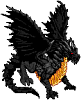
Finalized Malin in his ancient (as in "mature", but not necessarily thousand-years old  ) lich-self.
I've tried to convey both anger and a feeling of power unleashed compared to the former lich portrait, plus dim ambient light as he's fully become a creature of the night.
Note that the flames around his staff rely heavily on transparency, so don't mind if the look a bit gross on a white backround : they should be very different in game with the rather dark game screen as background.
- Attachments
-
- DiD-malin_ancient_lich.png (305.9 KiB) Viewed 4540 times

Re: Campaign art - Descent into Darkness
Wow!
Its fantastic.
Its fantastic.
Author of Antar, Son of Rheor ( SP Campaign) | Development Thread + Feedback Thread + Replays of ASoR

Re: Campaign art - Descent into Darkness
you mentioned that the flames have something to do with transparency, but to what extent? Right now, the color looks quite wrong. Specifically, the bright, energetic blue on the actual crystal makes me think of loyalty, not evil. Wouldn't something in the dark-purple or red color range do better? Or maybe acidic green?
This might just be me misunderstanding.
This might just be me misunderstanding.

Re: Campaign art - Descent into Darkness
This is a very subjective detail; to me, it only looks fitting with his “eye” color and background story.Arawn wrote:Specifically, the bright, energetic blue on the actual crystal makes me think of loyalty, not evil.
The only thing that bugs me (which I also see in the first young Malin portrait as it appears in trunk in the campaigns list dialog) is the cropping effects on the magic halo. I’ve attached a little composition pic showing what I mean.
- Attachments
-
Author of the unofficial UtBS sequels Invasion from the Unknown and After the Storm.
Re: Campaign art - Descent into Darkness
mm..that's gonna show nastily in dialogues..
I wonder how i noticed that - but there's a patch of pure (or at least visibly darker) black in the top-left 'corner' of the 'empty' eye
as for the feeling conveyed - objective achieved! He looks marvelously menacing
edit:there might be a use for that black patch..how about moving it to the center of the eyehole, 'antialiasing' a little and try to achieve an effect of some dark void staring at the viewer from somewhere inside?
Like cats? I've made a whole faction of them to kick ass with!
Don't like cats? I've made a whole faction of them to kick their asses! So everyone's happy :)
Felinian faction is part of the Beyond Southern Hells era
kitties need sprites! art topic here
Don't like cats? I've made a whole faction of them to kick their asses! So everyone's happy :)
Felinian faction is part of the Beyond Southern Hells era
kitties need sprites! art topic here
-
thespaceinvader

- Retired Art Director
- Posts: 8414
- Joined: August 25th, 2007, 10:12 am
- Location: Oxford, UK
- Contact:
Re: Campaign art - Descent into Darkness
Yeah, the cropping on the magic effect needs to be avoided. Otherwise, awesome.
http://thespaceinvader.co.uk | http://thespaceinvader.deviantart.com
Back to work. Current projects: Catching up on commits. Picking Meridia back up. Sprite animations, many and varied.
Back to work. Current projects: Catching up on commits. Picking Meridia back up. Sprite animations, many and varied.
-
LordBob
- Portrait Director
- Posts: 1309
- Joined: December 8th, 2008, 8:18 pm
- Location: Lille, France
- Contact:
Re: Campaign art - Descent into Darkness
StDrake : I see what you're refering to. I'll change it so that the entire eyesocket is the same colour, but if it's that obvious on your screen, you're likely using a gamma setting higher than mine
Shadowmaster : do you mean how the tip of the flames is more or less parallel to the top of the image ? Or is it something different ? I checked closely on both the reduced png and the full-size original and didn't find any actuall cropping After double-checking against a white background, it became obvious. Thanks, it had slipped through unnoticed as I work with a dark grey backgroung.
Also, I absolutely do not see it on Shadowmaster's pic. Both this and StDrake's comment have me worried, I'll have to check my screen settings.
Shadowmaster : do you mean how the tip of the flames is more or less parallel to the top of the image ? Or is it something different ? I checked closely on both the reduced png and the full-size original and didn't find any actuall cropping
Also, I absolutely do not see it on Shadowmaster's pic. Both this and StDrake's comment have me worried, I'll have to check my screen settings.
-
thespaceinvader
- Retired Art Director
- Posts: 8414
- Joined: August 25th, 2007, 10:12 am
- Location: Oxford, UK
- Contact:
Re: Campaign art - Descent into Darkness
Look on the black-background version - the background glow is cropped off, and shouldn't be.
http://thespaceinvader.co.uk | http://thespaceinvader.deviantart.com
Back to work. Current projects: Catching up on commits. Picking Meridia back up. Sprite animations, many and varied.
Back to work. Current projects: Catching up on commits. Picking Meridia back up. Sprite animations, many and varied.
Re: Campaign art - Descent into Darkness
Nope, I am talking about cropping. If you look carefully (or zoom in) you should notice that the flames halo is cut off towards the top left corner following the image’s edges.
EDIT: TSI beat me to it.
EDIT: TSI beat me to it.
Author of the unofficial UtBS sequels Invasion from the Unknown and After the Storm.
Re: Campaign art - Descent into Darkness
Hmm... yeah, I looked at the other undead and they all have that "loyal blue" color. I suppose it's not practical for me to ask all undead portraits to be changed. You're right, it should stay.

Re: Campaign art - Descent into Darkness
Not many of the other undead were created out of dedication and self-sacrifice to a good cause; the anomalous blue makes sense to me.

Re: Campaign art - Descent into Darkness
I see the same splotch on the eye as StDrake, but not without looking for it.
But that aside...Dangggg this is awesome! Nice work LB!
The only thing I can see is a nit pik, the metal on the book seems to me just a little to clean to have been carried around for so long by a dirty old lich. But that's purely opinionated, so don't mind me. It looks awesome!
[EDIT] Yano, I knew that it wasn't you who said it, but I guess I spazzed lol. Fixed.
But that aside...Dangggg
The only thing I can see is a nit pik, the metal on the book seems to me just a little to clean to have been carried around for so long by a dirty old lich. But that's purely opinionated, so don't mind me. It looks awesome!
[EDIT] Yano, I knew that it wasn't you who said it, but I guess I spazzed lol. Fixed.
Last edited by Mirion147 on January 10th, 2011, 10:48 pm, edited 1 time in total.
Take a look at the Era of the Future!
Current factions: The Welkin, The Brungar, and The Nordhris!
^This is old news lol but I don't care^
New news -> Up the River Bork Campaign!
Current factions: The Welkin, The Brungar, and The Nordhris!
^This is old news lol but I don't care^
New news -> Up the River Bork Campaign!
Re: Campaign art - Descent into Darkness
StDrake saw it, not me.Mirion147 wrote:I see the same splotch on the eye as shadowmaster, but not without looking for it.
Author of the unofficial UtBS sequels Invasion from the Unknown and After the Storm.