Justinoperable- Rise of Wesnoth
Moderator: Forum Moderators
Forum rules
Before posting critique in this forum, you must read the following thread:
Before posting critique in this forum, you must read the following thread:
-
thespaceinvader

- Retired Art Director
- Posts: 8414
- Joined: August 25th, 2007, 10:12 am
- Location: Oxford, UK
- Contact:
Re: Justinoperable- Rise of Wesnoth
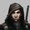
Aethyr's head looks a little unbalanced - the eyes a touch small, the mouth a touch large and wide, the top of the head too small - but otherwise, the overall design and appearance look excellent. That's very nice work. The only other slight issue I notice is that the direction of his shoulders and legs, and the apparent direction of his breastplate are different. You could do with rotating the centre line of his armour and collar a to our left somewhat.
http://thespaceinvader.co.uk | http://thespaceinvader.deviantart.com
Back to work. Current projects: Catching up on commits. Picking Meridia back up. Sprite animations, many and varied.
Back to work. Current projects: Catching up on commits. Picking Meridia back up. Sprite animations, many and varied.
-
JustinOperable
- Art Contributor
- Posts: 175
- Joined: March 3rd, 2009, 1:41 am
Re: Justinoperable- Rise of Wesnoth
I intend for him to be twisting, but it's hard to show when someone is in armor. That why I have the breastplate segmented. I didn't want him to be standing too straight, but I don't know if it's gonna work.
-
thespaceinvader
- Retired Art Director
- Posts: 8414
- Joined: August 25th, 2007, 10:12 am
- Location: Oxford, UK
- Contact:
Re: Justinoperable- Rise of Wesnoth
Ak, k - in that case, you need to rotate the shoulders out to agree with the breastplate - one way or the other, the two need to match.
http://thespaceinvader.co.uk | http://thespaceinvader.deviantart.com
Back to work. Current projects: Catching up on commits. Picking Meridia back up. Sprite animations, many and varied.
Back to work. Current projects: Catching up on commits. Picking Meridia back up. Sprite animations, many and varied.

Re: Justinoperable- Rise of Wesnoth
I'm not sure if you missed my comments on Burin and Eldaric, so I try to rephrase:JustinOperable wrote:I didn't really get much crit on Burin or Eldaric and I like to work on many different things, so I have also attached a start to Aethyr. Still a whole lot to be done, but I'm pretty happy with where it's going.
Burin looks very stiff and static due to the extremely full frontal layout you chose. And this doesn't convey his crazy personality at all. Break the symmetry up. You could also make his mouth more expressive, his eyes have a great stare already but the mouth is pretty emotionless right now. Apart from that his skintone is very uniform and unhealthy. Somebody already mentioned the strange helmet-hair-relationship.
Eldaric has strangely fat forearms, they strike me as a comic-like mannerism. And there is a problematic break in the level of detail/realism between the chainmail and the plate parts of his armour. The chainmail is incredibly detailed and beautiful while the plate armour is all soft and fuzzy. Look at ref of real armour and try to understand the way light interacts with metal to give it a better finish.
But all in all your work for tRoW will really be a great change for the better
-
JustinOperable
- Art Contributor
- Posts: 175
- Joined: March 3rd, 2009, 1:41 am
Re: Justinoperable- Rise of Wesnoth
All my lurking made me miss drawing for Wesnoth, so I'm taking a poorly advised break from homework to present a rough line drawing for Typhon. I still have plenty of half finished portraits in this series (in fact I think only Haldric has been committed or am I mistaken), but this is just some impulse drawing before the tidal wave of costume, product and transportation design homework I will be buffeted with. It's still a little rough in line quality but I think overall it looks good. I wanted it to look like he was just settling himself from thrusting up from the water, hence the way his arm is almost swinging behind him. I like it but I think people will feel it looks a bit awkward and I havent been able to figure out another way to draw him in that pose. Let me know what you all think. Please forgive the roughness, I didn't use any reference on this piece yet so the face and anatomy might not be completely accurate.
- Attachments
-
- Typhon.png (133.92 KiB) Viewed 3353 times

Re: Justinoperable- Rise of Wesnoth
IMO, the pose is great, as well as the line art. I'm a bit confused at whats going on around his neck, but I suppose this will be clarified during blocking/shading. I can't wait to see him done.
Ecce, in caelo! Est avem! Minime, est vehiculum aerem! Minime, est virum Latinum!
-
JustinOperable
- Art Contributor
- Posts: 175
- Joined: March 3rd, 2009, 1:41 am
Re: Justinoperable- Rise of Wesnoth
In the original portrait he has a a big gold shoulder guard with a plate protecting his neck. I liked it and try to maintain some continuity with the old designs, so I kept it, but it's going to be made of crab chitin so the shapes are more organic, it should be more easily understood when the flats and rendering occurs but if it still looks weird I will alter it.
-
LordBob

- Portrait Director
- Posts: 1309
- Joined: December 8th, 2008, 8:18 pm
- Location: Lille, France
- Contact:
Re: Justinoperable- Rise of Wesnoth
What I can suggest is that you take an additional leaf out of Kitty's book, especially regarding mermen armour designs : while promising, I feel your linework can improve before it equals the existing generic merpeople portraits. 
Areas that require specific attention IMHO : his right forearm + hand, the staff, the volume of the shouder guard (mirroring the picture ought to help spot minor imperfections), and the crown which seems weirdly bent and vaguely hovering in front of his head.
Areas that require specific attention IMHO : his right forearm + hand, the staff, the volume of the shouder guard (mirroring the picture ought to help spot minor imperfections), and the crown which seems weirdly bent and vaguely hovering in front of his head.
Want to see more of my art ? Visit my portfolio !