Ghosts!
Moderator: Forum Moderators
Forum rules
Before posting critique in this forum, you must read the following thread:
Before posting critique in this forum, you must read the following thread:
-
JustinOperable
- Art Contributor
- Posts: 175
- Joined: March 3rd, 2009, 1:41 am
Re: Ghosts!
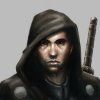
Looks amazing. I really like the face especially. if anything I think it bothers me that the opacity is very similar through many of the sheer portions especially in the arm, I'd like to see a little variation in that, it sounds strange but I feel like it flattens the area. But even as is, it's great.
-
lostnumber
- Posts: 198
- Joined: September 23rd, 2008, 1:06 am
Re: Ghosts!
I think the contrast between the highly polished metal and the dark and ragged character looks a little odd, I'd second doing something to make the blades look more evil/worn/non-shiny

Re: Ghosts!
I have to disagree with the above sentiments about wearing the blades down or rusting them. This thing is a magical incorporeal being....and you're telling me his blades are going to rust?
-
thespaceinvader

- Retired Art Director
- Posts: 8414
- Joined: August 25th, 2007, 10:12 am
- Location: Oxford, UK
- Contact:
Re: Ghosts!
I wasn't after rust and scratches, so much as mismatches - the blades simply look too perfect at present to me compared with the rest of the image. It's an interesting contrast, but one you could maintain just as well with nice shiny blades which aren't all identical - to fit with his sackcloth appearance, various items of farm equipment might be cool.
http://thespaceinvader.co.uk | http://thespaceinvader.deviantart.com
Back to work. Current projects: Catching up on commits. Picking Meridia back up. Sprite animations, many and varied.
Back to work. Current projects: Catching up on commits. Picking Meridia back up. Sprite animations, many and varied.
-
LordBob

- Portrait Director
- Posts: 1309
- Joined: December 8th, 2008, 8:18 pm
- Location: Lille, France
- Contact:
Re: Ghosts!
I find the transparency bit slightly disturbing.  I understand it fits an immaterial creature, but the in-game screen just feels a little weird. Maybe with higher opacity ?
As to the claws, I'm with TSI : it's not their rendering I'm bothered with (shiny solid steel is fine), it's the design. Maybe blades of different shapes and sizes, along with a built-from-scratch look, would fit ?
As to the claws, I'm with TSI : it's not their rendering I'm bothered with (shiny solid steel is fine), it's the design. Maybe blades of different shapes and sizes, along with a built-from-scratch look, would fit ?
Want to see more of my art ? Visit my portfolio !
-
lostnumber
- Posts: 198
- Joined: September 23rd, 2008, 1:06 am
Re: Ghosts!
Also on the blades, a lot of this is probably due to perspective (his back arm being much farther away) but the front blades look about 4 times the size of the back one. Due to the lighting they also look much more silver and shiny, while the back ones are darker and more black.
In the smaller picture the back ones also look somewhat crooked and blunt, while the front ones are perfectly straight.
Maybe this is what you are going for, but to me it looks a little off
In the smaller picture the back ones also look somewhat crooked and blunt, while the front ones are perfectly straight.
Maybe this is what you are going for, but to me it looks a little off

Re: Ghosts!
Some more work on the Shadow - more detailing to the body/cloth and its transparency issues and some irregularities for the blades. Since I really liked their original symmetrical design this is as far as I will go with them. Final touches tomorrow...
- Attachments
-
- shadow02.png (391.7 KiB) Viewed 3951 times
Re: Ghosts!
wowwwww kitty, always nice to see more of your work! You make them look so creepy!
You are truly a first rate artist!
David
You are truly a first rate artist!
David
“At Gambling, the deadly sin is to mistake bad play for bad luck.” -- Ian Fleming

Re: Ghosts!
Sweet Shadow. I like the shape of the blades, especially the one that's been bent a little to show excessively rough use. Maybe a little rust would help the blades match the torn cloth the Shadow is wearing.
Re: Ghosts!
well, as an opinion, (there is very little one can add to your pictures kitty), i think it looks more frightening with less rust, following the ethereal and magical nature of ghosts. or thats how i think about it.
Re: Ghosts!
Thanks for your opinions! Here is the final version.
I'll start working on the Nightgaunt tonight.
I'll start working on the Nightgaunt tonight.
- Attachments
-
- shadow03.png (251.67 KiB) Viewed 3812 times
-
- shadow_bg.png (59.32 KiB) Viewed 3812 times
Re: Ghosts!
And lines/flats for the Nightgaunt - I'm not as far as I planned for tonight, I'll have to make up for that tomorrow...
- Attachments
-
- nightgaunt01.png (361.91 KiB) Viewed 3686 times

Re: Ghosts!
He doesn't appear to have any bulk. On the other ghosts you did the cloth bends as if around an invisible body.
This one just completely blows in the wind?
This one just completely blows in the wind?
Re: Ghosts!
Yep, getting less and less corporeal. Plus more motion/wind this time.

Re: Ghosts!
Just a thought, what if there was a face scraped into the metal plate? 'Cause that doesn't really look that ominous.
Take a look at the Era of the Future!
Current factions: The Welkin, The Brungar, and The Nordhris!
^This is old news lol but I don't care^
New news -> Up the River Bork Campaign!
Current factions: The Welkin, The Brungar, and The Nordhris!
^This is old news lol but I don't care^
New news -> Up the River Bork Campaign!