Valkiers portraits: It's like I can touch you!
Moderator: Forum Moderators
Forum rules
Before posting critique in this forum, you must read the following thread:
Before posting critique in this forum, you must read the following thread:
Re: Valkiers portraits: Insubstantially exuberant
Break time! Time to get back to work!
I still know there are minor fixes to be done to some previous portraits. I will get to them in time.Till then, fun with Photoshop CS5!
I still know there are minor fixes to be done to some previous portraits. I will get to them in time.Till then, fun with Photoshop CS5!
- Attachments
-
- morvin.jpg (88.3 KiB) Viewed 5537 times
Win if you can. Lose if you must. But always cheat.

Re: Valkiers portraits: It's like I can touch you!
I'm loving the white scheme a lot. It works better with the sprites than turqoise. I trust Thera's going to get a same kind of treatment?
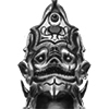
At this point the flow of the cloth he's wearing on his shoulders (the long, ornate one) is a bit weird. Also, the leather patches on his shoulders aren't too distinct from the cloth, and some dimensions wouldn't hurt. More reinforced, I mean. Furthermore, I'm having trouble figuring out what the grey plate on his breast is supposed to be.
A great WIP, though! You're taking the right approach here, I think.
"Oh, to the hades with the manners - he's a complete [censored], and calling him that insults bastards everywhere!"
-Nalia De'Arnise
-Nalia De'Arnise

Re: Valkiers portraits: It's like I can touch you!
Hey! Great to see you around again!
The new colour scheme is really nice, I like the silkiness of the robe a lot!
Atm I have some problems reading his upper body: the round plate doesn't seem to be centered and receives light from the opposite direction than his head. is the dark blue below his right lower arm supposed to be the sleeve's inside or a shadow? The belts are too low. And I have no idea how his right hand is supposed to be positioned, it also seems to be pretty tiny.
I'd really look forward to seeing something finished from you!
Re: Valkiers portraits: It's like I can touch you!
A lot of what I threw on to him is just playing around. Some of it is going to be kept. Others, not so much. I'm pretty much just using this portrait as an excuse to mess around with some of the new brush options.
Kraus: None of it is distinct right now. Still playing, so can't say when this will be solved. I think it's looking great for cloth though. Everything is coming out pretty soft.
Kitty: I'm redoing the lighting on him a bit to, once again, play around with some ideas and concepts about the whole thing right now. If it doesn't look uniform at the moment, that's because parts of him just haven't been reworked in any capacity yet. So as you said, shadows are a little off and dark, the lighting on his head doesn't match the body, etc. My hand blobs being the deformed clay that they are, I'm not sure what you mean by his belt. Typically, belts rest below the navel which typically falls in line with the elbows. I can moved it up a bit to give him something of a battle girdle I suppose, but my current idea is more or less to just keep playing around till I get a look I like. Your issue may be fixed in that process, or it may not be, so please let me know what you mean just in case.
Cheers!
And good god is CS5 fun. This guy may never be finished just out of the sheer amount of stuff I want to try!
Win if you can. Lose if you must. But always cheat.
Re: Valkiers portraits: It's like I can touch you!
Yep, elbows typically sit at the navel's height, which is about two heads below the chin. And since belts typically rest on the hips, they sit still a bit lower… my point simply was that Morvin's sit a tad too low, perhaps that has to do with the overall feeling that his torso lacks definition, I can't make out much of the basic shapes - even men have hips.Valkier wrote:I'm not sure what you mean by his belt. Typically, belts rest below the navel which typically falls in line with the elbows. I can moved it up a bit to give him something of a battle girdle I suppose, but my current idea is more or less to just keep playing around till I get a look I like. Your issue may be fixed in that process, or it may not be, so please let me know what you mean just in case.
But I guess your answer will be that everything is still in process and that you are anyways going to paint over it
Re: Valkiers portraits: It's like I can touch you!
Speaking of belts...
For what it's worth, I also get the impression that the belts are too low. They just don't quite look right.
- missingbelt.jpg (4.48 KiB) Viewed 5065 times
Re: Valkiers portraits: It's like I can touch you!
Probably my mistake. I was modeling his belt thing on a more modern version where it wraps around the hips (at least mine do. My fashion sense may certainly be askew, however) and not so much the mid section thing you typically see in fantasy art and such. Or maybe I'm not even thinking of the right fantasy art. Now I'm a bit paranoid.kitty wrote:Yep, elbows typically sit at the navel's height, which is about two heads below the chin. And since belts typically rest on the hips, they sit still a bit lower… my point simply was that Morvin's sit a tad too low, perhaps that has to do with the overall feeling that his torso lacks definition, I can't make out much of the basic shapes - even men have hips.Valkier wrote:I'm not sure what you mean by his belt. Typically, belts rest below the navel which typically falls in line with the elbows. I can moved it up a bit to give him something of a battle girdle I suppose, but my current idea is more or less to just keep playing around till I get a look I like. Your issue may be fixed in that process, or it may not be, so please let me know what you mean just in case.
But I guess your answer will be that everything is still in process and that you are anyways going to paint over itI really don't know how to give you any kind of critique because when everything is labelled preliminary and not to be taken seriously I don't know why I should even look at it - it would be nice if you could state clearly on which parts or aspects of your paintings you want comments and which are just to let us know what you are up to…
And I didn't mean to seem dismissive of your critique or anything. I just really am not yet satisfied with how he's looking at the moment in any way. He's not refined enough, his costume looks generic and boring, I want to find a more interesting way of doing the lighting, and I wish I'd have put his head at more of an angle. I tried to give that impression away by saying I'm playing with the latest update, but I will admit that it was not clear and I should have made that intention known. Typically when I post WIP's it's to get critique on how to make the costume more interesting or overly glaring mistakes like Camerin's mangled hands and the like. When I have a belt idea I like, I will certainly have it higher than the current one. I just meant that there may not end up being one at all, but I still did not see what you were pointing out and needed the clarification.
Now if I ever, at any point, say I'm happy with the overall design and am looking to sharpen things up and finish him, that's when you know I have overlooked a glaring mistake and need to be told, "Hey stupid! Fix it!" At which point I smack my own head and get to work. Case and point, the half naked dwarf guy whom I still need to fix his pectoral muscle. So I promise you, I do listen to what you say and mull over it a bit. It's why Morvin here got whiter robes instead of turquoise, your request if I recall correctly. I just ask that we hold off on pointing out when I'm being [censored] till I clearly and wrongly state I'm close to finished.
As for his brown mass disappearing, I saw that too as I submitted it. I haven't quite gotten a good consistency for how the blue glow to the left should play off the brown leather, so I probably threw down a color and forgot.
Win if you can. Lose if you must. But always cheat.
Re: Valkiers portraits: It's like I can touch you!
Thanks for the clarification That sounds fine with me.
Now I'm kicking my heels to seeing where you'll go with Morvin. Now get moving and back to the drawing board!
Now I'm kicking my heels to seeing where you'll go with Morvin. Now get moving and back to the drawing board!
Re: Valkiers portraits: It's like I can touch you!
Wanted to give a quick update on my progress. No pictures at the moment, but I have a good reason! To avoid confusion like the one with Kitty, I decided to hold off on posting WIP's till I think they are ready for a final review. I should have something worth while within the next week or two.
Win if you can. Lose if you must. But always cheat.
-
Drakefriend

- Posts: 436
- Joined: September 27th, 2009, 12:57 pm
- Location: Wandering from one world to another
- Contact:
Re: Valkiers portraits: It's like I can touch you!
Before they get forgotten: To me (who does not know...er,...very much about art) the portraits look perfect. I think they should be submitted with the possibility for upgrades. This includes the Liches- they look quite distinctive, Ro'Sothian would not make a good generic alternative Lich portrait.
Maybe the Wraith (I can't remember what he is called) should get a portrait, and probably the unit Wraith. too- it is one of the few units that do not have a portrait at all, and besides the WC/Soulless the only one avaible in default.
Maybe the Wraith (I can't remember what he is called) should get a portrait, and probably the unit Wraith. too- it is one of the few units that do not have a portrait at all, and besides the WC/Soulless the only one avaible in default.
After far too long an absence, I have returned.
According to the quiz 100% Silver Mage (85% Archmage, 75% Shyde, 67% Flameheart and Ancient Wose,58% Assassin, Troll Warrior and Berserker). And my top score is exactly how I see myself.
According to the quiz 100% Silver Mage (85% Archmage, 75% Shyde, 67% Flameheart and Ancient Wose,58% Assassin, Troll Warrior and Berserker). And my top score is exactly how I see myself.
-
Pewskeepski
- Posts: 378
- Joined: November 17th, 2010, 6:24 pm
- Location: An icy dungeon beneath Antarctica
Re: Valkiers portraits: It's like I can touch you!
While we're on the discussion, I was thinking that maybe Krash could use a portrait? He doesn't have a whole lot of dialogue, but he's in the campaign a lot.
"Everything is better with penguins."
Creator of Burning Souls, The Fall of Wesnoth (abandoned) and Adventures of Knighthood (now available on BfW 1.15!)
Creator of Burning Souls, The Fall of Wesnoth (abandoned) and Adventures of Knighthood (now available on BfW 1.15!)
Re: Valkiers portraits: It's like I can touch you!
Well through various projects and experiments I've done over the course of my semester, I'm seriously rethinking more than a couple of these. At the moment I'm looking at restarting the Orc guy, Morvin, and the lich. Basically the reason for this is I've found a much more fluid method to do these and with much better results. The down side is I feel quite terrible it's taking me this long to deliver on these portraits. I know there is some understanding since I am in college and all, but still. Tomorrow I'm going to sit down and do the reworks a bit and post them.
As for Krash, I don't have anything against doing it. Still, I have about 4 portraits remaining with the reworks counted, so I want to get the core cast done. After that, I'll look in to the lesser characters.
On another note, some of my experimenting has been done with scene and environmental work. After the portraits, I may give one or two of those a shot and see how they're received. If anyone can point out a particularly epic moment they'd want to see, please post about it here. Again, given how long it's taken for me to work in time on the portraits between class work I can't promise much speed till the end of the month, but I am very interested in giving it a shot.
Win if you can. Lose if you must. But always cheat.
Re: Valkiers portraits: It's like I can touch you!
Didn't want to actually forget this time. It's a rough outline right now. I mostly wanted to get the pose and the general idea down. More armor and the like will be added as I progress on it, but I didn't want to say I was going to do something and then disappear. Again.
Further refinements will come as the night goes on, along with other preliminary redraws. The process I'm using is MUCH faster and better than what I was doing before, so completing these shouldn't be the tooth pulling exhibition that it was before.
Further refinements will come as the night goes on, along with other preliminary redraws. The process I'm using is MUCH faster and better than what I was doing before, so completing these shouldn't be the tooth pulling exhibition that it was before.
- Attachments
-
Win if you can. Lose if you must. But always cheat.
-
Sleepwalker

- Art Contributor
- Posts: 416
- Joined: October 23rd, 2008, 6:34 am
- Location: Sweden
Re: Valkiers portraits: It's like I can touch you!
The pose looks better in a more relaxed and confident way. I like that his gear seems to conform to his body structure more. Though his head seems a little too big for his body in orc terms. At least judging by the general size of the orcs in Lordbob's portraits.
Just holding a snapped lochaber axe unmodified looks pretty awkward. He could have wrapped leather or something around the handle to get a better grip... And maybe he could have added some kind of improvised pommel as a small counterweight.
Is that a axe head jutting out from his right bracer? If it is then that's awesome.
Sometimes we must be hurt in order to grow, fail in order to know, lose in order to gain, and sometimes we must have to be broken so we can be whole again...
- Nercy Masayon
- Nercy Masayon
Re: Valkiers portraits: It's like I can touch you!
I'm much more pleased with this one.
- Attachments
-
Win if you can. Lose if you must. But always cheat.