Captain Swings portrait work ... Undead
Moderator: Forum Moderators
Forum rules
Before posting critique in this forum, you must read the following thread:
Before posting critique in this forum, you must read the following thread:
-
Kestenvarn

- Inactive Developer
- Posts: 1307
- Joined: August 19th, 2005, 7:30 pm
- Contact:
Re: Draugnatomy - portrait attempt
That would contradict the note we have repeatedly made about how strictly following the sprite isn't necessary, wouldn't it?
E: Eh, it's kind of a murky rule anyways.
vvvvvv
E: Eh, it's kind of a murky rule anyways.
vvvvvv
-
thespaceinvader

- Retired Art Director
- Posts: 8414
- Joined: August 25th, 2007, 10:12 am
- Location: Oxford, UK
- Contact:
Re: Draugnatomy - portrait attempt
IN terms of posing, this looks much better - i meant to suggest a low camera angle like that to add to his towering-ness. As regards the helm, I'd suggest that with the current helm (which could still stand to be scaled down a touch) this guy would make a perfect Revenant, otherwise it could do with a helm which matches the Draug - a simple open faced pot helmet with lots of spikes like these on the top. I'd personally prefer the latter, since he does have that towering badassness i'd like from the Draug. (Sorry to contradict you there, Kestenvarn, but when (as here) something on the sprite exactly matches the previous level, it's a bit more of a grey area). But if you'd prefer to keep this helm and keep him as the draug, that works for me as well, it's up to you as the artist.
When you're inking, be careful that you don't have the 'fade out' setting on the paint tool ticked - that's what's causing the lines in long curves to... well, fade out...
It might also be worth cutting the frame in a little closer to him on the sides, and having his axe (nice design, but make sure the middle bit doesn't look too chunky - this was in issue with the previous model as well - a big step between the blade and the body of the head would cause it to stop rather than going straight through the target...) break the 400x400 size at the top, again to emphasise his size.
This looks very promising, keep up the great work =) If your finalised inks and shading still don't quite make it, I'll be happy to give it a go myself once I've finished on the Dwarves.
http://thespaceinvader.co.uk | http://thespaceinvader.deviantart.com
Back to work. Current projects: Catching up on commits. Picking Meridia back up. Sprite animations, many and varied.
Back to work. Current projects: Catching up on commits. Picking Meridia back up. Sprite animations, many and varied.
-
Cernunnos
- Art Contributor
- Posts: 292
- Joined: August 12th, 2008, 11:47 am
- Location: Bordeaux, France.
Re: Draugnatomy - portrait attempt
Hi,
First, agree with Kestenvarn,
Don't know if this is due to the helmet, or what causes that, but the head seems to go too far in front of him, it's to say i'm not sure about the distance of the head from the spine. (the spine would finish behind its head in the way it is drawn now, no?)
I'm sorry i can't find the problem exactly but i think the head or the spine or something around there, doesn't work properly.
As for the upper body armor i'm not exactly sure of the perspective or of its shape,moreover the curved line that is descending all along the chest plate. Well there again i don't know exactly what is wrong, but i believe (and it's just my opinion) that something actually is wrong.
I haven't seen no specific problem about the other parts, and the overall result is really good, and moreover, impressive.
Well, raised this before you start the color part, hope this helps,
Nice work, good luck!
edit: for the armor part it's maybe because the chest armor is seen from down whereas other parts (like around the neck) are seen from up?
since i'm not good in english (head moved too):
First, agree with Kestenvarn,
But since you're at the lining part, can i raise a point about the head,Truly, that looks terrific. Or as my friend put it, "that qualifies as badass."
Don't know if this is due to the helmet, or what causes that, but the head seems to go too far in front of him, it's to say i'm not sure about the distance of the head from the spine. (the spine would finish behind its head in the way it is drawn now, no?)
I'm sorry i can't find the problem exactly but i think the head or the spine or something around there, doesn't work properly.
As for the upper body armor i'm not exactly sure of the perspective or of its shape,moreover the curved line that is descending all along the chest plate. Well there again i don't know exactly what is wrong, but i believe (and it's just my opinion) that something actually is wrong.
I haven't seen no specific problem about the other parts, and the overall result is really good, and moreover, impressive.
Well, raised this before you start the color part, hope this helps,
Nice work, good luck!
edit: for the armor part it's maybe because the chest armor is seen from down whereas other parts (like around the neck) are seen from up?
since i'm not good in english (head moved too):
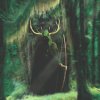
- drauging.png (110.86 KiB) Viewed 3574 times
"While portrait art may be where Wesnoth gets its glamour, and sprite art may be where Wesnoth gets its zest, it's the terrain art that's so crucial to Wesnoth's polish - it's the canvas that the rest goes on." Sangel
-
LordBob

- Portrait Director
- Posts: 1309
- Joined: December 8th, 2008, 8:18 pm
- Location: Lille, France
- Contact:
Re: Draugnatomy - portrait attempt
I like the pose of your new attempt but if I may, the helm desperately needs change: it looks wrong both in size and perspective.
My next comment is not only about your undead warrior : I may have a problem with your inking at large. The lines are smooth and sure, yet their number and thickness render a drawing that is difficult to read. Furthermore, it keeps your eye off of the perspective and volume problems. In your latest picture, his left shoulder region especially is a struggle for the eye. What I can suggest is to draw less lines on the final linework and do more with the shading.
One last question : is your work size 400*400 ? If so, it might explain your linework thickness. Working at 2, 3 times the definitive scale would help, but take this with a grain of salt as I'm not certain how you're currently working.
Want to see more of my art ? Visit my portfolio !
-
Captain Swing
- Posts: 52
- Joined: January 20th, 2009, 8:43 pm
- Location: The Coastal US of A
Re: Draugnatomy - portrait attempt
LordBob wrote: My next comment is not only about your undead warrior : I may have a problem with your inking at large. The lines are smooth and sure, yet their number and thickness render a drawing that is difficult to read. Furthermore, it keeps your eye off of the perspective and volume problems. In your latest picture, his left shoulder region especially is a struggle for the eye. What I can suggest is to draw less lines on the final linework and do more with the shading.
One last question : is your work size 400*400 ? If so, it might explain your linework thickness. Working at 2, 3 times the definitive scale would help, but take this with a grain of salt as I'm not certain how you're currently working.
I've mostly been working at 800 x 800 or so, using a 3 pixel brush for the majority of the inking and a 5 pixel for the heavier lines. I will try a larger scale, hopefully it helps. Inking is generally a real struggle, as the fade out tool (properly spotted by Spaceinvader) is the only means I have to vary line thickness in a single line. If there's some other way to get some varied thickness (a low jitter, or multiple lines over the same area might work but I think it would be either a)uneven b)a real bear). Otherwise there's always the possibility of inking the lines by hand as suggested in the old cartoon style portrait tutorial. The other method suggested of varying line thickness without a tablet is to use an erasing line to chop out volume (from what I can understand it's seems to be for a different program then GIMP) and this has it's applications but is both time consuming and somewhat ineffective.
Help me out here guys I got nuthin.
As to the helm, I like it for it's oddity, but I'll get rid of it -- it seems a bit out of place on 16th century jousting armor anyway. Nothing I draw will have a spiked helm though, and seriously, the rules need to get laid down about how closely one follows the sprite -- there's a ton of variance in the elves (many who seem to lack the armor shown in the sprite, or possess armor not shown) and in Lord Bob's soldiers (armor variations) so I have been basing my design decisions on those portraits. Am I wrong? I don't want to do all the work to get something up to par and have it rejected because it's not 'sprite' enough, but mindlessly following some of the sillier elements of the sprites (like the freakin' spiked helmet and shoulderpads on the Druag, or his double bitted axe) takes a lot of fun out of the sketching. I promise not to take things to an extreme, as in the idea below, which while 'threatening' enough, strays too far from the sprite...even to me.

He also illustrates several of the problems I am having drawing armored skeletons - but that's another story. Yes, he is wearing hockey goalie pads - 'cause hockey goalies are scary...
Cennerous - I'm not sure I quite get your questions, I think the shape of the body armor is correct and the head in the right place, take a look at the 1st posing sketch w/out armor to see if it's just the placement of the armor. The breastplate comes rather far from the chest, and as always the volume of 'body' in a skeleton is much smaller than the volume of armor made for a fleshy fellow. To be realistic I suppose the helmet should fall completely down over the skull for example. I am still not sure about the questions you pose - but let me know if the go away in the re-draw.
...Swing
-
thespaceinvader
- Retired Art Director
- Posts: 8414
- Joined: August 25th, 2007, 10:12 am
- Location: Oxford, UK
- Contact:
Re: Draugnatomy - portrait attempt
As regards line weighting etc: you might consider using the eraser tool to manually 'sculpt' your lines thinner - it's difficult to draw long spans smoothly, but back when I didn't have my tablet, I sometimes found it easier to nip bits out of the line. But overall, thinner lines are probably better - I tend to work with roughly 3 pixel thick lines at 1200x1200 or above, and thicker than that will tend to crowd an image. But it may unfortunately end up that a lack of a tablet prevents an image getting in. I wish I had some time to help out with inking.
As regards the helm: were it not for the fact that the helm worn by the Revenant is identical to that one, whilst the draug's is different, I'd say the comb morion model would be fine. And as I said, if you are particularly attached to it, you're welcome to keep it Such things tend to be taken on a case-by-case basis, to be honest. A deviation which might be acceptable on one portrait (say, leaving out a secondary weapon or shield, or adding a helm as with my Dwarf Fighter, or as in this image, a single bitted axe where the sprite's has 2) might not be on another - it's a matter of the prominence of certain characteristics, and sprite interpretation. Sorry I can't be clearer, but like I said, it's a grey area.
Sorry to be frustrating - believe me, I know the feeling. I've been on your side of the equation before myself.
As regards the helm: were it not for the fact that the helm worn by the Revenant is identical to that one, whilst the draug's is different, I'd say the comb morion model would be fine. And as I said, if you are particularly attached to it, you're welcome to keep it
Sorry to be frustrating - believe me, I know the feeling. I've been on your side of the equation before myself.
http://thespaceinvader.co.uk | http://thespaceinvader.deviantart.com
Back to work. Current projects: Catching up on commits. Picking Meridia back up. Sprite animations, many and varied.
Back to work. Current projects: Catching up on commits. Picking Meridia back up. Sprite animations, many and varied.
-
Darker_Dreams

- Posts: 608
- Joined: February 1st, 2008, 5:26 pm
Re: Draugnatomy - portrait attempt
I did want to take a moment and make a comment about this- you've said it several times, but there are a couple possible counter-arguments. First, would it not be possible for a skeleton to find armor correctly made to someone smaller than their original (fleshy) size? Second, if you're willing to stipulate magic that holds a skeleton together without skin or tendons, keeps it from grinding itself away without the pads between, animates it without muscle, and gives it motivation (and possibly even a mind and will) without a brain... Even if additional pieces obtained later have to be held in place through other means, why is it stretching belief that basic magic would keep the skeleton's original armor from falling off?Captain Swing wrote:...and as always the volume of 'body' in a skeleton is much smaller than the volume of armor made for a fleshy fellow. To be realistic I suppose the helmet should fall completely down over the skull for example. I am still not sure about the questions you pose - but let me know if the go away in the re-draw.
...Swing
-
thespaceinvader
- Retired Art Director
- Posts: 8414
- Joined: August 25th, 2007, 10:12 am
- Location: Oxford, UK
- Contact:
Re: Draugnatomy - portrait attempt
Indeed - as regards that point, I've used a combination between physical attachment (like screws and straps) to hold on more external parts like vambraces and upper arm armour, and an assumption that a wizard did it on things like the helm and breastplate. I think you've pitched the amount of falling-onto-the-body compared to supported-by-magic about right here =)
http://thespaceinvader.co.uk | http://thespaceinvader.deviantart.com
Back to work. Current projects: Catching up on commits. Picking Meridia back up. Sprite animations, many and varied.
Back to work. Current projects: Catching up on commits. Picking Meridia back up. Sprite animations, many and varied.
-
LordBob
- Portrait Director
- Posts: 1309
- Joined: December 8th, 2008, 8:18 pm
- Location: Lille, France
- Contact:
Re: Draugnatomy - portrait attempt
Rest assured Swing, as an artist you're free to take some amount of liberty with pictures. In addition to what TSI said already, your guideline should be that, while not a perfect copy, the viewer must easily recognize the portrayed unit. Here are a few examples to help.
Deviations that will generaly be considered invalid:
- Drawing a heavy unit bare-headed when the sprite has a helm
- Drawing a unit with a kind of armour that deviates too much (e.g. an armoured can such as the Iron Mauler with a leather shirt)
- Drawing a unit with a weapon it doesn't wield in game (e.g. a lich with an axe, or a royal guard with a bow)
- Drawing a low-rank peon with rich armour or clothing that doeesn't suit its character.
Deviations that will generally be accepted:
- Drawing armour which, while visually different, is coherent with the unit profile (e.g. a Brigandine for the pikeman instead of half-plate)
- Drawing armour of the correct type (plate / mail / leather etc.) which visually deviates from the sprite's (e.g. most of my loyalists)
- Drawing weapons of the correct type (sword / axe / spear etc.) which visually deviates form the sprite's (e.g. the sword of my royal guard)
Anyway, keep in mind that these exemples only reflect general rules we apply when drawing. In the end, the decision's up to Kitty and Jetryl, our portrait directors.
About the line thickness, if it can help I'm the same as TSI : I work in 1200*1200 and eventhough I use a tablet, I still end sculpting my lines with the eraser. In your case, I know Photoshop allows brushes to fade in size, but I couldn't be certain with GIMP.
Want to see more of my art ? Visit my portfolio !
-
Cernunnos
- Art Contributor
- Posts: 292
- Joined: August 12th, 2008, 11:47 am
- Location: Bordeaux, France.
Re: Draugnatomy - portrait attempt
I believe it's addressed to me,Cennerous - I'm not sure I quite get your questions, I think the shape of the body armor is correct and the head in the right place, take a look at the 1st posing sketch w/out armor to see if it's just the placement of the armor. The breastplate comes rather far from the chest, and as always the volume of 'body' in a skeleton is much smaller than the volume of armor made for a fleshy fellow. To be realistic I suppose the helmet should fall completely down over the skull for example. I am still not sure about the questions you pose - but let me know if the go away in the re-draw.
For the armor, in my opinion as someone who doesn't know how to draw, or it should have a little line to indicate the change in the perspective, if the armor as two layers or coats (this line should be quite like the little black line i just draw :
- armorbottom.png (110.79 KiB) Viewed 3277 times
But you just told that the armor was falling back, plus the fact i can be wrong.
So maybe it's just my eyes, and nothing to take care of.
Thanks a lot, bye.
"While portrait art may be where Wesnoth gets its glamour, and sprite art may be where Wesnoth gets its zest, it's the terrain art that's so crucial to Wesnoth's polish - it's the canvas that the rest goes on." Sangel
-
Captain Swing
- Posts: 52
- Joined: January 20th, 2009, 8:43 pm
- Location: The Coastal US of A
Re: Draugnatomy - portrait attempt
Yeah, you're basically right, it's partially me being lazy and not wanting to deal fully with the thickness issue, but it's also because I intended to make that whole trim piece at the bottom of the breastplate's lame a rolled copper decorative edge. Thus the change in perspective would be seen in the shading. Anyway thanks for clearing that up - I was worried that you had seen some perspective issue in the breastplate as a whole that I couldn't find...Cernunnos wrote:For the armor, in my opinion as someone who doesn't know how to draw, or it should have a little line to indicate the change in the perspective, if the armor as two layers or coats (this line should be quite like the little black line i just draw : Or if the two bottom lines represent the depth of the armor (like i thought it was on first sight), then i believe something is wrong but i can't draw it, nor explain it exactly, i think it is drawn as seen from bottom to top, while the rest of the picture is drawn as seen from top to bottom. (the two green things are eyes in my first post)
But you just told that the armor was falling back, plus the fact i can be wrong.
So maybe it's just my eyes, and nothing to take care of.
Thanks a lot, bye.
Ack! So GIMP lacks a fade by width feature on the brush tool (it has a nice set of these on the ink tool) and will only allow paths to be stroked with the brush tool ... for want of a minor feature...I guess that's what one gets from free software.
Since my lines are too think anyways, I'm pruning them with the eraser tool - hopefully that'll work. It's frustrating this stuff, but if I seem frustrated, it's not at you all -- learning new mediums is always troubling and frustrating.
...Swing
-
thespaceinvader
- Retired Art Director
- Posts: 8414
- Joined: August 25th, 2007, 10:12 am
- Location: Oxford, UK
- Contact:
Re: Draugnatomy - portrait attempt
I think you ought to be able to stroke with any of the brush tools, including ink...
Yep. On the version I have (2.4), the Stroke dialogue has a dropdown option entitled 'stroke with a brush tool', one of the options within which is Ink. Give it a shot =)
Yep. On the version I have (2.4), the Stroke dialogue has a dropdown option entitled 'stroke with a brush tool', one of the options within which is Ink. Give it a shot =)
http://thespaceinvader.co.uk | http://thespaceinvader.deviantart.com
Back to work. Current projects: Catching up on commits. Picking Meridia back up. Sprite animations, many and varied.
Back to work. Current projects: Catching up on commits. Picking Meridia back up. Sprite animations, many and varied.
-
Captain Swing
- Posts: 52
- Joined: January 20th, 2009, 8:43 pm
- Location: The Coastal US of A
Re: Draugnatomy - portrait attempt
Arrgh! How did I miss that!thespaceinvader wrote:I think you ought to be able to stroke with any of the brush tools, including ink...
Yep. On the version I have (2.4), the Stroke dialogue has a dropdown option entitled 'stroke with a brush tool', one of the options within which is Ink. Give it a shot =)
it looks like it will vary line thickness based on angle and 'speed' - which seems to be slower at the start of the stroke then the finish. Our children is learning! Thanks.
...Swing
-
Captain Swing
- Posts: 52
- Joined: January 20th, 2009, 8:43 pm
- Location: The Coastal US of A
Re: Draugnatomy - portrait attempt
So I hope I have the inking down to something passable, I don't know that it can be improved without a tablet and/or practice. Here's a new helmet as well - thinner lines (still not dark, just thin) and some base colors.
If he's looking okay I'll start trying to do a real coloring on him.
...Swing
If he's looking okay I'll start trying to do a real coloring on him.
...Swing
- Attachments
-
- DraugDsample.png (90.98 KiB) Viewed 3158 times
-
Sleepwalker

- Art Contributor
- Posts: 416
- Joined: October 23rd, 2008, 6:34 am
- Location: Sweden
Re: Draugnatomy - portrait attempt
To me the inking looks fine, you can tell much clearer now the shape of his armor. It just needs a little more cleanup, like on the our left of his shield.
I think Cernunnos was on to something bigger here, I see a bit of a perspective problem here illustrated by the red lines in the picture. The lower end part of his breast plate is in a different angle than the top part. changing it to line up more with the top would fix it.
The last thing is something that was pointed out before me, I think the head is too big, almost bigger than on a normal human, and the Draug is supposed to be a towering giant skeleton (at least in my mind). A smaller head would make the body seem larger.
Other than that I think it's a awesome Draug . Like the new helm too.
EDIT: forgot to post the pic
I think Cernunnos was on to something bigger here, I see a bit of a perspective problem here illustrated by the red lines in the picture. The lower end part of his breast plate is in a different angle than the top part. changing it to line up more with the top would fix it.
The last thing is something that was pointed out before me, I think the head is too big, almost bigger than on a normal human, and the Draug is supposed to be a towering giant skeleton (at least in my mind). A smaller head would make the body seem larger.
Other than that I think it's a awesome Draug
EDIT: forgot to post the pic
- Attachments
-
- DraugDsample perspective.png (96.65 KiB) Viewed 3145 times
Sometimes we must be hurt in order to grow, fail in order to know, lose in order to gain, and sometimes we must have to be broken so we can be whole again...
- Nercy Masayon
- Nercy Masayon