Return of the fencer, part deux
Moderator: Forum Moderators
Forum rules
Before posting critique in this forum, you must read the following thread:
Before posting critique in this forum, you must read the following thread:

Re: Return of the fencer, part deux
i'd suggest just taking the easy route and leaving this hand altogether - just hide it behind the body...
(and kaoron: i totally agree with what you say - we generally don't go for long posed kind of portraits. but it's groovy's portrait and his interpretation of the unit.)
(and kaoron: i totally agree with what you say - we generally don't go for long posed kind of portraits. but it's groovy's portrait and his interpretation of the unit.)
-
vonHalenbach

- Translator
- Posts: 398
- Joined: May 3rd, 2006, 10:23 am
- Location: united europe
Re: Return of the fencer, part deux
I like the new fencer very much.
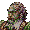
Minor things are the smallish head and his right arm seem to be crippled.
* could you move the hat a bit upwards and enlarge his face a little bit?
* In my opinion his right arm needs to be redrawn, because the length doesn't correspond to his body. Now it is bend unaturally.
* maybe his upper body is too short. Could you give him a rib more?
-
Sgt. Groovy

- Art Contributor
- Posts: 1471
- Joined: May 22nd, 2006, 9:15 pm
- Location: Helsinki
Re: Return of the fencer, part deux
Duelist WIP, linework and preliminary colour scheme (click the image, the forum resize function messes up colours!), which is supposed to match the sprite (never mind the missing stuff for now):
- Attachments
-
Tiedäthän kuinka pelataan.
Tiedäthän, vihtahousua vastaan.
Tiedäthän, solmu kravatin, se kantaa niin synnit
kuin syntien tekijätkin.
Tiedäthän, vihtahousua vastaan.
Tiedäthän, solmu kravatin, se kantaa niin synnit
kuin syntien tekijätkin.
-
LordBob

- Portrait Director
- Posts: 1309
- Joined: December 8th, 2008, 8:18 pm
- Location: Lille, France
- Contact:
Re: Return of the fencer, part deux
I like the color scheme and your linework is really clean, can't wait to see it finished.
Want to see more of my art ? Visit my portfolio !
-
Sgt. Groovy
- Art Contributor
- Posts: 1471
- Joined: May 22nd, 2006, 9:15 pm
- Location: Helsinki
Re: Return of the fencer, part deux
Thanks to a flu I have found time to work on this. Here's the next iteration:
- Attachments
-
- duelistd4pre2.png (99.95 KiB) Viewed 3918 times
Tiedäthän kuinka pelataan.
Tiedäthän, vihtahousua vastaan.
Tiedäthän, solmu kravatin, se kantaa niin synnit
kuin syntien tekijätkin.
Tiedäthän, vihtahousua vastaan.
Tiedäthän, solmu kravatin, se kantaa niin synnit
kuin syntien tekijätkin.
Re: Return of the fencer, part deux
This begins to look really good.
-
Sgt. Groovy
- Art Contributor
- Posts: 1471
- Joined: May 22nd, 2006, 9:15 pm
- Location: Helsinki
Re: Return of the fencer, part deux
Enter the sword. Also shown in small size and black background (I keep forgetting hoe awfully small the 205x205 is, maybe I should go for thighter cropping for that):
- Attachments
-
- duelistbig.png (101.67 KiB) Viewed 3811 times
-
- duelistsmall.png (34.23 KiB) Viewed 3818 times
Tiedäthän kuinka pelataan.
Tiedäthän, vihtahousua vastaan.
Tiedäthän, solmu kravatin, se kantaa niin synnit
kuin syntien tekijätkin.
Tiedäthän, vihtahousua vastaan.
Tiedäthän, solmu kravatin, se kantaa niin synnit
kuin syntien tekijätkin.
Re: Return of the fencer, part deux
I have mixed emotion when I watch this project. This duelist looks almost too smooth for the wesnoth-new-style portrait and the colours are too pastel for my personal taste. But you know already that I'm fond of much stronger, more saturated colours and the others don't agree with me. (Well, not as much as they appeared to be on the portraits in my thread. My laptop displays the colours less saturated when I'm drawing). The pose is very static - like he was really posing for portrait. But that's the matter of personal taste too.
Still the lineart is really good and I admire the feather on duelist's hat and the design of his doublet. The rapier's hilt is also nice.
Are you going to make the fencer's and the master's portaits too?
It looks like in the worst case you will be the author of fencer's line portraits as your work gains much less critique and more approval. And in the best there will be two lines - yours and mine because our concepts aren't compatible.
-
thespaceinvader

- Retired Art Director
- Posts: 8414
- Joined: August 25th, 2007, 10:12 am
- Location: Oxford, UK
- Contact:
Re: Return of the fencer, part deux
I agree with the critique about his smoothness. I don't have any issues with the overall posing and design, he looks great. But there's a lack of texture and realism to certain parts, particularly the cloth - the whole of his doublet is unnaturally smooth, it looks like plastic. it's particularly noticeable aroun his hand - the position of his thumb should make a big dent in the cloth, but it's like it's resting on the surface. There are similar issues with the belt as well. But i'm not sure overall how finished you consider these areas, so you may be planning on improving them anyway...
The sleeve creases look great, though - you've captured a thick, padded look really well.
The sleeve creases look great, though - you've captured a thick, padded look really well.
http://thespaceinvader.co.uk | http://thespaceinvader.deviantart.com
Back to work. Current projects: Catching up on commits. Picking Meridia back up. Sprite animations, many and varied.
Back to work. Current projects: Catching up on commits. Picking Meridia back up. Sprite animations, many and varied.
-
Sgt. Groovy
- Art Contributor
- Posts: 1471
- Joined: May 22nd, 2006, 9:15 pm
- Location: Helsinki
Re: Return of the fencer, part deux
I'm aware of the smoothness issue, and that's because I'm working on vector graphics, where there is no luxury of brushstrokes to create a textured surface 'for free'. I have been experimenting with some approaches to break out of the 'plastic' look, though, and I hope to find a way to reach a result technically compatible with the current raster-created portrait style.

Yeah, I have had them in the works as well, but given my lousy record for finishing projects, I'm hardly in a position to make any claims on them. On the contrary, I would prefer you to continue on your versions, because that would give me an extra incentive to be more productive.Are you going to make the fencer's and the master's portaits too?
Tiedäthän kuinka pelataan.
Tiedäthän, vihtahousua vastaan.
Tiedäthän, solmu kravatin, se kantaa niin synnit
kuin syntien tekijätkin.
Tiedäthän, vihtahousua vastaan.
Tiedäthän, solmu kravatin, se kantaa niin synnit
kuin syntien tekijätkin.
Re: Return of the fencer, part deux
i just wanted to chime in and tell you that on the one hand he's starting to look really good, i like the thickness of the fabric and the general colour choices. but on the other hand the colouration is stylistically too far from what we are doing for mainline. you'll need to find a way to make him more painted, more textured and less plastic-y feeling. the shading seems overall pretty timid atm, you'll need to introduce darker shadows, too.
you wrote that you did all the colouration by vector - why don't you import your clean vector lineart to photoshop/gimp?
and if you continue to work on the fencer line, please try to find more natural (less posing) poses for the follow-ups.
keep trying!
you wrote that you did all the colouration by vector - why don't you import your clean vector lineart to photoshop/gimp?
and if you continue to work on the fencer line, please try to find more natural (less posing) poses for the follow-ups.
keep trying!
-
Sgt. Groovy
- Art Contributor
- Posts: 1471
- Joined: May 22nd, 2006, 9:15 pm
- Location: Helsinki
Re: Return of the fencer, part deux
I will, but only if nothing else works. First I want to see how far I can get with pure vector. There are ways for more lively feel with vector, but I'm only beginning to discover them.kitty wrote:why don't you import your clean vector lineart to photoshop/gimp?
As for shading contrast, that will be easy to fix. I have made light and shadow with colour matrices, and changing the contrast and tone is just a matter of fiddling with the values. Hell, I could provide a whole range of versions with different contrasts in just few minutes, and you'd just need to take your pick.
Tiedäthän kuinka pelataan.
Tiedäthän, vihtahousua vastaan.
Tiedäthän, solmu kravatin, se kantaa niin synnit
kuin syntien tekijätkin.
Tiedäthän, vihtahousua vastaan.
Tiedäthän, solmu kravatin, se kantaa niin synnit
kuin syntien tekijätkin.
-
Sgt. Groovy
- Art Contributor
- Posts: 1471
- Joined: May 22nd, 2006, 9:15 pm
- Location: Helsinki
Re: Return of the fencer, part deux
New iteration of the duelist, deepened shadows and better shape to the fabric. Also featured an old sketch for the Master at Arms.
- Attachments
-
- duelistbig.png (104.4 KiB) Viewed 3058 times
-
Tiedäthän kuinka pelataan.
Tiedäthän, vihtahousua vastaan.
Tiedäthän, solmu kravatin, se kantaa niin synnit
kuin syntien tekijätkin.
Tiedäthän, vihtahousua vastaan.
Tiedäthän, solmu kravatin, se kantaa niin synnit
kuin syntien tekijätkin.
-
thespaceinvader
- Retired Art Director
- Posts: 8414
- Joined: August 25th, 2007, 10:12 am
- Location: Oxford, UK
- Contact:
Re: Return of the fencer, part deux
It's a very subtle alteration, but those stitching marks really add texture. It's getting there on style...
The master at arms looks good, but his head's too large. I like the pose, though =)
The master at arms looks good, but his head's too large. I like the pose, though =)
http://thespaceinvader.co.uk | http://thespaceinvader.deviantart.com
Back to work. Current projects: Catching up on commits. Picking Meridia back up. Sprite animations, many and varied.
Back to work. Current projects: Catching up on commits. Picking Meridia back up. Sprite animations, many and varied.
-
Sgt. Groovy
- Art Contributor
- Posts: 1471
- Joined: May 22nd, 2006, 9:15 pm
- Location: Helsinki
Re: Return of the fencer, part deux
Compared to what?his head's too large
Tiedäthän kuinka pelataan.
Tiedäthän, vihtahousua vastaan.
Tiedäthän, solmu kravatin, se kantaa niin synnit
kuin syntien tekijätkin.
Tiedäthän, vihtahousua vastaan.
Tiedäthän, solmu kravatin, se kantaa niin synnit
kuin syntien tekijätkin.