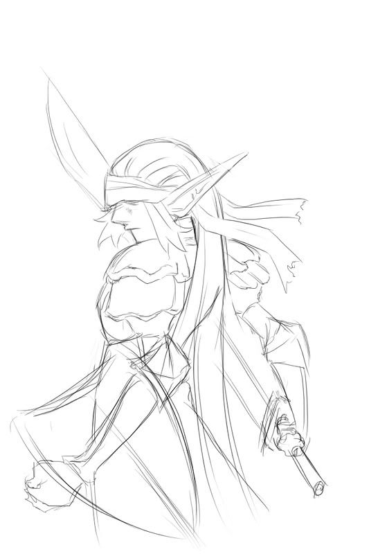
Elvish Fighter portrait (draft)
Moderator: Forum Moderators
Forum rules
Before posting critique in this forum, you must read the following thread:
Before posting critique in this forum, you must read the following thread:
Elvish Fighter portrait (draft)
I tried to do a slightly cartoony feel for portraits but still retaining certain 'cool' points. What do you think of the style? It's quite heavily influenced by Odin Sphere artworks.
-
thespaceinvader

- Retired Art Director
- Posts: 8414
- Joined: August 25th, 2007, 10:12 am
- Location: Oxford, UK
- Contact:
Your style's nice - it's smooth and flowing, and i can see it will look good when rendered out - the lines are clean and sure.
The composition's good in itself, and as a standalone picture, it is excellent. But not it's not so brilliant, in my opinion, for an identifying portrait. I know it's a little boring, but the standard is a roughly 3/4 view, facing either off to the right or left (which doesn't matter, as they can easily be flipped depending on which side the dialogue is). It's there to identify the unit as well as looking cool. Of course, my opinion on that isn't as important as the art devs, so i defer to their judgement, whatever that may be, there.
What's bugging me a little is the size of his gear - that sword is huge (proportionately, a bit bigger than the sprites, and bigger even than the Elvish Champion's, and he wields the biggest sword in the elvish armoury...), and looks a little off in the hands of a slender elf, particularly a level one elf. Similarly, the shield is possibly a little small - it's about proportionally the size of the one on the sprite, but the shields on the sprites are by necessity often disproportionately small so you can see the rest of the image.
I do like the shape of that sword, though - it's graceful enough to be an elvish design, but it seems inspired by machetes and kukhris, which, whilst also weapons, share a practical purpose in cutting through heavy forest undergrowth. And the elves are forest dwellers...
He also seems a little too slender to me, particularly in the arms. I always envision elves as being of the sort of bruce lee (well, early bruce lee, anyway) build - wiry and thin, but still distinctly muscular. Again, there's a lot of style to the sort of build you're showing, but i likes my realism, too
I like the armour design - again, it looks forest-inspired, which fits nicely. The ears look good, as does the headband, but would he be able to see out from underneath it?
Finally, it's worth bearing in mind, when drawing unit portraits, that the final crop will be square (205x205) so a composition that is tall and narrow might end up either cut off very high up, or with a lot of black space on one or both sides.
All in all, great work =D more of this sort would be fantastic =)
http://thespaceinvader.co.uk | http://thespaceinvader.deviantart.com
Back to work. Current projects: Catching up on commits. Picking Meridia back up. Sprite animations, many and varied.
Back to work. Current projects: Catching up on commits. Picking Meridia back up. Sprite animations, many and varied.
-
Thrawn

- Moderator Emeritus
- Posts: 2047
- Joined: June 2nd, 2005, 11:37 am
- Location: bridge of SSD Chimera
Very nice sketch! When you clean it up some it will look pretty awesome!
Imo it definitely captures the feel of the sprite, something that is sometimes hard to do, or hard not to over do (copying the sprite almost exactly, which just as bad) so major kudos for that
Just a couple of things:
1. to restate some of spaceinvader's comments, it makes a spectacular picture, but not a great dialog portrait. Also, the pose gives it a kind of sinister/shifty air (for a dialog scene) because his view isn't connecting to the viewer.
Also, more defined arms (not necessarily bulky, but as si says, wiry muscles)
2. re: the sword. The blade doesn't attach to the hilt properly.
a. it isn't centered
b. The hilt goes off at an angel, but the blade twists behind him, and comes out going the same direction as the "gaze" of the elf...If my explanation isn't too clear, I'll try to make a quick mock-up.
this needs to be fixed
3. I'm pretty sure you know you'll have to do this, but (just in ase) when you clean it up, make sure that you don't have the multiple lines used to denote one edge--again, I'm not sure if I'm wording it properly, so let me know if I have to give an example...
Please keep working on this! I want to see the finished product.
EDIT: alsoin your other thread, jetryl says you should have more facial detail. I think that would help this, but not sure how exactly to do that--I'm not so good with profiles <_<
...please remember that "IT'S" ALWAYS MEANS "IT IS" and "ITS" IS WHAT YOU USE TO INDICATE POSSESSION BY "IT".--scott
this goes for they're/their/there as well
this goes for they're/their/there as well
-
Shadow
- Posts: 1264
- Joined: September 9th, 2004, 10:27 am
- Location: Following the steps of Goethe
- Contact:
Almost nothing to add besides nice .
Though the pose could work if you could see enough of the face.
He's talking to you while on the move nothing ground breaking.
Though the pose could work if you could see enough of the face.
He's talking to you while on the move nothing ground breaking.
... all romantics meet the same fate someday
Cynical and drunk and boring someone in some dark cafe ...
All good dreamers pass this way some day
Hidin’ behind bottles in dark cafes
Cynical and drunk and boring someone in some dark cafe ...
All good dreamers pass this way some day
Hidin’ behind bottles in dark cafes

The concerns that have been voiced about the direction he's facing are valid. The subject in a portrait like this should visually address the viewer, rather than staring off in a different direction.
Namely, if you can achieve the same level of detail that whatsherface did on the portrait art for "Oni", you'd be good to go. I'll try and upload an example.Thrawn wrote:alsoin your other thread, jetryl says you should have more facial detail. I think that would help this, but not sure how exactly to do that--I'm not so good with profiles <_<
thespaceinvader > Corrections can be done, it's a draft after all. I'll be sure to draw the blade smaller then. Well I tried to do slightly a bit cartoony by drawing the arms slender, long and well...skinny. Well regarding the eyes, it's just a trademark style I'm going to be sticking to when drawing mass produced units. I'll cover the eyes but not too much. Just so I won't have to draw the eyes. To me, to draw the eyes means the character is one of the main characters (Or a known character), and without the eyes showing, they're defined as a random character. For main characters, I'll be showing their eyes. 205x205, right got it.
thrawn > So should I redraft it for another pose? Right, I'll give him some definitive muscles but I'll keep his slender arms, it's quite a style I'm interested to looking when playing Odin Sphere ^^;; And the blade's supposed to be angled properly...Just that it might seem facing where he is facing now, it'll show when I paint it. And yeah don't worry, this is just a draft, I'll be cleaning the lines when I paint him. (Yeah not cellshading I suppose, painting will define his features a bit more when I do his face)
Shadow > Thanks :3~ I'll try to rework it if necessary.
Jetryl > Is it better if I redraft him in another pose? Hmm no worries, I will be painting this portrait so his facial features will show.
-
Federalist marshal

- Art Contributor
- Posts: 382
- Joined: December 17th, 2007, 12:02 am
That style is quite common in anime, as far as I can tell, and it definitely does make sense to make common units faceless, but I sadly doubt you'll be able to keep that. If the portrait were for a UMC it might be acceptable, however.Well regarding the eyes, it's just a trademark style I'm going to be sticking to when drawing mass produced units. I'll cover the eyes but not too much. Just so I won't have to draw the eyes. To me, to draw the eyes means the character is one of the main characters (Or a known character), and without the eyes showing, they're defined as a random character.
UMC? However...? @@;;Federalist marshal wrote:That style is quite common in anime, as far as I can tell, and it definitely does make sense to make common units faceless, but I sadly doubt you'll be able to keep that. If the portrait were for a UMC it might be acceptable, however.Well regarding the eyes, it's just a trademark style I'm going to be sticking to when drawing mass produced units. I'll cover the eyes but not too much. Just so I won't have to draw the eyes. To me, to draw the eyes means the character is one of the main characters (Or a known character), and without the eyes showing, they're defined as a random character.
-
Sgt. Groovy

- Art Contributor
- Posts: 1471
- Joined: May 22nd, 2006, 9:15 pm
- Location: Helsinki
-
Kestenvarn

- Inactive Developer
- Posts: 1307
- Joined: August 19th, 2005, 7:30 pm
- Contact:
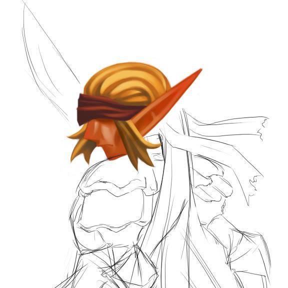
I like it. The bandanna could be improved if it was tighter across the forehead. (I must assume it is tied underneath the hair, with the ends trailing from there.)
The current pose could still work as a portrait if the elf was shown looking sideways towards the viewer. If not as a Fighter, then as something else.

The current pose could still work as a portrait if the elf was shown looking sideways towards the viewer. If not as a Fighter, then as something else.
-
thespaceinvader
- Retired Art Director
- Posts: 8414
- Joined: August 25th, 2007, 10:12 am
- Location: Oxford, UK
- Contact:
WRT the eyes, that would be brilliant if not for two things: firstly, that generic portraits are often used as standbys by campaign makers who cannot find a good artist to do their portraits for them. Secondly, and more importantly, it's not the standard. It would look weird to have a bunch of portraits without eyes, when the majority show them (if they're not hidden under a helm or something), generic unit or not...kuroyuki wrote:thespaceinvader > Corrections can be done, it's a draft after all. I'll be sure to draw the blade smaller then. Well I tried to do slightly a bit cartoony by drawing the arms slender, long and well...skinny. Well regarding the eyes, it's just a trademark style I'm going to be sticking to when drawing mass produced units. I'll cover the eyes but not too much. Just so I won't have to draw the eyes. To me, to draw the eyes means the character is one of the main characters (Or a known character), and without the eyes showing, they're defined as a random character. For main characters, I'll be showing their eyes. 205x205, right got it.
Regarding the skinniness, a little is fine, i think, but not to the extent he is current;y - his arms are essentially tubes without any muscle definition at all, apart from on the one hidden behind the shield.
Personally, on the posing, i'd say finish this by all means, and it'll likely be extremely useful to a UMC maker somewhere. But don't be too surprised based on what jetryl said if that pose keeps it out of the mainline as a generic unit portrait, and you have to draw it again.
Also, bear in mind that 205x205 is the standard for generic identifier portraits. It helps if specific character portraits are the same, but they can be bigger and in different - i.e. not square - proportions (see the campaign Northern Rebirth).
To sum up, it is my opinion that this would be better produced as a piece for UMC, and a different version done for the unit portrait for the elvish fighter. That keeps this very good image available to any who want to use it, but at the same time get the best possible identifying portrait for the Fighter.
EDIT: crossposted. He's really, really orange. A different skin colour would be preferable. But the rendering style your using cements my conclusion above - it's a good style, but not the standard portrait one.
http://thespaceinvader.co.uk | http://thespaceinvader.deviantart.com
Back to work. Current projects: Catching up on commits. Picking Meridia back up. Sprite animations, many and varied.
Back to work. Current projects: Catching up on commits. Picking Meridia back up. Sprite animations, many and varied.
Well, it's not that they aren't showing their eyes. I'm trying to 'cover' it so that it won't show. Like for example, a bandana for this Elvish Fighter. Drawn it to look like the bandana is tied loosely therefore it'd droop a bit, but it's not really tied loosely. Sort of an artistic way I suppose? XD;; And for Orcs or Dwarves (Which may be interesting to attempt) Their eyes can be covered by helms.)thespaceinvader wrote:WRT the eyes, that would be brilliant if not for two things: firstly, that generic portraits are often used as standbys by campaign makers who cannot find a good artist to do their portraits for them. Secondly, and more importantly, it's not the standard. It would look weird to have a bunch of portraits without eyes, when the majority show them (if they're not hidden under a helm or something), generic unit or not...
Regarding the skinniness, a little is fine, i think, but not to the extent he is current;y - his arms are essentially tubes without any muscle definition at all, apart from on the one hidden behind the shield.
Personally, on the posing, i'd say finish this by all means, and it'll likely be extremely useful to a UMC maker somewhere. But don't be too surprised based on what jetryl said if that pose keeps it out of the mainline as a generic unit portrait, and you have to draw it again.
Also, bear in mind that 205x205 is the standard for generic identifier portraits. It helps if specific character portraits are the same, but they can be bigger and in different - i.e. not square - proportions (see the campaign Northern Rebirth).
To sum up, it is my opinion that this would be better produced as a piece for UMC, and a different version done for the unit portrait for the elvish fighter. That keeps this very good image available to any who want to use it, but at the same time get the best possible identifying portrait for the Fighter.
EDIT: crossposted. He's really, really orange. A different skin colour would be preferable. But the rendering style your using cements my conclusion above - it's a good style, but not the standard portrait one.
Aye, that's why I stated "I tried to do a slightly cartoony feel for portraits but still retaining certain 'cool' points." It's not really meant to be 100% real, rather it's intentionally disproportioned.
Right, I'll finish it up then. Feel free to use it for the mean time when it's done ^^;;
And yeah, It's intentional. I know elves are supposed to have really fair skin. But I just wanted to play with color tinting. Like during sundown, the atmosphere around turns orangey and all XD (Deh sorry, it's a habit of mine to not use the actual colors and try to tint it to get that special flare)
-
thespaceinvader
- Retired Art Director
- Posts: 8414
- Joined: August 25th, 2007, 10:12 am
- Location: Oxford, UK
- Contact:
Bear in mind that this will be displayed against a black background, so you won't have any hints of what environment he's in - neutral lighting is better than a particular colour. Against a black background, people won't realise he's lit by a setting sun, they'll simply think he's orange.
http://thespaceinvader.co.uk | http://thespaceinvader.deviantart.com
Back to work. Current projects: Catching up on commits. Picking Meridia back up. Sprite animations, many and varied.
Back to work. Current projects: Catching up on commits. Picking Meridia back up. Sprite animations, many and varied.