new portrait for troll warrior
Moderator: Forum Moderators
Forum rules
Before posting critique in this forum, you must read the following thread:
Before posting critique in this forum, you must read the following thread:

new portrait for troll warrior
hello
ive working in a new portrair for the troll warrior.
tell me what you think.
and i want to know if another unit have priority of having portrait, to work on it.
Again, excuse my english.
ive working in a new portrair for the troll warrior.
tell me what you think.
and i want to know if another unit have priority of having portrait, to work on it.
Again, excuse my english.
- Attachments
-
- trol.png (24.45 KiB) Viewed 6581 times
-
Sgt. Groovy

- Art Contributor
- Posts: 1471
- Joined: May 22nd, 2006, 9:15 pm
- Location: Helsinki
Wow, that's pretty nice. 
The things that need to change to bring it stylistically up to par are:
The things that need to change to bring it stylistically up to par are:
- Variation in line width
- Lines darker shade of the area they are covering instead of black
- Black background.
Tiedäthän kuinka pelataan.
Tiedäthän, vihtahousua vastaan.
Tiedäthän, solmu kravatin, se kantaa niin synnit
kuin syntien tekijätkin.
Tiedäthän, vihtahousua vastaan.
Tiedäthän, solmu kravatin, se kantaa niin synnit
kuin syntien tekijätkin.
-
thespaceinvader

- Retired Art Director
- Posts: 8414
- Joined: August 25th, 2007, 10:12 am
- Location: Oxford, UK
- Contact:
Shadow: don't the Discworld trolls look more like Thing from the fantastic 4? Certainly, that's how they've always appeared on the (UK) book covers...
Nehuen: I think this looks great. I can really see the thuggish cunning that wesnoth's trolls have coming through here, he looks a real brute.
I'll agree with Groovy's points for now, and add a couple of my own:
- From a game background perspective, i'm not sure about the ear piercing - since troll skin supposed to be rock hard, i'm not sure how easy it would be to do... Or, for that matter, with hands the size and strength of a troll's, how easy it would be to put in without crushing the ring...
- It could stand, i think, to show more of the unit, as it's cropped a little close for my taste. And even with the crop where it is, i think we could do with seeing some of the troll's shoulders, rather than just his trapezius - i think of trolls as very hunched without much neck at all, and at the moment his neck seems quite wide and long.
It's great work, keep it up =)
And since you ask, pretty much any unit without a current portrait is fair game to try your hand at, I think. In this sort of style, i'd personally love to see more northerners - the entire orc race apart from Warlords is currently lacking in portraits, i think, as are the remaining trolls.
http://thespaceinvader.co.uk | http://thespaceinvader.deviantart.com
Back to work. Current projects: Catching up on commits. Picking Meridia back up. Sprite animations, many and varied.
Back to work. Current projects: Catching up on commits. Picking Meridia back up. Sprite animations, many and varied.
ok, ive changed the line widths, the background color and the eyes, as you asked.
Well, what do you think now?
And what do you mean with Detritus is alive? I didn't understand it.
Spaceinvader: I didn't draw the shoulders because the head would be small, and it wont have the detail level that i want.
And about the earring, i think you're right, the next edition will be whitout it.
- Attachments
-
- trol.png (16.71 KiB) Viewed 6500 times
Last edited by nehuen on December 30th, 2007, 8:38 pm, edited 1 time in total.
-
thespaceinvader
- Retired Art Director
- Posts: 8414
- Joined: August 25th, 2007, 10:12 am
- Location: Oxford, UK
- Contact:
Since you ask, detritus is probably the most famous troll from Terry Pratchett's Discworld books series. IN personality, he pretty much epitomises the Wesnoth troll, although i've never personally seen him look like one... That's the reference Shadow's giving, i think.
Looking better already, though i'd maybe go a couple of shades darker with the lines, and the ones around the outside need to be anti-aliased like the internal ones are.
Looking better already, though i'd maybe go a couple of shades darker with the lines, and the ones around the outside need to be anti-aliased like the internal ones are.
http://thespaceinvader.co.uk | http://thespaceinvader.deviantart.com
Back to work. Current projects: Catching up on commits. Picking Meridia back up. Sprite animations, many and varied.
Back to work. Current projects: Catching up on commits. Picking Meridia back up. Sprite animations, many and varied.
-
Federalist marshal

- Art Contributor
- Posts: 382
- Joined: December 17th, 2007, 12:02 am
It's very well done, as far as I can tell. But I think that the camera view should zoom out, so that more of the body should be shown.
Trolls are usually stupid and belligerent, and therefore I think that his facial expression should reflect that he's an idiot who will smash literally everthing he sees.
Trolls are usually stupid and belligerent, and therefore I think that his facial expression should reflect that he's an idiot who will smash literally everthing he sees.
-
Sgt. Groovy
- Art Contributor
- Posts: 1471
- Joined: May 22nd, 2006, 9:15 pm
- Location: Helsinki
Loking at it more carefully, there are few problems with the shading. His left ear is in light, but it's as dark as the one in shadow. Also, according to the general direction of lighting, as indicated by other shadows, there really shouldn't be that big a shadow under the chin.
Furthermore, I'm not sure the multi-tier shading is necessary, just one shade for both light and shadow might be better.
Furthermore, I'm not sure the multi-tier shading is necessary, just one shade for both light and shadow might be better.
- Attachments
-
- text3405.png (38.07 KiB) Viewed 6481 times
Tiedäthän kuinka pelataan.
Tiedäthän, vihtahousua vastaan.
Tiedäthän, solmu kravatin, se kantaa niin synnit
kuin syntien tekijätkin.
Tiedäthän, vihtahousua vastaan.
Tiedäthän, solmu kravatin, se kantaa niin synnit
kuin syntien tekijätkin.
-
Sgt. Groovy
- Art Contributor
- Posts: 1471
- Joined: May 22nd, 2006, 9:15 pm
- Location: Helsinki
Whoops, we cross-posted, adn you had already fixed the ear.
Speaking of the ears, I'm not sure the tip of his right ear should be darker than the rest, suggesting it's going deeper into the shadow volume. Rather, it might be sticking out of, and thus be lighter.
Speaking of the ears, I'm not sure the tip of his right ear should be darker than the rest, suggesting it's going deeper into the shadow volume. Rather, it might be sticking out of, and thus be lighter.
Tiedäthän kuinka pelataan.
Tiedäthän, vihtahousua vastaan.
Tiedäthän, solmu kravatin, se kantaa niin synnit
kuin syntien tekijätkin.
Tiedäthän, vihtahousua vastaan.
Tiedäthän, solmu kravatin, se kantaa niin synnit
kuin syntien tekijätkin.

That's very nice work so far. You might want to wait until Jetryl or one of the official Art Developers gets a chance to respond before making any major revisions.
I suspect they will want to see more of the shoulders / torso.
Also, I don't see any thematic problem with earrings... some explanations would be that it doesn't need to pierce the skin entirely to stay in place, or that the ears of a troll are softer than most of his other skin (both seem plausible to me). So it's just a stylistic choice.
http://www.wesnoth.org/wiki/User:Sapient... "Looks like your skills saved us again. Uh, well at least, they saved Soarin's apple pie."
here is another update, fixing the shadow in the ears.
in answer to Federalist marshal, i dont think that he has to have an stupid face, considering that he is a lvl 3 warrior, he has enough experience in war to look rough and not stupid.
and for the comment of Sapient, i agree, and i will wait until one official art developer tell me if i have to draw more of the shoulders or is fine right now.
- Attachments
-
- trol.png (16.66 KiB) Viewed 6416 times

Note: when we'll use this, it'll most likely be a portrait for most of the troll line, or for some troll character (like Grüü from SotBE, unless someone really makes that portrait set for that campaign sometime soon). It wouldn't make any sense to just use this as a unit type portrait for the troll warrior.
It's a really good portrait already, IMO.
It's a really good portrait already, IMO.
-
thespaceinvader
- Retired Art Director
- Posts: 8414
- Joined: August 25th, 2007, 10:12 am
- Location: Oxford, UK
- Contact:
The only thing that still needs doing style-wise before that is to anti-alias (that is to say, remove the jagged edges on) the lines around the edge where you filled the background in black. Everything else is looking great.,
http://thespaceinvader.co.uk | http://thespaceinvader.deviantart.com
Back to work. Current projects: Catching up on commits. Picking Meridia back up. Sprite animations, many and varied.
Back to work. Current projects: Catching up on commits. Picking Meridia back up. Sprite animations, many and varied.
-
Shadow
- Posts: 1264
- Joined: September 9th, 2004, 10:27 am
- Location: Following the steps of Goethe
- Contact:
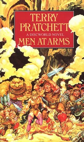
I've bought some Art books of Paul Kidby. The new cover designer of Discworld. I really like the art and this one comes close to his vision.thespaceinvader wrote:Shadow: don't the Discworld trolls look more like Thing from the fantastic 4? Certainly, that's how they've always appeared on the (UK) book covers...
/edit
Found a copy
... all romantics meet the same fate someday
Cynical and drunk and boring someone in some dark cafe ...
All good dreamers pass this way some day
Hidin’ behind bottles in dark cafes
Cynical and drunk and boring someone in some dark cafe ...
All good dreamers pass this way some day
Hidin’ behind bottles in dark cafes